base <- ggplot(mpg, aes(cty, hwy, color = factor(cyl))) +
  geom_jitter() +
  geom_abline(colour = "grey50", size = 2)
#> Warning: Using `size` aesthetic for lines was deprecated in ggplot2 3.4.0.
#> ℹ Please use `linewidth` instead.
base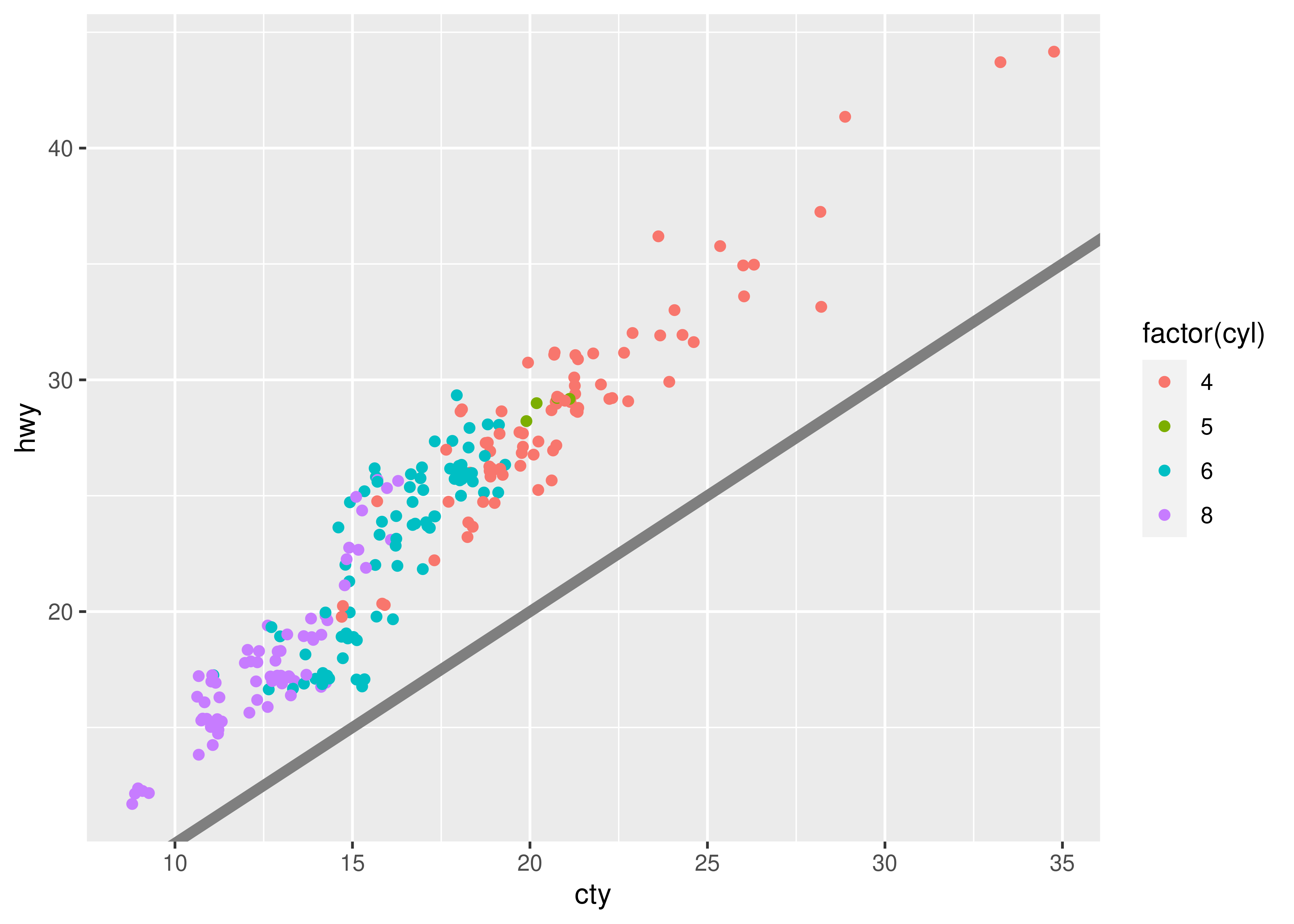
You are reading the work-in-progress third edition of the ggplot2 book. This chapter is currently a dumping ground for ideas, and we don’t recommend reading it.
In this chapter you will learn how to use the ggplot2 theme system, which allows you to exercise fine control over the non-data elements of your plot. The theme system does not affect how the data is rendered by geoms, or how it is transformed by scales. Themes don’t change the perceptual properties of the plot, but they do help you make the plot aesthetically pleasing or match an existing style guide. Themes give you control over things like fonts, ticks, panel strips, and backgrounds.
This separation of control into data and non-data parts is quite different from base and lattice graphics. In base and lattice graphics, most functions take a large number of arguments that specify both data and non-data appearance, which makes the functions complicated and harder to learn. ggplot2 takes a different approach: when creating the plot you determine how the data is displayed, then after it has been created you can edit every detail of the rendering, using the theming system.
The theming system is composed of four main components:
Theme elements specify the non-data elements that you can control. For example, the plot.title element controls the appearance of the plot title; axis.ticks.x, the ticks on the x axis; legend.key.height, the height of the keys in the legend.
Each element is associated with an element function, which describes the visual properties of the element. For example, element_text() sets the font size, colour and face of text elements like plot.title.
The theme() function which allows you to override the default theme elements by calling element functions, like theme(plot.title = element_text(colour = "red")).
Complete themes, like theme_grey() set all of the theme elements to values designed to work together harmoniously.
For example, imagine you’ve made the following plot of your data.
base <- ggplot(mpg, aes(cty, hwy, color = factor(cyl))) +
geom_jitter() +
geom_abline(colour = "grey50", size = 2)
#> Warning: Using `size` aesthetic for lines was deprecated in ggplot2 3.4.0.
#> ℹ Please use `linewidth` instead.
base
It’s served its purpose for you: you’ve learned that cty and hwy are highly correlated, both are tightly coupled with cyl, and that hwy is always greater than cty (and the difference increases as cty increases). Now you want to share the plot with others, perhaps by publishing it in a paper. That requires some changes. First, you need to make sure the plot can stand alone by:
Fortunately, you know how to do that already because you’ve read Section 8.1 and Chapter 11:
labelled <- base +
  labs(
    x = "City mileage/gallon",
    y = "Highway mileage/gallon",
    colour = "Cylinders",
    title = "Highway and city mileage are highly correlated"
  ) +
  scale_colour_brewer(type = "seq", palette = "Spectral")
labelled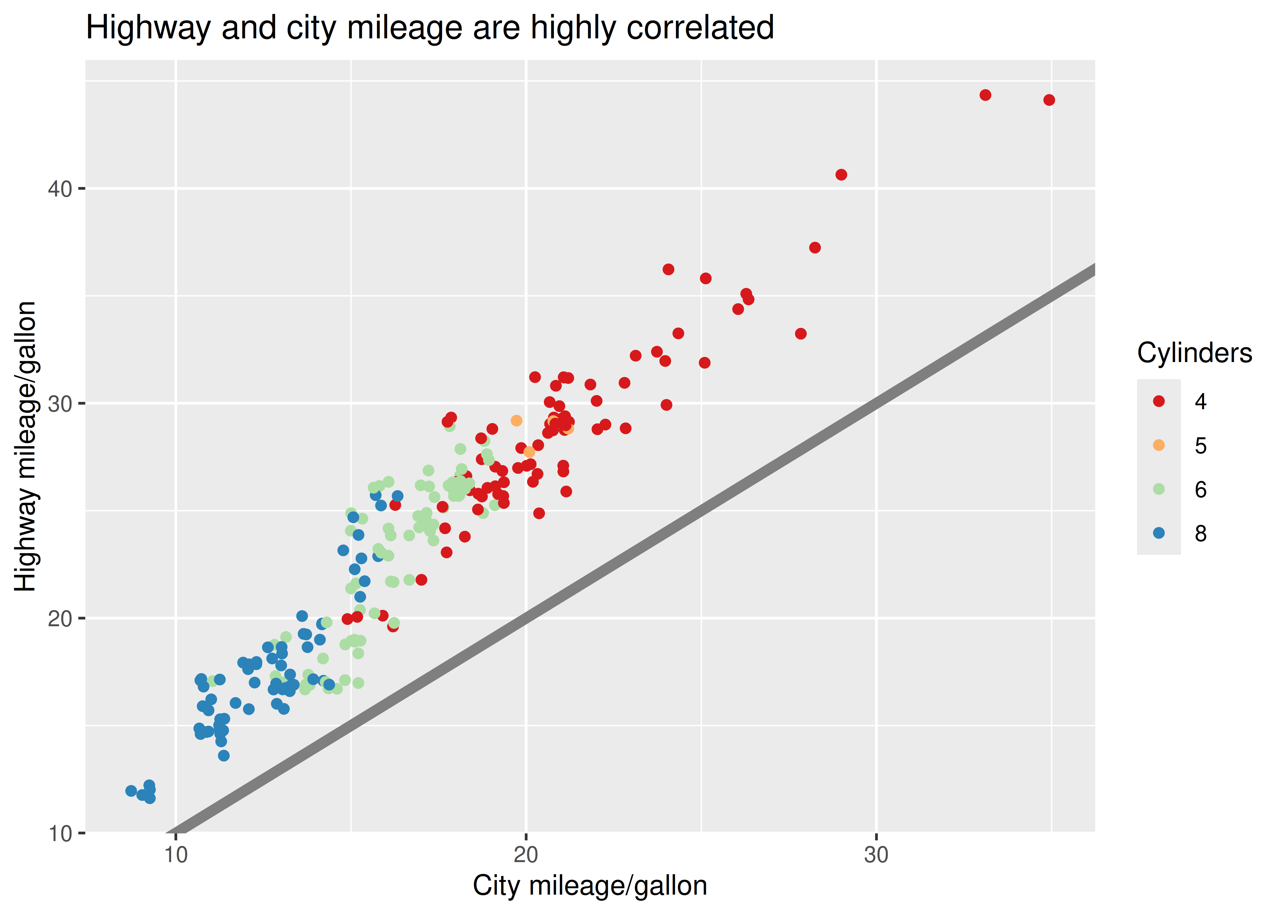
Next, you need to make sure the plot matches the style guidelines of your journal:
In this chapter, you’ll learn how to use the theming system to make those changes, as shown below:
styled <- labelled +
  theme_bw() +
  theme(
    plot.title = element_text(face = "bold", size = 12),
    legend.background = element_rect(
      fill = "white",
      linewidth = 4,
      colour = "white"
    ),
    legend.justification = c(0, 1),
    legend.position = c(0, 1),
    axis.ticks = element_line(colour = "grey70", linewidth = 0.2),
    panel.grid.major = element_line(colour = "grey70", linewidth = 0.2),
    panel.grid.minor = element_blank()
  )
styled
Finally, the journal wants the figure as a 600 dpi TIFF file. You’ll learn the fine details of ggsave() in Section 17.5.
ggplot2 comes with a number of built-in themes. The most important is theme_grey(), the signature ggplot2 theme with a light grey background and white gridlines. The theme is designed to put the data forward while supporting comparisons, following the advice of (Tufte 2006; Brewer 1994; Carr 2002, 1994; Carr and Sun 1999). We can still see the gridlines to aid in the judgement of position (Cleveland 1993), but they have little visual impact and we can easily ‘tune’ them out. The grey background gives the plot a similar typographic colour to the text, ensuring that the graphics fit in with the flow of a document without jumping out with a bright white background. Finally, the grey background creates a continuous field of colour which ensures that the plot is perceived as a single visual entity.
There are seven other themes built in to ggplot2 1.1.0:
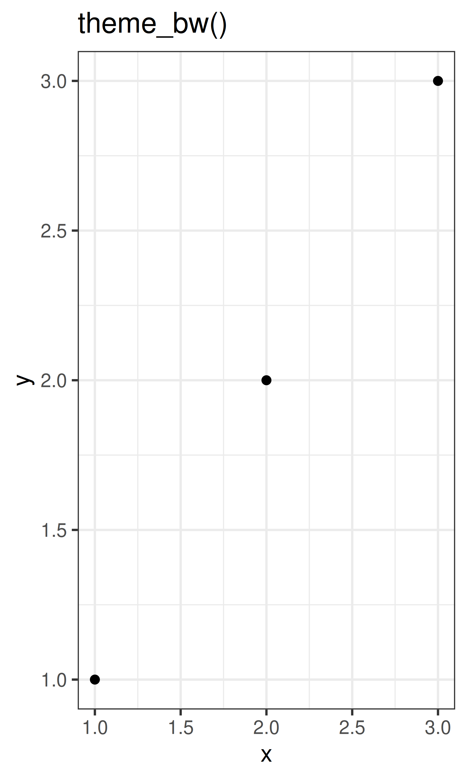
theme_bw(): a variation on theme_grey() that uses a white background and thin grey grid lines.
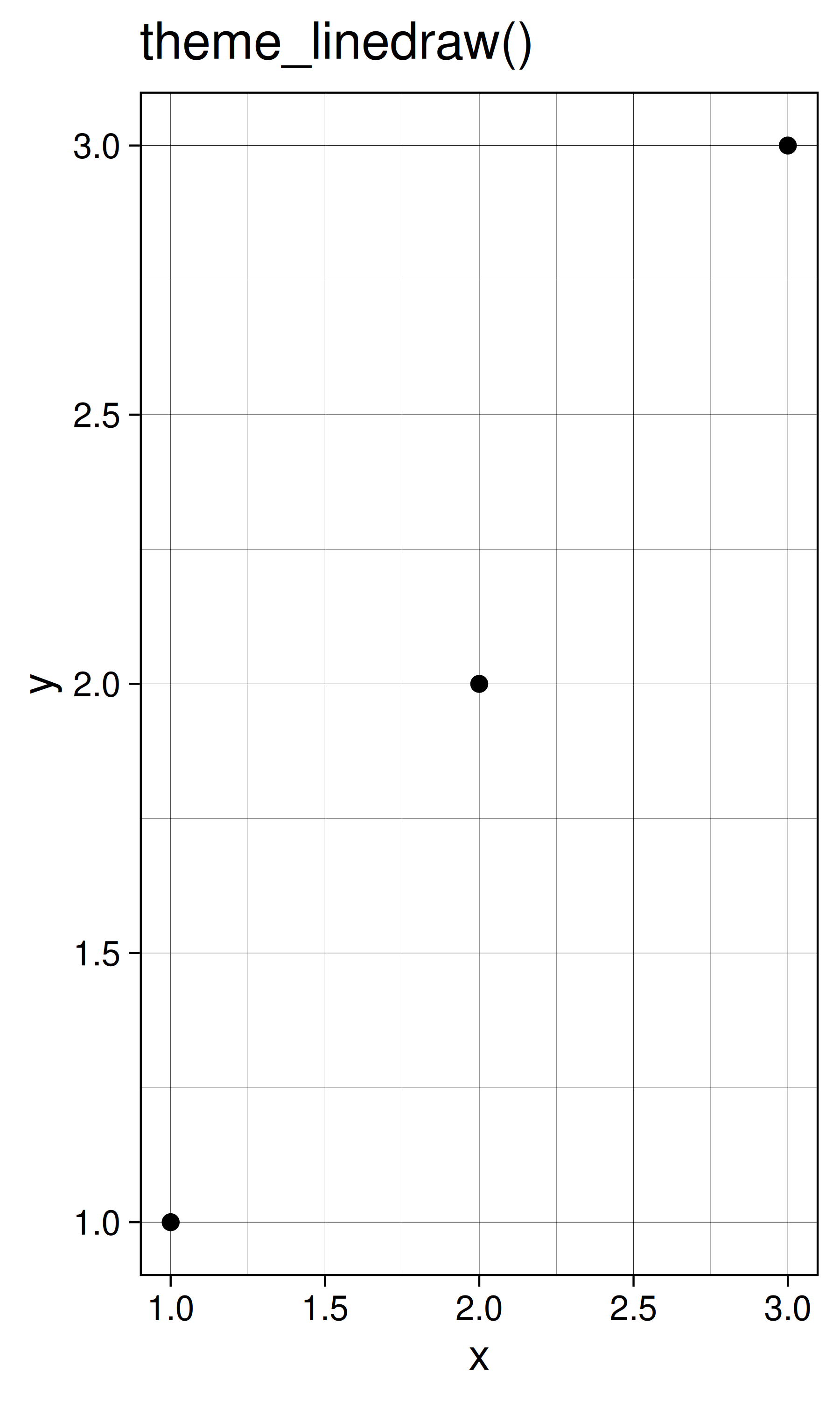
theme_linedraw(): a theme with only black lines of various widths on white backgrounds, reminiscent of a line drawing.
theme_light(): similar to theme_linedraw() but with light grey lines and axes, to direct more attention towards the data.
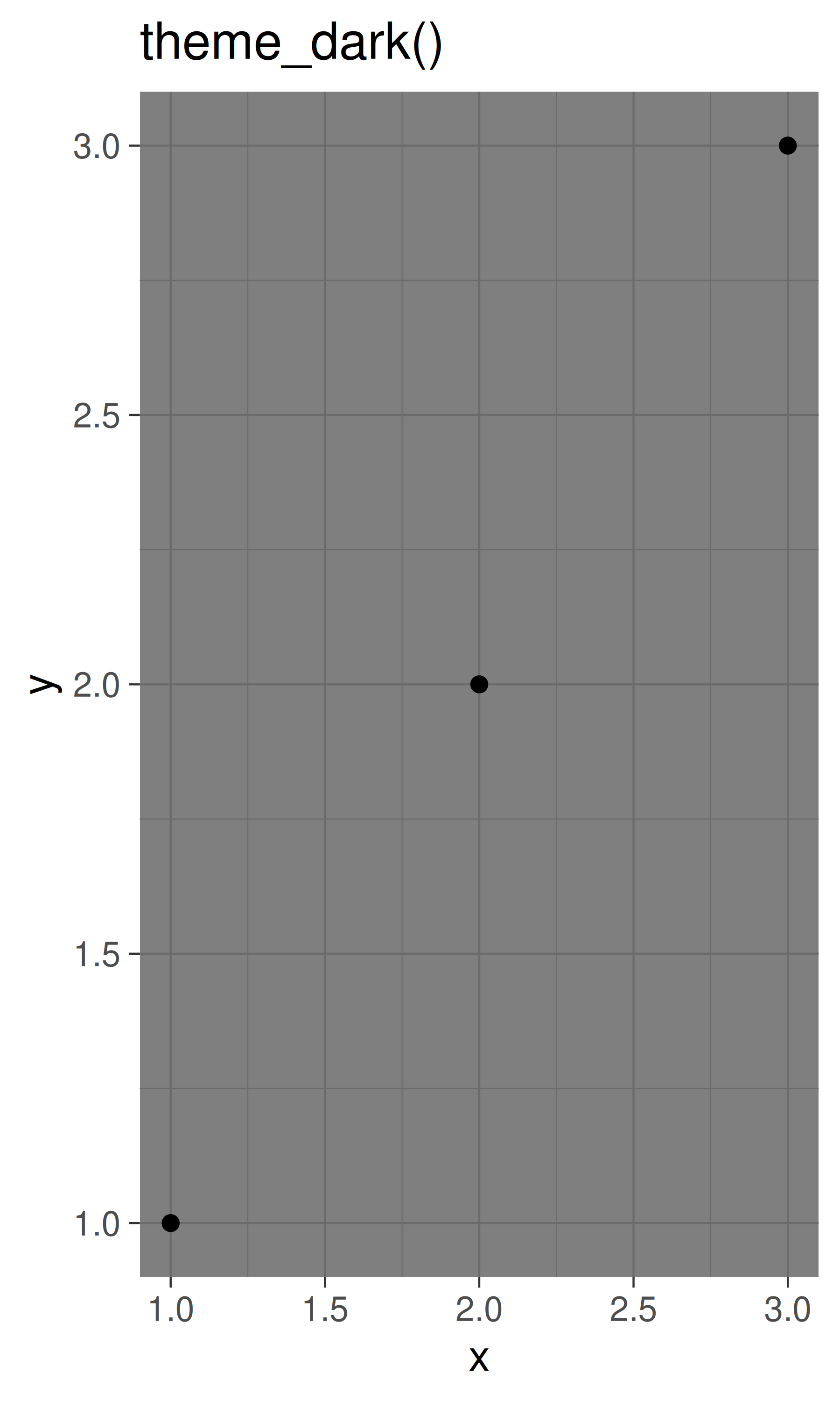
theme_dark(): the dark cousin of theme_light(), with similar line sizes but a dark background. Useful to make thin coloured lines pop out.
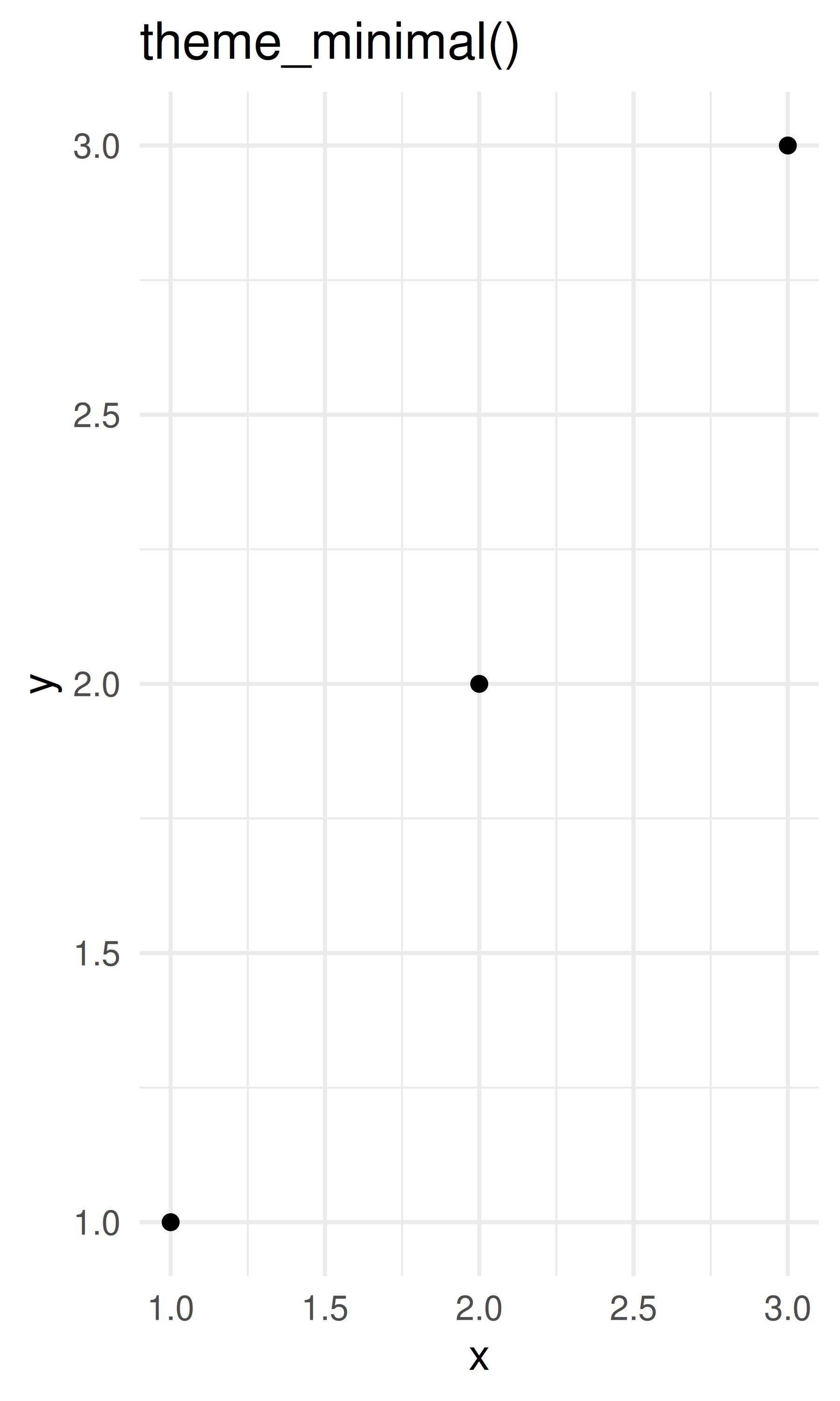
theme_minimal(): a minimalistic theme with no background annotations.
theme_classic(): a classic-looking theme, with x and y axis lines and no gridlines.
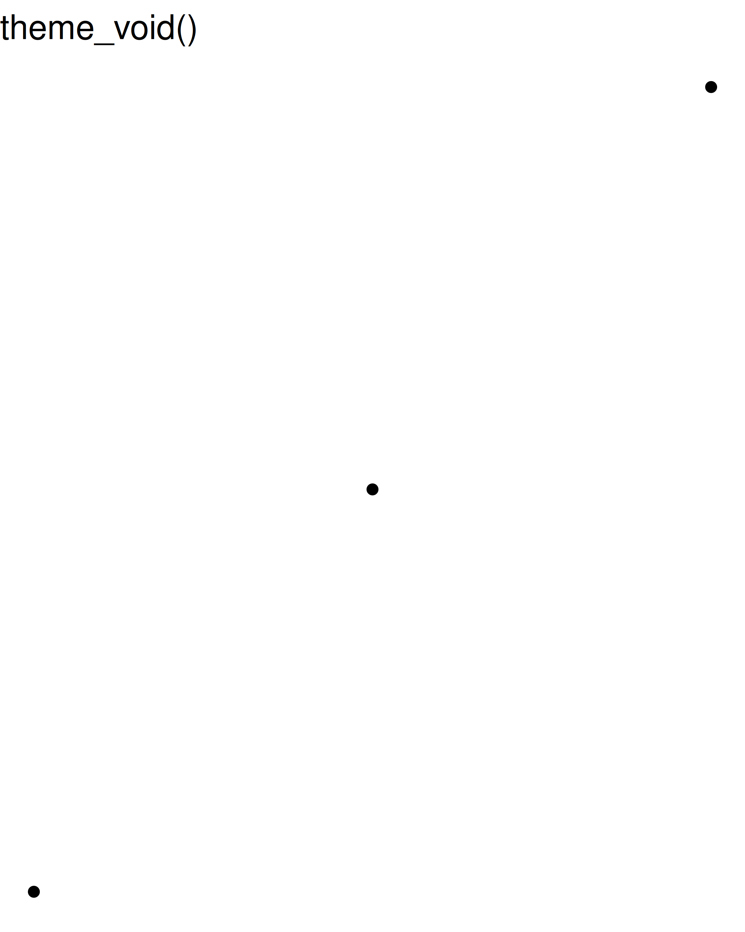
theme_void(): a completely empty theme.
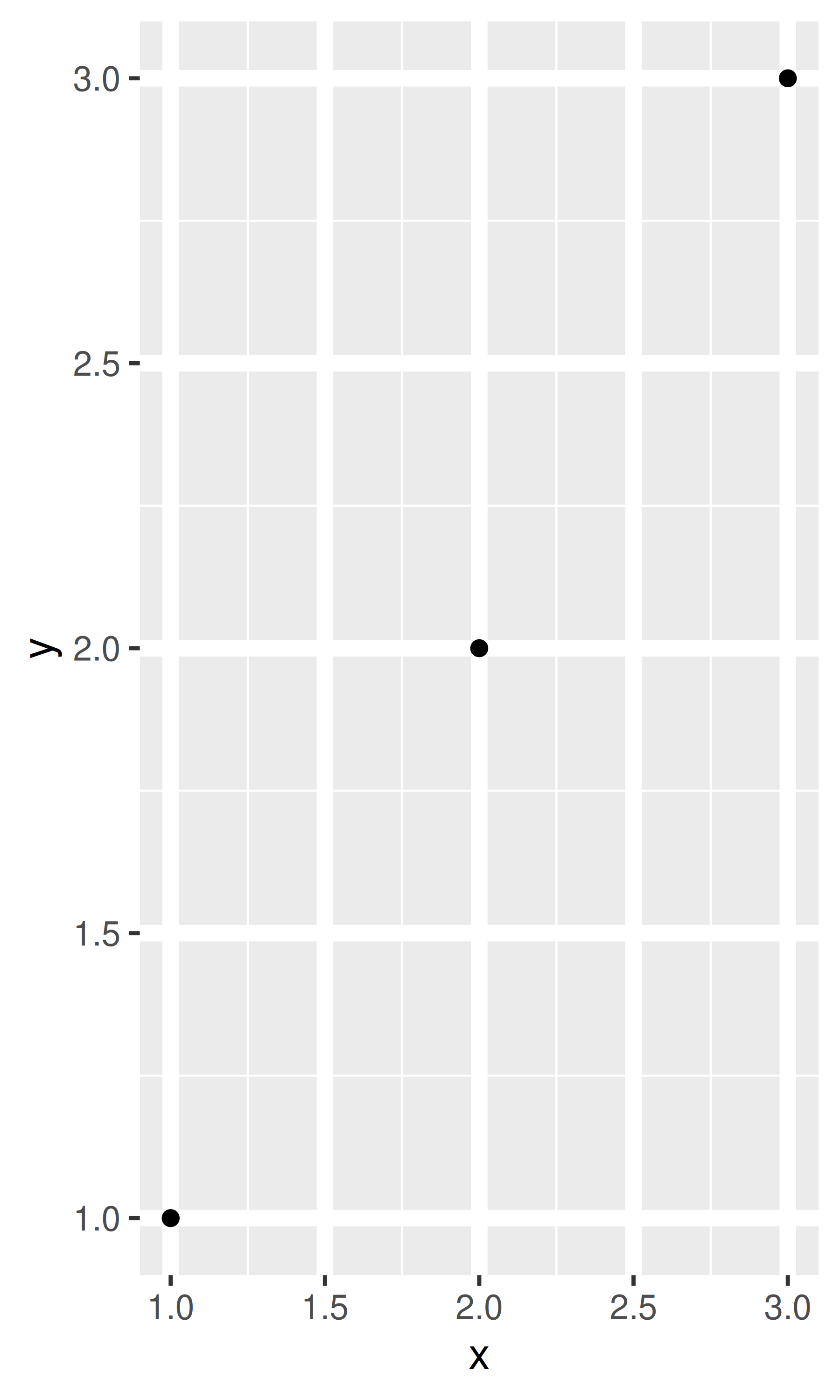
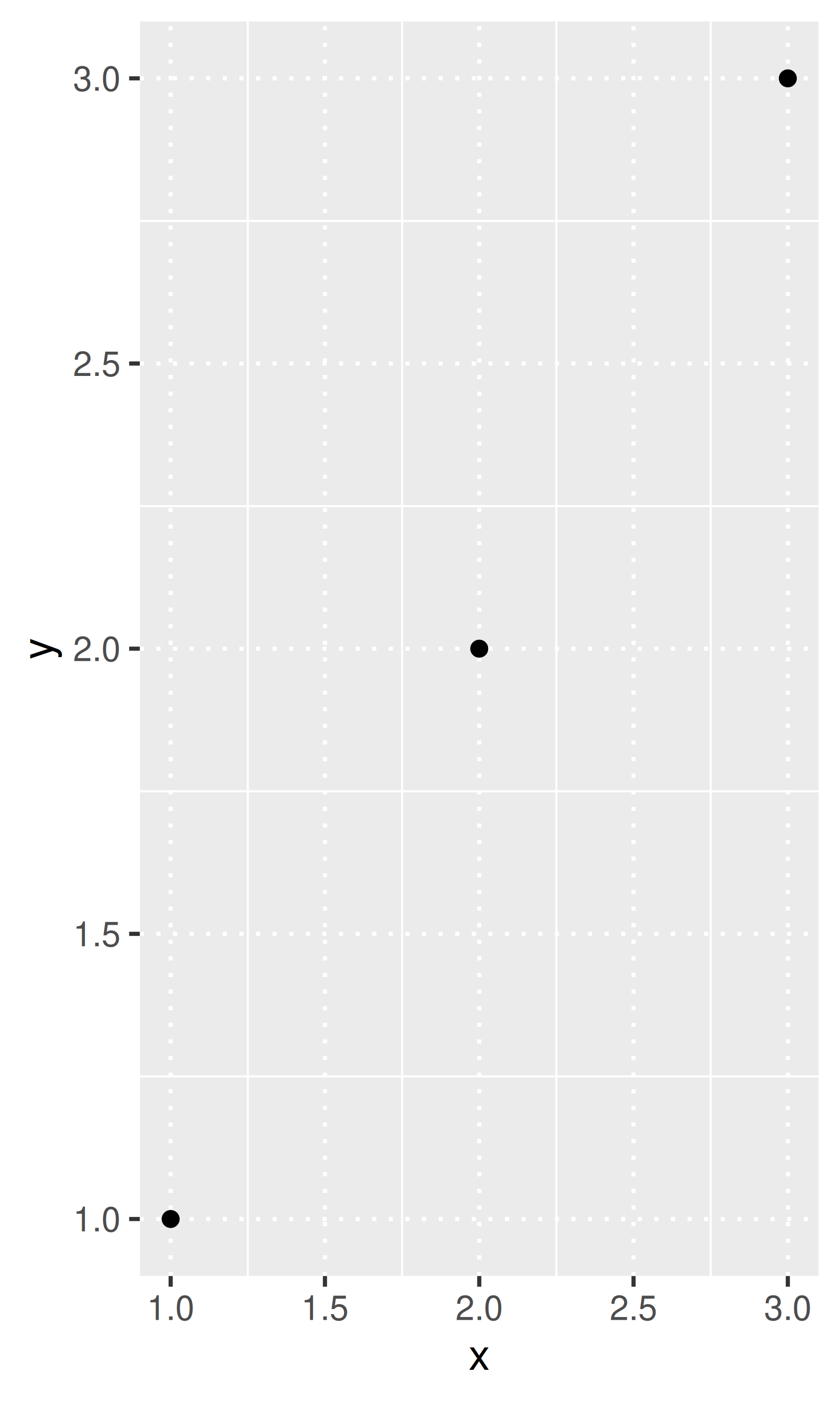
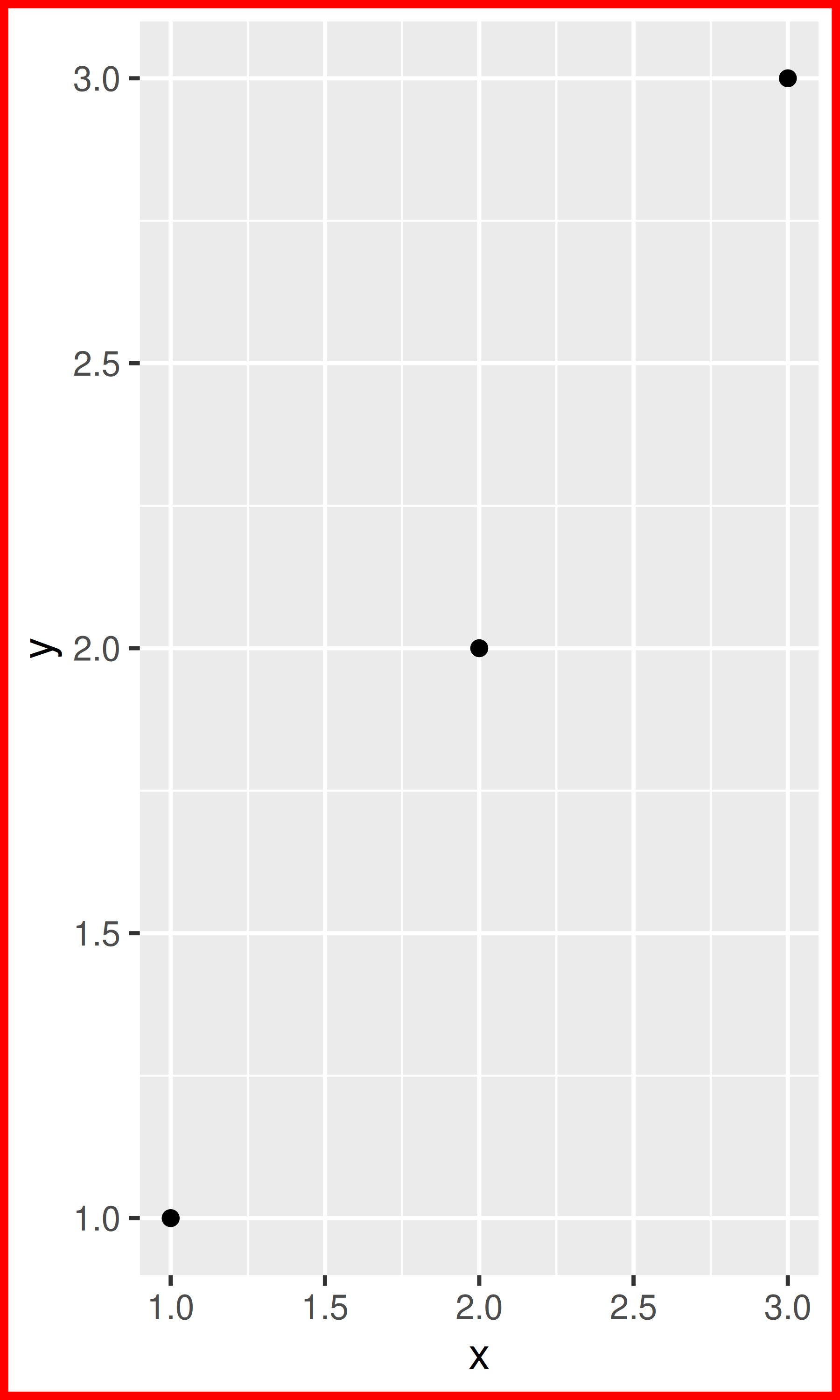
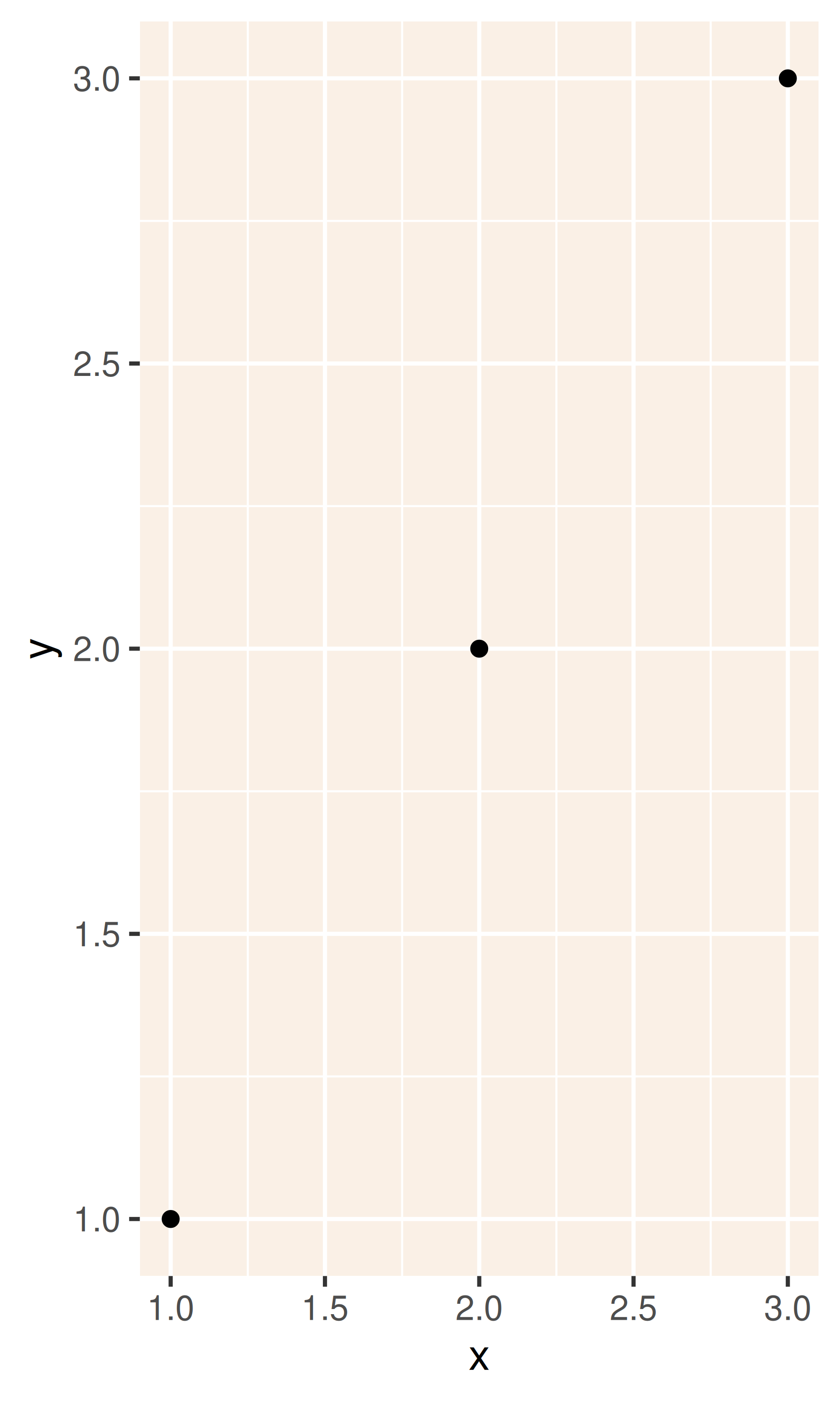
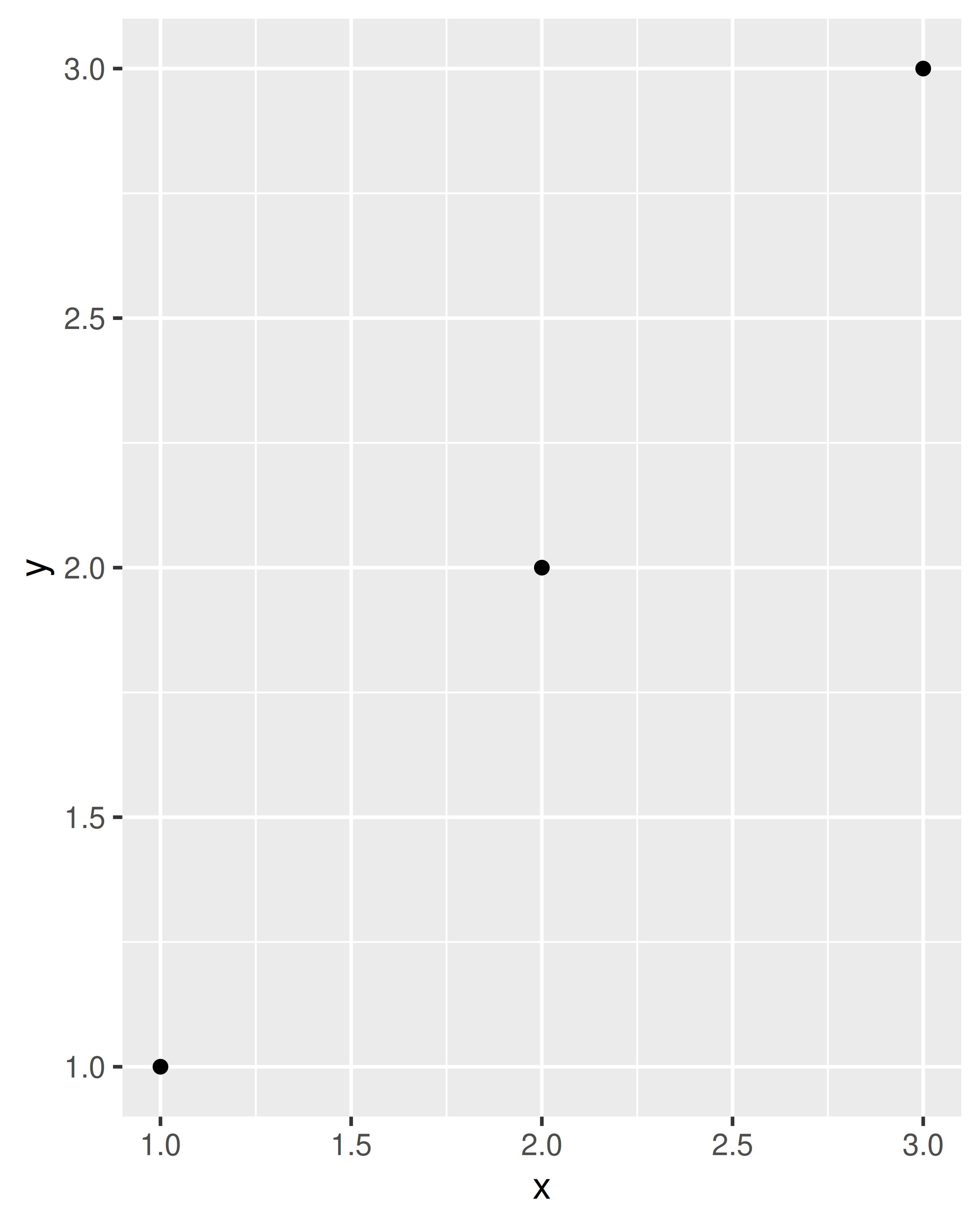
df <- data.frame(x = 1:3, y = 1:3)
base <- ggplot(df, aes(x, y)) + geom_point()
base + theme_grey() + ggtitle("theme_grey()")
base + theme_bw() + ggtitle("theme_bw()")
base + theme_linedraw() + ggtitle("theme_linedraw()")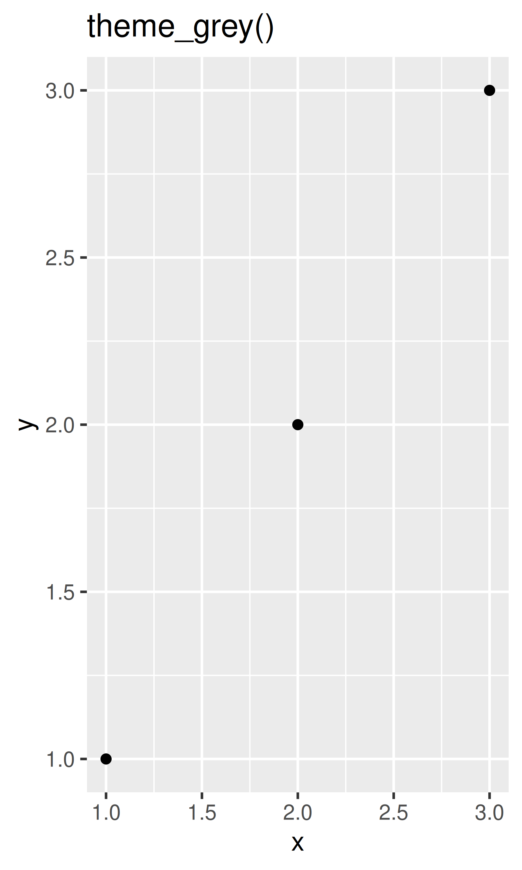
base + theme_light() + ggtitle("theme_light()")
base + theme_dark() + ggtitle("theme_dark()")
base + theme_minimal()  + ggtitle("theme_minimal()")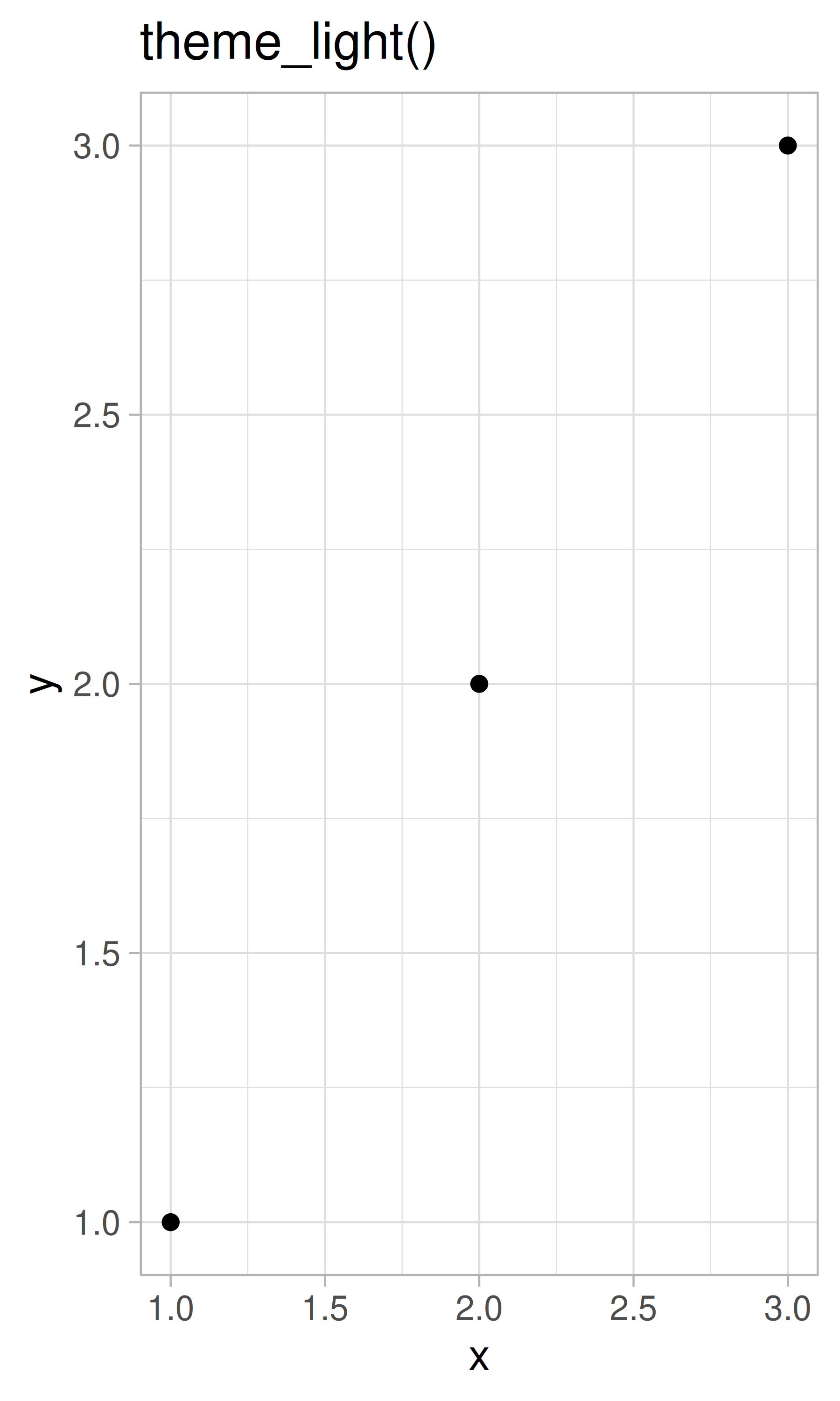
base + theme_classic() + ggtitle("theme_classic()")
base + theme_void() + ggtitle("theme_void()")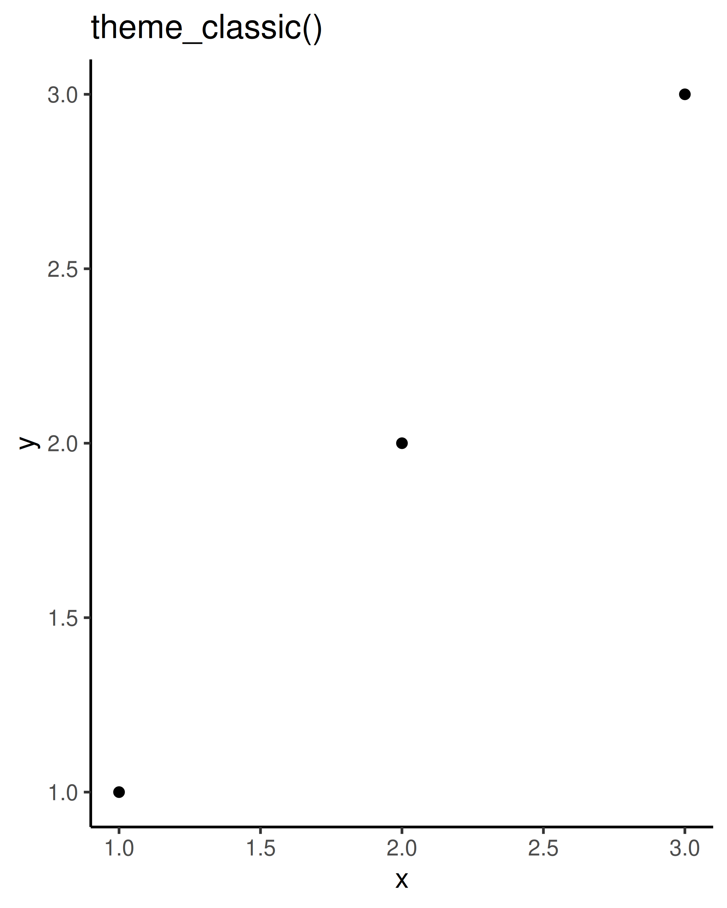
All themes have a base_size parameter which controls the base font size. The base font size is the size that the axis titles use: the plot title is usually bigger (1.2x), and the tick and strip labels are smaller (0.8x). If you want to control these sizes separately, you’ll need to modify the individual elements as described below.
As well as applying themes a plot at a time, you can change the default theme with theme_set(). For example, if you really hate the default grey background, run theme_set(theme_bw()) to use a white background for all plots.
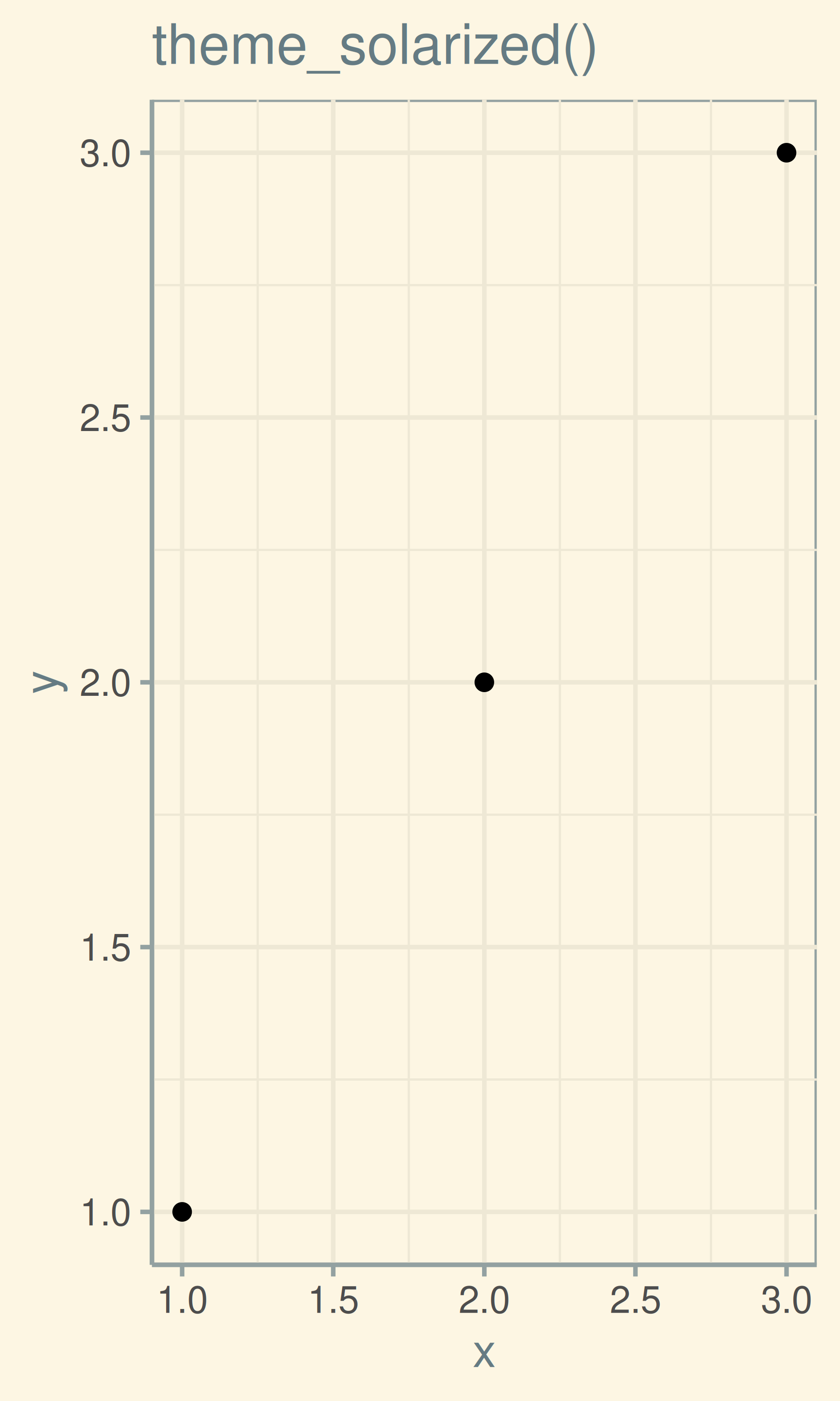
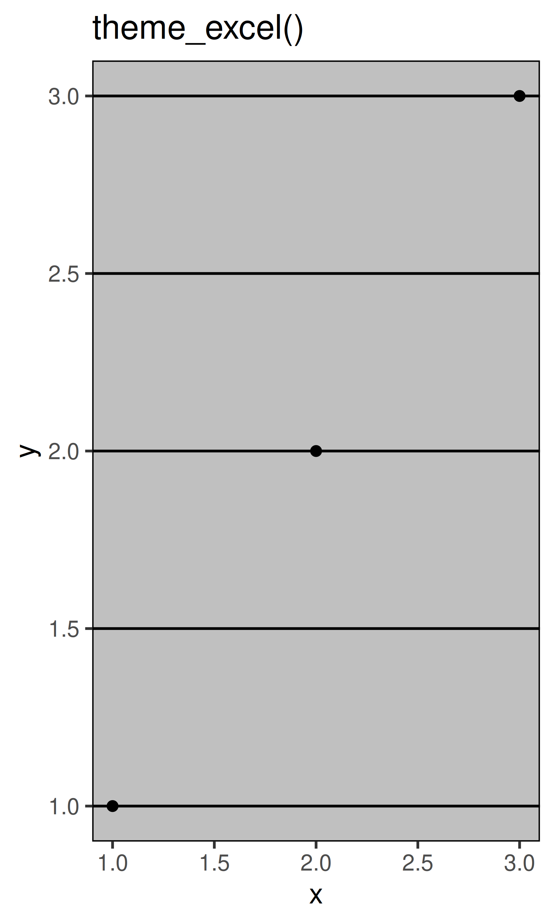
You’re not limited to the themes built-in to ggplot2. Other packages, like ggthemes by Jeffrey Arnold, add even more. Here are a few of my favourites from ggthemes:
library(ggthemes)
base + theme_tufte() + ggtitle("theme_tufte()")
base + theme_solarized() + ggtitle("theme_solarized()")
base + theme_excel() + ggtitle("theme_excel()") # ;)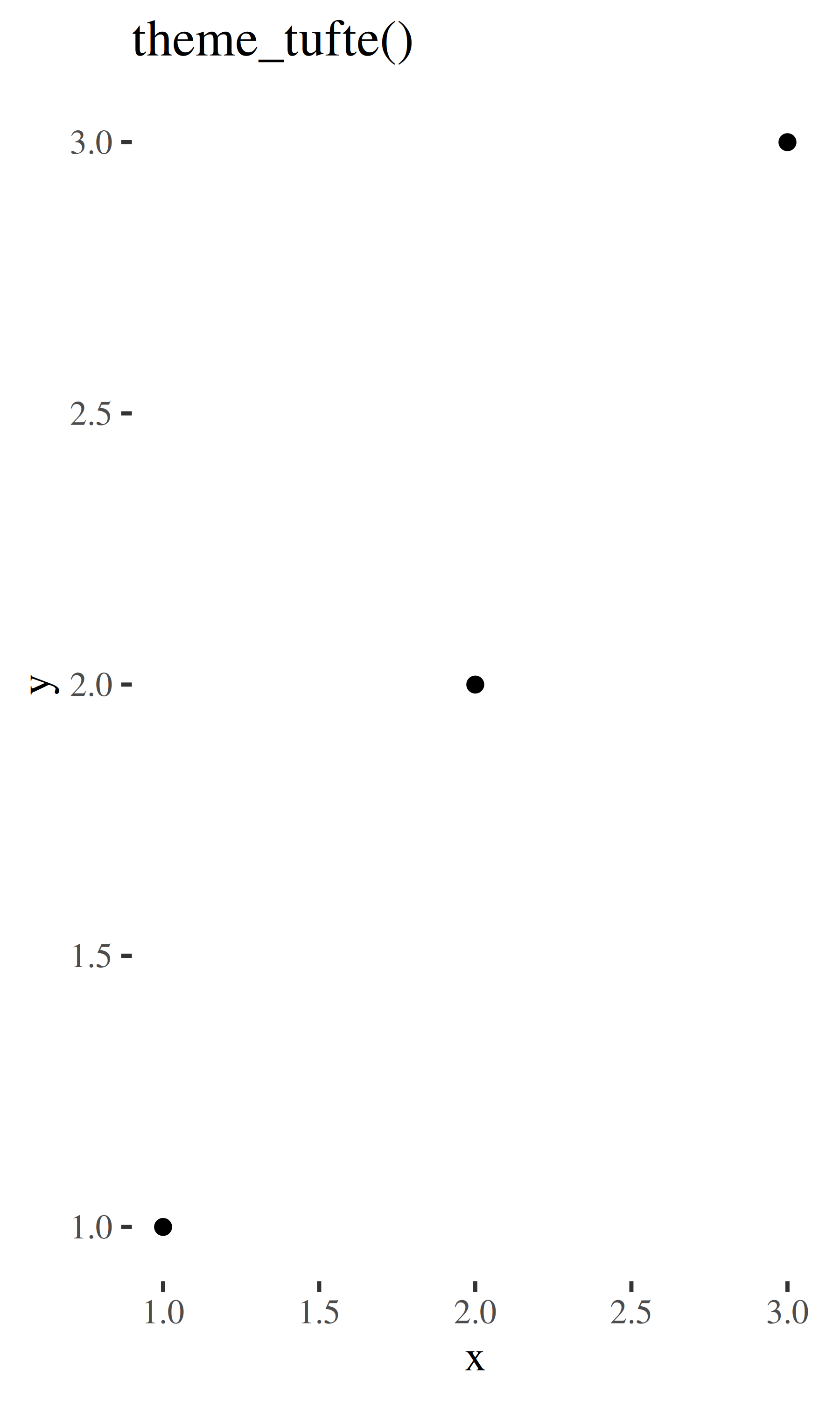
The complete themes are a great place to start but don’t give you a lot of control. To modify individual elements, you need to use theme() to override the default setting for an element with an element function.
Try out all the themes in ggthemes. Which do you like the best?
What aspects of the default theme do you like? What don’t you like?
What would you change?
Look at the plots in your favourite scientific journal. What theme do they most resemble? What are the main differences?
To modify an individual theme component you use code like plot + theme(element.name = element_function()). In this section you’ll learn about the basic element functions, and then in the next section, you’ll see all the elements that you can modify.
There are four basic types of built-in element functions: text, lines, rectangles, and blank. Each element function has a set of parameters that control the appearance:
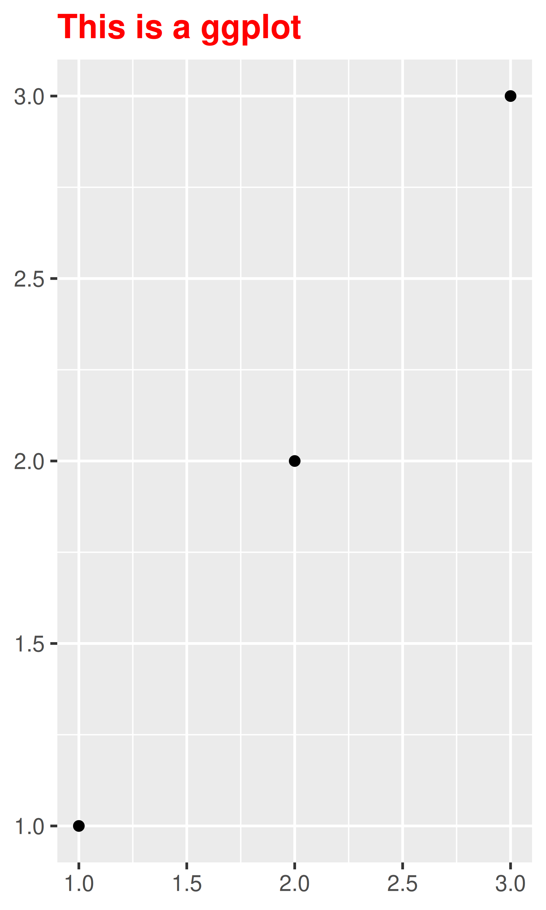
element_text() draws labels and headings. You can control the font family, face, colour, size (in points), hjust, vjust, angle (in degrees) and lineheight (as ratio of fontcase). More details on the parameters can be found in vignette("ggplot2-specs"). Setting the font face is particularly challenging.
base_t <- base + labs(title = "This is a ggplot") + xlab(NULL) + ylab(NULL)
base_t + theme(plot.title = element_text(size = 16))
base_t + theme(plot.title = element_text(face = "bold", colour = "red"))
base_t + theme(plot.title = element_text(hjust = 1))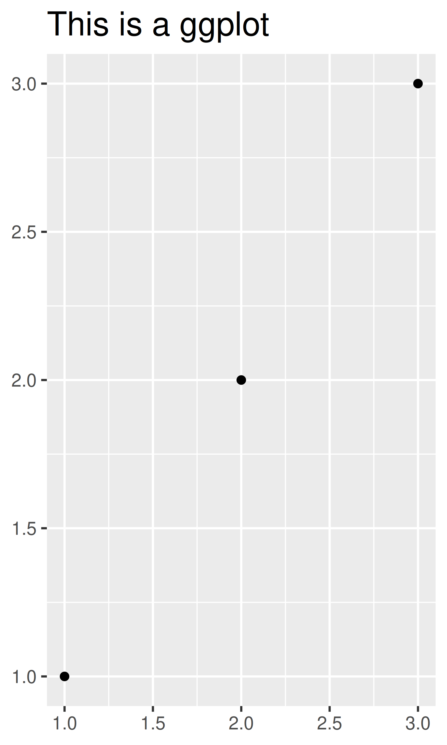
You can control the margins around the text with the margin argument and margin() function. margin() has four arguments: the amount of space (in points) to add to the top, right, bottom and left sides of the text. Any elements not specified default to 0.
# The margins here look asymmetric because there are also plot margins
base_t + theme(plot.title = element_text(margin = margin()))
base_t + theme(plot.title = element_text(margin = margin(t = 10, b = 10)))
base_t + theme(axis.title.y = element_text(margin = margin(r = 10)))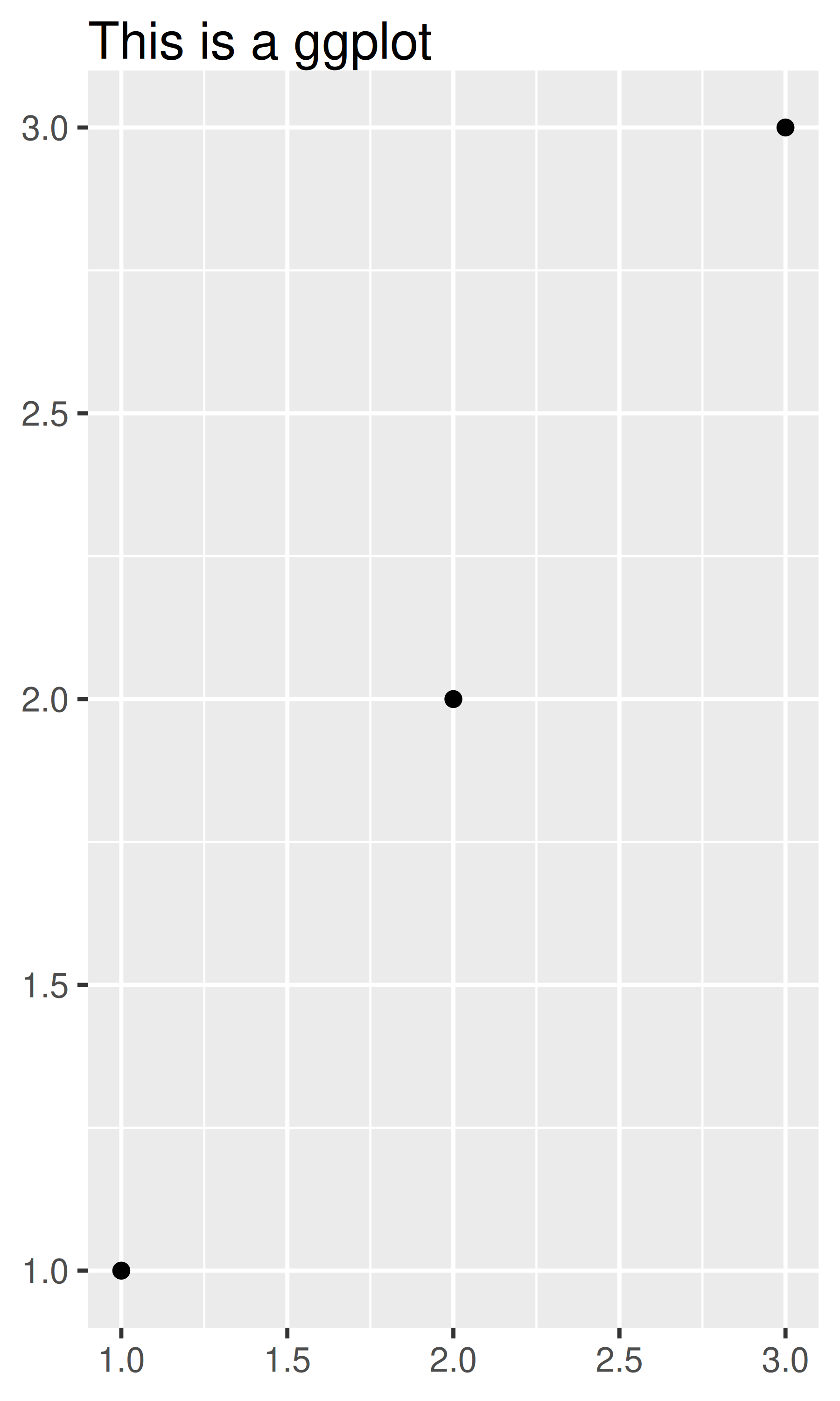

element_line() draws lines parameterised by colour, linewidth and linetype:
base + theme(panel.grid.major = element_line(colour = "black"))
base + theme(panel.grid.major = element_line(linewidth = 2))
base + theme(panel.grid.major = element_line(linetype = "dotted"))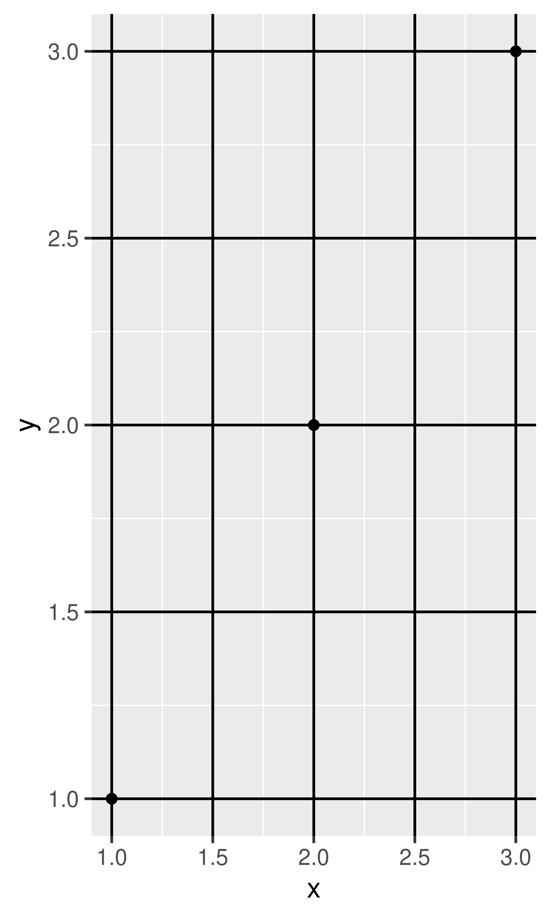
element_rect() draws rectangles, mostly used for backgrounds, parameterised by fill colour and border colour, linewidth and linetype.
base + theme(plot.background = element_rect(fill = "grey80", colour = NA))
base + theme(plot.background = element_rect(colour = "red", linewidth = 2))
base + theme(panel.background = element_rect(fill = "linen"))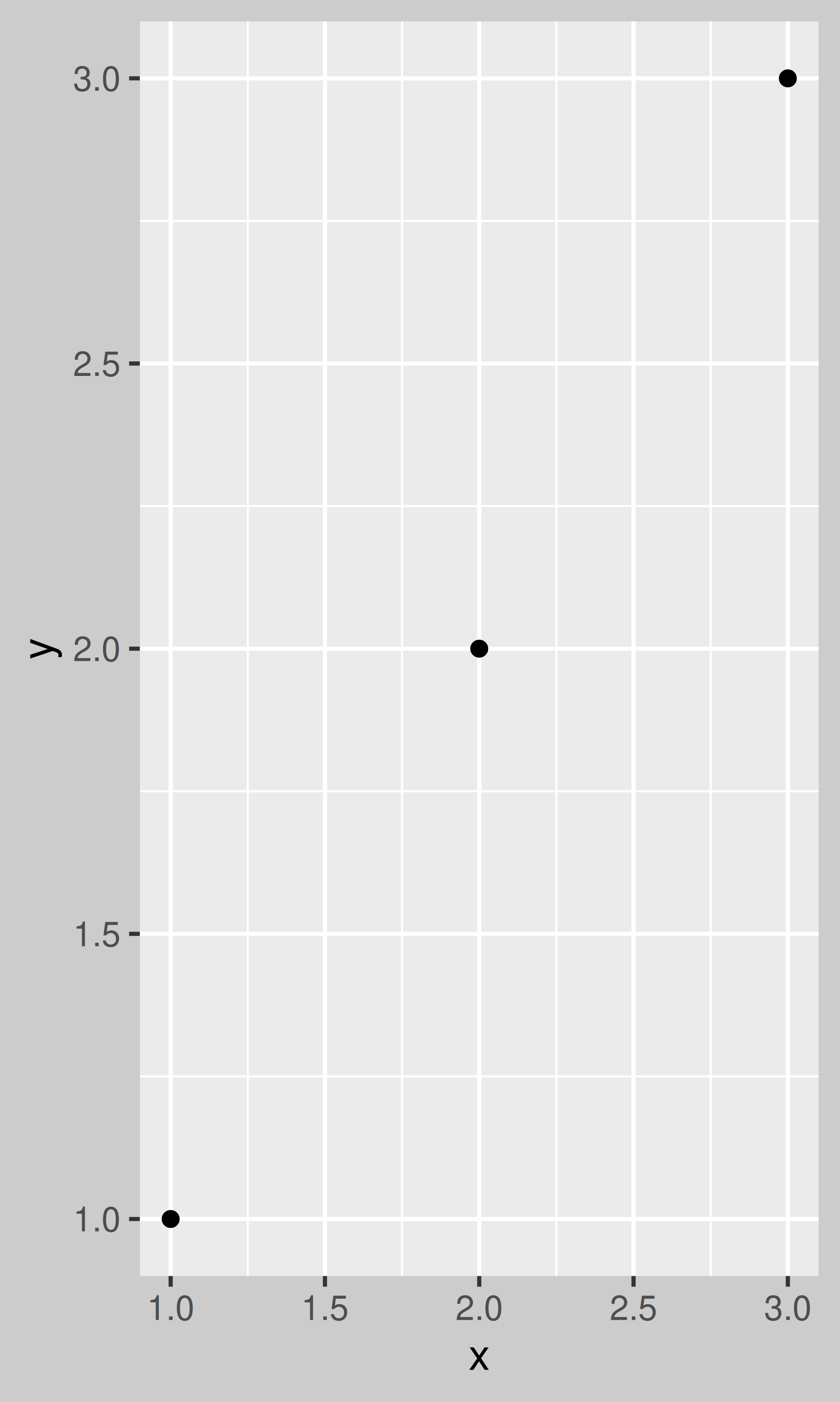
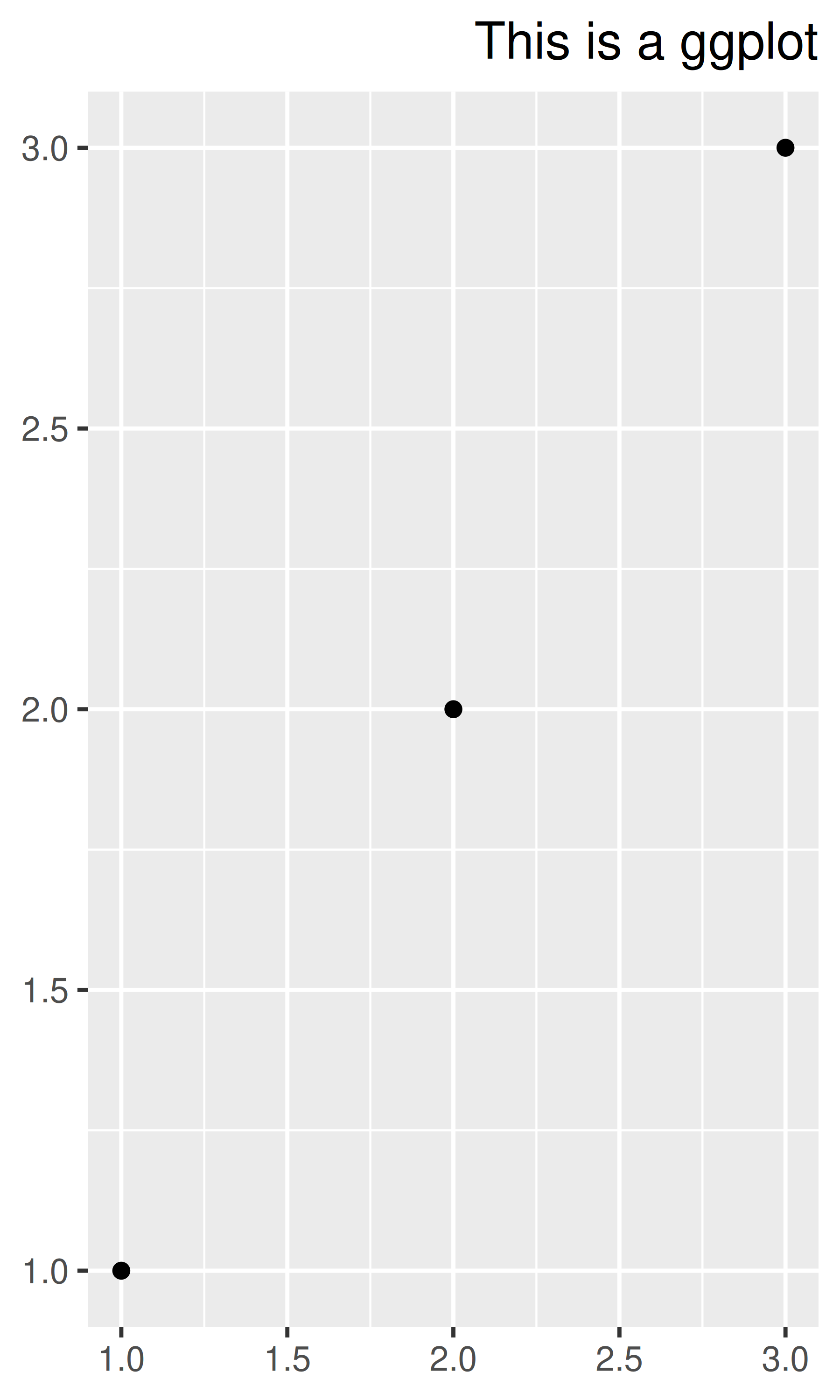
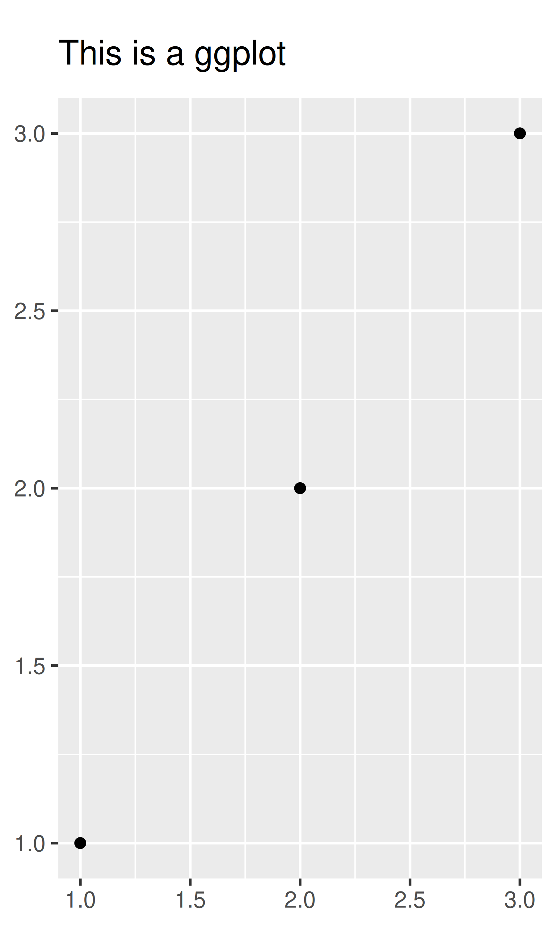
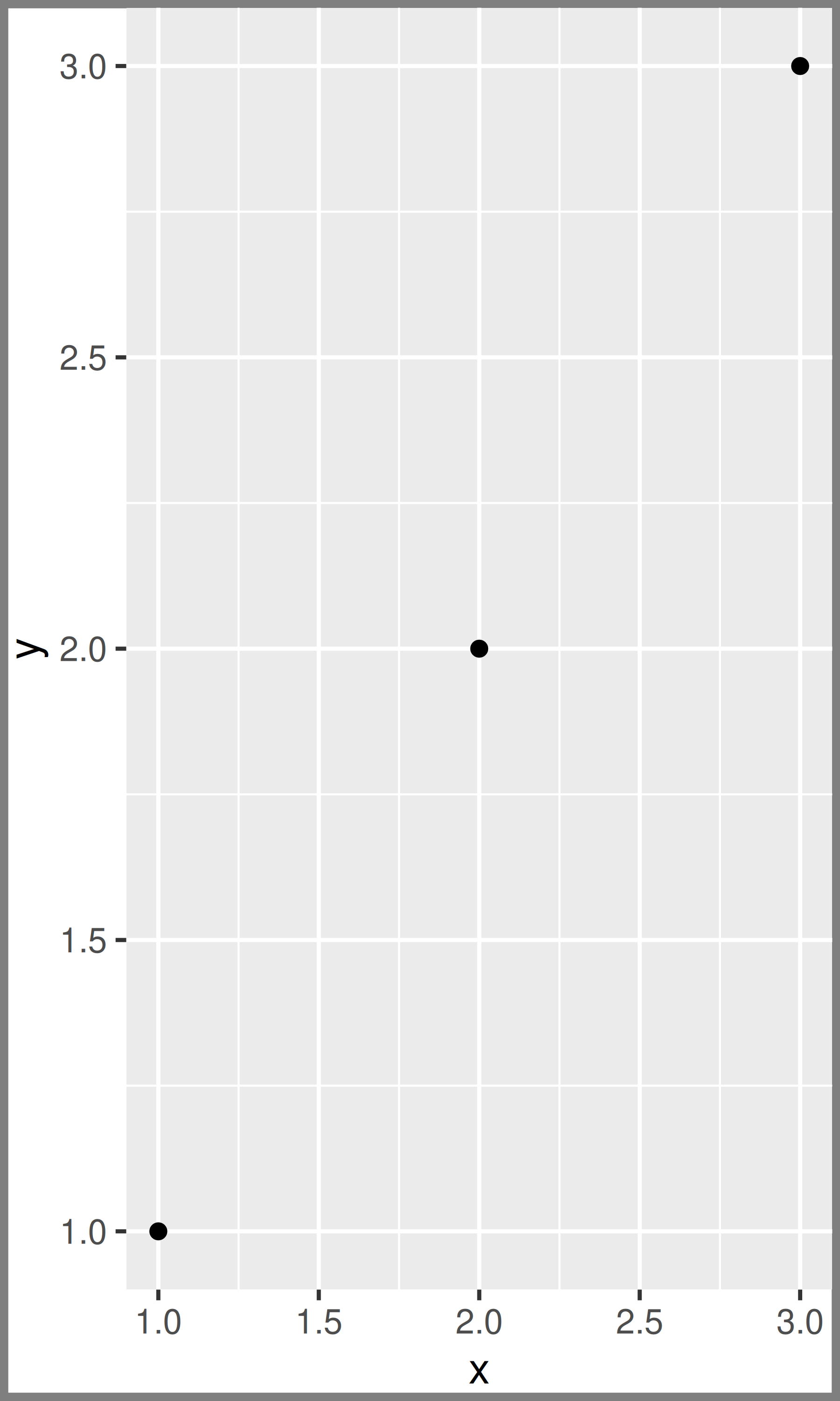
element_blank() draws nothing. Use this if you don’t want anything drawn, and no space allocated for that element. The following example uses element_blank() to progressively suppress the appearance of elements we’re not interested in. Notice how the plot automatically reclaims the space previously used by these elements: if you don’t want this to happen (perhaps because they need to line up with other plots on the page), use colour = NA, fill = NA to create invisible elements that still take up space.
base
last_plot() + theme(panel.grid.minor = element_blank())
last_plot() + theme(panel.grid.major = element_blank())![]()
![]()
![]()
last_plot() + theme(panel.background = element_blank())
last_plot() + theme(
  axis.title.x = element_blank(),
  axis.title.y = element_blank()
)
last_plot() + theme(axis.line = element_line(colour = "grey50"))![]()
![]()
![]()
A few other settings take grid units. Create them with unit(1, "cm") or unit(0.25, "in").
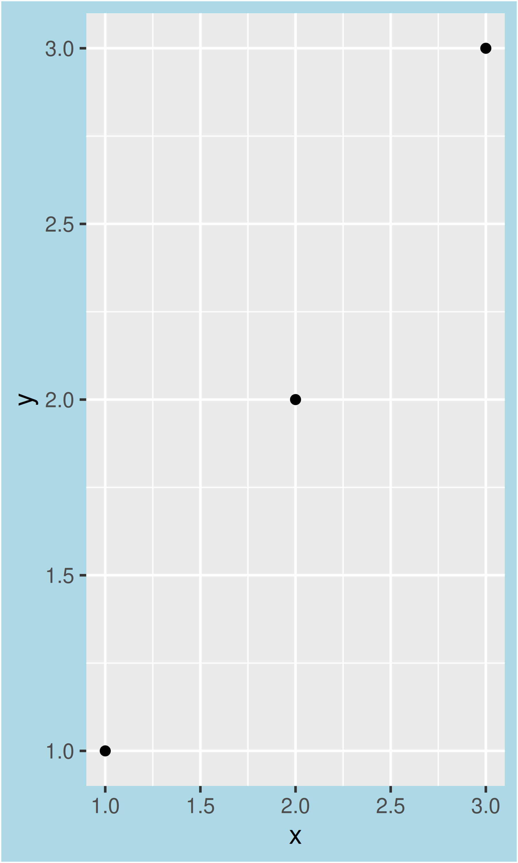
To modify theme elements for all future plots, use theme_update(). It returns the previous theme settings, so you can easily restore the original parameters once you’re done.
old_theme <- theme_update(
  plot.background = element_rect(fill = "lightblue3", colour = NA),
  panel.background = element_rect(fill = "lightblue", colour = NA),
  axis.text = element_text(colour = "linen"),
  axis.title = element_text(colour = "linen")
)
base
theme_set(old_theme)
base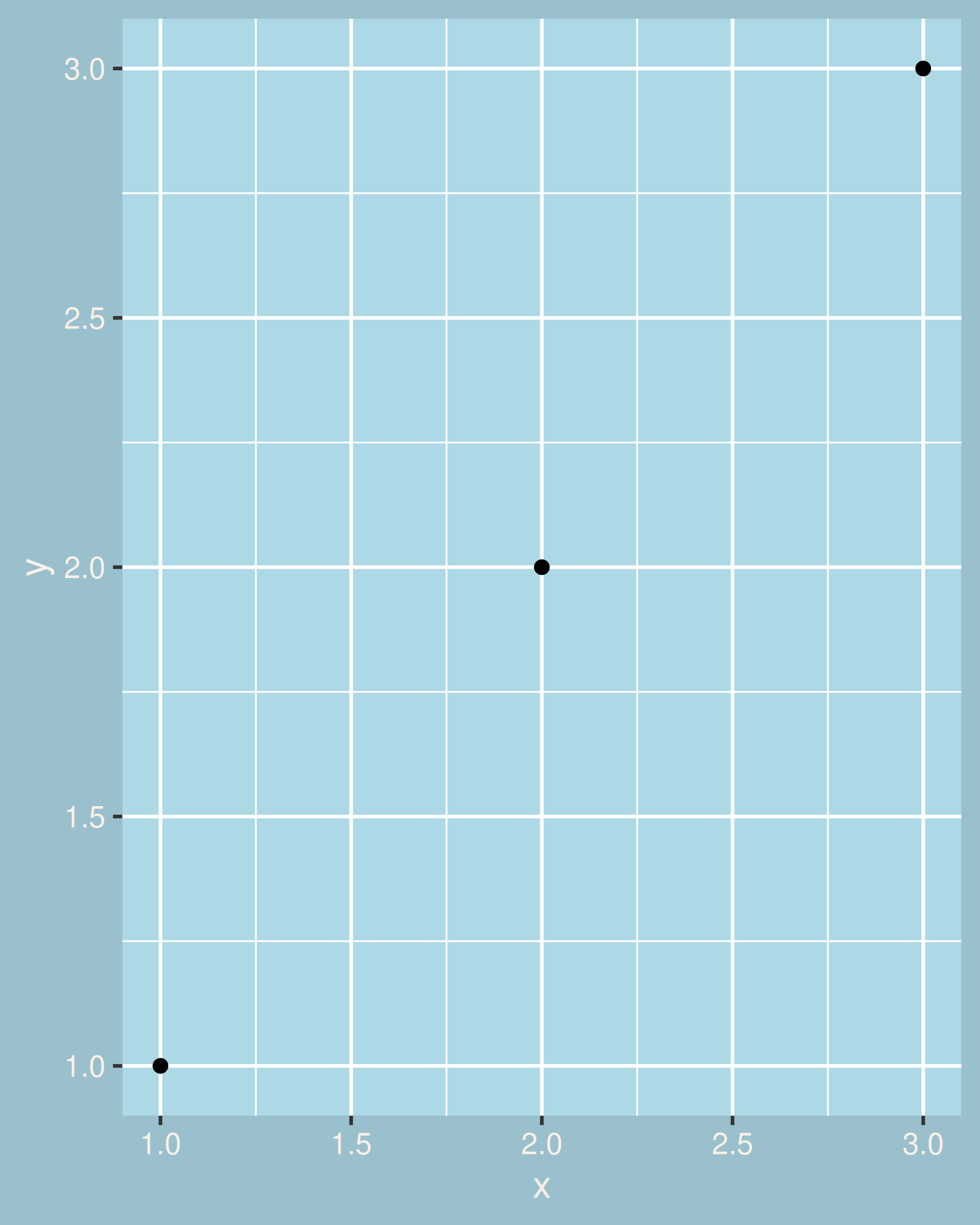
There are around 40 unique elements that control the appearance of the plot. They can be roughly grouped into five categories: plot, axis, legend, panel and facet. The following sections describe each in turn.
Some elements affect the plot as a whole:
| Element | Setter | Description |
|---|---|---|
| plot.background | element_rect() |
plot background |
| plot.title | element_text() |
plot title |
| plot.margin | margin() |
margins around plot |
plot.background draws a rectangle that underlies everything else on the plot. By default, ggplot2 uses a white background which ensures that the plot is usable wherever it might end up (e.g. even if you save as a png and put on a slide with a black background). When exporting plots to use in other systems, you might want to make the background transparent with fill = NA. Similarly, if you’re embedding a plot in a system that already has margins you might want to eliminate the built-in margins. Note that a small margin is still necessary if you want to draw a border around the plot.
base + theme(plot.background = element_rect(colour = "grey50", linewidth = 2))
base + theme(
  plot.background = element_rect(colour = "grey50", linewidth = 2),
  plot.margin = margin(2, 2, 2, 2)
)
base + theme(plot.background = element_rect(fill = "lightblue"))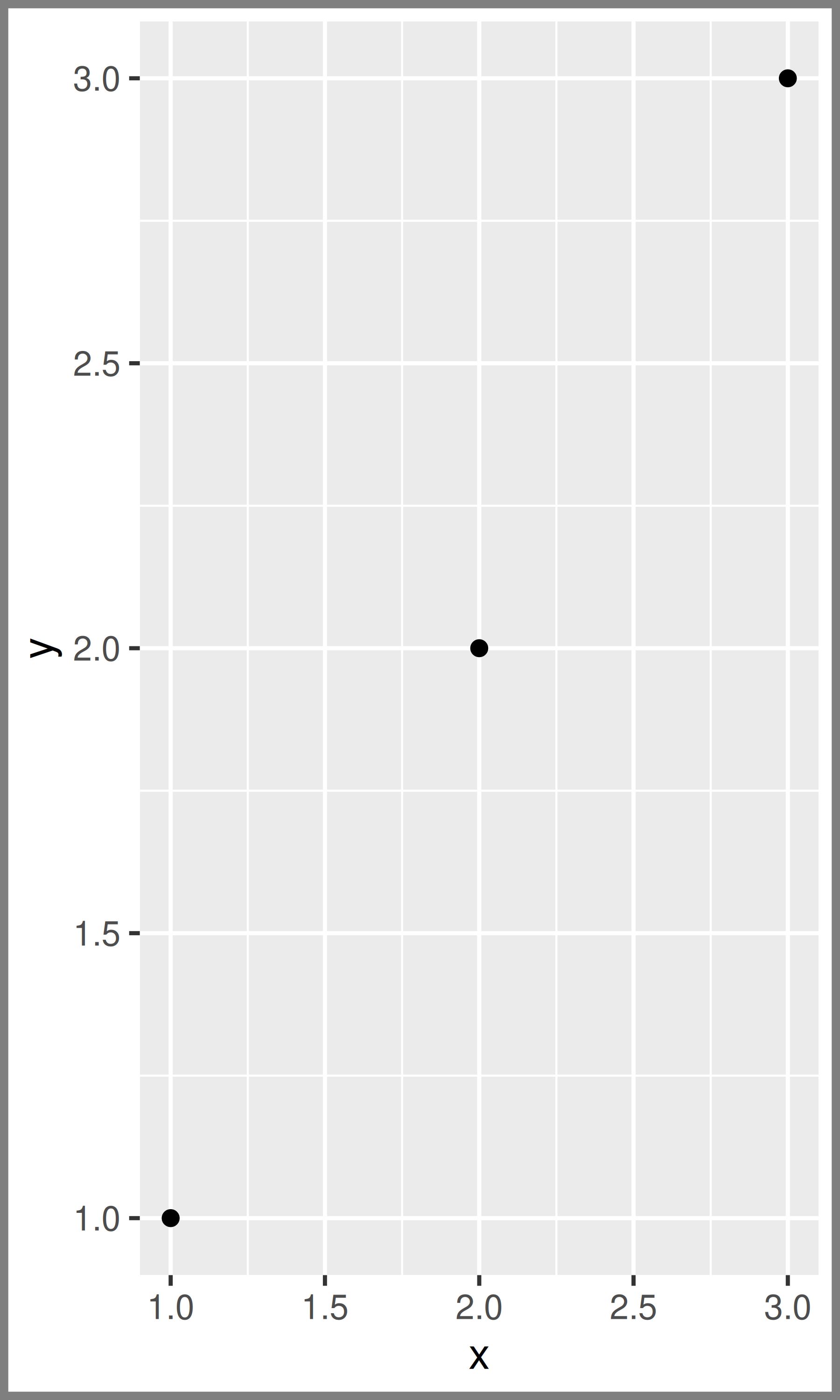
The axis elements control the appearance of the axes:
| Element | Setter | Description |
|---|---|---|
| axis.line | element_line() |
line parallel to axis (hidden in default themes) |
| axis.text | element_text() |
tick labels |
| axis.text.x | element_text() |
x-axis tick labels |
| axis.text.y | element_text() |
y-axis tick labels |
| axis.title | element_text() |
axis titles |
| axis.title.x | element_text() |
x-axis title |
| axis.title.y | element_text() |
y-axis title |
| axis.ticks | element_line() |
axis tick marks |
| axis.ticks.length | unit() |
length of tick marks |
Note that axis.text (and axis.title) comes in three forms: axis.text, axis.text.x, and axis.text.y. Use the first form if you want to modify the properties of both axes at once: any properties that you don’t explicitly set in axis.text.x and axis.text.y will be inherited from axis.text.
df <- data.frame(x = 1:3, y = 1:3)
base <- ggplot(df, aes(x, y)) + geom_point()

# Accentuate the axes
base + theme(axis.line = element_line(colour = "grey50", linewidth = 1))
# Style both x and y axis labels
base + theme(axis.text = element_text(color = "blue", size = 12))
# Useful for long labels
base + theme(axis.text.x = element_text(angle = -90, vjust = 0.5))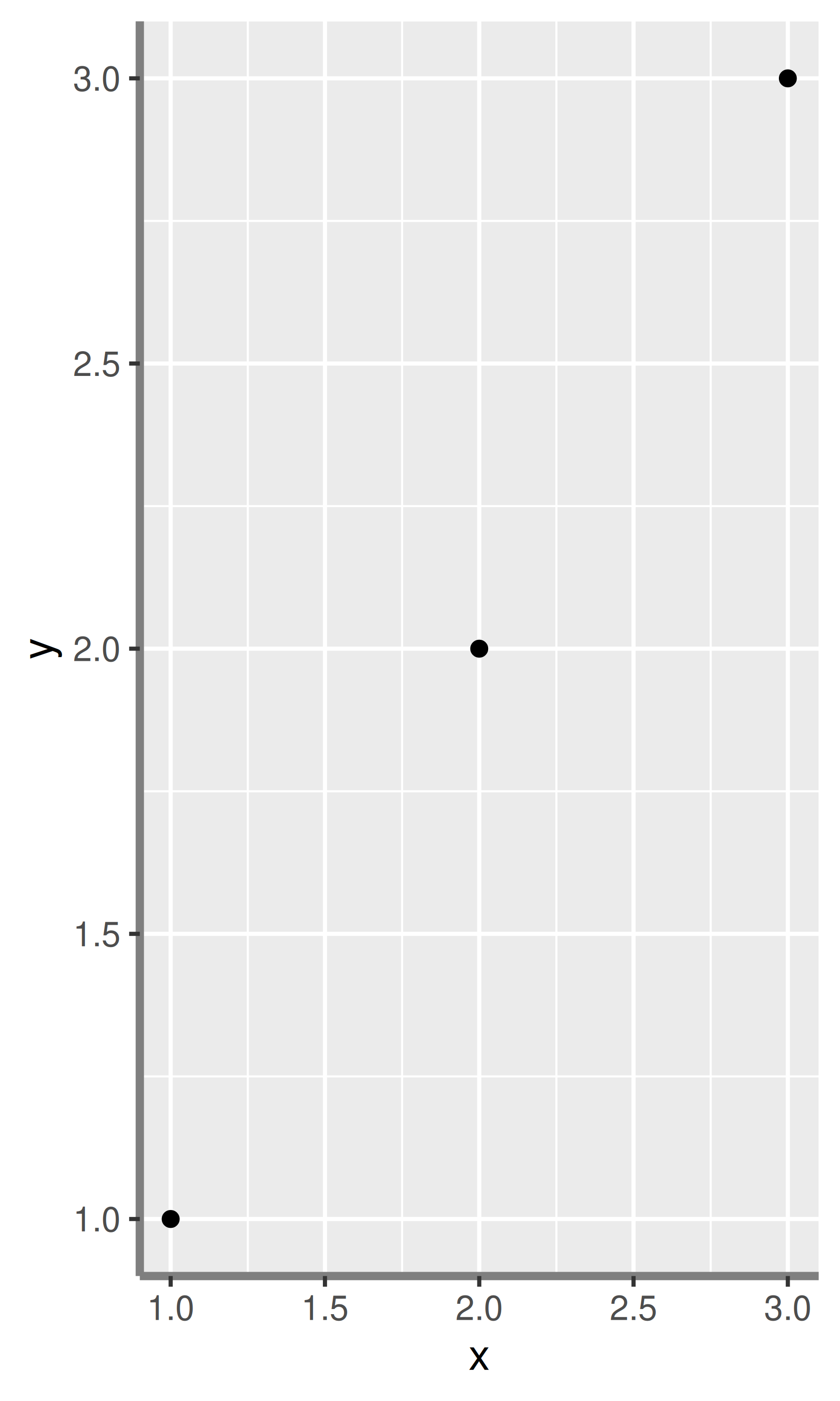

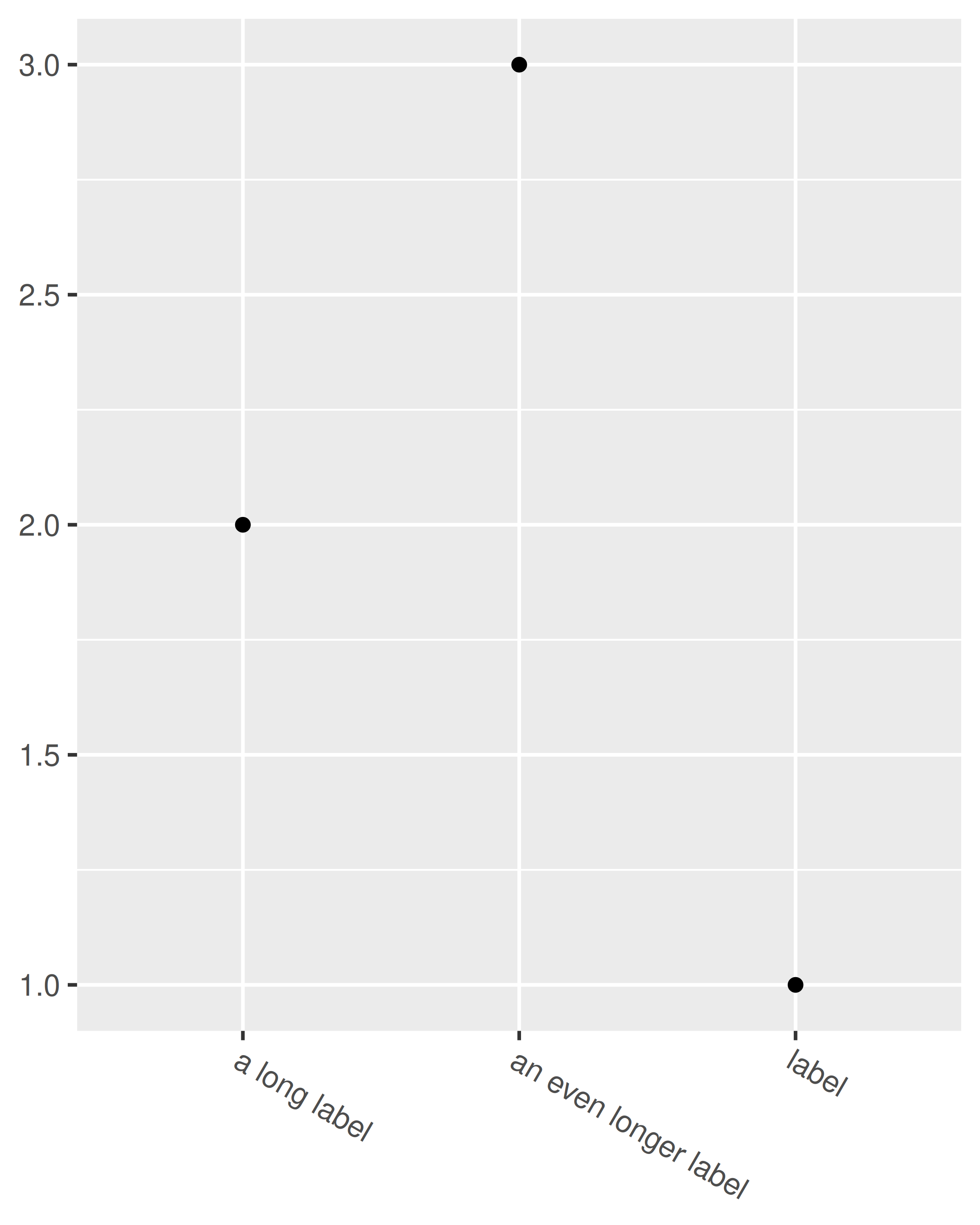
The most common adjustment is to rotate the x-axis labels to avoid long overlapping labels. If you do this, note negative angles tend to look best and you should set hjust = 0 and vjust = 1:
df <- data.frame(
  x = c("label", "a long label", "an even longer label"),
  y = 1:3
)
base <- ggplot(df, aes(x, y)) + geom_point()
base
base +
  theme(axis.text.x = element_text(angle = -30, vjust = 1, hjust = 0)) +
  xlab(NULL) +
  ylab(NULL)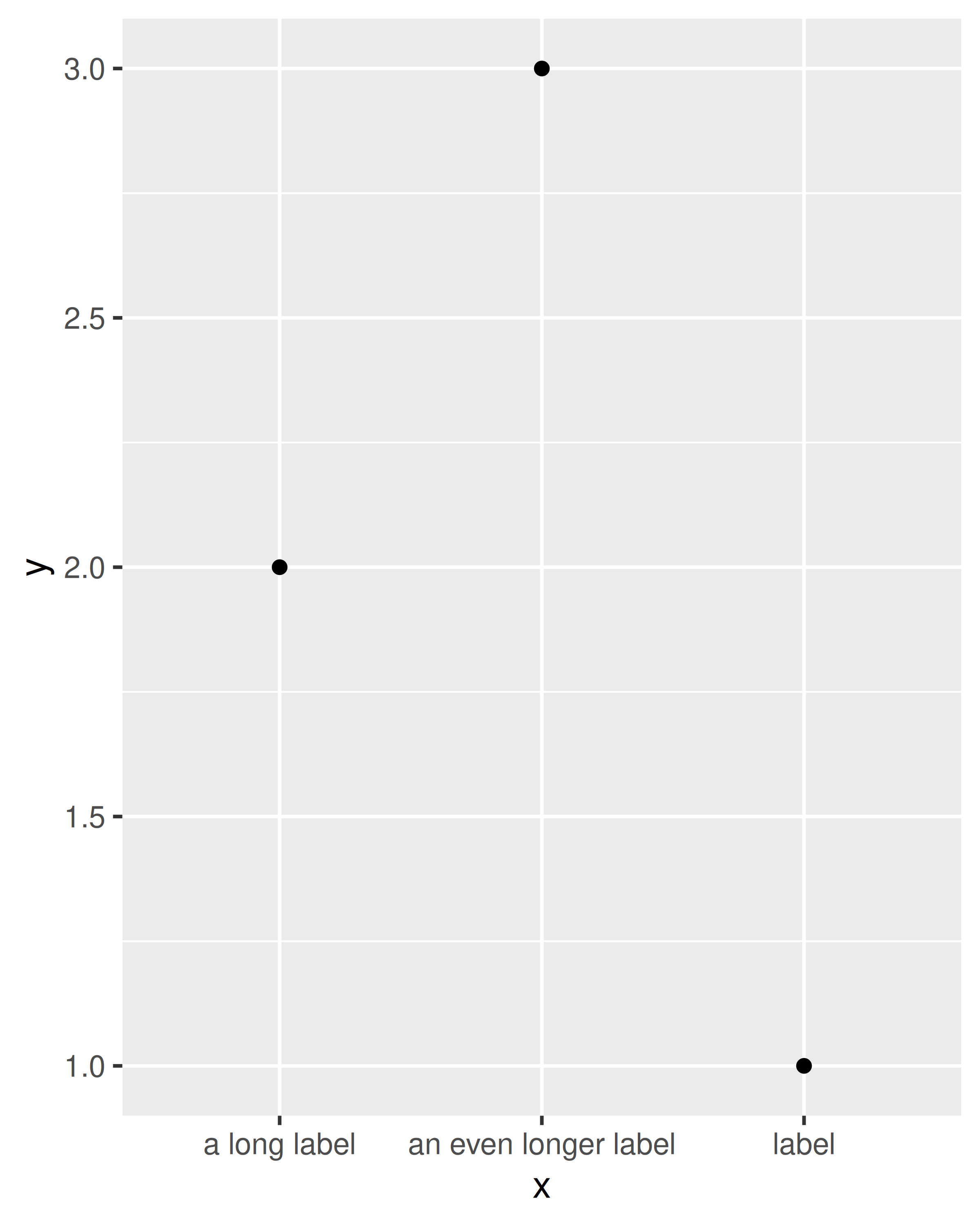
The legend elements control the appearance of all legends. You can also modify the appearance of individual legends by modifying the same elements in guide_legend() or guide_colourbar().
| Element | Setter | Description |
|---|---|---|
| legend.background | element_rect() |
legend background |
| legend.key | element_rect() |
background of legend keys |
| legend.key.size | unit() |
legend key size |
| legend.key.height | unit() |
legend key height |
| legend.key.width | unit() |
legend key width |
| legend.margin | unit() |
legend margin |
| legend.text | element_text() |
legend labels |
| legend.text.align | 0–1 | legend label alignment (0 = right, 1 = left) |
| legend.title | element_text() |
legend name |
| legend.title.align | 0–1 | legend name alignment (0 = right, 1 = left) |
These options are illustrated below:
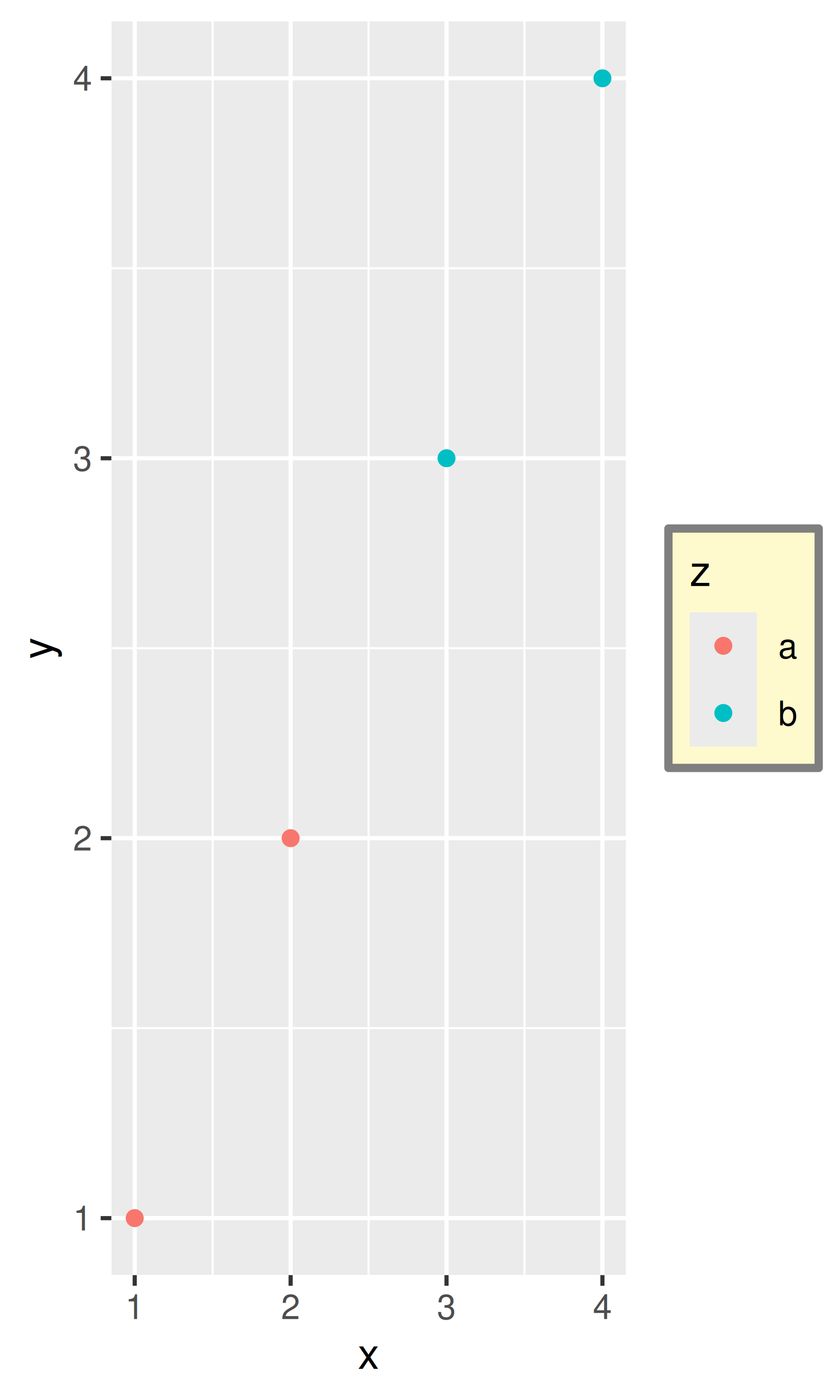
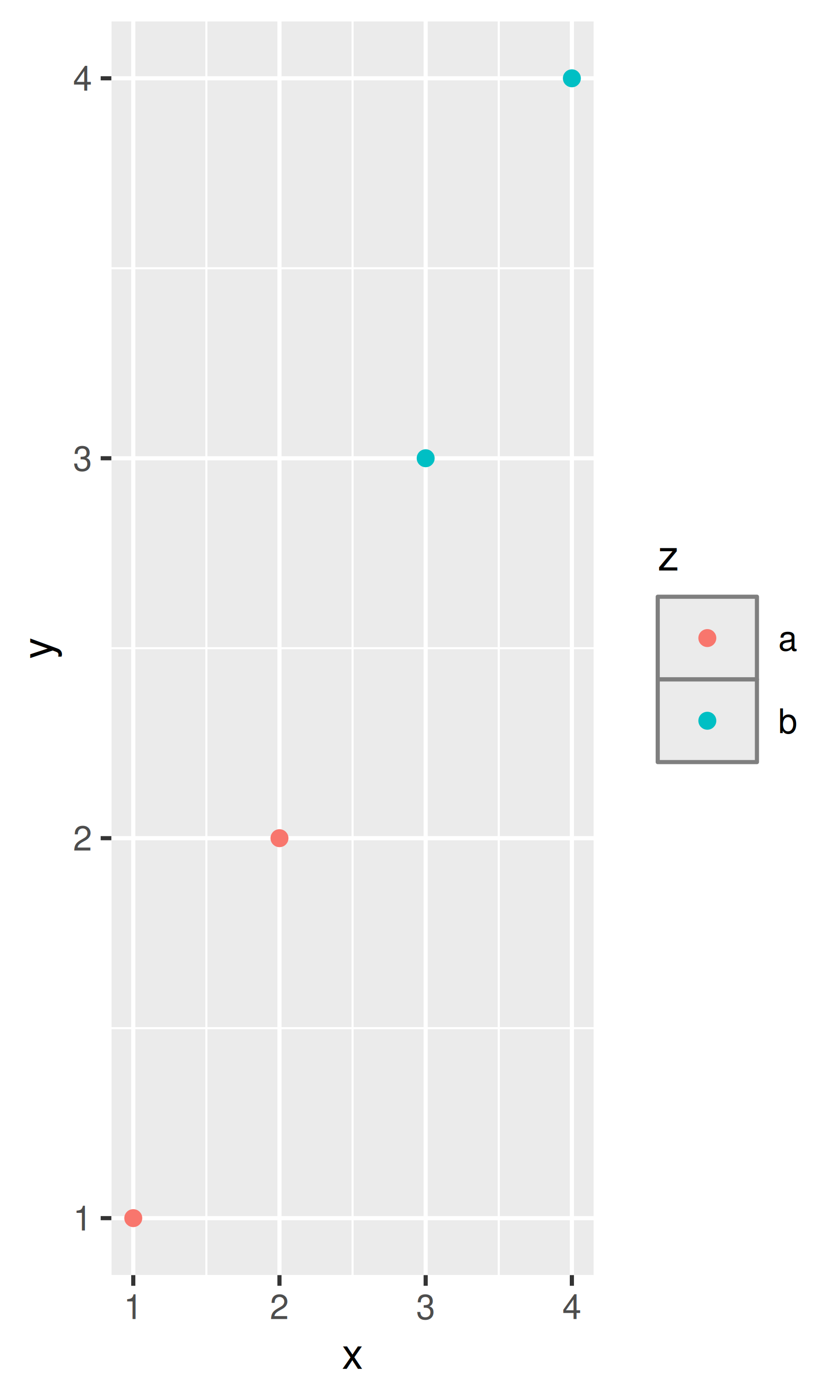
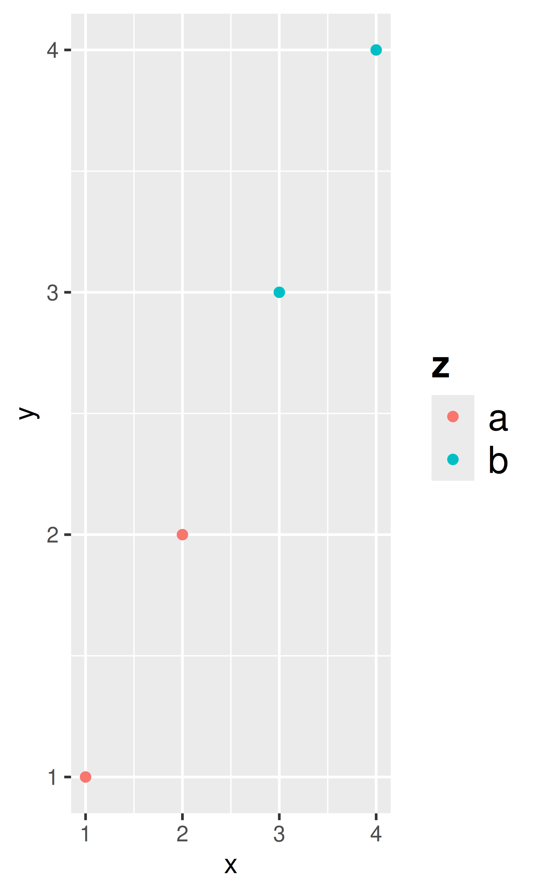
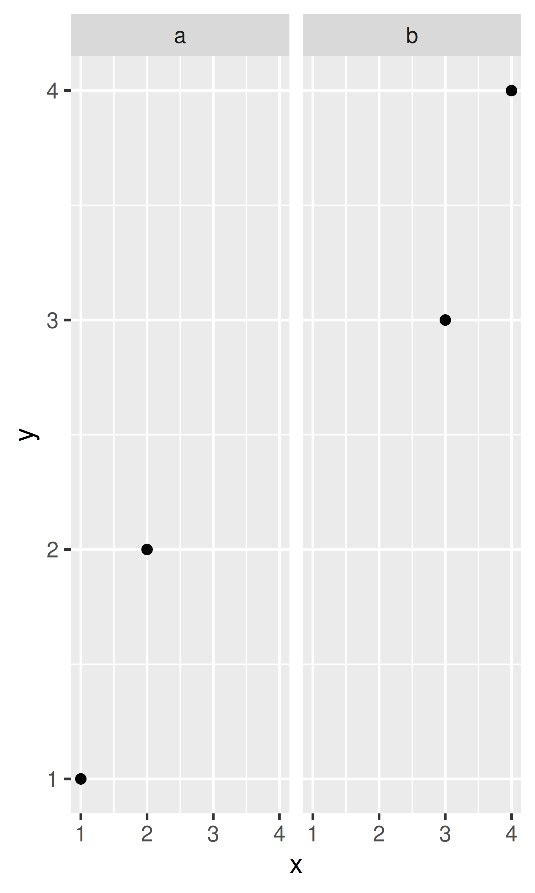
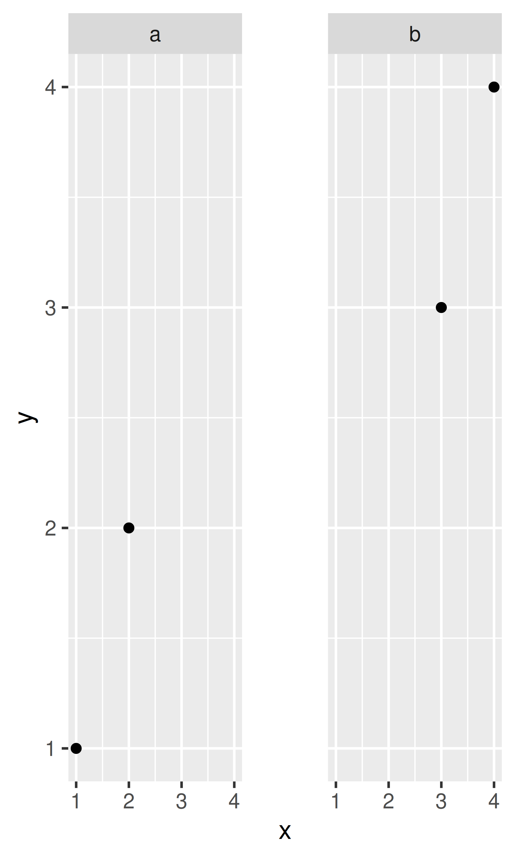
df <- data.frame(x = 1:4, y = 1:4, z = rep(c("a", "b"), each = 2))
base <- ggplot(df, aes(x, y, colour = z)) + geom_point()

base + theme(
  legend.background = element_rect(
    fill = "lemonchiffon",
    colour = "grey50",
    linewidth = 1
  )
)
base + theme(
  legend.key = element_rect(color = "grey50"),
  legend.key.width = unit(0.9, "cm"),
  legend.key.height = unit(0.75, "cm")
)
base + theme(
  legend.text = element_text(size = 15),
  legend.title = element_text(size = 15, face = "bold")
)
There are four other properties that control how legends are laid out in the context of the plot (legend.position, legend.direction, legend.justification, legend.box). They are described in Section 11.7.
Panel elements control the appearance of the plotting panels:
| Element | Setter | Description |
|---|---|---|
| panel.background | element_rect() |
panel background (under data) |
| panel.border | element_rect() |
panel border (over data) |
| panel.grid.major | element_line() |
major grid lines |
| panel.grid.major.x | element_line() |
vertical major grid lines |
| panel.grid.major.y | element_line() |
horizontal major grid lines |
| panel.grid.minor | element_line() |
minor grid lines |
| panel.grid.minor.x | element_line() |
vertical minor grid lines |
| panel.grid.minor.y | element_line() |
horizontal minor grid lines |
| aspect.ratio | numeric | plot aspect ratio |
The main difference between panel.background and panel.border is that the background is drawn underneath the data, and the border is drawn on top of it. For that reason, you’ll always need to assign fill = NA when overriding panel.border.
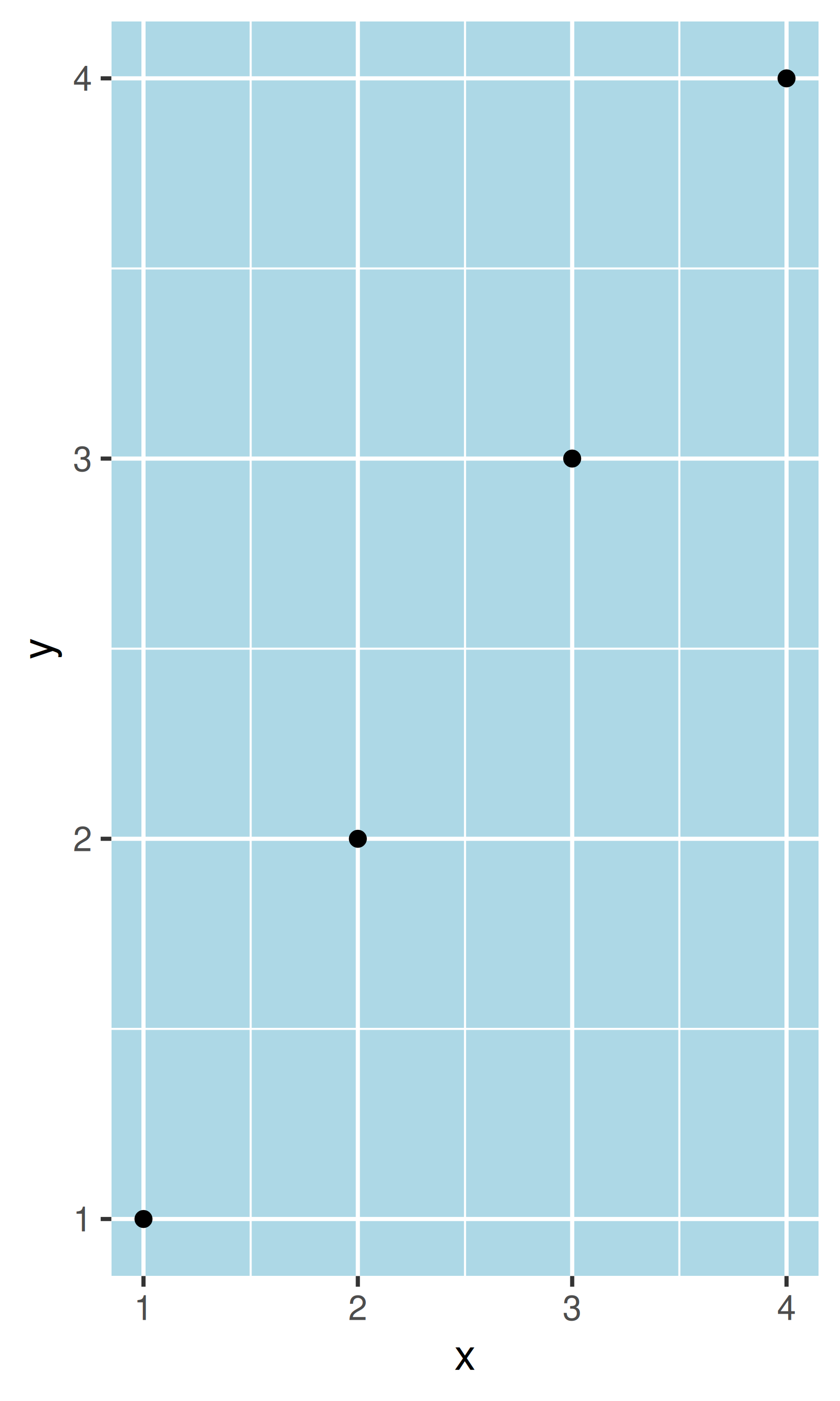
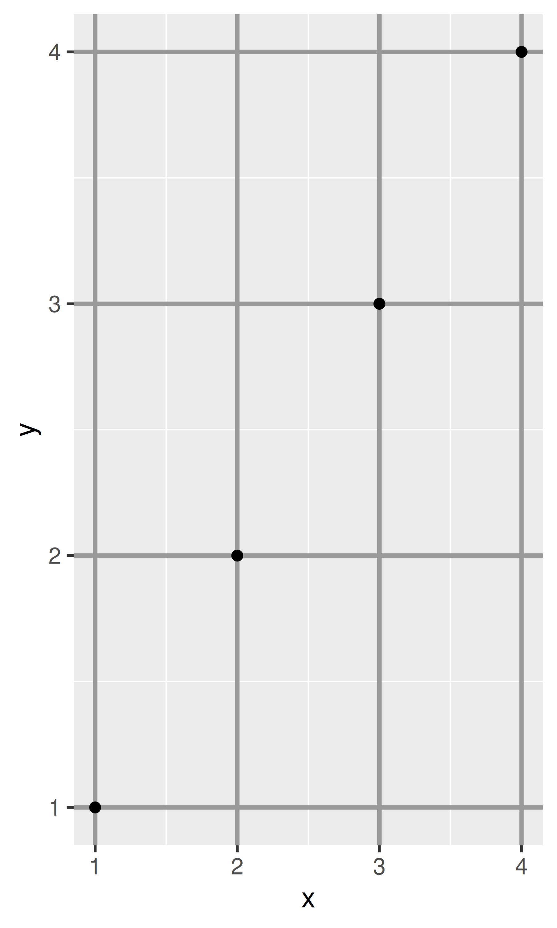
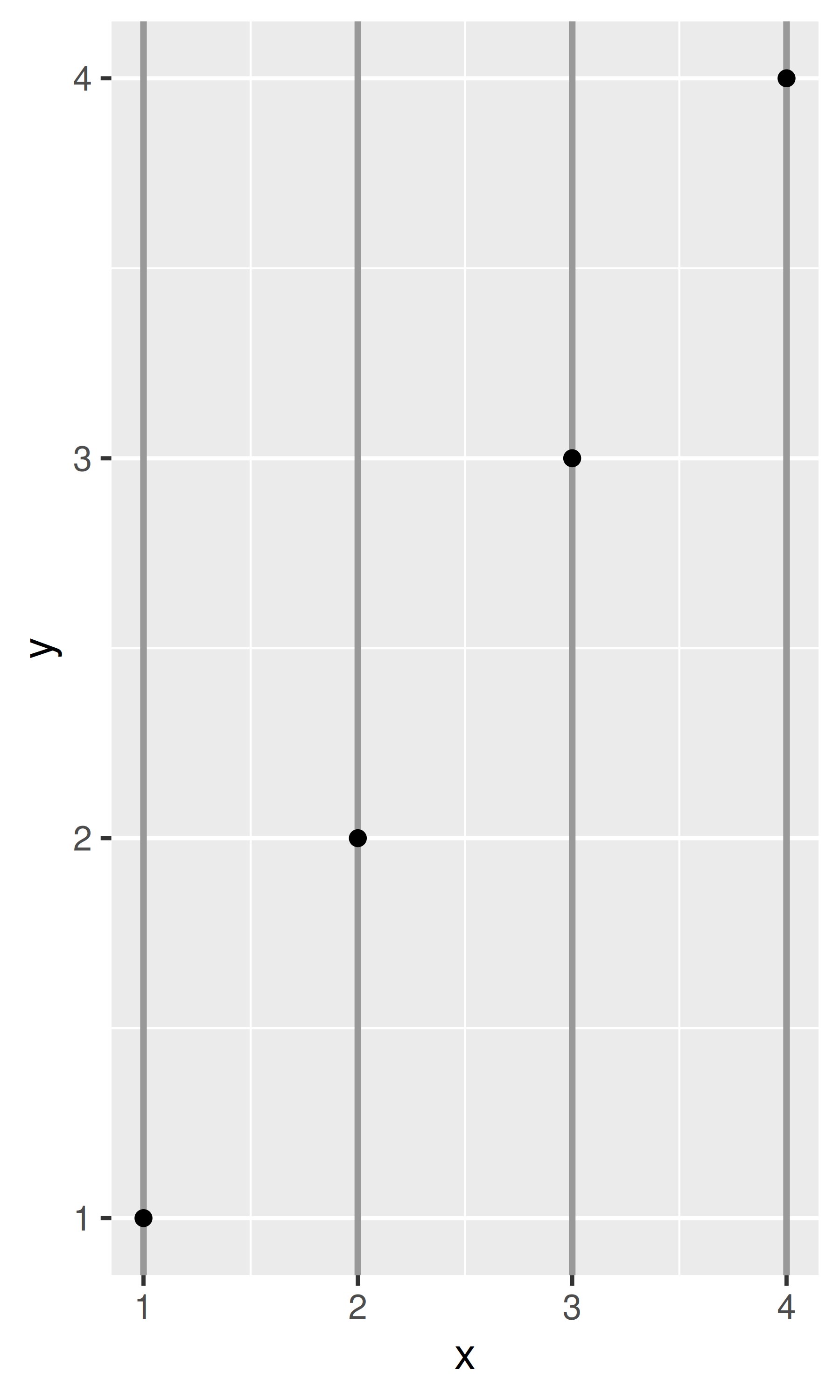
base <- ggplot(df, aes(x, y)) + geom_point()
# Modify background
base + theme(panel.background = element_rect(fill = "lightblue"))

# Tweak major grid lines
base + theme(
  panel.grid.major = element_line(color = "gray60", linewidth = 0.8)
)
# Just in one direction
base + theme(
  panel.grid.major.x = element_line(color = "gray60", linewidth = 0.8)
)
Note that aspect ratio controls the aspect ratio of the panel, not the overall plot:
base2 <- base + theme(plot.background = element_rect(colour = "grey50"))
# Wide screen
base2 + theme(aspect.ratio = 9 / 16)
# Long and skinny
base2 + theme(aspect.ratio = 2 / 1)
# Square
base2 + theme(aspect.ratio = 1)
The following theme elements are associated with faceted ggplots:
| Element | Setter | Description |
|---|---|---|
| strip.background | element_rect() |
background of panel strips |
| strip.text | element_text() |
strip text |
| strip.text.x | element_text() |
horizontal strip text |
| strip.text.y | element_text() |
vertical strip text |
| panel.spacing | unit() |
margin between facets |
| panel.spacing.x | unit() |
margin between facets (vertical) |
| panel.spacing.y | unit() |
margin between facets (horizontal) |
Element strip.text.x affects both facet_wrap() or facet_grid(); strip.text.y only affects facet_grid().
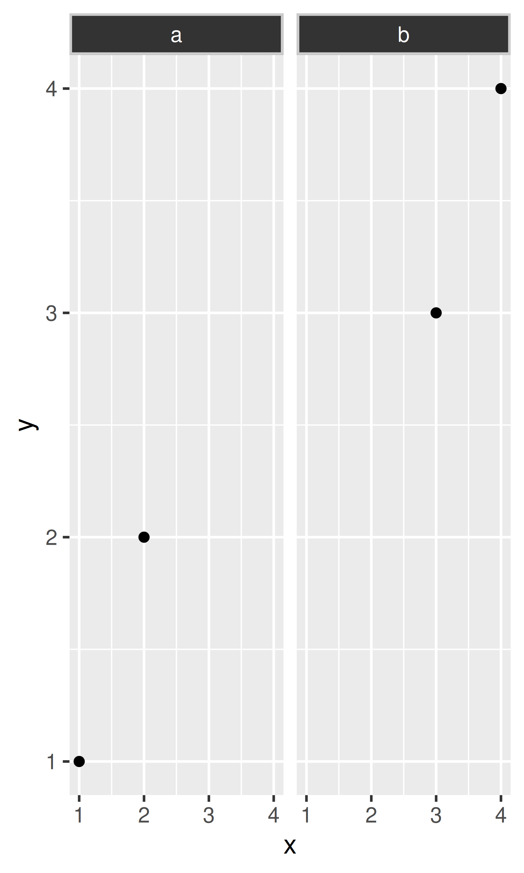
df <- data.frame(x = 1:4, y = 1:4, z = c("a", "a", "b", "b"))
base_f <- ggplot(df, aes(x, y)) + geom_point() + facet_wrap(~z)

base_f
base_f + theme(panel.spacing = unit(0.5, "in"))
base_f + theme(
  strip.text = element_text(colour = "white"),
  strip.background = element_rect(
    fill = "grey20",
    color = "grey80",
    linewidth = 1
  )
)
Create the ugliest plot possible! (Contributed by Andrew D. Steen, University of Tennessee - Knoxville)
theme_dark() makes the inside of the plot dark, but not the outside. Change the plot background to black, and then update the text settings so you can still read the labels.
Make an elegant theme that uses “linen” as the background colour and a serif font for the text.
Systematically explore the effects of hjust when you have a multiline title. Why doesn’t vjust do anything?
When saving a plot to use in another program, you have two basic choices of output: raster or vector:
Vector graphics describe a plot as sequence of operations: draw a line from \((x_1, y_1)\) to \((x_2, y_2)\), draw a circle at \((x_3, x_4)\) with radius \(r\). This means that they are effectively ‘infinitely’ zoomable; there is no loss of detail. The most useful vector graphic formats are pdf and svg.
Raster graphics are stored as an array of pixel colours and have a fixed optimal viewing size. The most useful raster graphic format is png.
The figure below illustrates the basic differences in these formats for a circle.
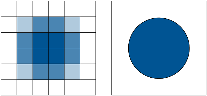
Unless there is a compelling reason not to, use vector graphics: they look better in more places. There are two main reasons to use raster graphics:
You have a plot (e.g. a scatterplot) with thousands of graphical objects (i.e. points). A vector version will be large and slow to render.
You want to embed the graphic in MS Office. MS has poor support for vector graphics (except for their own DrawingXML format which is not currently easy to make from R), so raster graphics are easier.
There are two ways to save output from ggplot2. You can use the standard R approach where you open a graphics device, generate the plot, then close the device:
This works for all packages, but is verbose. ggplot2 provides a convenient shorthand with ggsave():
ggplot(mpg, aes(displ, cty)) + geom_point()
ggsave("output.pdf")
ggsave() is optimised for interactive use: you can use it after you’ve drawn a plot. It has the following important arguments:
The first argument, path, specifies the path where the image should be saved. The file extension will be used to automatically select the correct graphics device. ggsave() can produce .eps, .pdf, .svg, .wmf, .png, .jpg, .bmp, and .tiff.
width and height control the output size, specified in inches. If left blank, they’ll use the size of the on-screen graphics device.
For raster graphics (i.e. .png, .jpg), the dpi argument controls the resolution of the plot. It defaults to 300, which is appropriate for most printers, but you may want to use 600 for particularly high-resolution output, or 96 for on-screen (e.g., web) display.
See ?ggsave for more details.