p <- ggplot(mpg, aes(displ, hwy))
p
You are reading the work-in-progress third edition of the ggplot2 book. This chapter is currently a dumping ground for ideas, and we don’t recommend reading it.
One of the key ideas behind ggplot2 is that it allows you to easily iterate, building up a complex plot a layer at a time. Each layer can come from a different dataset and have a different aesthetic mapping, making it possible to create sophisticated plots that display data from multiple sources.
You’ve already created layers with functions like geom_point() and geom_histogram(). In this chapter, you’ll dive into the details of a layer, and how you can control all five components: data, the aesthetic mappings, the geom, stat, and position adjustments. The goal here is to give you the tools to build sophisticated plots tailored to the problem at hand.
So far, whenever we’ve created a plot with ggplot(), we’ve immediately added on a layer with a geom function. But it’s important to realise that there really are two distinct steps. First, we create a plot with default dataset and aesthetic mappings:
p <- ggplot(mpg, aes(displ, hwy))
p
There’s nothing to see yet, so we need to add a layer:
p + geom_point()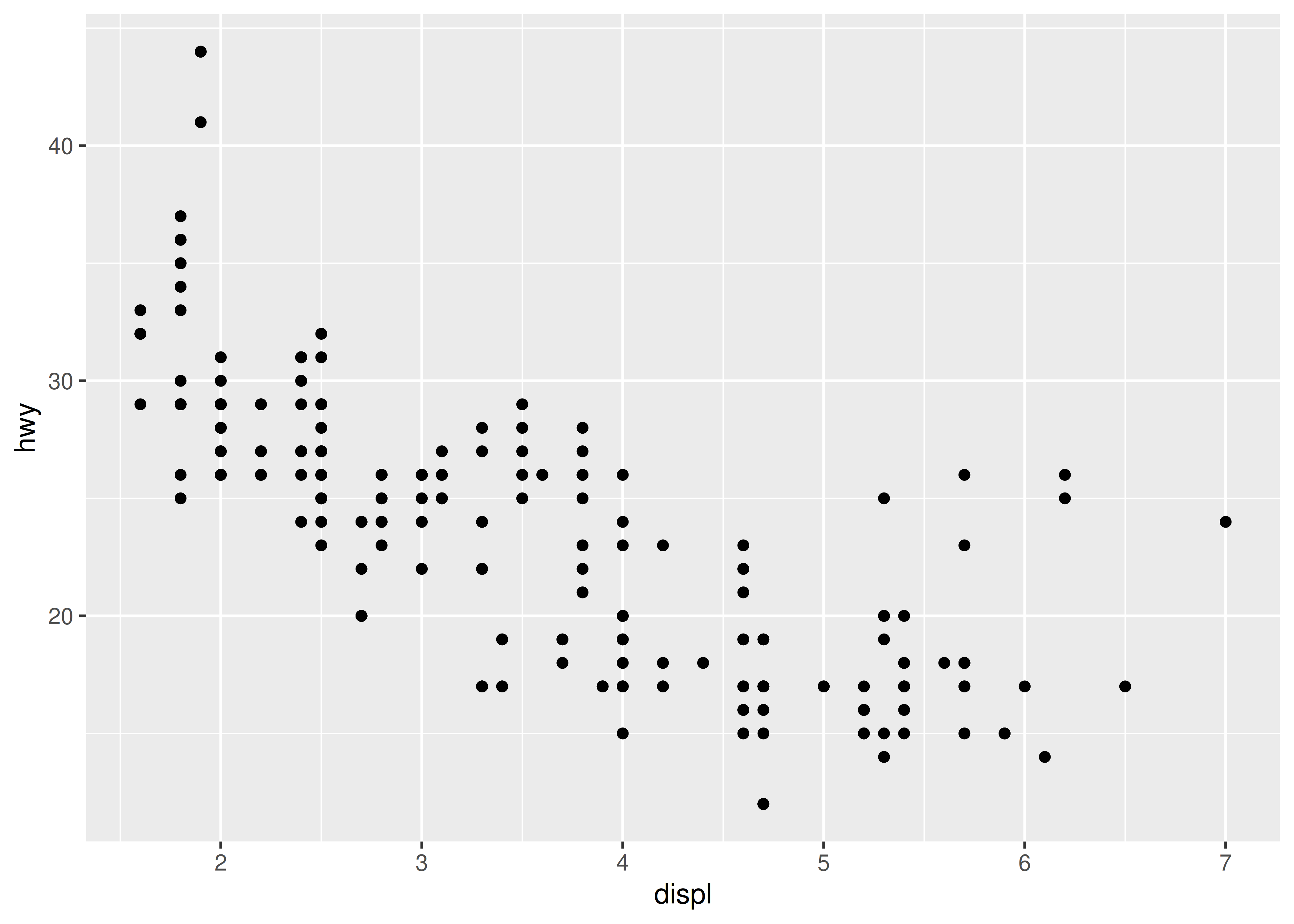
geom_point() is a shortcut. Behind the scenes it calls the layer() function to create a new layer:
p + layer(
  mapping = NULL,
  data = NULL,
  geom = "point",
  stat = "identity",
  position = "identity"
)
This call fully specifies the five components to the layer:
mapping: A set of aesthetic mappings, specified using the aes() function and combined with the plot defaults as described in Section 13.4. If NULL, uses the default mapping set in ggplot().
data: A dataset which overrides the default plot dataset. It is usually omitted (set to NULL), in which case the layer will use the default data specified in ggplot(). The requirements for data are explained in more detail in Section 13.3.
geom: The name of the geometric object to use to draw each observation. Geoms are discussed in more detail in Section 13.3, and Chapter 3 and Chapter 4 explore their use in more depth.
Geoms can have additional arguments. All geoms take aesthetics as parameters. If you supply an aesthetic (e.g. colour) as a parameter, it will not be scaled, allowing you to control the appearance of the plot, as described in Section 13.4.2. You can pass params in ... (in which case stat and geom parameters are automatically teased apart), or in a list passed to geom_params.
stat: The name of the statistical tranformation to use. A statistical transformation performs some useful statistical summary, and is key to histograms and smoothers. To keep the data as is, use the “identity” stat. Learn more in Section 13.6.
You only need to set one of stat and geom: every geom has a default stat, and every stat a default geom.
Most stats take additional parameters to specify the details of statistical transformation. You can supply params either in ... (in which case stat and geom parameters are automatically teased apart), or in a list called stat_params.
position: The method used to adjust overlapping objects, like jittering, stacking or dodging. More details in Section 13.7.
It’s useful to understand the layer() function so you have a better mental model of the layer object. But you’ll rarely use the full layer() call because it’s so verbose. Instead, you’ll use the shortcut geom_ functions: geom_point(mapping, data, ...) is exactly equivalent to layer(mapping, data, geom = "point", ...).
Every layer must have some data associated with it, and that data must be in a tidy data frame. Tidy data frames are described in more detail in R for Data Science (https://r4ds.had.co.nz), but for now, all you need to know is that a tidy data frame has variables in the columns and observations in the rows. This is a strong restriction, but there are good reasons for it:
Your data is very important, so it’s best to be explicit about it.
A single data frame is also easier to save than a multitude of vectors, which means it’s easier to reproduce your results or send your data to someone else.
It enforces a clean separation of concerns: ggplot2 turns data frames into visualisations. Other packages can make data frames in the right format.
The data on each layer doesn’t need to be the same, and it’s often useful to combine multiple datasets in a single plot. To illustrate that idea, we’ll generate two new datasets related to the mpg dataset. First, we’ll fit a loess model and generate predictions from it. (This is what geom_smooth() does behind the scenes)
mod <- loess(hwy ~ displ, data = mpg)
grid <- tibble(displ = seq(min(mpg$displ), max(mpg$displ), length = 50))
grid$hwy <- predict(mod, newdata = grid)

grid
#> # A tibble: 50 × 2
#>   displ   hwy
#>   <dbl> <dbl>
#> 1  1.6   33.1
#> 2  1.71  32.2
#> 3  1.82  31.3
#> 4  1.93  30.4
#> 5  2.04  29.6
#> 6  2.15  28.8
#> # ℹ 44 more rows
Next, we’ll isolate observations that are particularly far away from their predicted values:
std_resid <- resid(mod) / mod$s
outlier <- filter(mpg, abs(std_resid) > 2)
outlier
#> # A tibble: 6 × 11
#> manufacturer model displ year cyl trans drv cty hwy fl class
#> <chr> <chr> <dbl> <int> <int> <chr> <chr> <int> <int> <chr> <chr>
#> 1 chevrolet corvette 5.7 1999 8 manua… r 16 26 p 2sea…
#> 2 pontiac grand prix 3.8 2008 6 auto(… f 18 28 r mids…
#> 3 pontiac grand prix 5.3 2008 8 auto(… f 16 25 p mids…
#> 4 volkswagen jetta 1.9 1999 4 manua… f 33 44 d comp…
#> 5 volkswagen new beetle 1.9 1999 4 manua… f 35 44 d subc…
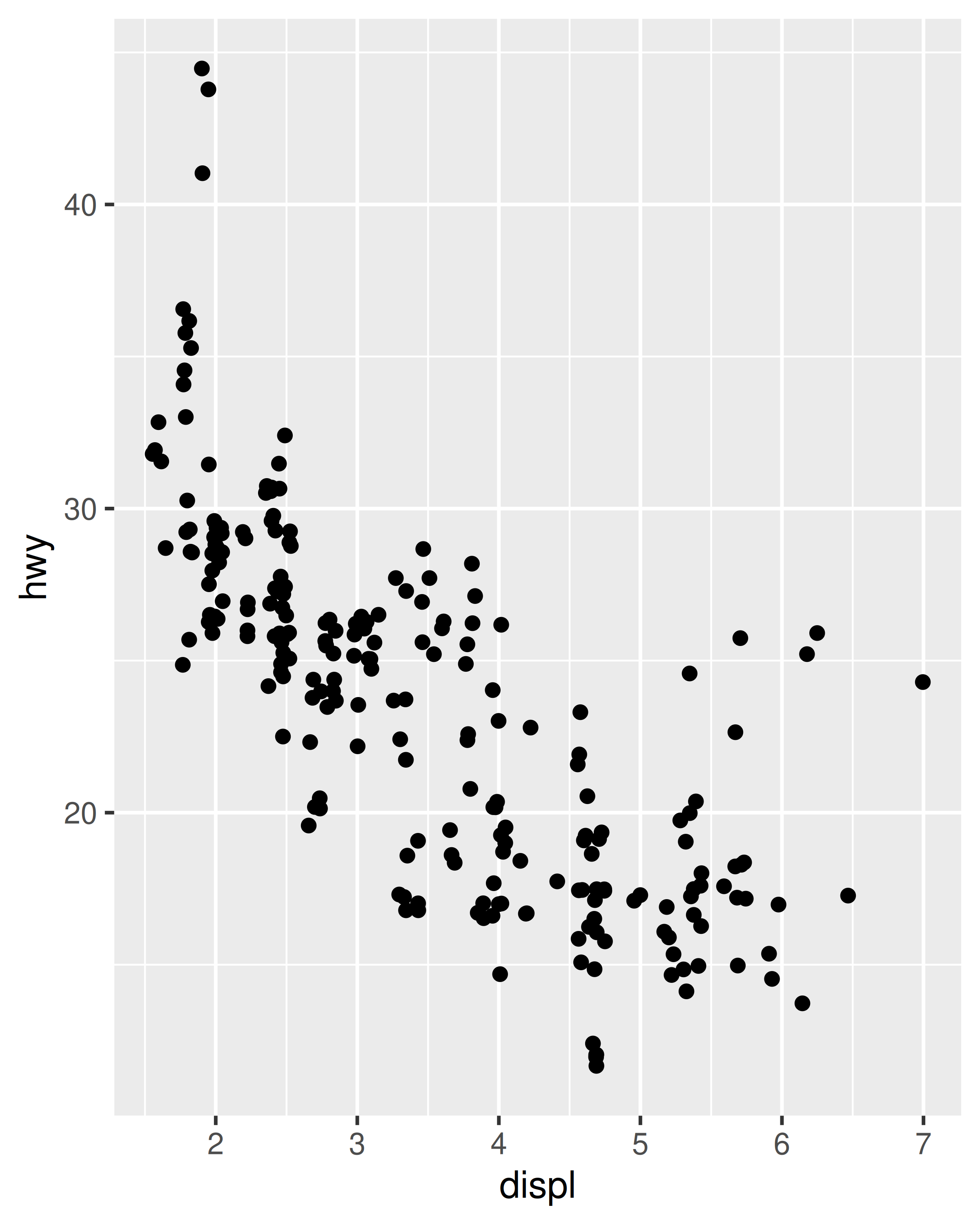
#> 6 volkswagen new beetle 1.9 1999 4 auto(… f 29 41 d subc…We’ve generated these datasets because it’s common to enhance the display of raw data with a statistical summary and some annotations. With these new datasets, we can improve our initial scatterplot by overlaying a smoothed line, and labelling the outlying points:
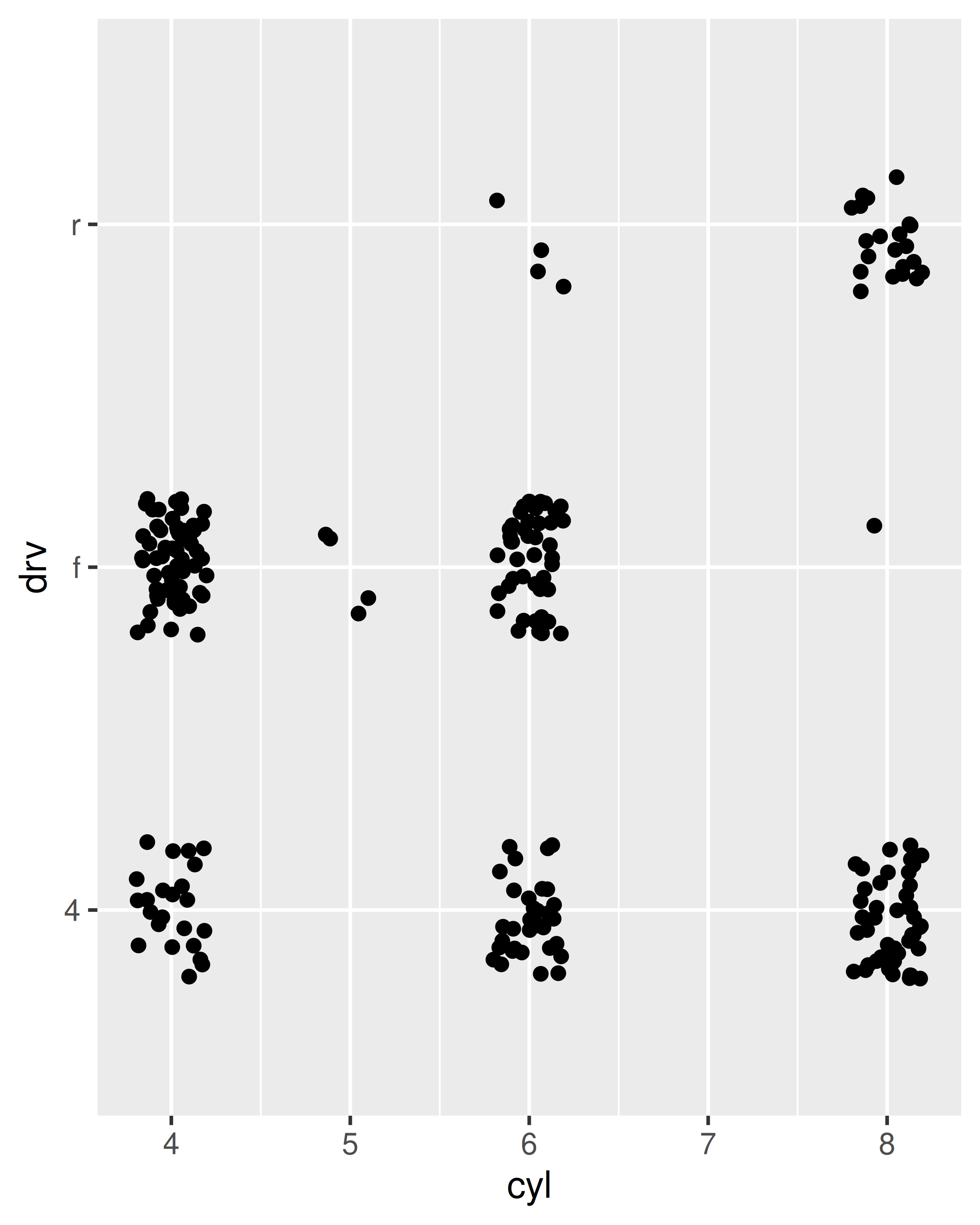
ggplot(mpg, aes(displ, hwy)) +
  geom_point() +
  geom_line(data = grid, colour = "blue", linewidth = 1.5) +
  geom_text(data = outlier, aes(label = model))
(The labels aren’t particularly easy to read, but you can fix that with some manual tweaking.)
Note that you need the explicit data = in the layers, but not in the call to ggplot(). That’s because the argument order is different. This is a little inconsistent, but it reduces typing for the common case where you specify the data once in ggplot() and modify aesthetics in each layer.
In this example, every layer uses a different dataset. We could define the same plot in another way, omitting the default dataset, and specifying a dataset for each layer:
ggplot(mapping = aes(displ, hwy)) +
  geom_point(data = mpg) +
  geom_line(data = grid) +
  geom_text(data = outlier, aes(label = model))
We don’t particularly like this style in this example because it makes it less clear what the primary dataset is (and because of the way that the arguments to ggplot() are ordered, it actually requires more keystrokes). However, you may prefer it in cases where there isn’t a clear primary dataset, or where the aesthetics also vary from layer to layer.
The first two arguments to ggplot are data and mapping. The first two arguments to all layer functions are mapping and data. Why does the order of the arguments differ? (Hint: think about what you set most commonly.)
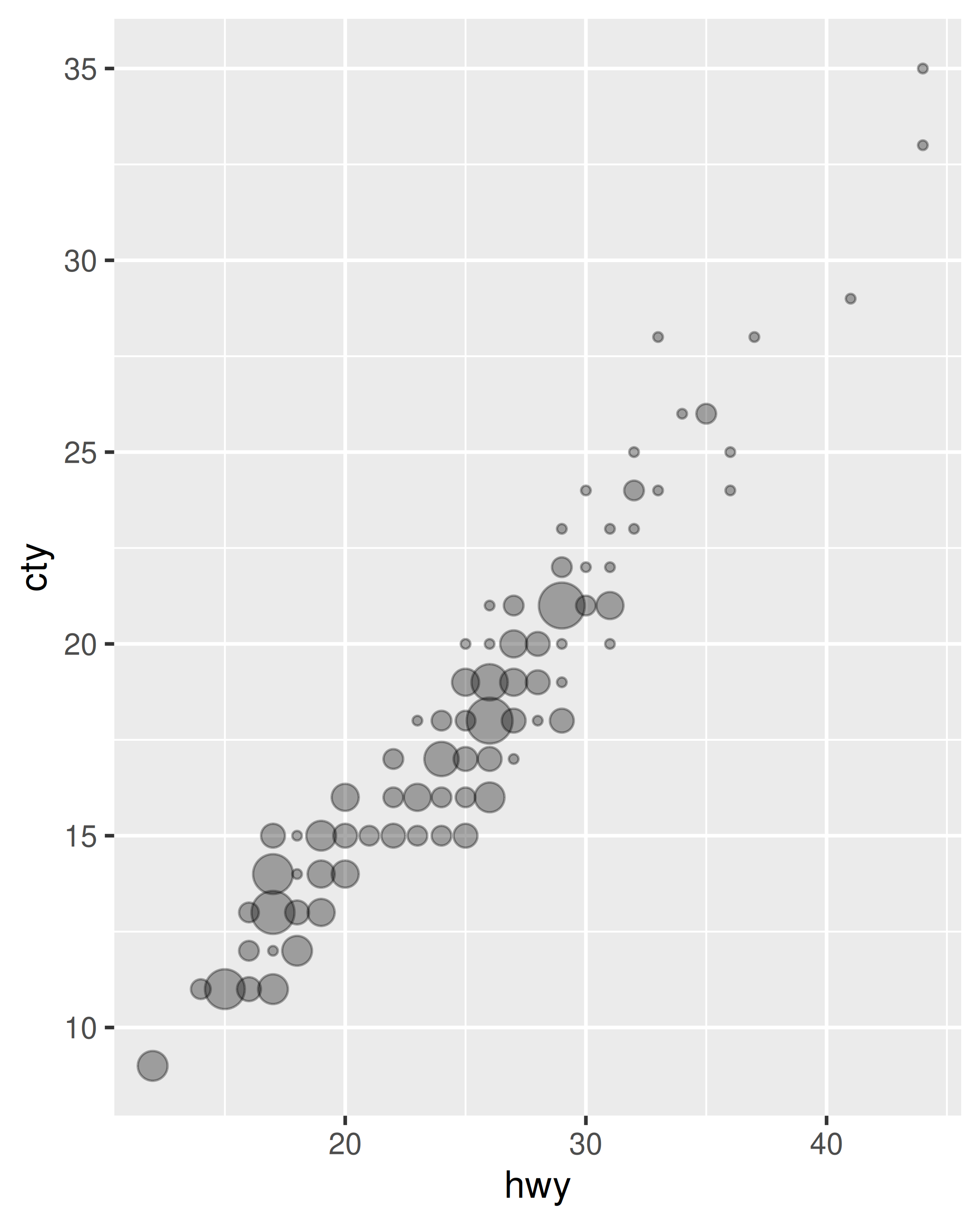
The following code uses dplyr to generate some summary statistics about each class of car.
Use the data to recreate this plot:

The aesthetic mappings, defined with aes(), describe how variables are mapped to visual properties or aesthetics. aes() takes a sequence of aesthetic-variable pairs like this:
aes(x = displ, y = hwy, colour = class)(If you’re American, you can use color, and behind the scenes ggplot2 will correct your spelling ;)
Here we map x-position to displ, y-position to hwy, and colour to class. The names for the first two arguments can be omitted, in which case they correspond to the x and y variables. That makes this specification equivalent to the one above:
aes(displ, hwy, colour = class)While you can do data manipulation in aes(), e.g. aes(log(carat), log(price)), it’s best to only do simple calculations. It’s better to move complex transformations out of the aes() call and into an explicit dplyr::mutate() call. This makes it easier to check your work and it’s often faster because you need only do the transformation once, not every time the plot is drawn.
Never refer to a variable with $ (e.g., diamonds$carat) in aes(). This breaks containment, so that the plot no longer contains everything it needs, and causes problems if ggplot2 changes the order of the rows, as it does when faceting.
Aesthetic mappings can be supplied in the initial ggplot() call, in individual layers, or in some combination of both. All of these calls create the same plot specification:
ggplot(mpg, aes(displ, hwy, colour = class)) +
  geom_point()
ggplot(mpg, aes(displ, hwy)) +
  geom_point(aes(colour = class))
ggplot(mpg, aes(displ)) +
  geom_point(aes(y = hwy, colour = class))
ggplot(mpg) +
  geom_point(aes(displ, hwy, colour = class))
Within each layer, you can add, override, or remove mappings. For example, if you have a plot using the mpg data that has aes(displ, hwy) as the starting point, the table below illustrates all three operations:
| Operation | Layer aesthetics | Result |
|---|---|---|
| Add | aes(colour = cyl) |
aes(displ, hwy, colour = cyl) |
| Override | aes(y = cty) |
aes(displ, cty) |
| Remove | aes(y = NULL) |
aes(displ) |
If you only have one layer in the plot, the way you specify aesthetics doesn’t make any difference. However, the distinction is important when you start adding additional layers. These two plots are both valid and interesting, but focus on quite different aspects of the data:
ggplot(mpg, aes(displ, hwy, colour = class)) +
  geom_point() +
  geom_smooth(method = "lm", se = FALSE) +
  theme(legend.position = "none")
#> `geom_smooth()` using formula = 'y ~ x'

ggplot(mpg, aes(displ, hwy)) +
  geom_point(aes(colour = class)) +
  geom_smooth(method = "lm", se = FALSE) +
  theme(legend.position = "none")
#> `geom_smooth()` using formula = 'y ~ x'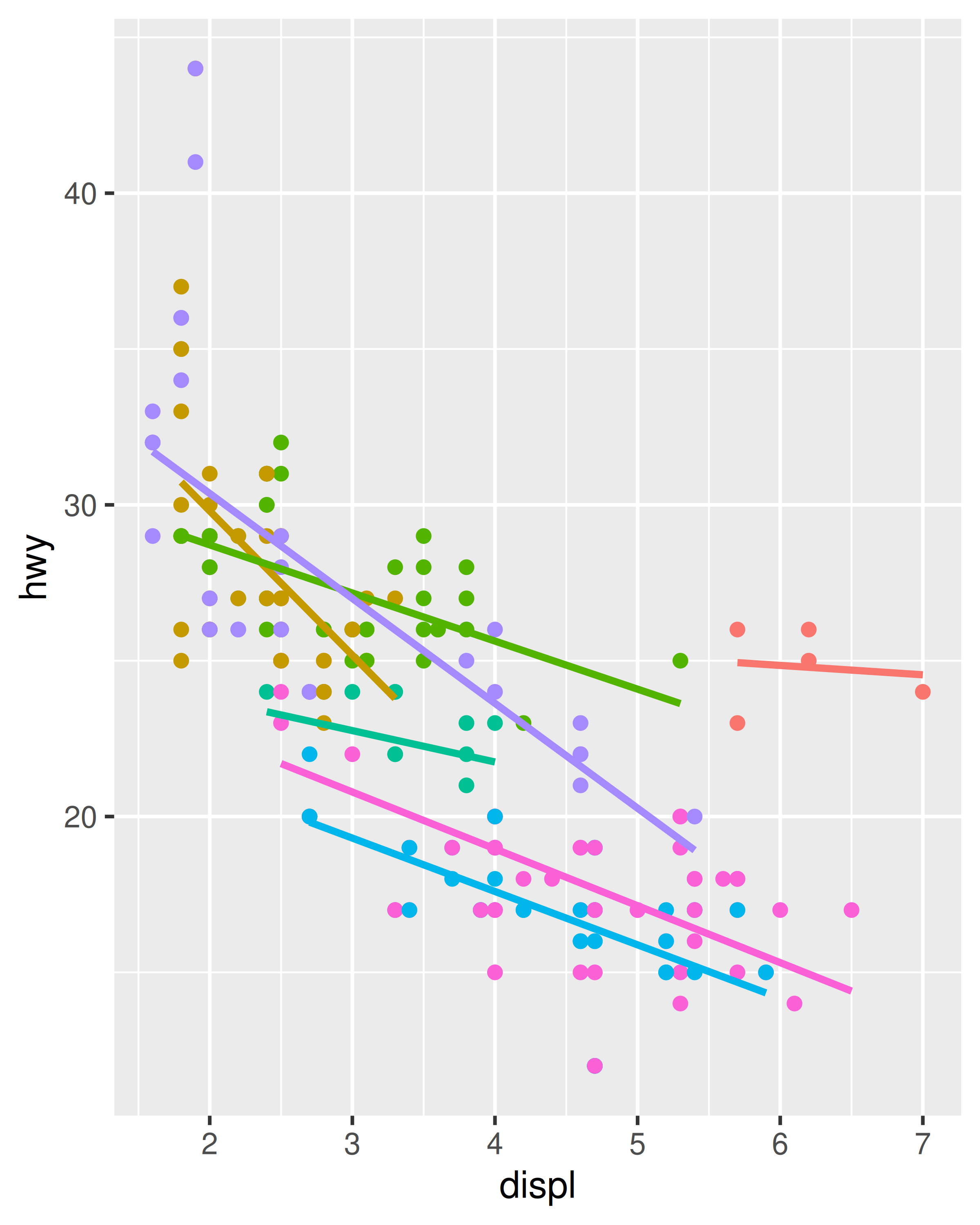

Generally, you want to set up the mappings to illuminate the structure underlying the graphic and minimise typing. It may take some time before the best approach is immediately obvious, so if you’ve iterated your way to a complex graphic, it may be worthwhile to rewrite it to make the structure more clear.
Instead of mapping an aesthetic property to a variable, you can set it to a single value by specifying it in the layer parameters. We map an aesthetic to a variable (e.g., aes(colour = cut)) or set it to a constant (e.g., colour = "red"). If you want appearance to be governed by a variable, put the specification inside aes(); if you want override the default size or colour, put the value outside of aes().
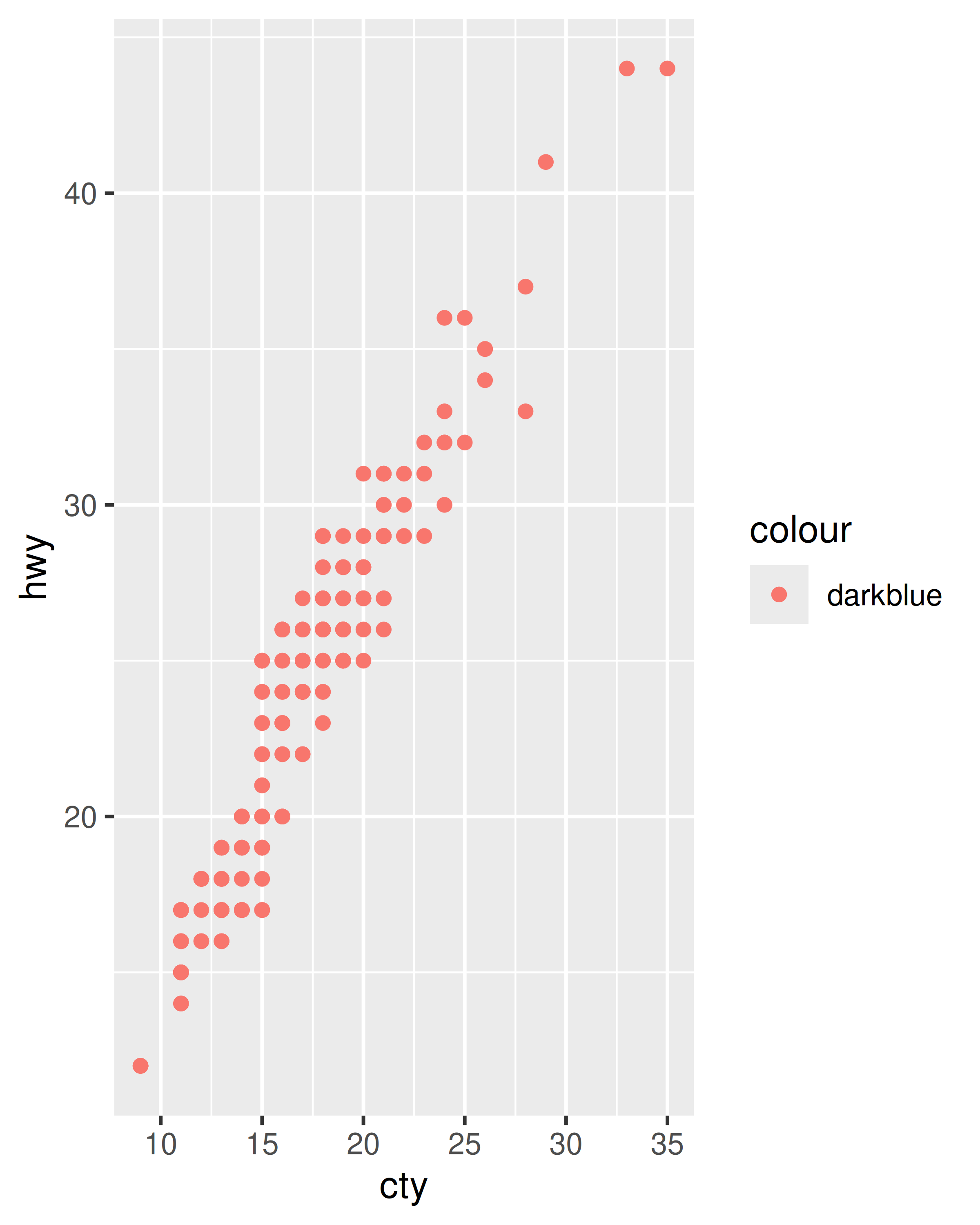
The following plots are created with similar code, but have rather different outputs. The second plot maps (not sets) the colour to the value ‘darkblue’. This effectively creates a new variable containing only the value ‘darkblue’ and then scales it with a colour scale. Because this value is discrete, the default colour scale uses evenly spaced colours on the colour wheel, and since there is only one value this colour is pinkish.
ggplot(mpg, aes(cty, hwy)) +
  geom_point(colour = "darkblue")

ggplot(mpg, aes(cty, hwy)) +
  geom_point(aes(colour = "darkblue"))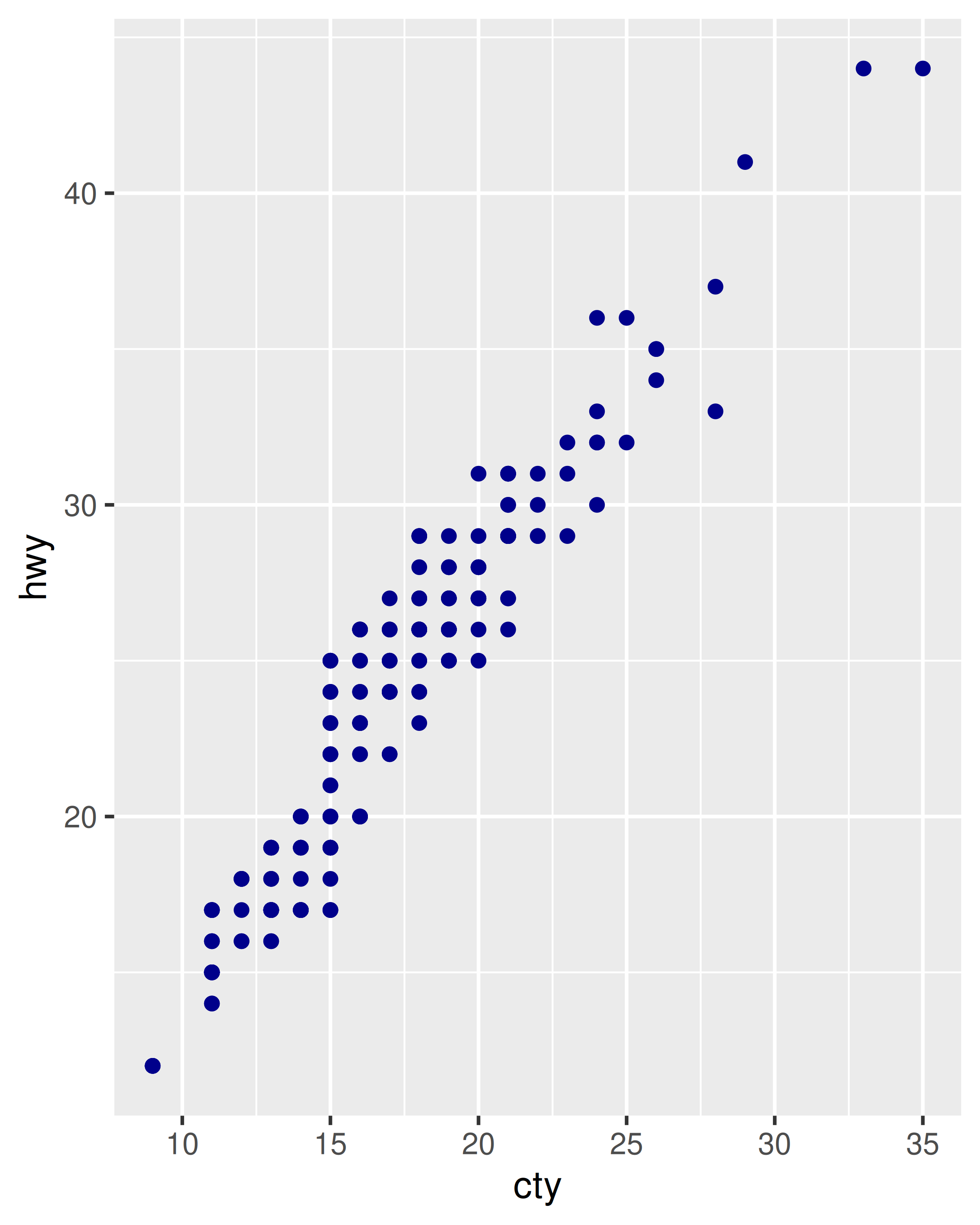
A third approach is to map the value, but override the default scale:
ggplot(mpg, aes(cty, hwy)) +
  geom_point(aes(colour = "darkblue")) +
  scale_colour_identity()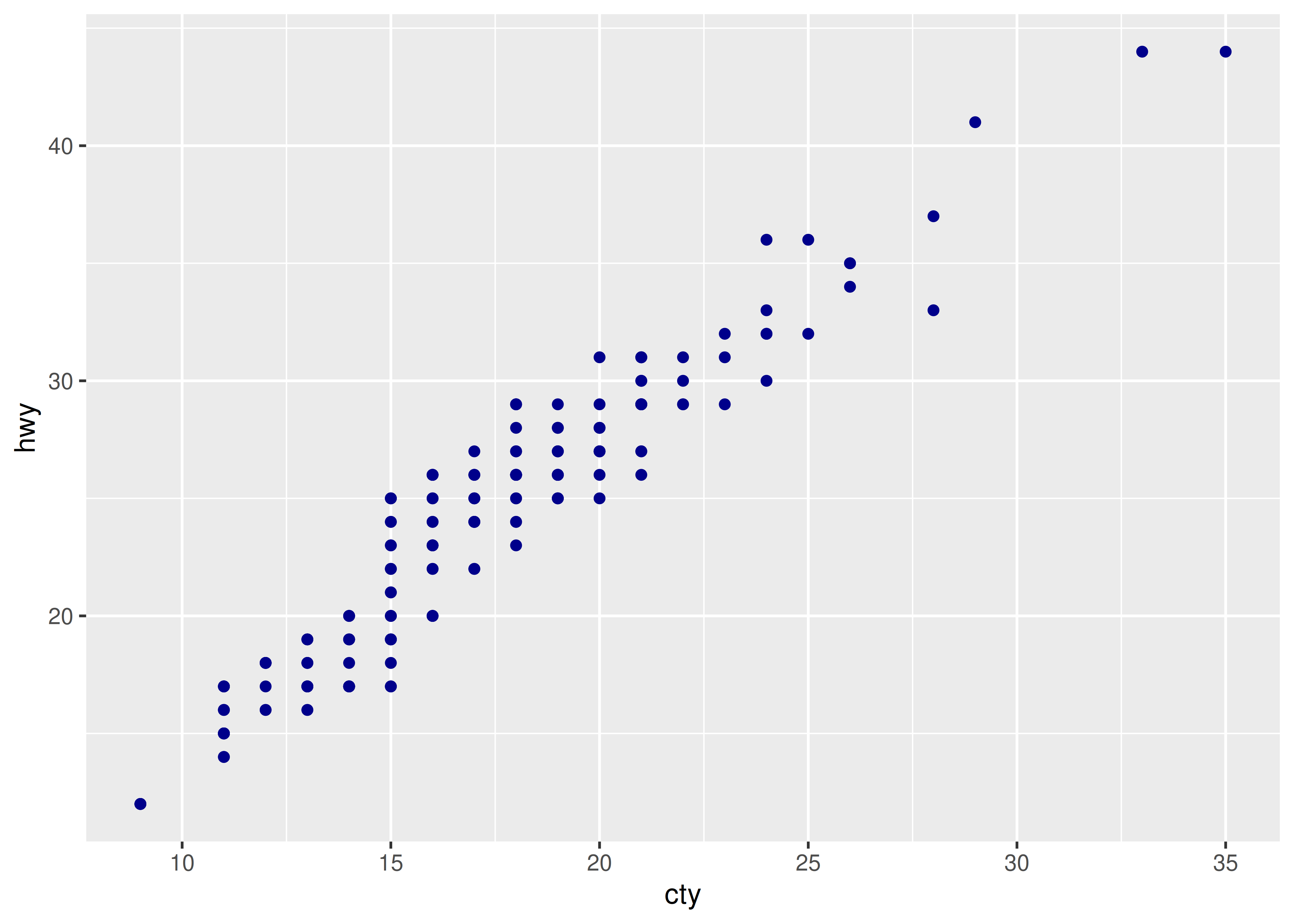
This is most useful if you always have a column that already contains colours. You’ll learn more about that in Section 12.6.
It’s sometimes useful to map aesthetics to constants. For example, if you want to display multiple layers with varying parameters, you can “name” each layer:
ggplot(mpg, aes(displ, hwy)) +
  geom_point() +
  geom_smooth(aes(colour = "loess"), method = "loess", se = FALSE) +
  geom_smooth(aes(colour = "lm"), method = "lm", se = FALSE) +
  labs(colour = "Method")
#> `geom_smooth()` using formula = 'y ~ x'
#> `geom_smooth()` using formula = 'y ~ x'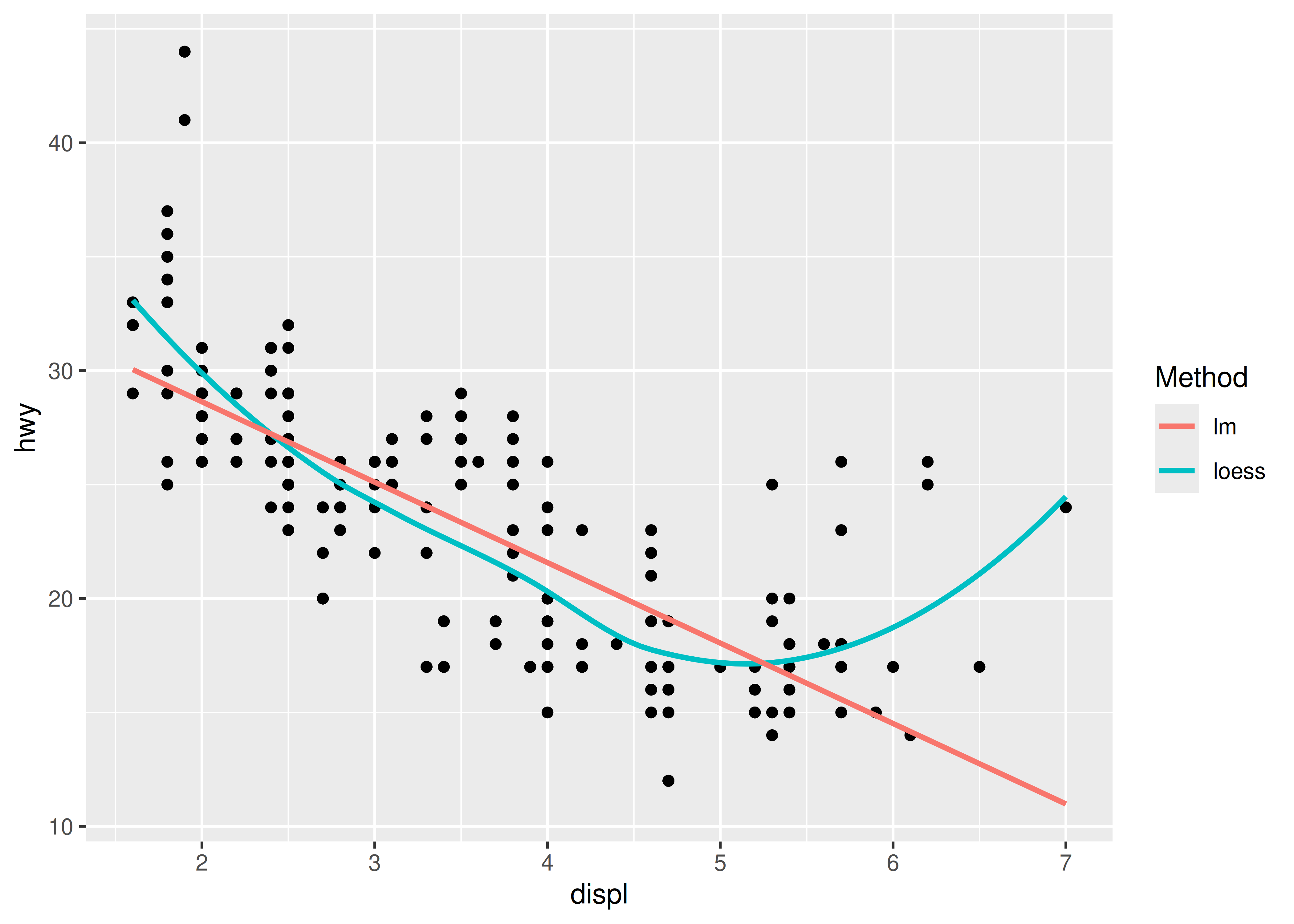
Simplify the following plot specifications:
What does the following code do? Does it work? Does it make sense? Why/why not?
ggplot(mpg) +
  geom_point(aes(class, cty)) +
  geom_boxplot(aes(trans, hwy))
What happens if you try to use a continuous variable on the x axis in one layer, and a categorical variable in another layer? What happens if you do it in the opposite order?
Geometric objects, or geoms for short, perform the actual rendering of the layer, controlling the type of plot that you create. For example, using a point geom will create a scatterplot, while using a line geom will create a line plot.
geom_blank(): display nothing. Most useful for adjusting axes limits using data.geom_point(): points.geom_path(): paths.geom_ribbon(): ribbons, a path with vertical thickness.geom_segment(): a line segment, specified by start and end position.geom_rect(): rectangles.geom_polygon(): filled polygons.geom_text(): text.geom_bar(): display distribution of discrete variable.geom_histogram(): bin and count continuous variable, display with bars.geom_density(): smoothed density estimate.geom_dotplot(): stack individual points into a dot plot.geom_freqpoly(): bin and count continuous variable, display with lines.geom_point(): scatterplot.geom_quantile(): smoothed quantile regression.geom_rug(): marginal rug plots.geom_smooth(): smoothed line of best fit.geom_text(): text labels.geom_bin2d(): bin into rectangles and count.geom_density2d(): smoothed 2d density estimate.geom_hex(): bin into hexagons and count.geom_count(): count number of point at distinct locationsgeom_jitter(): randomly jitter overlapping points.geom_bar(stat = "identity"): a bar chart of precomputed summaries.geom_boxplot(): boxplots.geom_violin(): show density of values in each group.geom_area(): area plot.geom_line(): line plot.geom_step(): step plot.geom_crossbar(): vertical bar with center.geom_errorbar(): error bars.geom_linerange(): vertical line.geom_pointrange(): vertical line with center.geom_map(): fast version of geom_polygon() for map data.geom_contour(): contours.geom_tile(): tile the plane with rectangles.geom_raster(): fast version of geom_tile() for equal sized tiles.Each geom has a set of aesthetics that it understands, some of which must be provided. For example, the point geoms requires x and y position, and understands colour, size and shape aesthetics. A bar requires height (ymax), and understands width, border colour and fill colour. Each geom lists its aesthetics in the documentation.
Some geoms differ primarily in the way that they are parameterised. For example, you can draw a square in three ways:
By giving geom_tile() the location (x and y) and dimensions (width and height).
By giving geom_rect() top (ymax), bottom (ymin), left (xmin) and right (xmax) positions.
By giving geom_polygon() a four row data frame with the x and y positions of each corner.
Other related geoms are:
geom_segment() and geom_line()
geom_area() and geom_ribbon().If alternative parameterisations are available, picking the right one for your data will usually make it much easier to draw the plot you want.
Download and print out the ggplot2 cheatsheet from https://posit.co/resources/cheatsheets/ so you have a handy visual reference for all the geoms.
Look at the documentation for the graphical primitive geoms. Which aesthetics do they use? How can you summarise them in a compact form?
What’s the best way to master an unfamiliar geom? List three resources to help you get started.
For each of the plots below, identify the geom used to draw it.

For each of the following problems, suggest a useful geom:
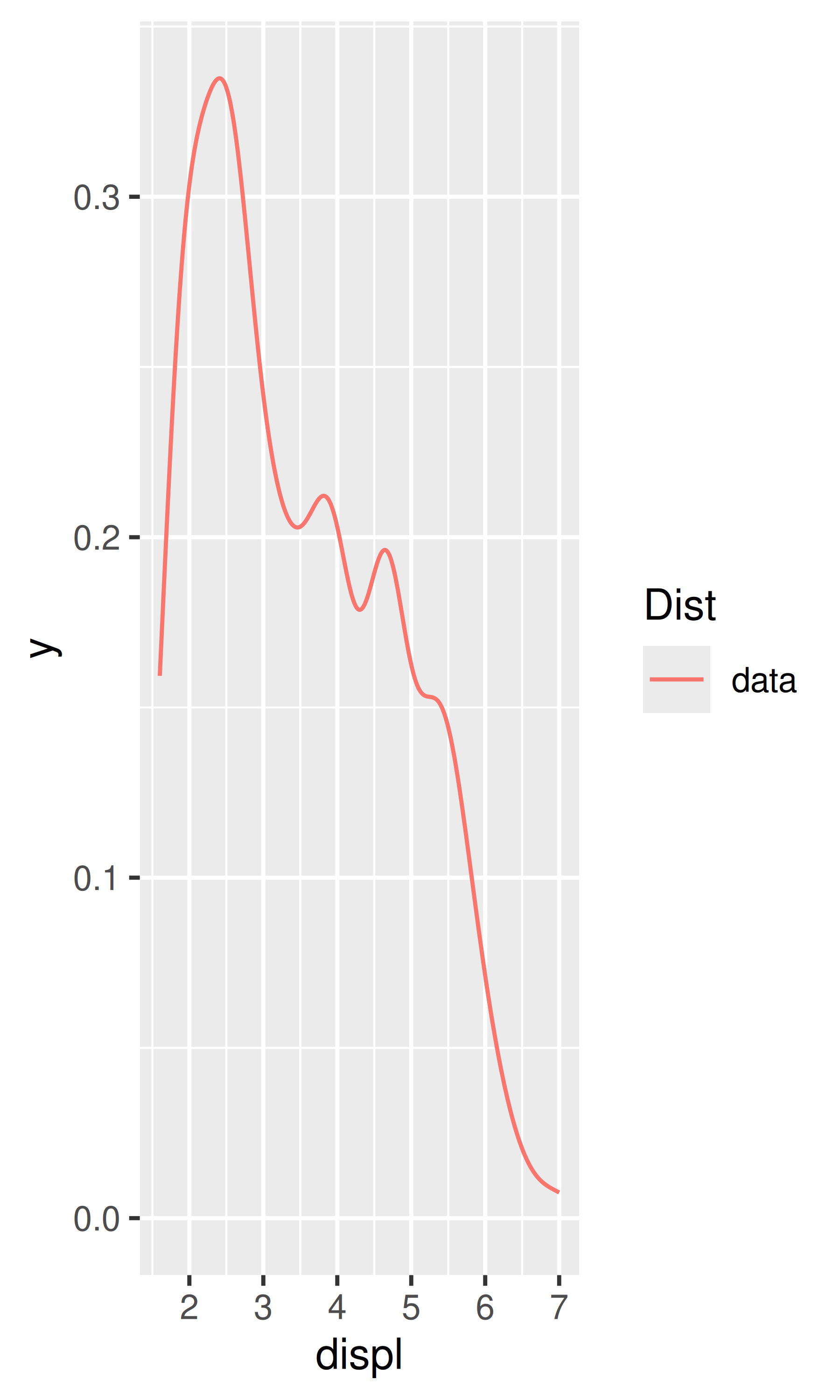
A statistical transformation, or stat, transforms the data, typically by summarising it in some manner. For example, a useful stat is the smoother, which calculates the smoothed mean of y, conditional on x. You’ve already used many of ggplot2’s stats because they’re used behind the scenes to generate many important geoms:
stat_bin(): geom_bar(), geom_freqpoly(), geom_histogram()
stat_bin2d(): geom_bin2d()
stat_bindot(): geom_dotplot()
stat_binhex(): geom_hex()
stat_boxplot(): geom_boxplot()
stat_contour(): geom_contour()
stat_quantile(): geom_quantile()
stat_smooth(): geom_smooth()
stat_sum(): geom_count()
You’ll rarely call these functions directly, but they are useful to know about because their documentation often provides more detail about the corresponding statistical transformation.
Other stats can’t be created with a geom_ function:
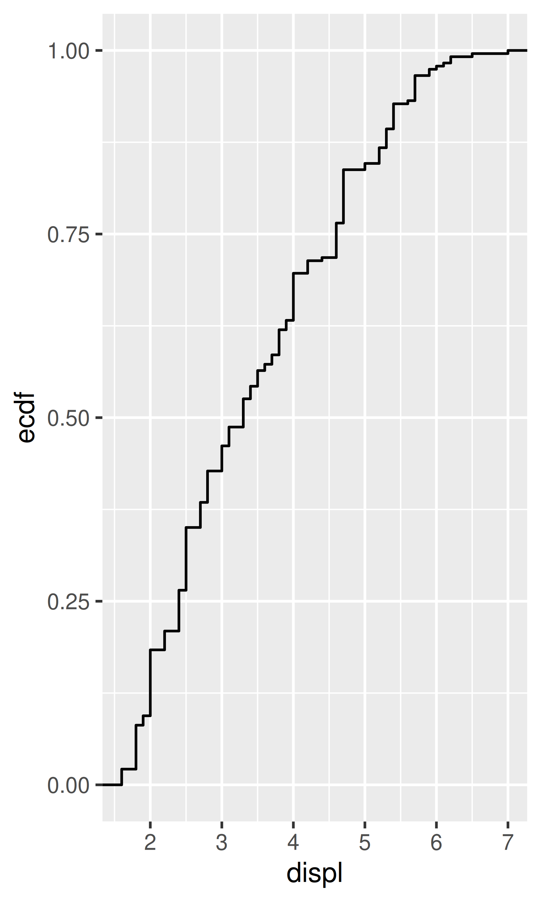
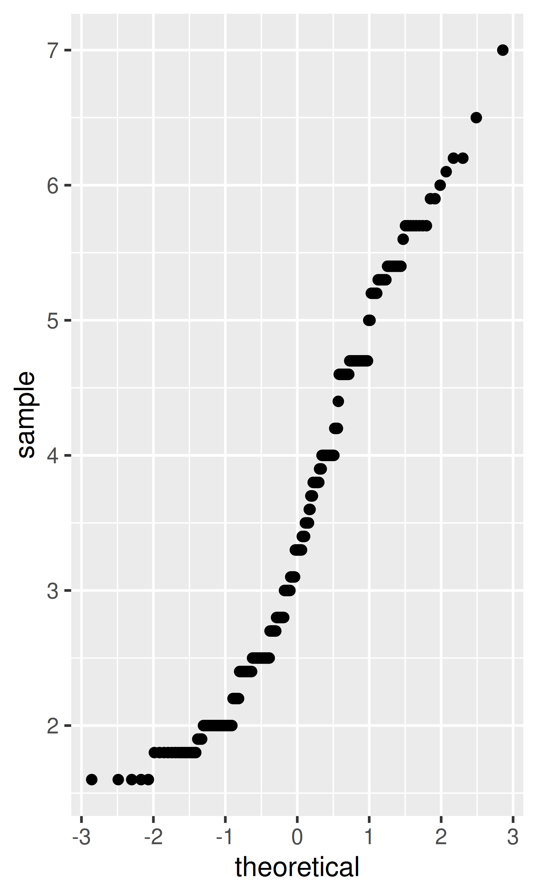
stat_ecdf(): compute a empirical cumulative distribution plot.stat_function(): compute y values from a function of x values.stat_summary(): summarise y values at distinct x values.stat_summary2d(), stat_summary_hex(): summarise binned values.stat_qq(): perform calculations for a quantile-quantile plot.stat_spoke(): convert angle and radius to position.stat_unique(): remove duplicated rows.There are two ways to use these functions. You can either add a stat_() function and override the default geom, or add a geom_() function and override the default stat:
ggplot(mpg, aes(trans, cty)) +
  geom_point() +
  stat_summary(geom = "point", fun = "mean", colour = "red", size = 4)

ggplot(mpg, aes(trans, cty)) +
  geom_point() +
  geom_point(stat = "summary", fun = "mean", colour = "red", size = 4)
We think it’s best to use the second form because it makes it more clear that you’re displaying a summary, not the raw data.
Internally, a stat takes a data frame as input and returns a data frame as output, and so a stat can add new variables to the original dataset. It is possible to map aesthetics to these new variables. For example, stat_bin, the statistic used to make histograms, produces the following variables:
count, the number of observations in each bindensity, the density of observations in each bin (percentage of total / bar width)x, the centre of the binThese generated variables can be used instead of the variables present in the original dataset. For example, the default histogram geom assigns the height of the bars to the number of observations (count), but if you’d prefer a more traditional histogram, you can use the density (density). To refer to a generated variable like density, “after_stat()” must wrap the name. This prevents confusion in case the original dataset includes a variable with the same name as a generated variable, and it makes it clear to any later reader of the code that this variable was generated by a stat. Each statistic lists the variables that it creates in its documentation. Compare the y-axes on these two plots:
ggplot(diamonds, aes(price)) +
geom_histogram(binwidth = 500)
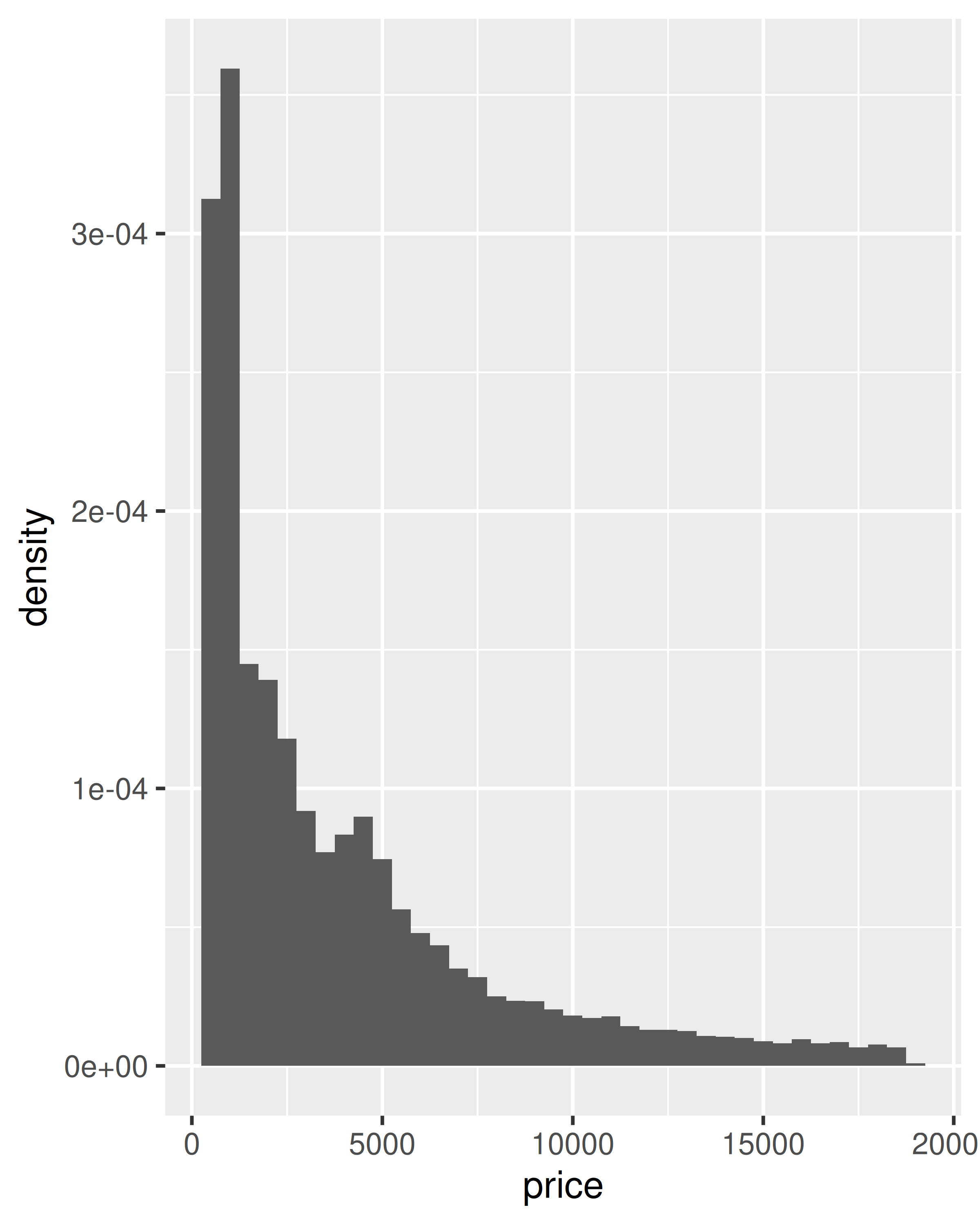
ggplot(diamonds, aes(price)) +
geom_histogram(aes(y = after_stat(density)), binwidth = 500)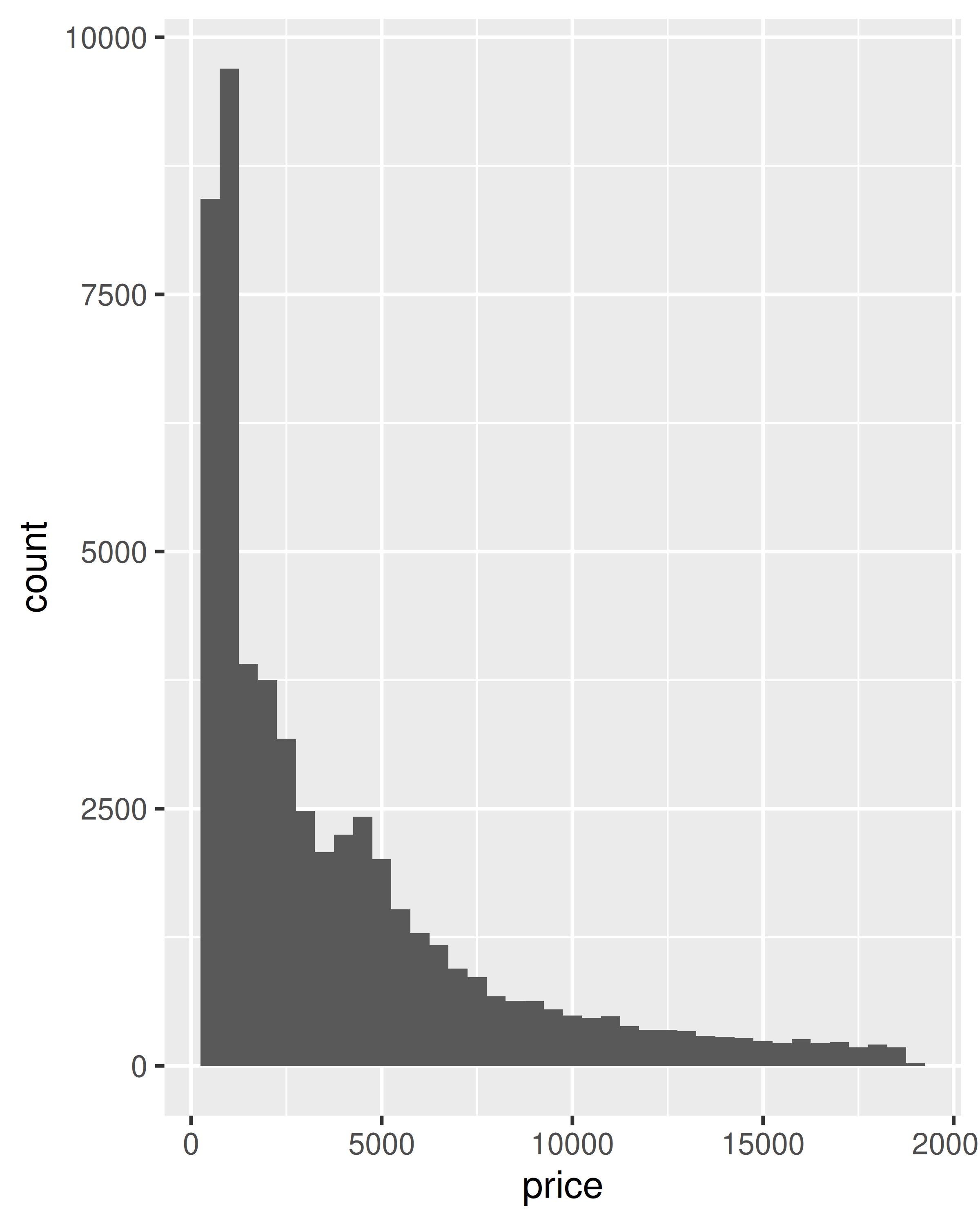
This technique is particularly useful when you want to compare the distribution of multiple groups that have very different sizes. For example, it’s hard to compare the distribution of price within cut because some groups are quite small. It’s easier to compare if we standardise each group to take up the same area:
ggplot(diamonds, aes(price, colour = cut)) +
  geom_freqpoly(binwidth = 500) +
  theme(legend.position = "none")

ggplot(diamonds, aes(price, colour = cut)) +
  geom_freqpoly(aes(y = after_stat(density)), binwidth = 500) +
  theme(legend.position = "none")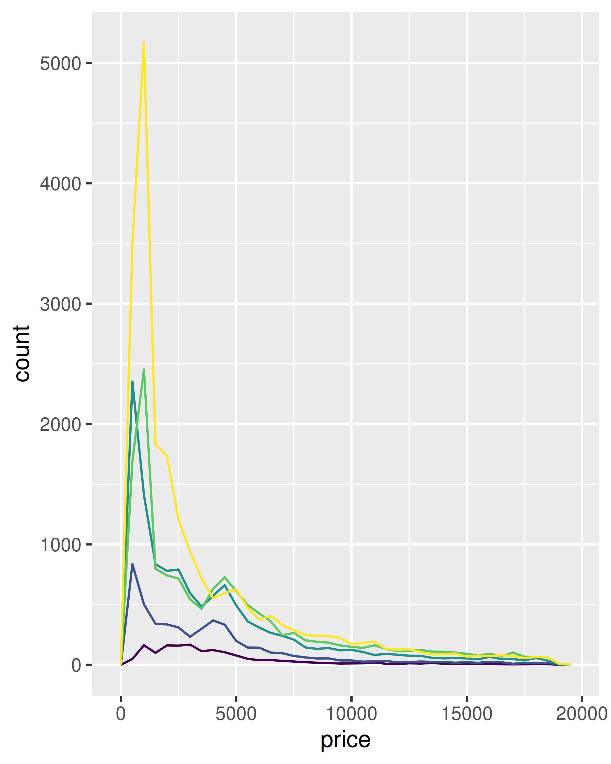
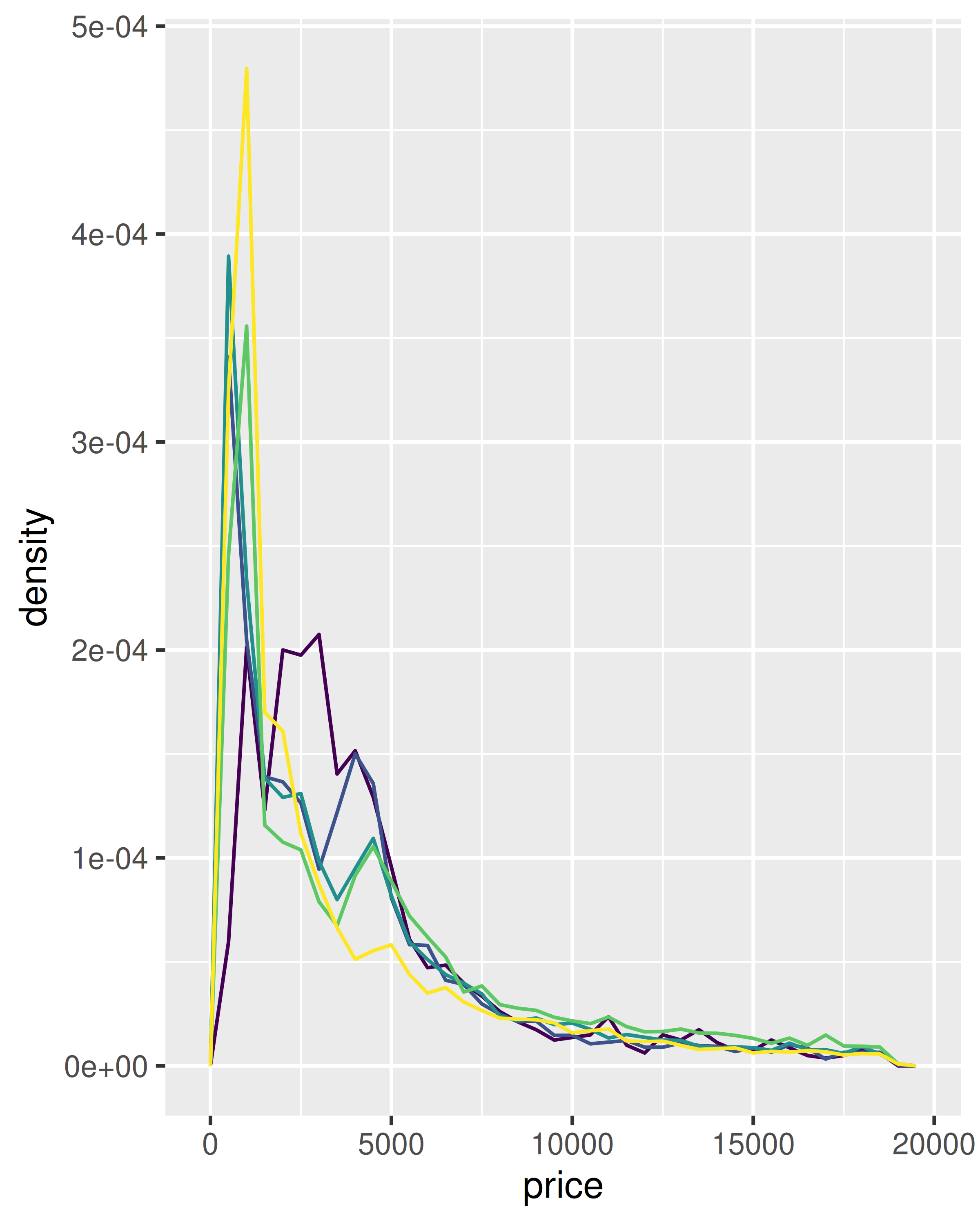
The result of this plot is rather surprising: low quality diamonds seem to be more expensive on average.
The code below creates a similar dataset to stat_smooth(). Use the appropriate geoms to mimic the default geom_smooth() display.
mod <- loess(hwy ~ displ, data = mpg)
smoothed <- data.frame(displ = seq(1.6, 7, length = 50))
pred <- predict(mod, newdata = smoothed, se = TRUE)
smoothed$hwy <- pred$fit
smoothed$hwy_lwr <- pred$fit - (1.96 * pred$se.fit)
smoothed$hwy_upr <- pred$fit + (1.96 * pred$se.fit)
What stats were used to create the following plots?
Read the help for stat_sum() then use geom_count() to create a plot that shows the proportion of cars that have each combination of drv and trans.
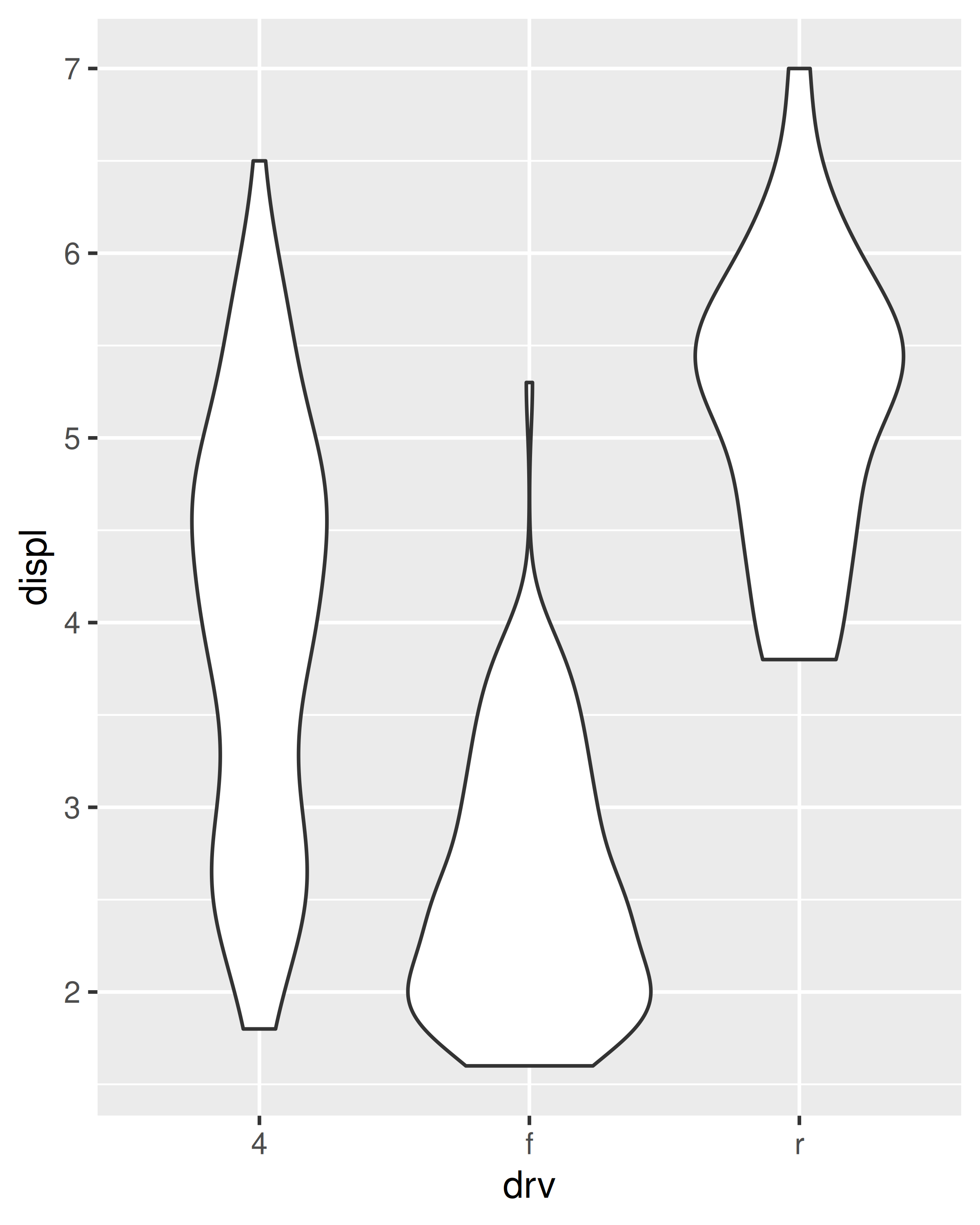
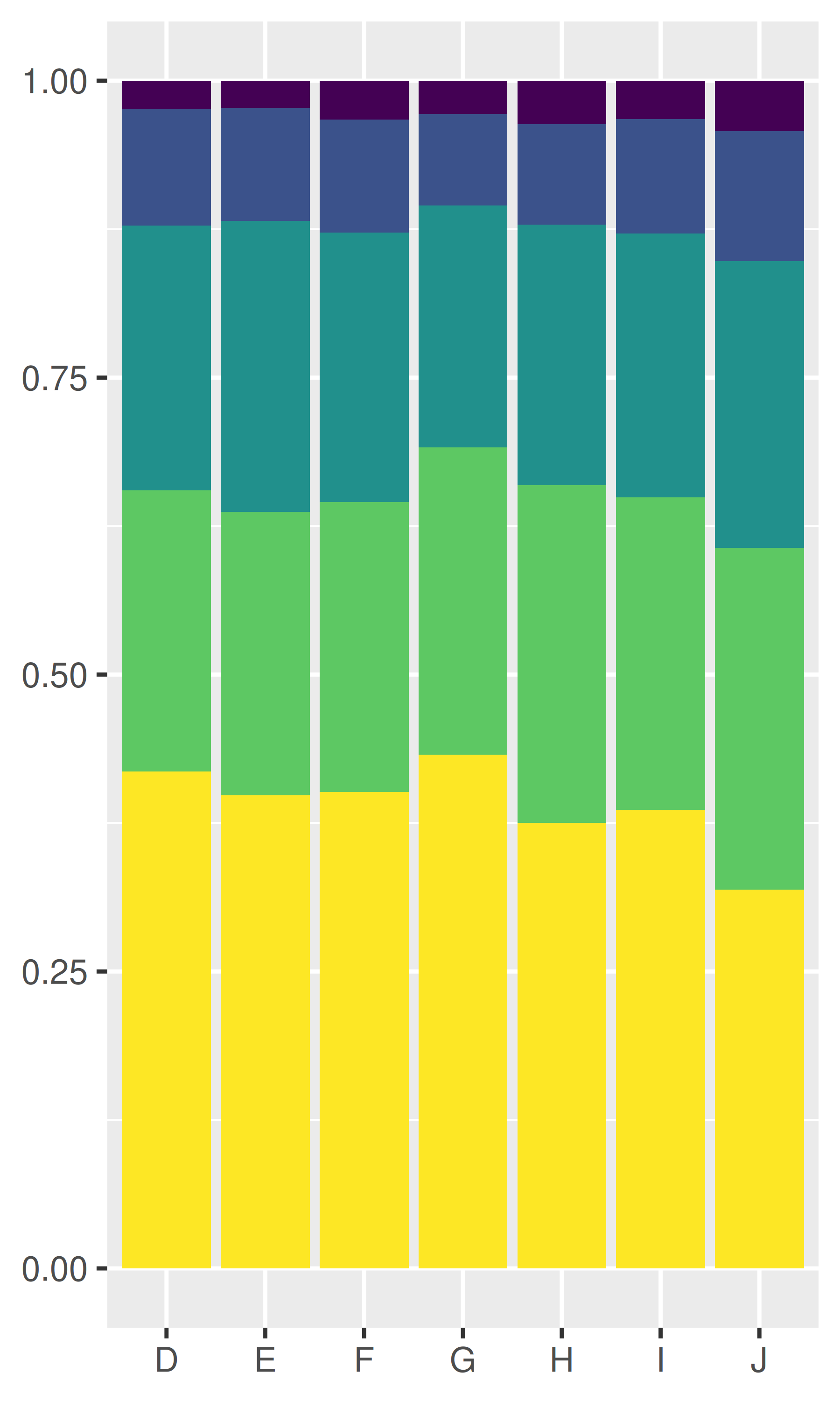
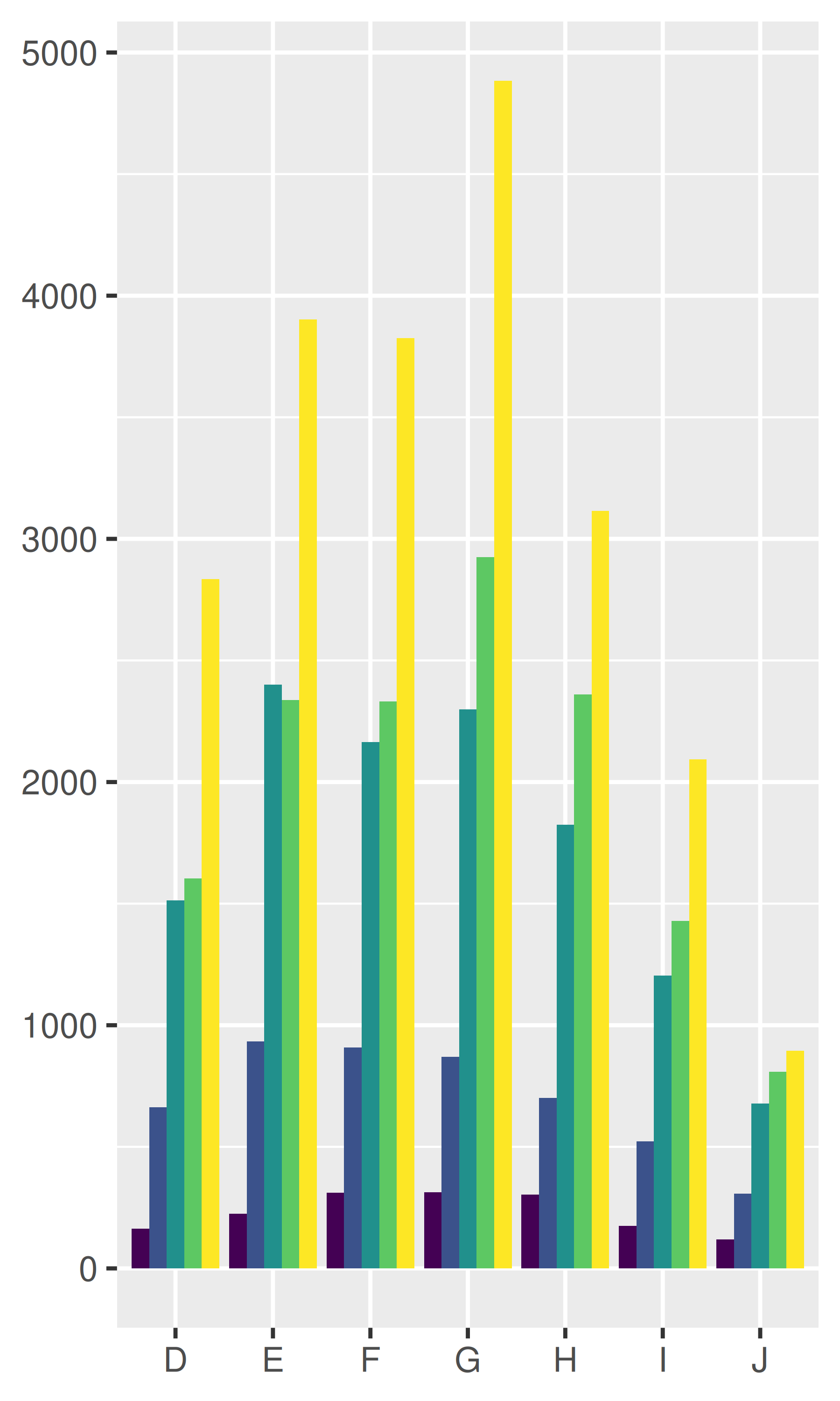
Position adjustments apply minor tweaks to the position of elements within a layer. Three adjustments apply primarily to bars:
position_stack(): stack overlapping bars (or areas) on top of each other.position_fill(): stack overlapping bars, scaling so the top is always at 1.position_dodge(): place overlapping bars (or boxplots) side-by-side.dplot <- ggplot(diamonds, aes(color, fill = cut)) +
xlab(NULL) + ylab(NULL) + theme(legend.position = "none")
# position stack is the default for bars, so `geom_bar()`
# is equivalent to `geom_bar(position = "stack")`.
dplot + geom_bar()
dplot + geom_bar(position = "fill")
dplot + geom_bar(position = "dodge")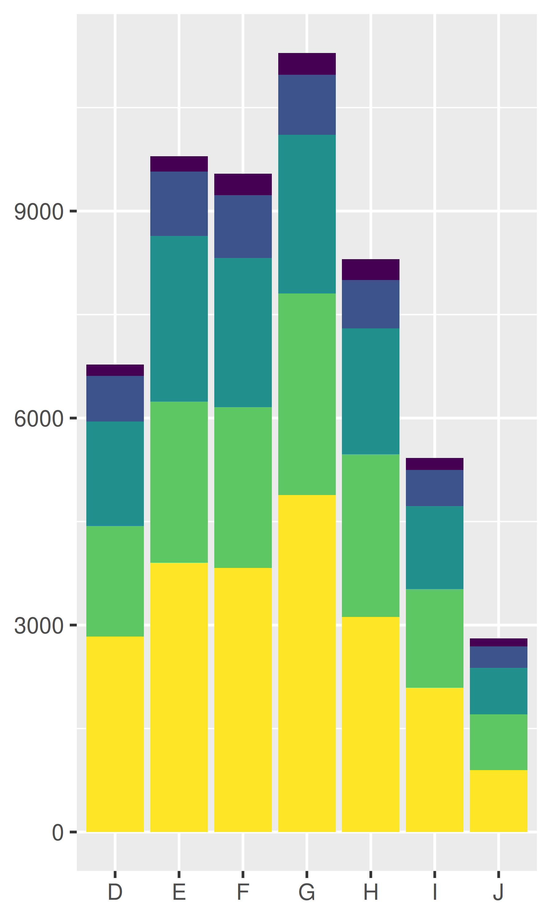
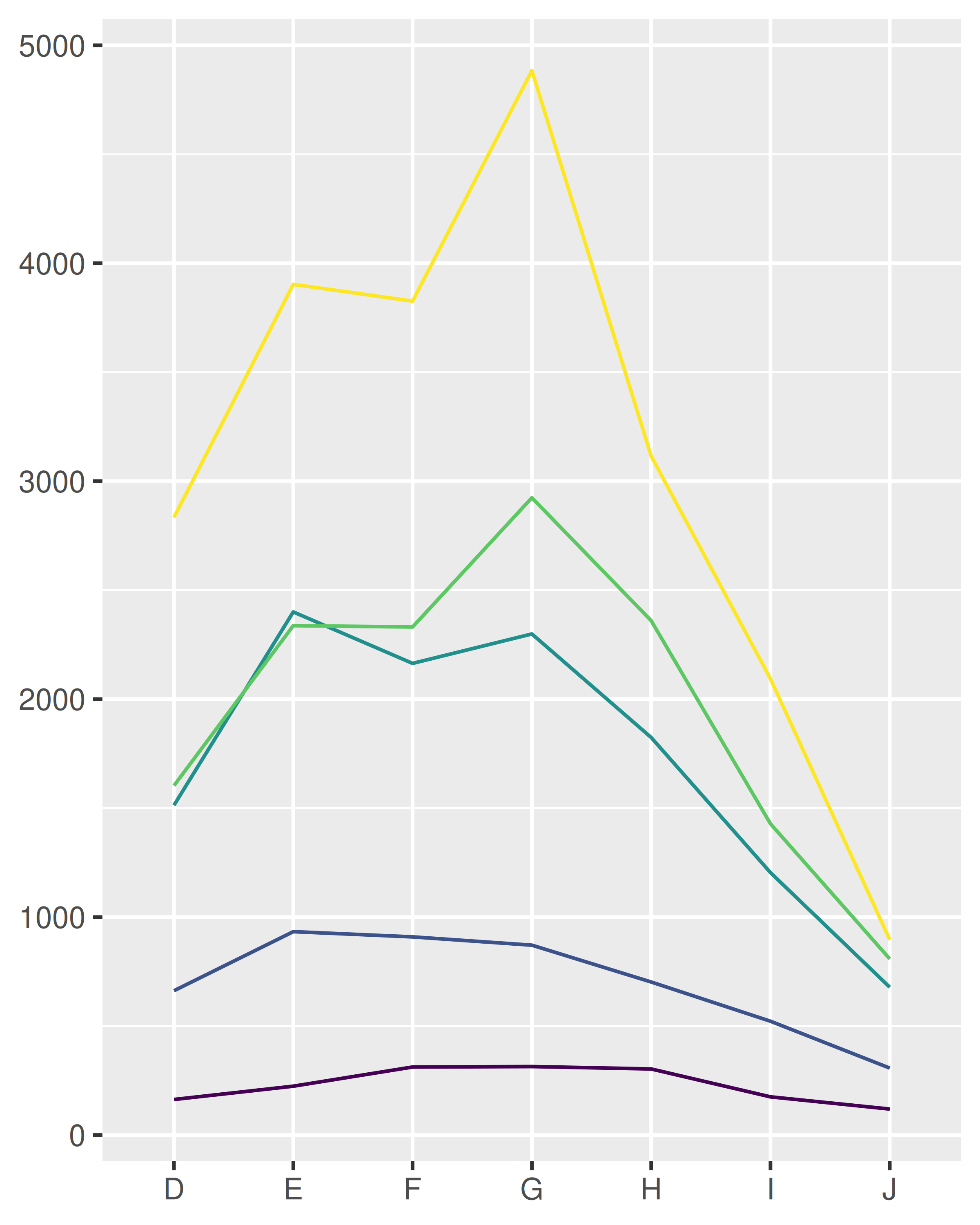
There’s also a position adjustment that does nothing: position_identity(). The identity position adjustment isn’t useful for bars, because each bar obscures the bars behind, but there are many geoms that don’t need adjusting, like lines:
dplot + geom_bar(position = "identity", alpha = 1 / 2, colour = "grey50")

ggplot(diamonds, aes(color, colour = cut)) +
  geom_line(aes(group = cut), stat = "count") +
  xlab(NULL) + ylab(NULL) +
  theme(legend.position = "none")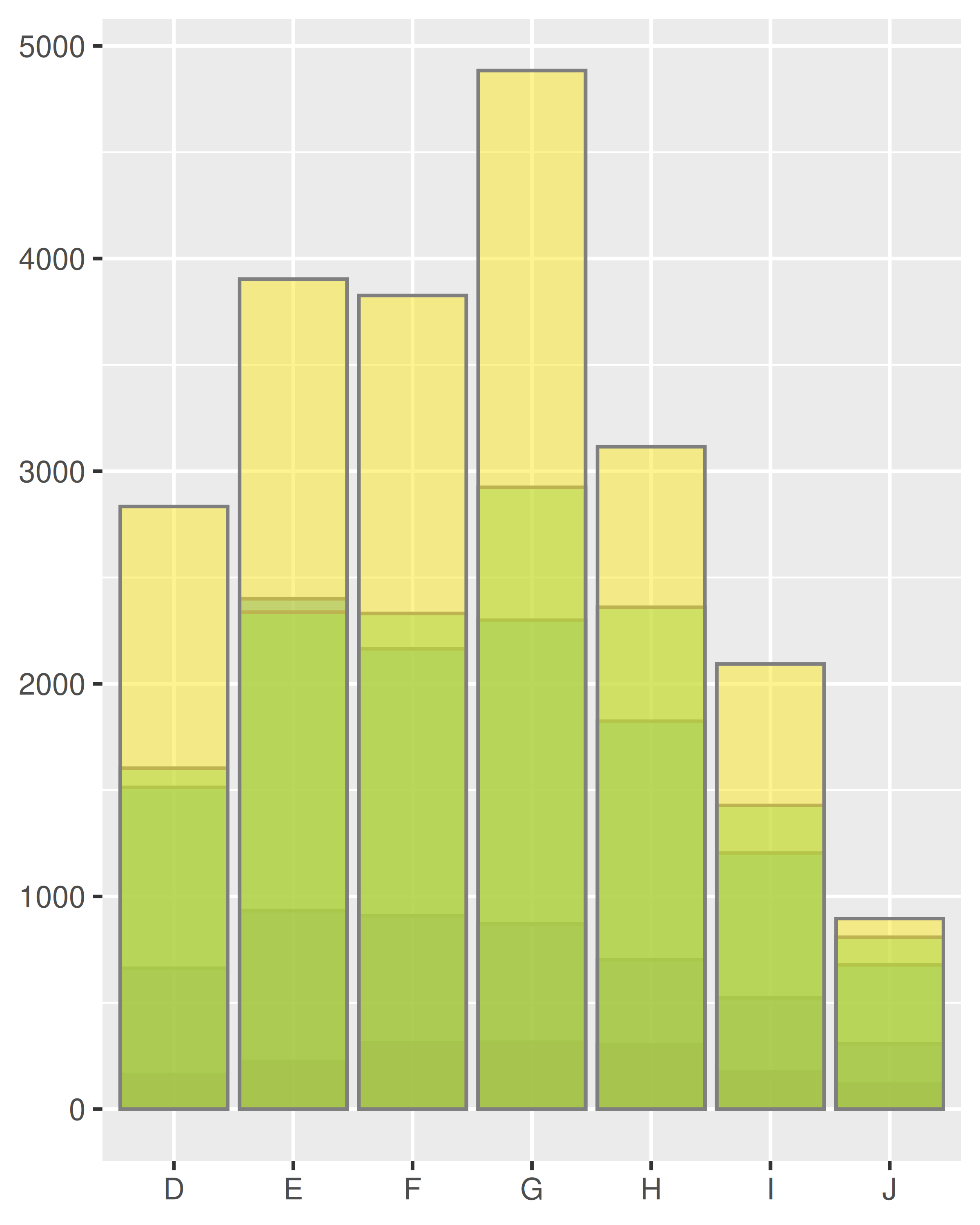
There are three position adjustments that are primarily useful for points:
position_nudge(): move points by a fixed offset.position_jitter(): add a little random noise to every position.position_jitterdodge(): dodge points within groups, then add a little random noise.
Note that the way you pass parameters to position adjustments differs to stats and geoms. Instead of including additional arguments in ..., you construct a position adjustment object, supplying additional arguments in the call:
ggplot(mpg, aes(displ, hwy)) +
  geom_point(position = "jitter")

ggplot(mpg, aes(displ, hwy)) +
  geom_point(position = position_jitter(width = 0.05, height = 0.5))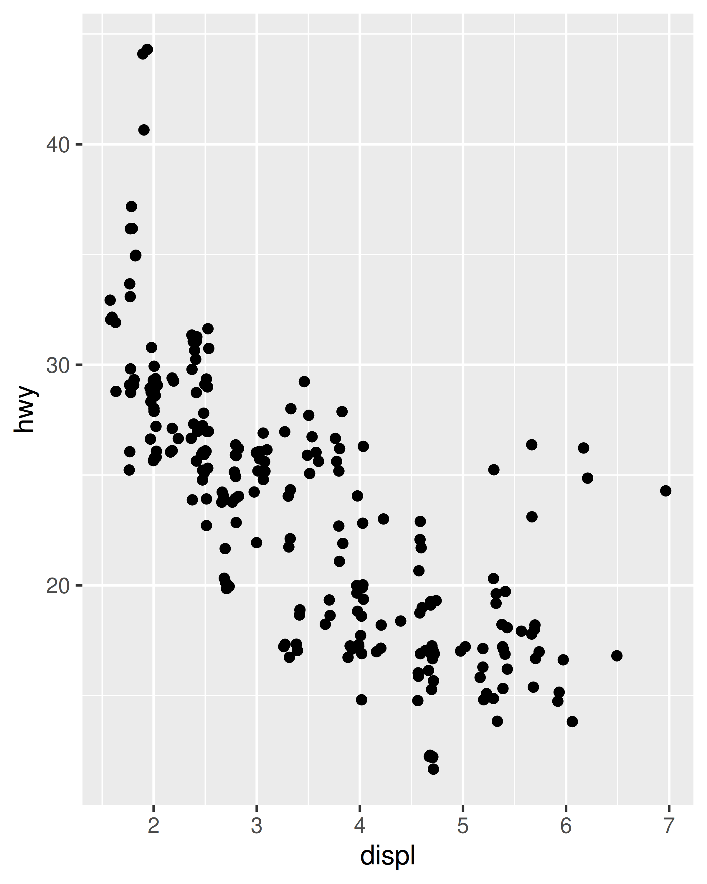
This is rather verbose, so geom_jitter() provides a convenient shortcut:
ggplot(mpg, aes(displ, hwy)) +
  geom_jitter(width = 0.05, height = 0.5)
Continuous data typically doesn’t overlap exactly, and when it does (because of high data density) minor adjustments, like jittering, are often insufficient to fix the problem. For this reason, position adjustments are generally most useful for discrete data.
When might you use position_nudge()? Read the documentation.
Many position adjustments can only be used with a few geoms. For example, you can’t stack boxplots or errors bars. Why not? What properties must a geom possess in order to be stackable? What properties must it possess to be dodgeable?
Why might you use geom_jitter() instead of geom_count()? What are the advantages and disadvantages of each technique?
When might you use a stacked area plot? What are the advantages and disadvantages compared to a line plot?