planets
#> name type position radius orbit
#> 1 Mercury Inner 1 2440 5.79e+07
#> 2 Venus Inner 2 6052 1.08e+08
#> 3 Earth Inner 3 6378 1.50e+08
#> 4 Mars Inner 4 3390 2.28e+08
#> 5 Jupiter Outer 5 71400 7.78e+08
#> 6 Saturn Outer 6 60330 1.43e+09
#> 7 Uranus Outer 7 25559 2.87e+09
#> 8 Neptune Outer 8 24764 4.50e+0912 Other aesthetics
You are reading the work-in-progress third edition of the ggplot2 book. This chapter should be readable but is currently undergoing final polishing.
In addition to position and colour, there are several other aesthetics that ggplot2 can use to represent data. In this chapter we’ll look at size scales (Section 12.1), shape scales (Section 12.2), line width scales (Section 12.3), and line type scales (Section 12.4), which use visual features other than location and colour to represent data values. Additionally, we’ll talk about manual scales (Section 12.5) and identity scales (Section 12.6): these don’t necessarily use different visual features, but they construct data mappings in an unusual way.
12.1 Size
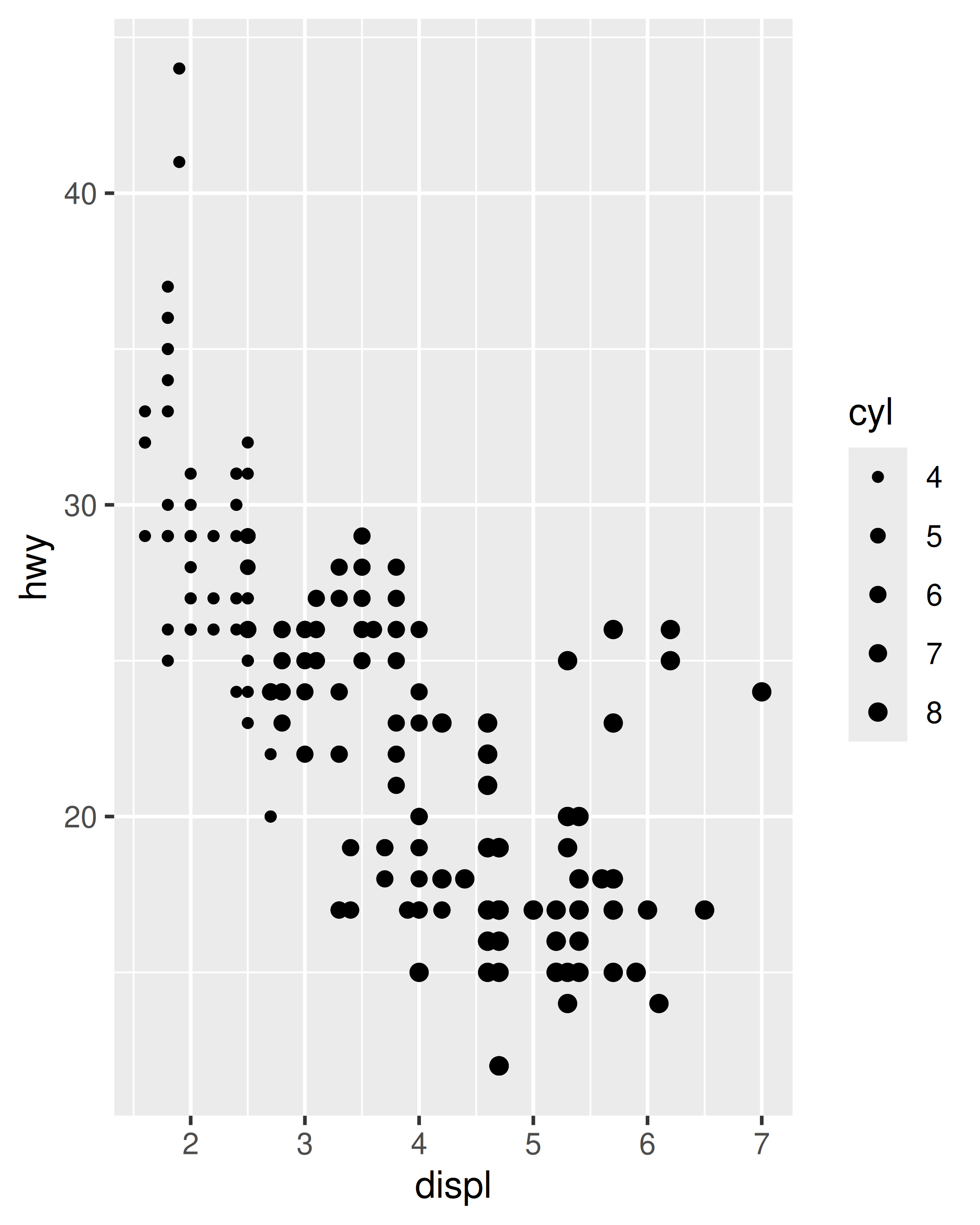
The size aesthetic is typically used to scale points and text. The default scale for size aesthetics is scale_size() in which a linear increase in the variable is mapped onto a linear increase in the area (not the radius) of the geom. Scaling as a function of area is a sensible default as human perception of size is more closely mimicked by area scaling than by radius scaling. By default the smallest value in the data (more precisely in the scale limits) is mapped to a size of 1 and the largest is mapped to a size of 6. The range argument allows you to scale the size of the geoms:
base <- ggplot(mpg, aes(displ, hwy, size = cyl)) +
  geom_point()

base
base + scale_size(range = c(1, 2))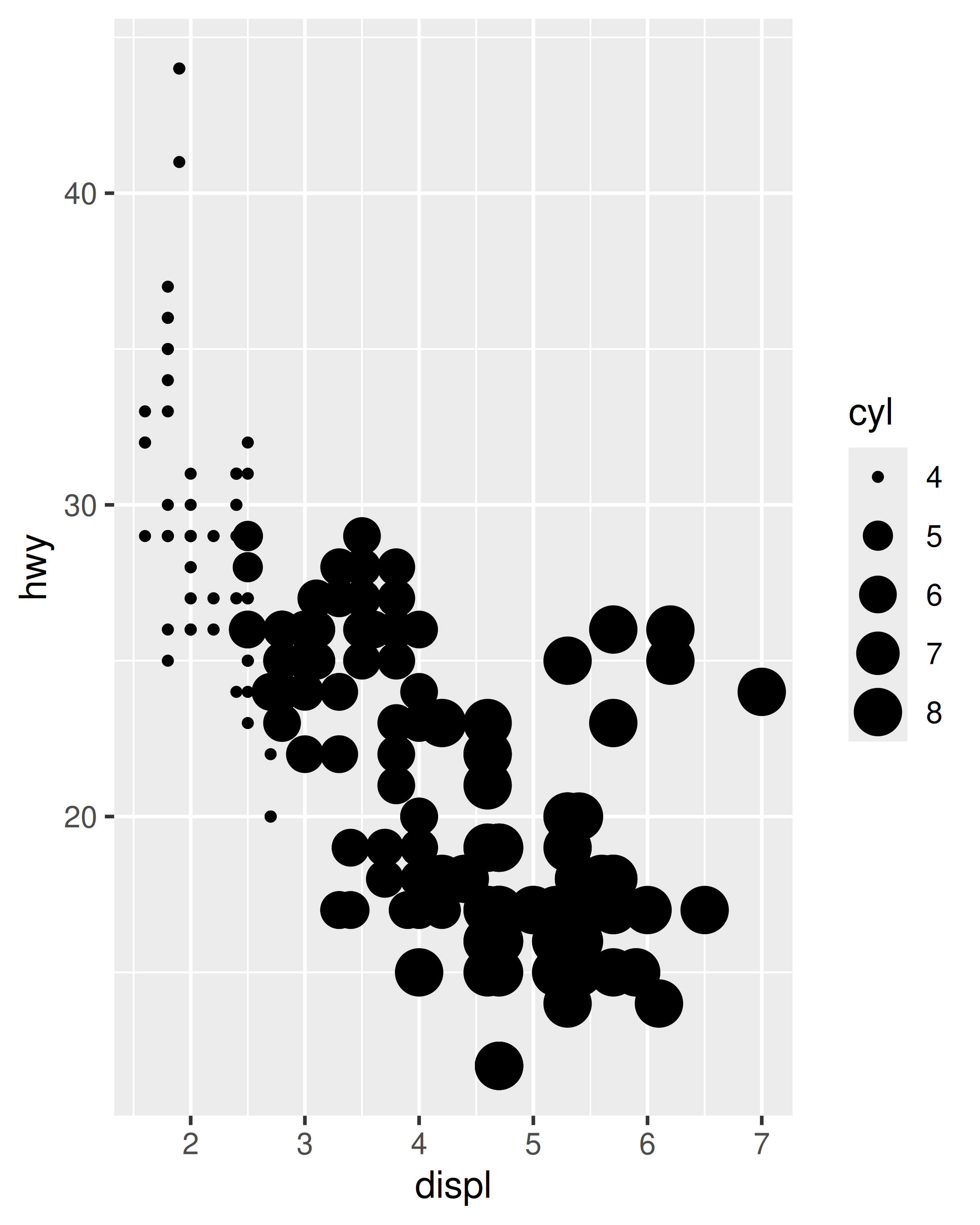
There are several size scales worth noting briefly:
scale_size_area()andscale_size_binned_area()are versions ofscale_size()andscale_size_binned()that ensure that a value of 0 maps to an area of 0.scale_radius()maps the data value to the radius rather than to the area (Section 12.1.1).scale_size_binned()is a size scale that behaves likescale_size()but maps continuous values onto discrete size categories, analogous to the binned position and colour scales discussed in Section 10.4 and Section 11.4 respectively. Legends associated with this scale are discussed in Section 12.1.2.scale_size_date()andscale_size_datetime()are designed to handle date data, analogous to the date scales discussed in Section 10.2.
12.1.1 Radius size scales
There are situations where area scaling is undesirable, and for such situations the scale_radius() function is provided. To illustrate when scale_radius() is appropriate consider a data set containing astronomical data that includes the radius of different planets:
In this instance a plot that uses the size aesthetic to represent the radius of the planets should use scale_radius() rather than the default scale_size(). It is also important in this case to set the scale limits so that a planet with radius 0 would be drawn with a disc with radius 0.
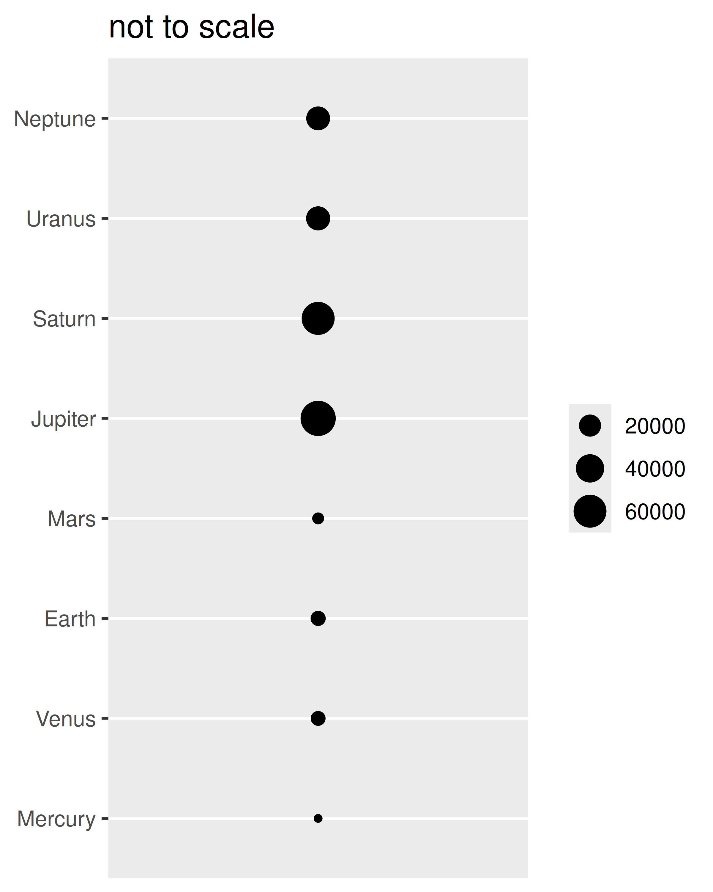
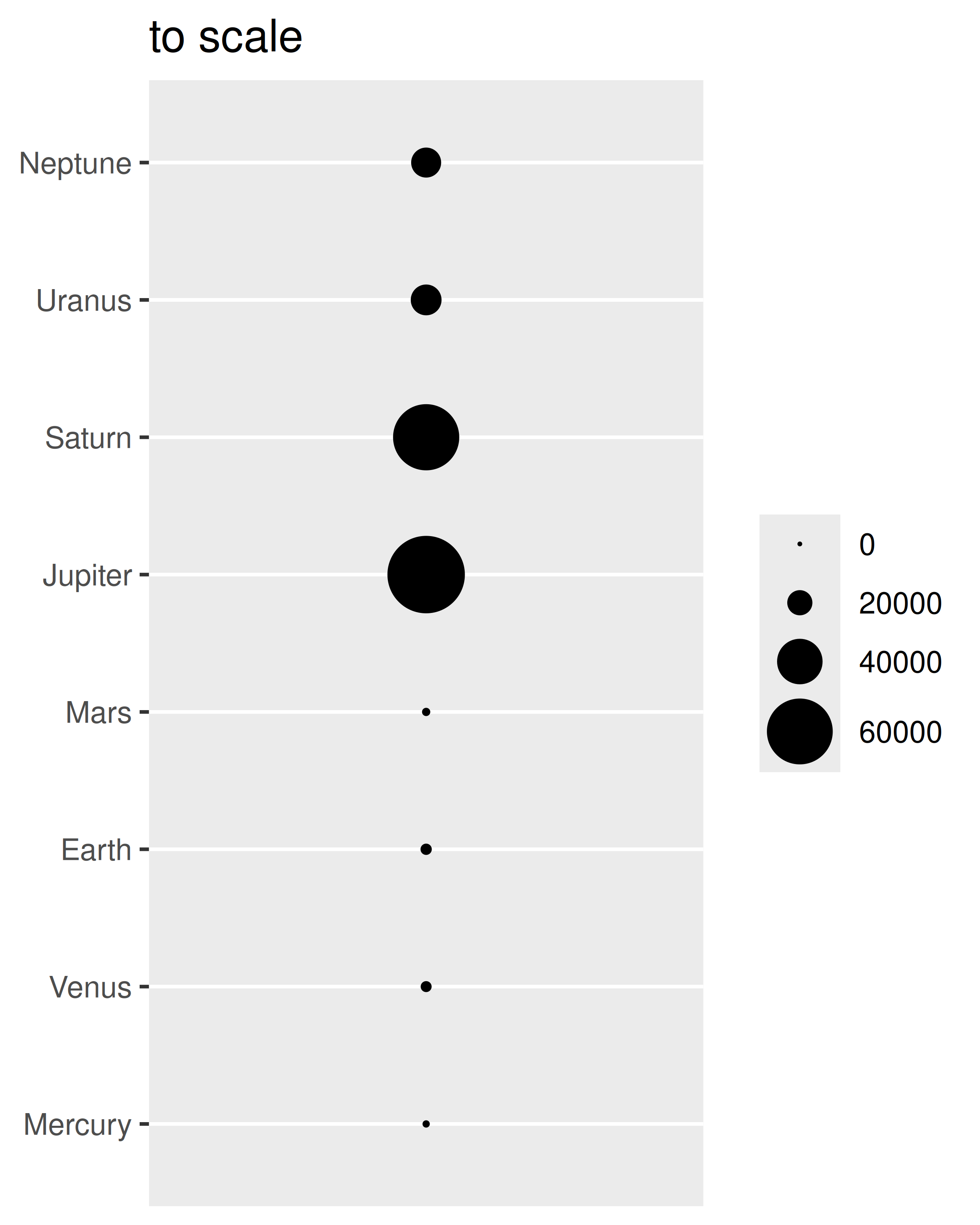
On the left it is difficult to distinguish Jupiter from Saturn, despite the fact that the difference between the two should be double the size of Earth; compare this to the plot on the right where the radius of Jupiter is visibly larger.
12.1.2 Binned size scales
Binned size scales work similarly to binned scales for colour and position aesthetics (Section 11.4 and Section 10.4). One difference is how legends are displayed. The default legend for a binned size scale, and all binned scales except position and colour aesthetics, is governed by guide_bins(). For instance, in the mpg data we could use scale_size_binned() to create a binned version of the continuous variable hwy:
base <- ggplot(mpg, aes(displ, manufacturer, size = hwy)) +
  geom_point(alpha = .2) +
  scale_size_binned()

base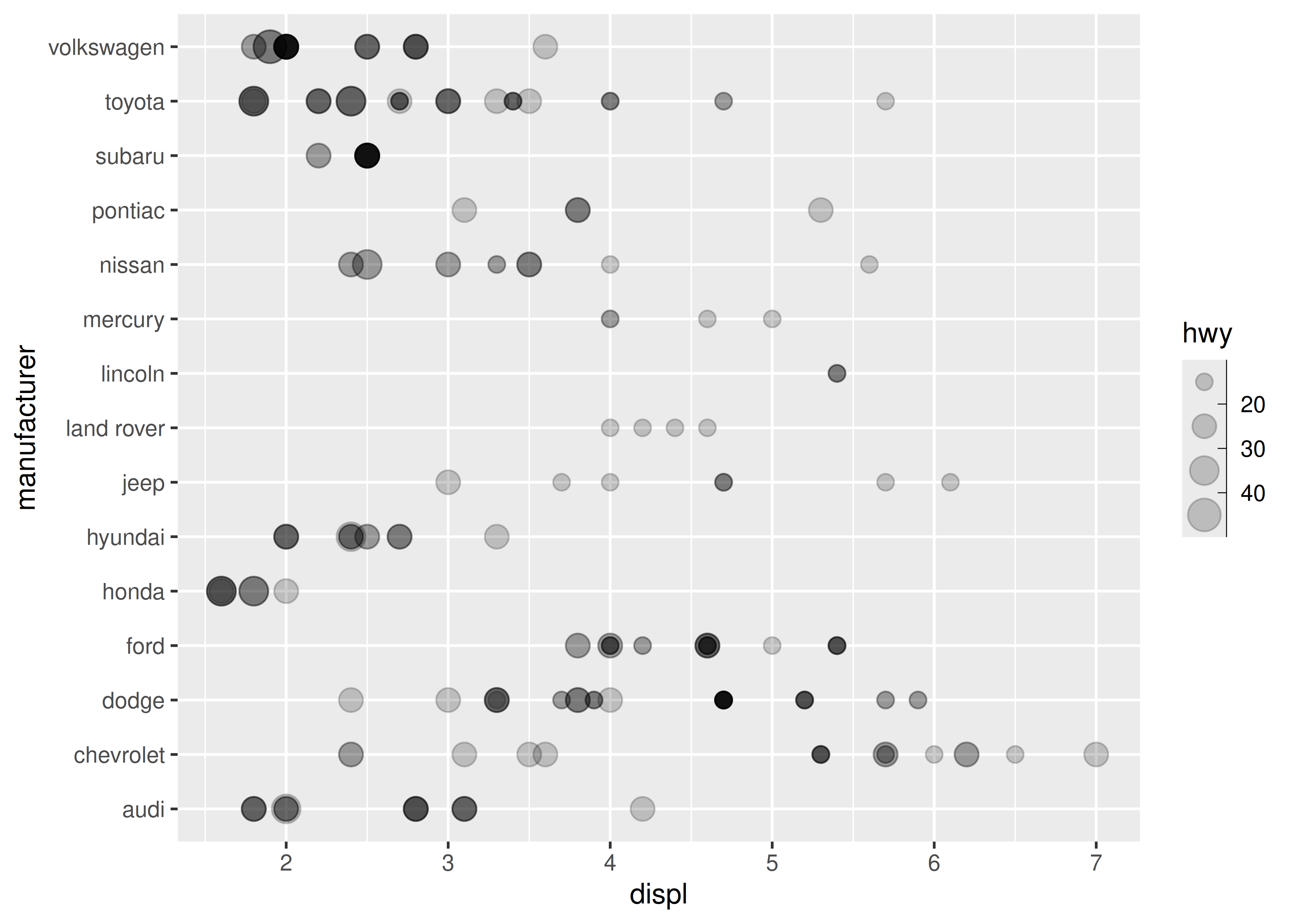
Unlike guide_legend(), the guide created for a binned scale by guide_bins() does not organise the individual keys into a table. Instead they are arranged in a column (or row) along a single vertical (or horizontal) axis, which by default is displayed with its own axis. The important arguments to guide_bins() are listed below:
-
axisindicates whether the axis should be drawn (default isTRUE)base + guides(size = guide_bins(axis = FALSE)) #> Warning: Ignoring unknown argument to `guide_bins()`: `axis`.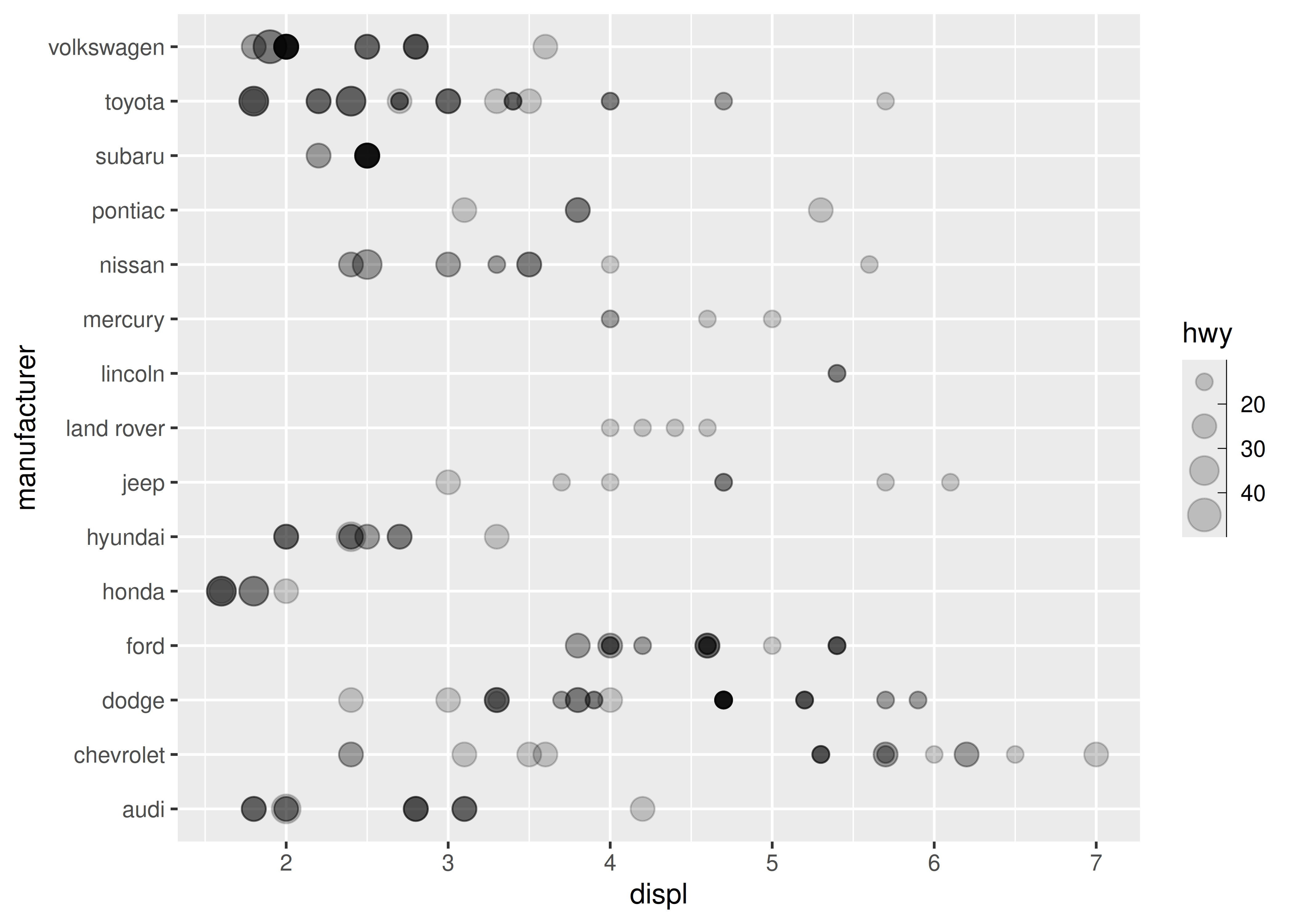
-
directionis a character string specifying the direction of the guide, either"vertical"(the default) or"horizontal"base + guides(size = guide_bins(direction = "horizontal"))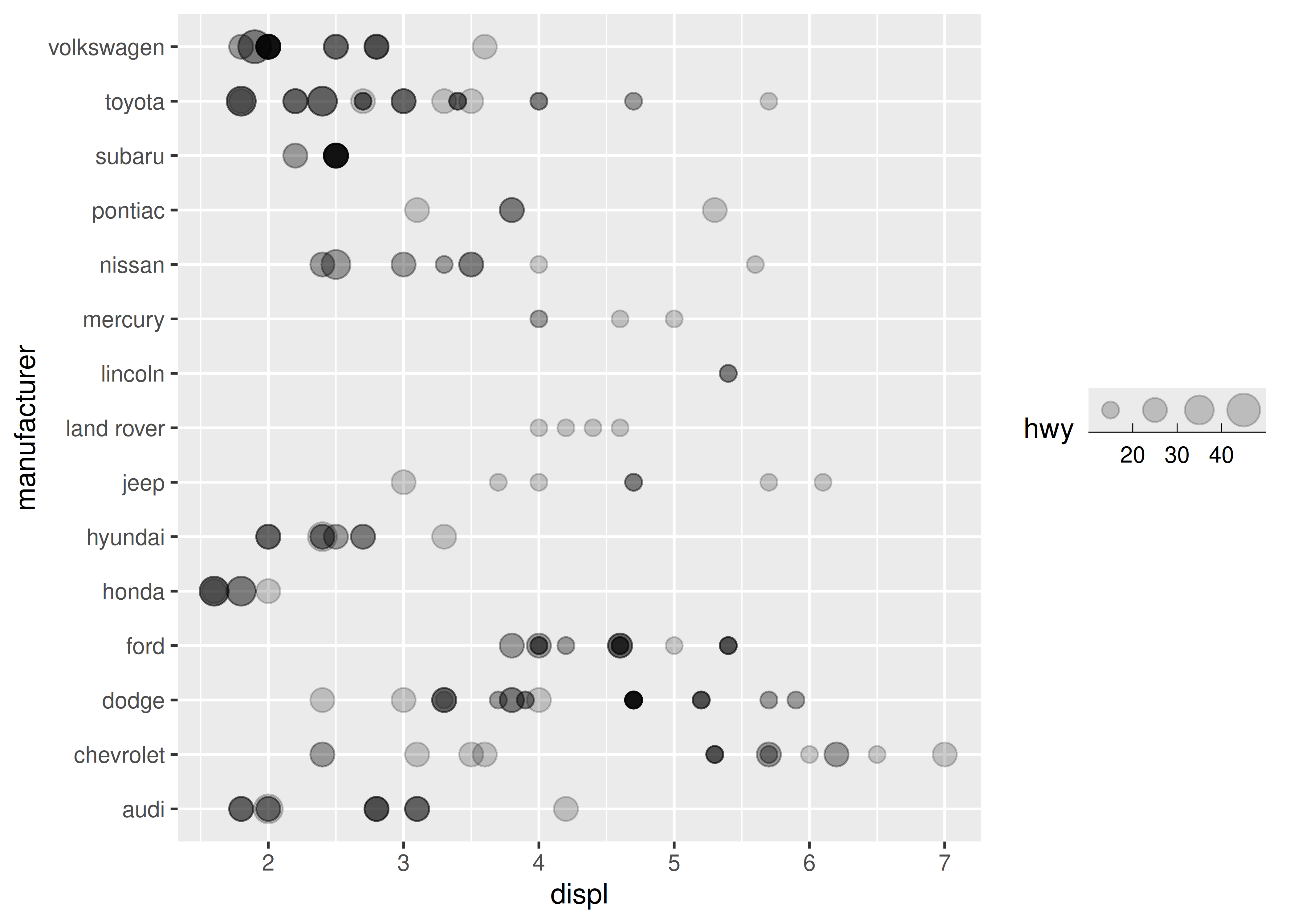
-
show.limitsspecifies whether tick marks are shown at the ends of the guide axis (default is FALSE)base + guides(size = guide_bins(show.limits = TRUE))
-
axis.colour,axis.linewidthandaxis.arroware used to control the guide axis that is displayed alongside the legend keysbase + guides( size = guide_bins( axis.colour = "red", axis.arrow = arrow( length = unit(.1, "inches"), ends = "first", type = "closed" ) ) ) #> Warning: Ignoring unknown arguments to `guide_bins()`: `axis.colour` and #> `axis.arrow`.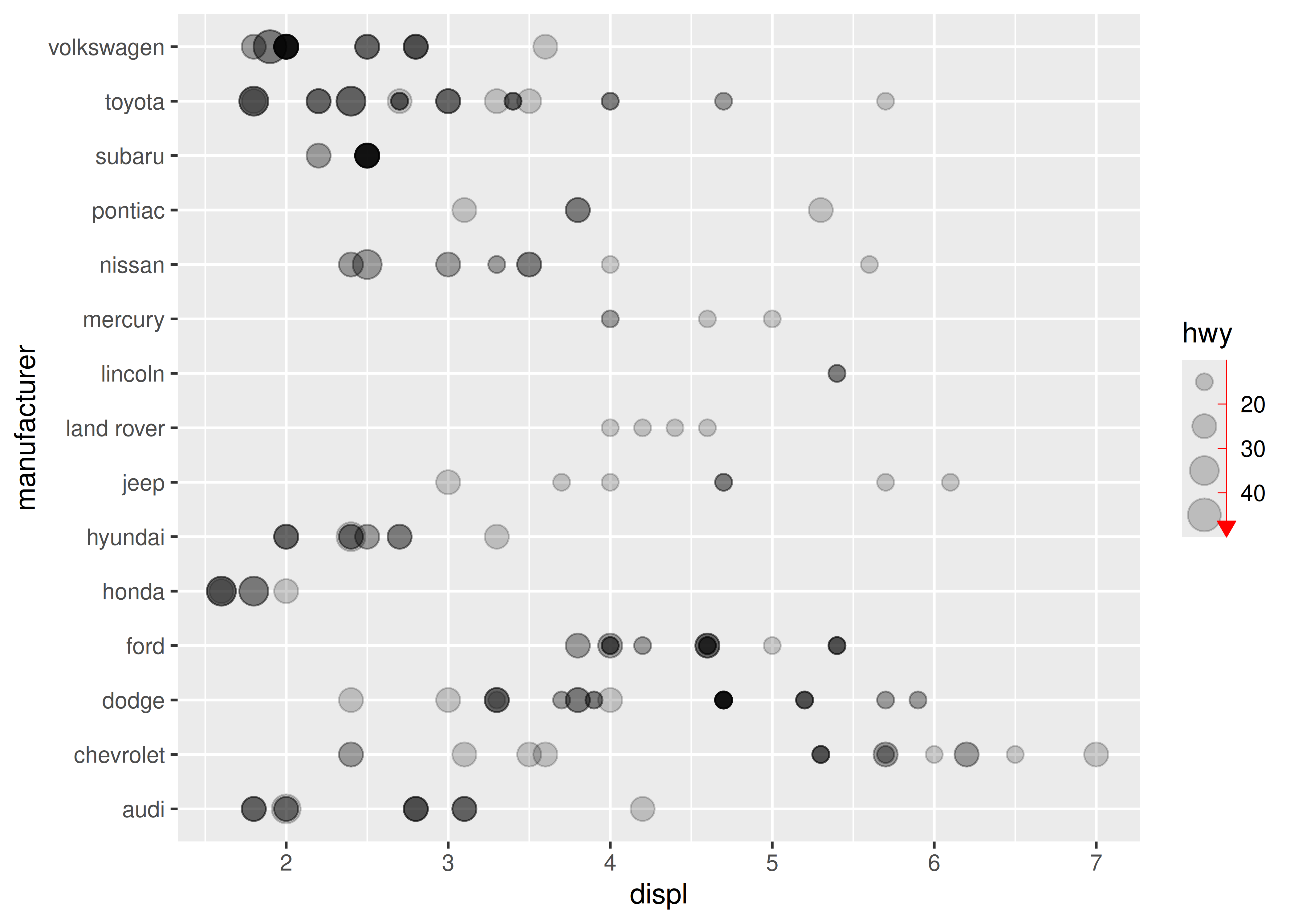
keywidth,keyheight,reverseandoverride.aeshave the same behaviour forguide_bins()as they do forguide_legend()(see Section 11.3.6)
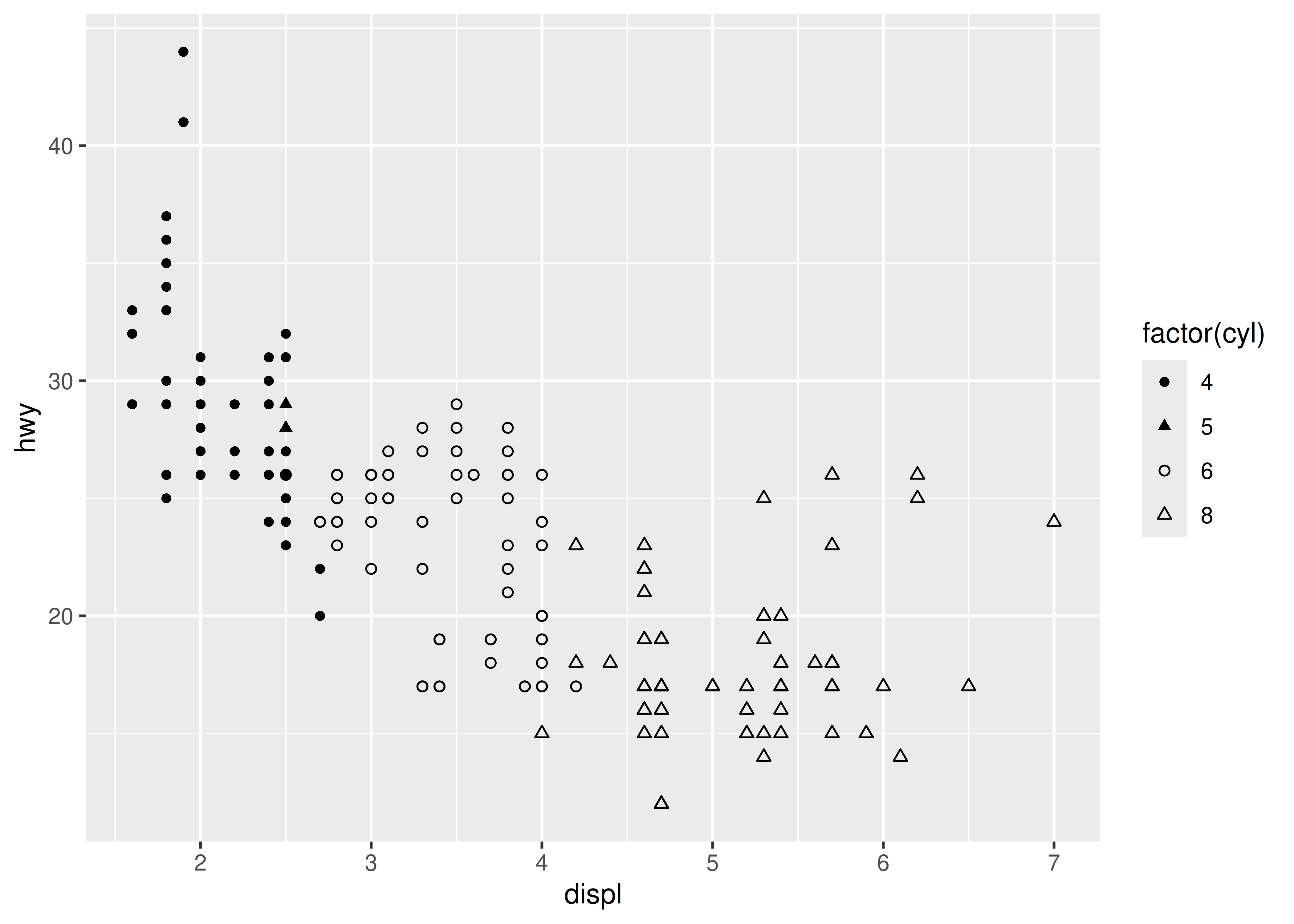
12.2 Shape
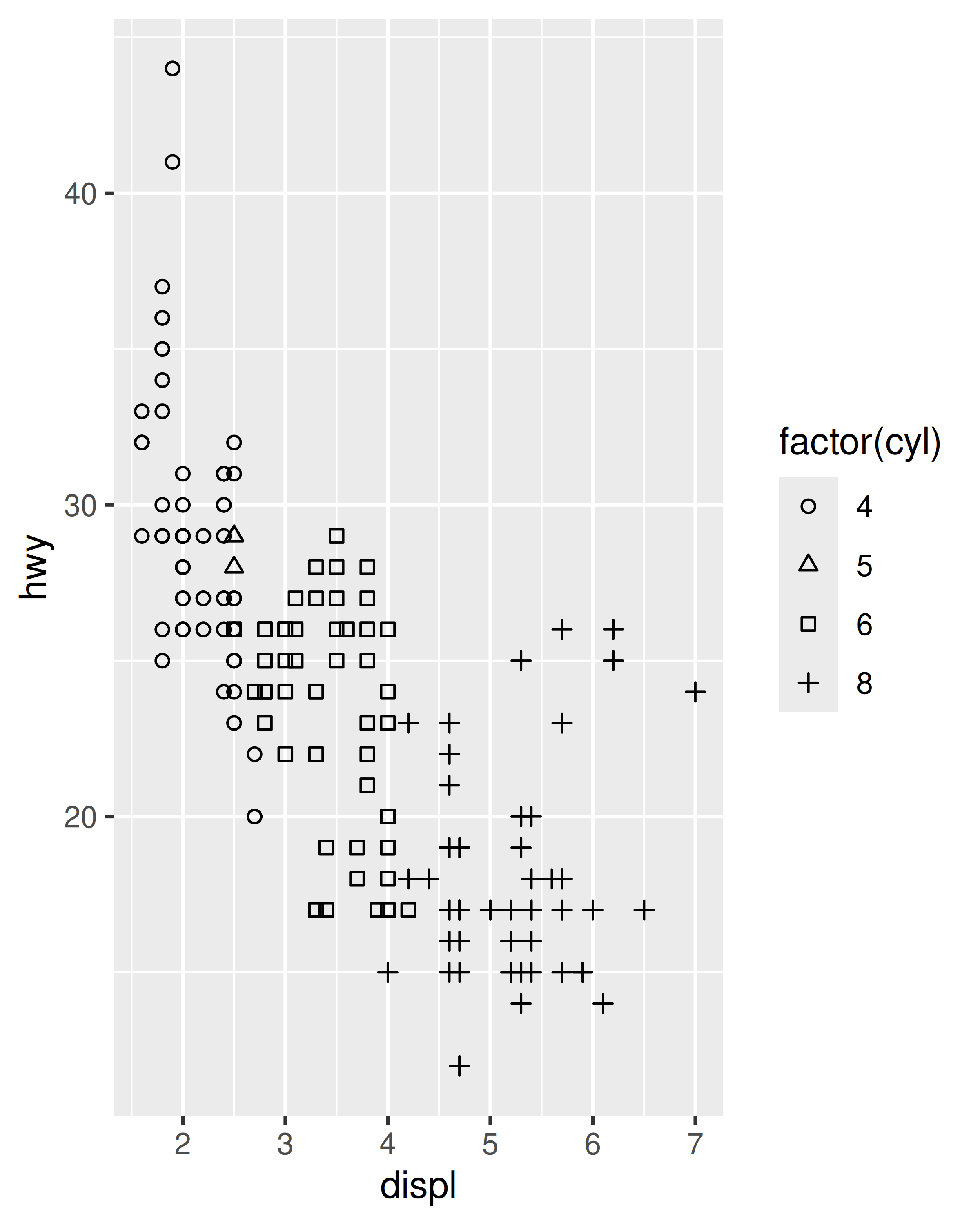
Values can be mapped to the shape aesthetic. The typical use for this is when you have a small number of discrete categories: if the data variable contains more than 6 values it becomes difficult to distinguish between shapes, and will produce a warning. The default scale_shape() function contains a single argument: set solid = TRUE (the default) to use a “palette” consisting of three solid shapes and three hollow shapes, or set solid = FALSE to use six hollow shapes:
base <- ggplot(mpg, aes(displ, hwy, shape = factor(cyl))) +
  geom_point()

base
base + scale_shape(solid = FALSE)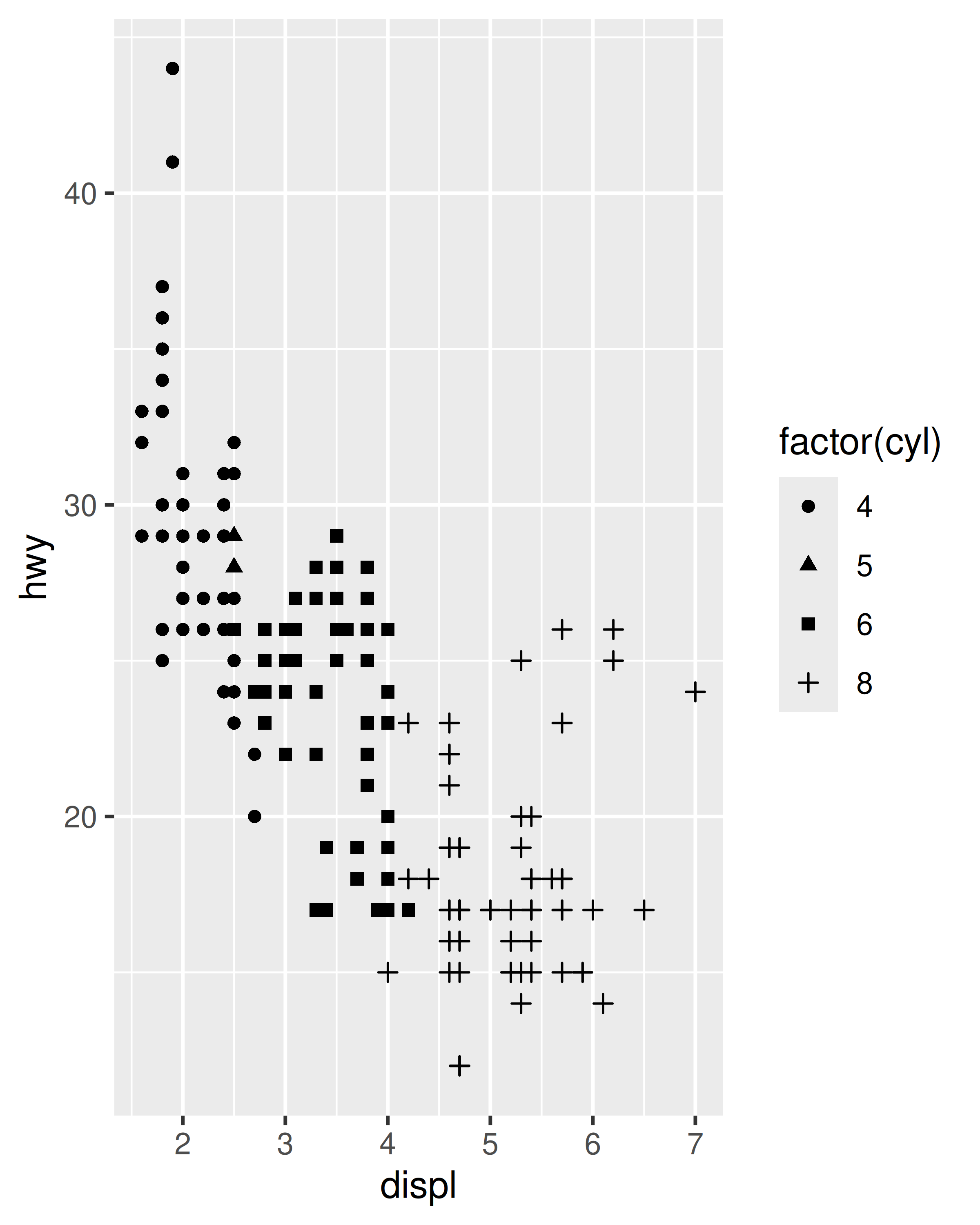
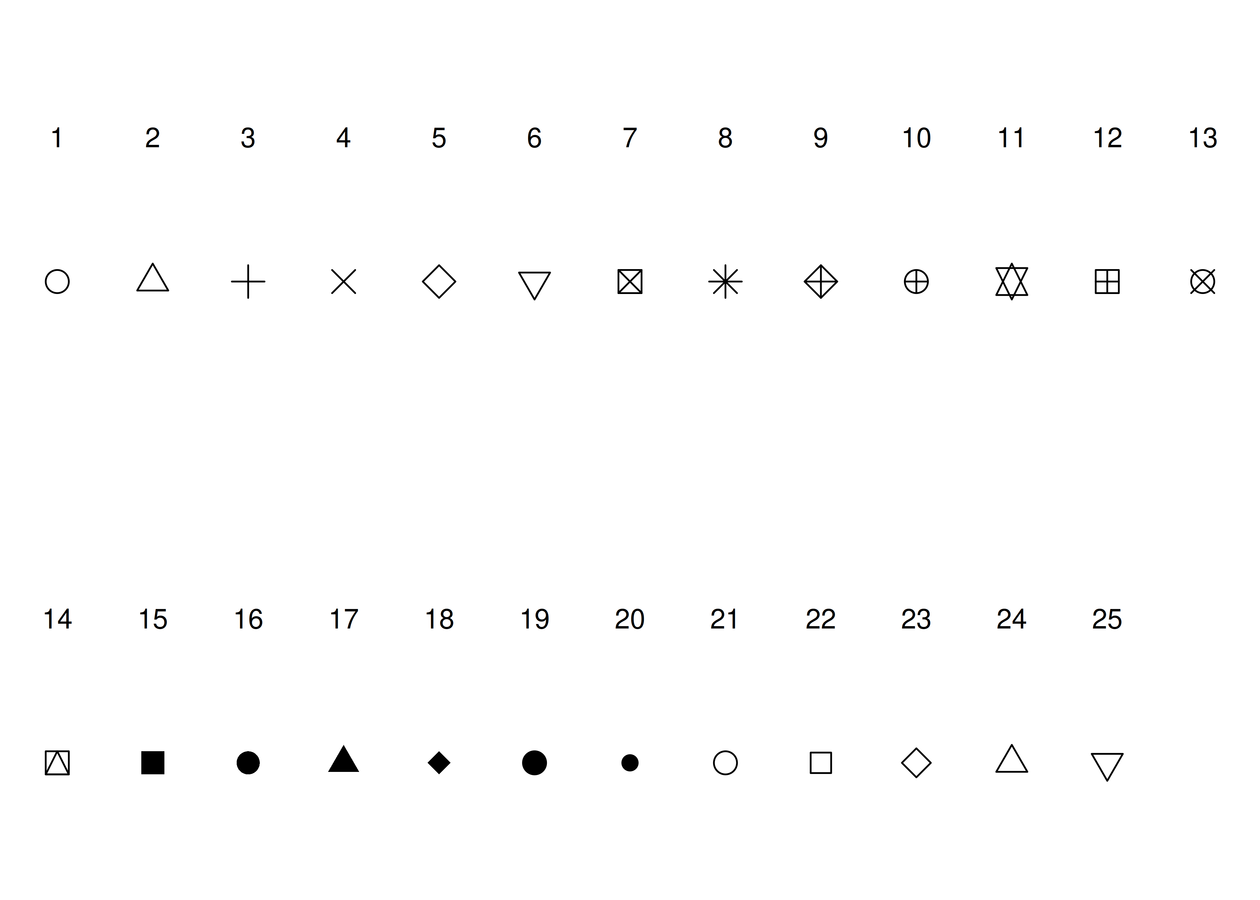
Although any one plot is unlikely to be readable with more than a 6 distinct markers, there are 25 possible shapes to choose from, each associated with an integer value:
You can specify the marker types for each data value manually using scale_shape_manual():
base +
  scale_shape_manual(
    values = c("4" = 16, "5" = 17, "6" = 1, "8" = 2)
  )
For more information about manual scales see Section 12.5.
12.3 Line width
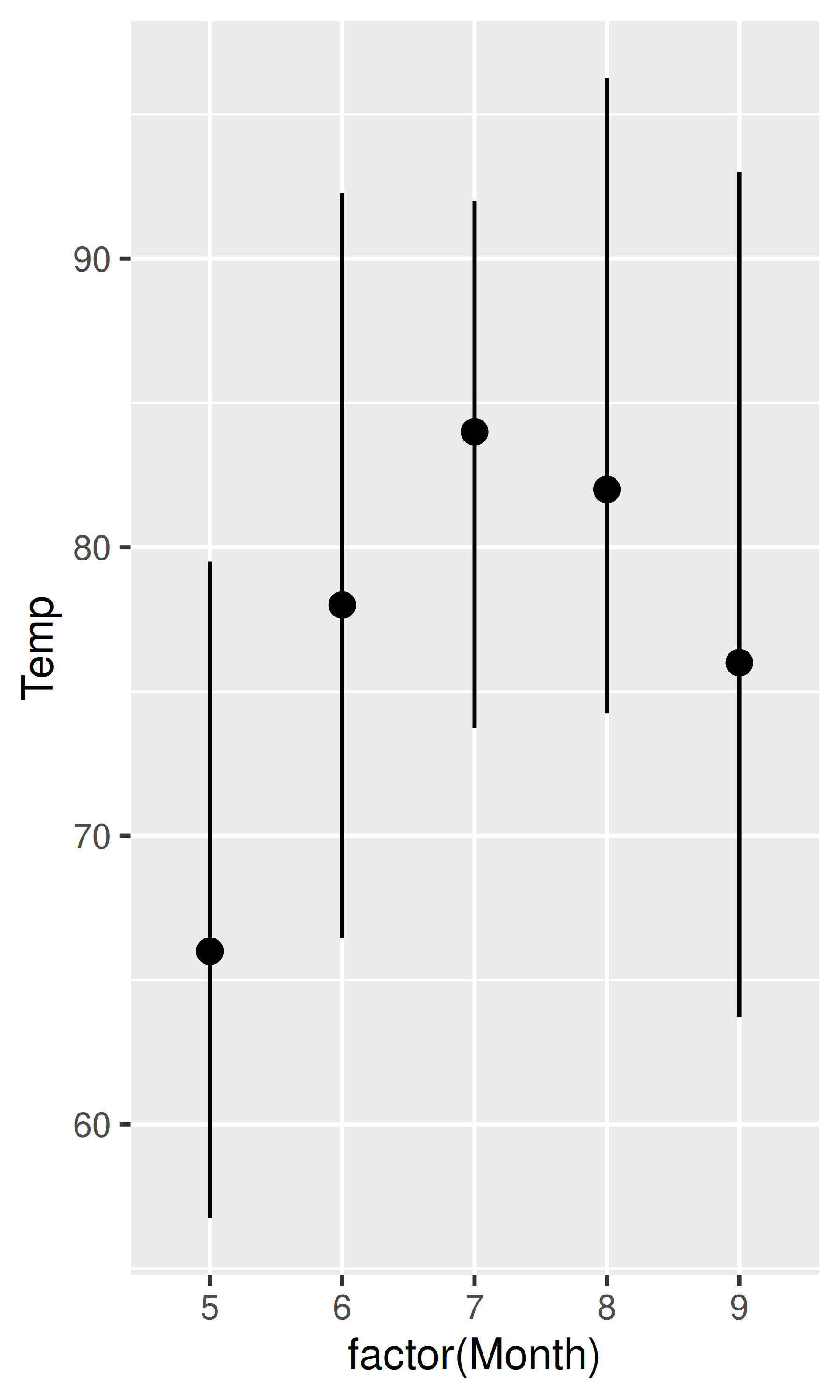
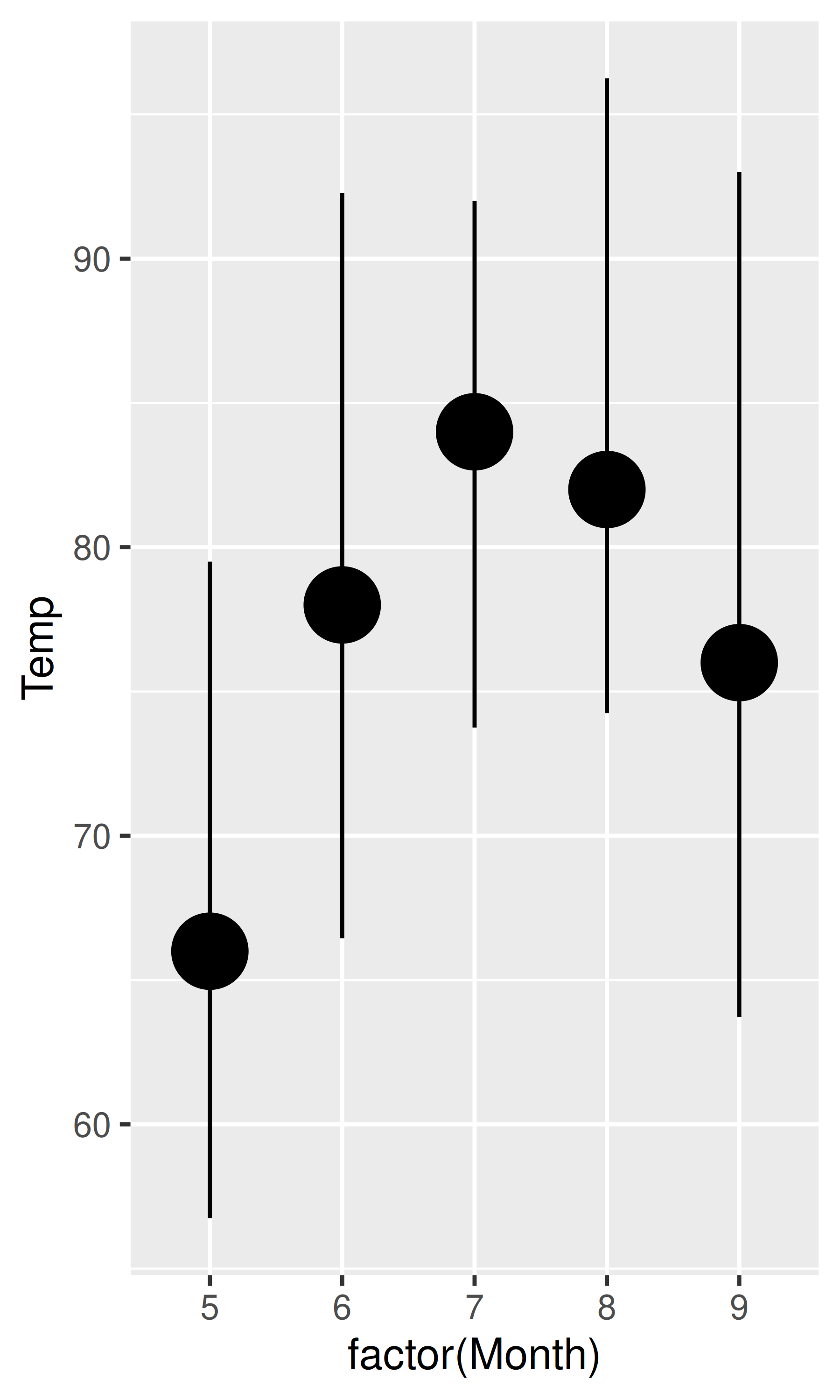
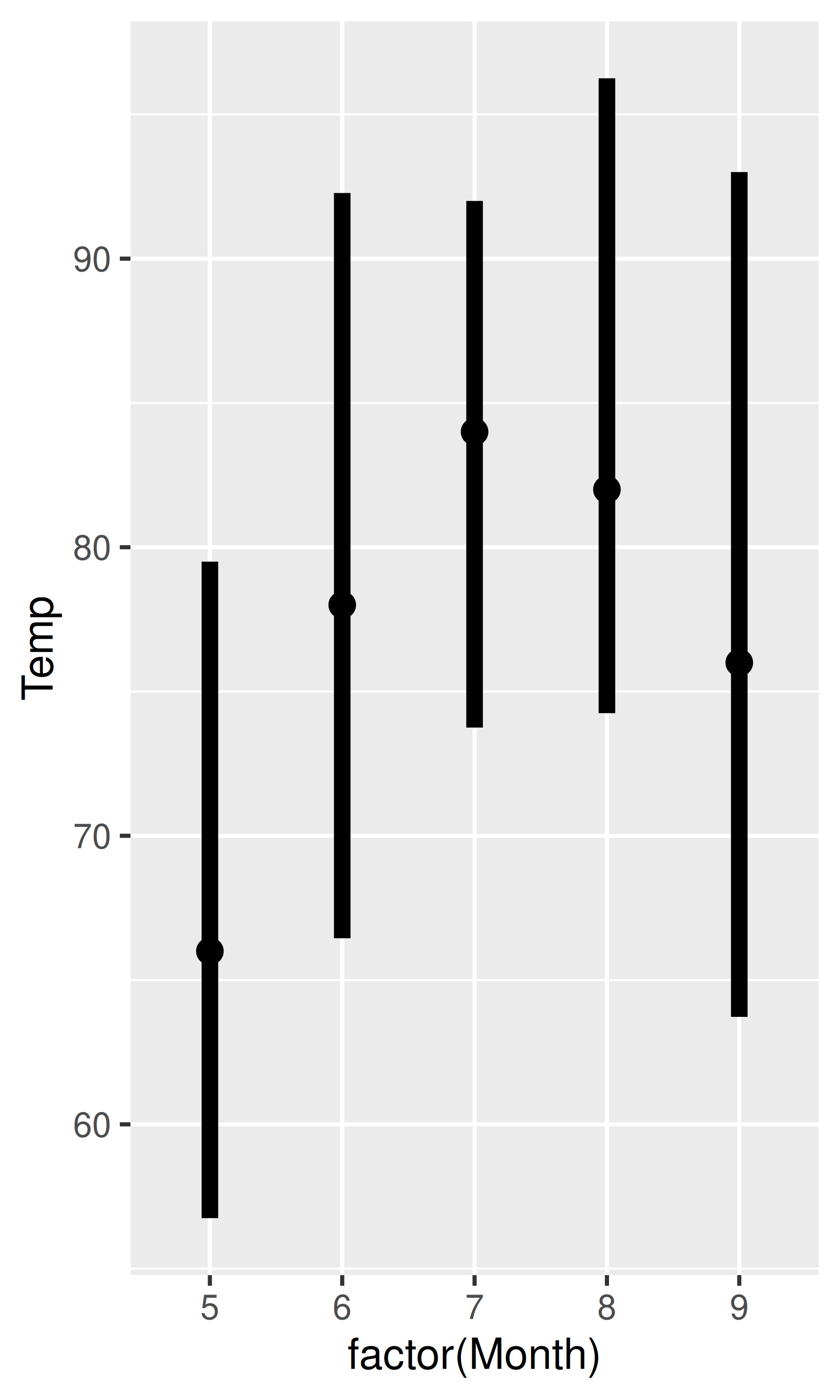
The linewidth aesthetic, introduced in ggplot2 3.4.0, is used to control the width of lines. In earlier versions of ggplot2 the size aesthetic was used for this purpose, which caused some difficulty for complex geoms such as geom_pointrange() that contain both points and lines. For these geoms it’s often important to be able to separately control the size of the points and the width of the lines. This is illustrated in the plots below. In the leftmost plot both the size and linewidth aesthetics are set at their default values. The middle plot increases the size of the points while leaving the linewidth unchanged, whereas the plot on the right increases the linewidth while leaving the point size unchanged.
base <- ggplot(airquality, aes(x = factor(Month), y = Temp))

base + geom_pointrange(stat = "summary", fun.data = "median_hilow")
base +
  geom_pointrange(
    stat = "summary",
    fun.data = "median_hilow",
    size = 2
  )
base +
  geom_pointrange(
    stat = "summary",
    fun.data = "median_hilow",
    linewidth = 2
  )
In practice you’re most likely to set linewidth as a fixed parameter, as shown in the previous example, but it is a true aesthetic and can be mapped onto data values:
ggplot(airquality, aes(Day, Temp, group = Month)) +
  geom_line(aes(linewidth = Month)) +
  scale_linewidth(range = c(0.5, 3))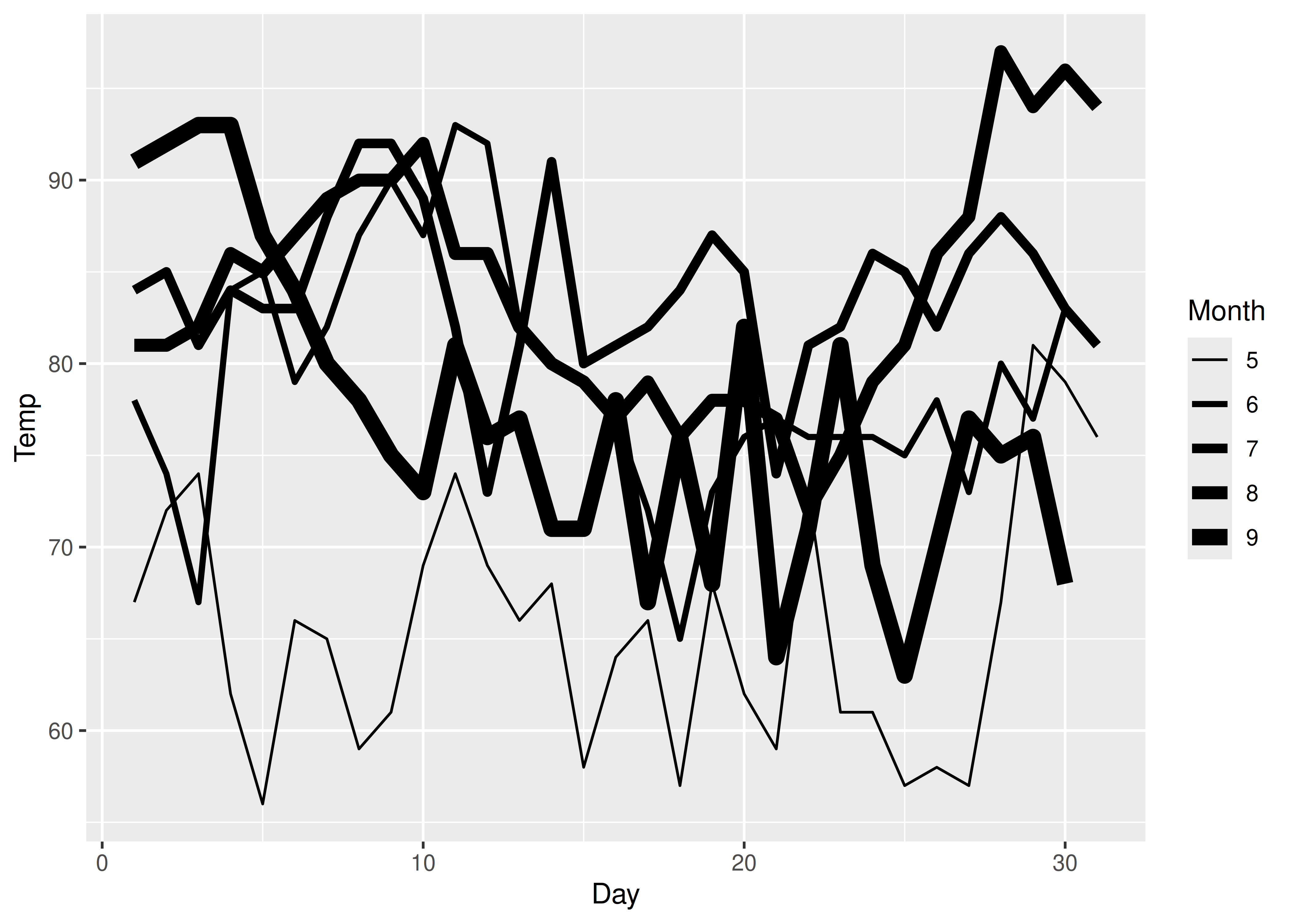
Linewidth scales behave like size scales in most ways, but there are differences. As discussed earlier the default behaviour of a size scale is to increase linearly with the area of the plot marker (e.g., the diameter of a circular plot marker increases with the square root of the data value). In contrast, the linewidth increases linearly with the data value.
Binned linewidth scales can be added using scale_linewidth_binned().
12.4 Line type
It is possible to map a variable onto the linetype aesthetic in ggplot2. This works best for discrete variables with a small number of categories, and scale_linetype() is an alias for scale_linetype_discrete(). Continuous variables cannot be mapped to line types unless scale_linetype_binned() is used: although there is a scale_linetype_continuous() function, all it does is produce an error. To see why the linetype aesthetic is suited only to cases with a few categories, consider this plot:
ggplot(economics_long, aes(date, value01, linetype = variable)) +
  geom_line()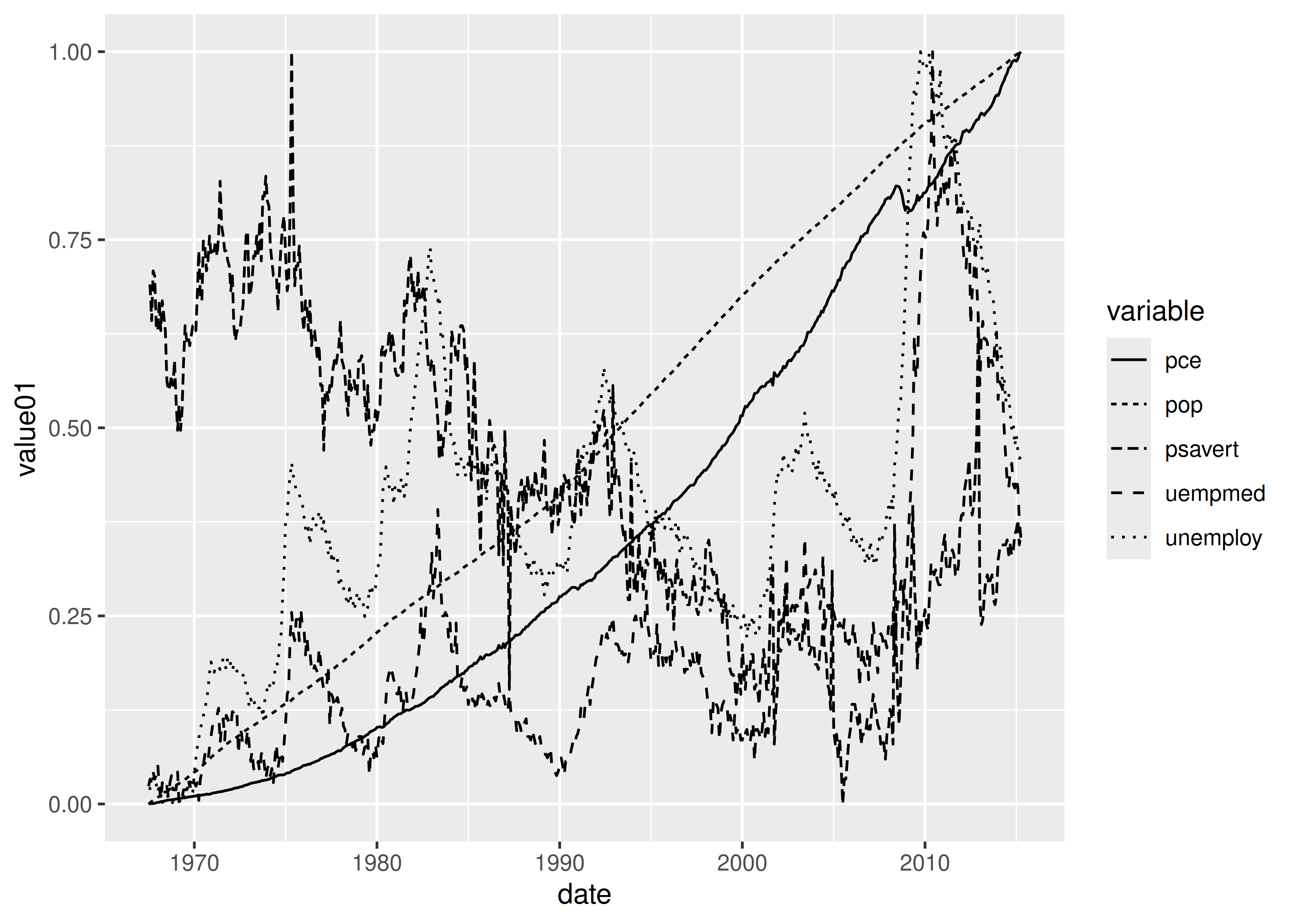
With five categories the plot is quite difficult to read, and it is unlikely you will want to use the linetype aesthetic for more than that. The default “palette” for linetype is supplied by the scales::linetype_pal() function, and includes the 13 linetypes shown below:
df <- data.frame(value = letters[1:13])
base <- ggplot(df, aes(linetype = value)) +
  geom_segment(
    mapping = aes(x = 0, xend = 1, y = value, yend = value),
    show.legend = FALSE
  ) +
  theme(panel.grid = element_blank()) +
  scale_x_continuous(NULL, NULL)

base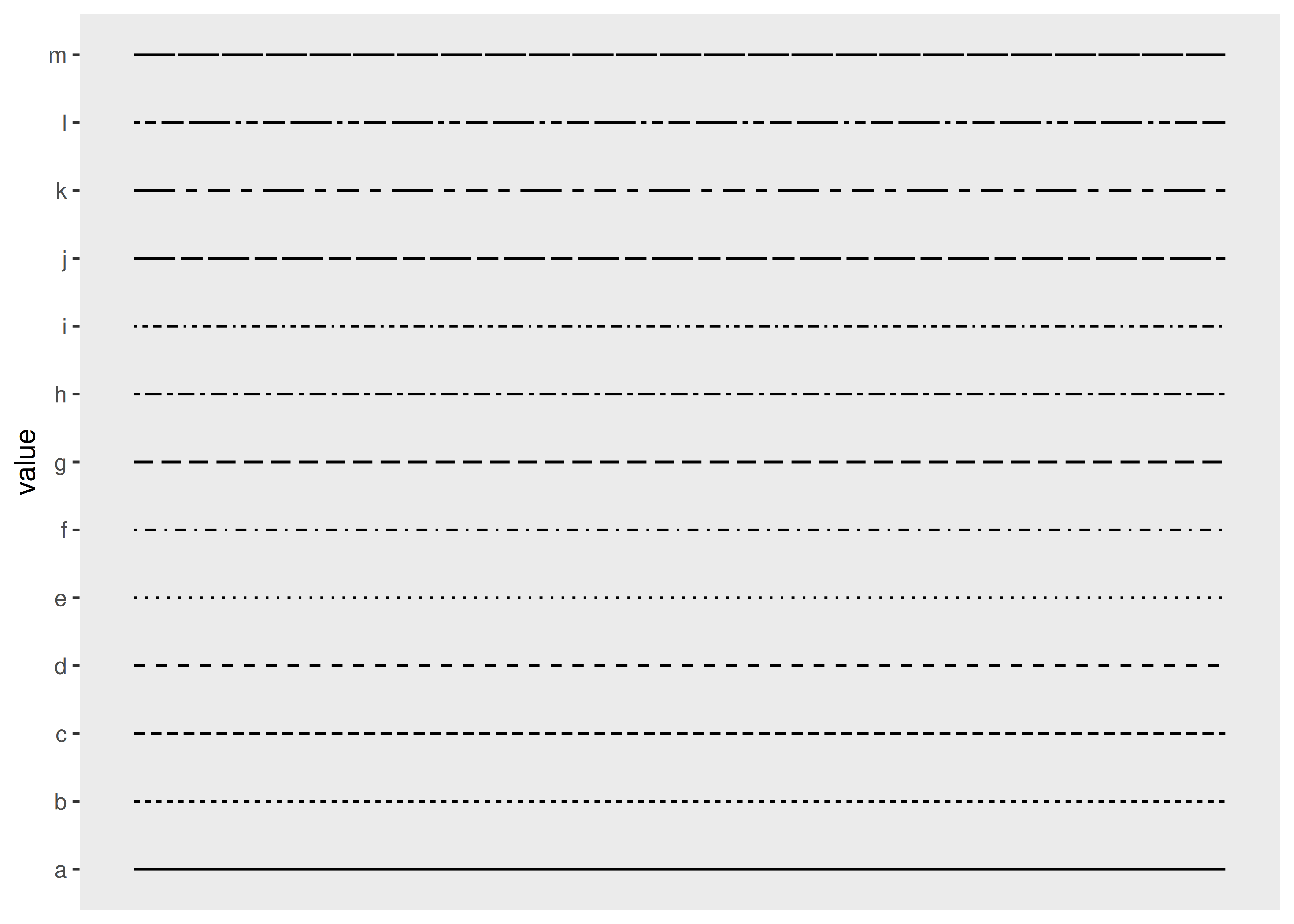
You can control the line type by specifying a string with up to 8 hexadecimal values (i.e., from 0 to F). In this specification, the first value is the length of the first line segment, the second value is the length of the first space between segments, and so on. This allows you to specify your own line types using scale_linetype_manual(), or alternatively, by passing a custom function to the palette argument:
Note that the last four lines are blank, because the linetypes() function defined above returns NA when the number of categories exceeds 9. The discrete_scale() function contains a na.value argument used to specify what kind of line is plotted for these values. By default this produces a blank line, but you can override this by setting na.value = "dotted":
base + discrete_scale("linetype", palette = linetypes)Valid line types can be set using a human readable character string: "blank", "solid", "dashed", "dotted", "dotdash", "longdash", and "twodash" are all understood.
12.5 Manual scales
Manual scales are just a list of valid values that are mapped to the unique discrete values. If you want to customise these scales, you need to create your own new scale with the “manual” version of each: scale_linetype_manual(), scale_shape_manual(), scale_colour_manual(), etc. The manual scale has one important argument, values, where you specify the values that the scale should produce if this vector is named, it will match the values of the output to the values of the input; otherwise it will match in order of the levels of the discrete variable. You will need some knowledge of the valid aesthetic values, which are described in vignette("ggplot2-specs").
Manual scales have appeared earlier, in Section 11.3.4 and Section 12.2. In this example we’ll show a creative use of scale_colour_manual() to display multiple variables on the same plot and show a useful legend. In most plotting systems, you’d colour the lines and then add a legend:
huron <- data.frame(year = 1875:1972, level = as.numeric(LakeHuron))
ggplot(huron, aes(year)) +
  geom_line(aes(y = level + 5), colour = "red") +
  geom_line(aes(y = level - 5), colour = "blue")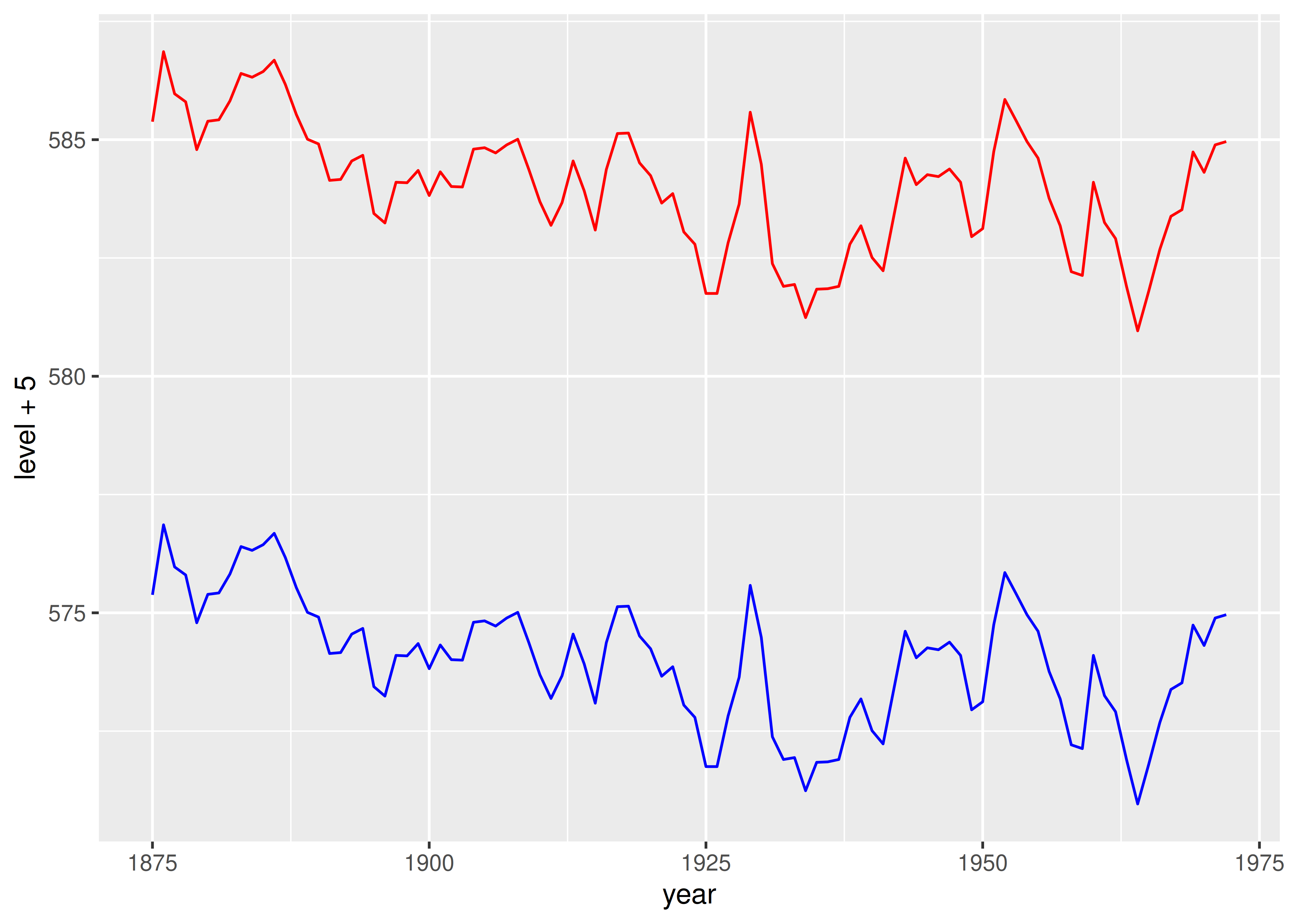
That doesn’t work in ggplot because there’s no way to add a legend manually. Instead, give the lines informative labels:
ggplot(huron, aes(year)) +
  geom_line(aes(y = level + 5, colour = "above")) +
  geom_line(aes(y = level - 5, colour = "below"))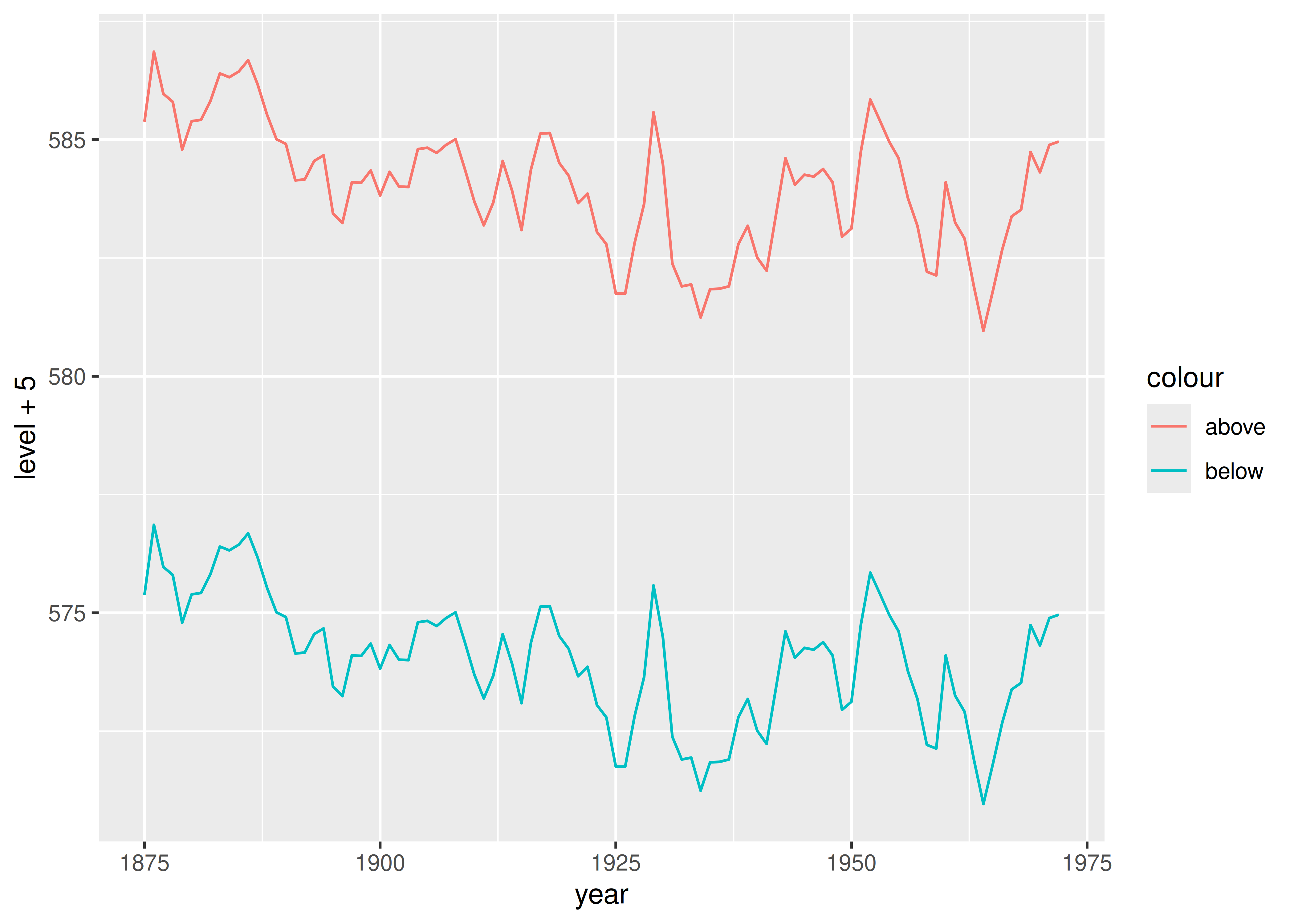
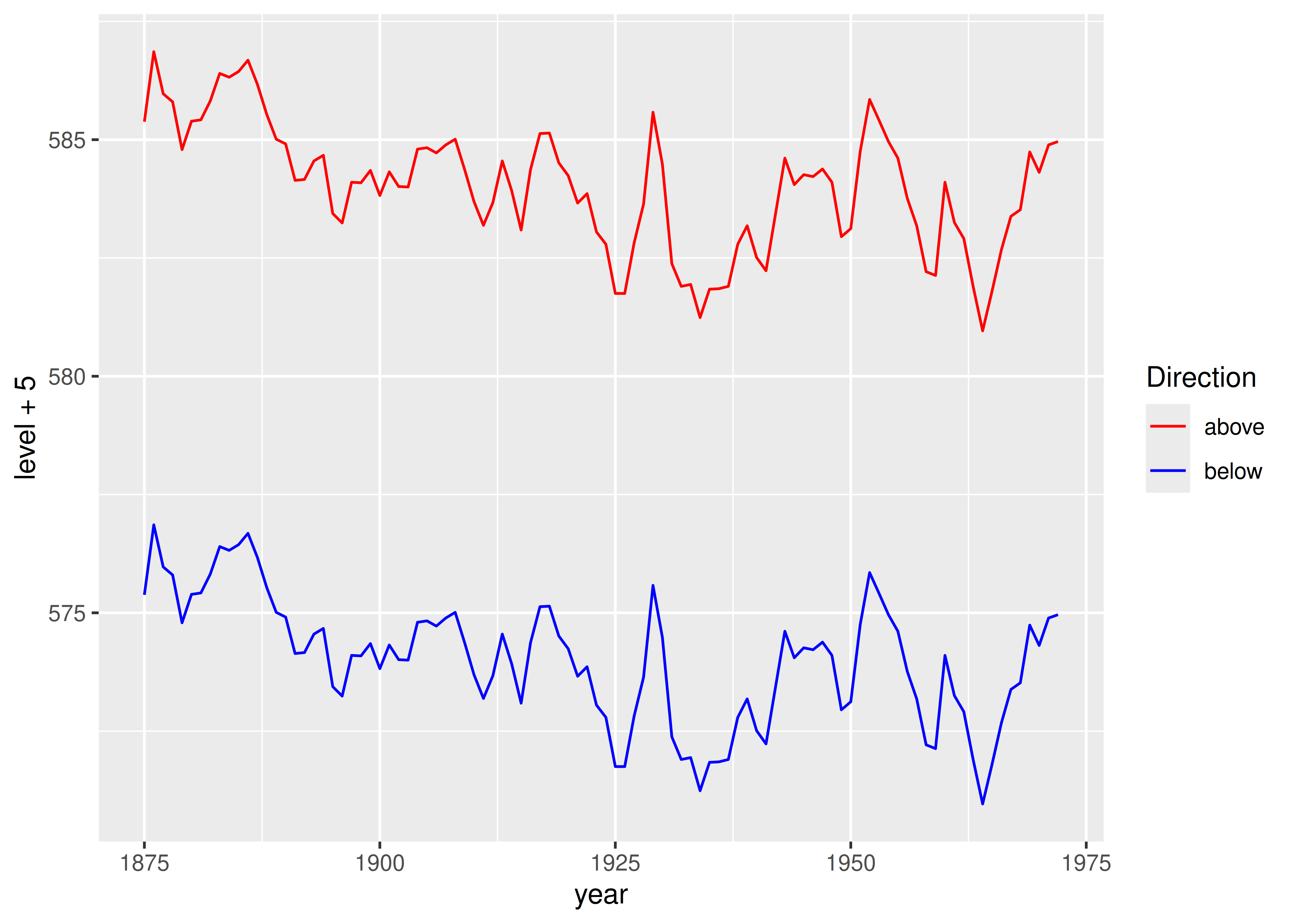
And then tell the scale how to map labels to colours:
ggplot(huron, aes(year)) +
  geom_line(aes(y = level + 5, colour = "above")) +
  geom_line(aes(y = level - 5, colour = "below")) +
  scale_colour_manual(
    "Direction",
    values = c("above" = "red", "below" = "blue")
  )
12.6 Identity scales
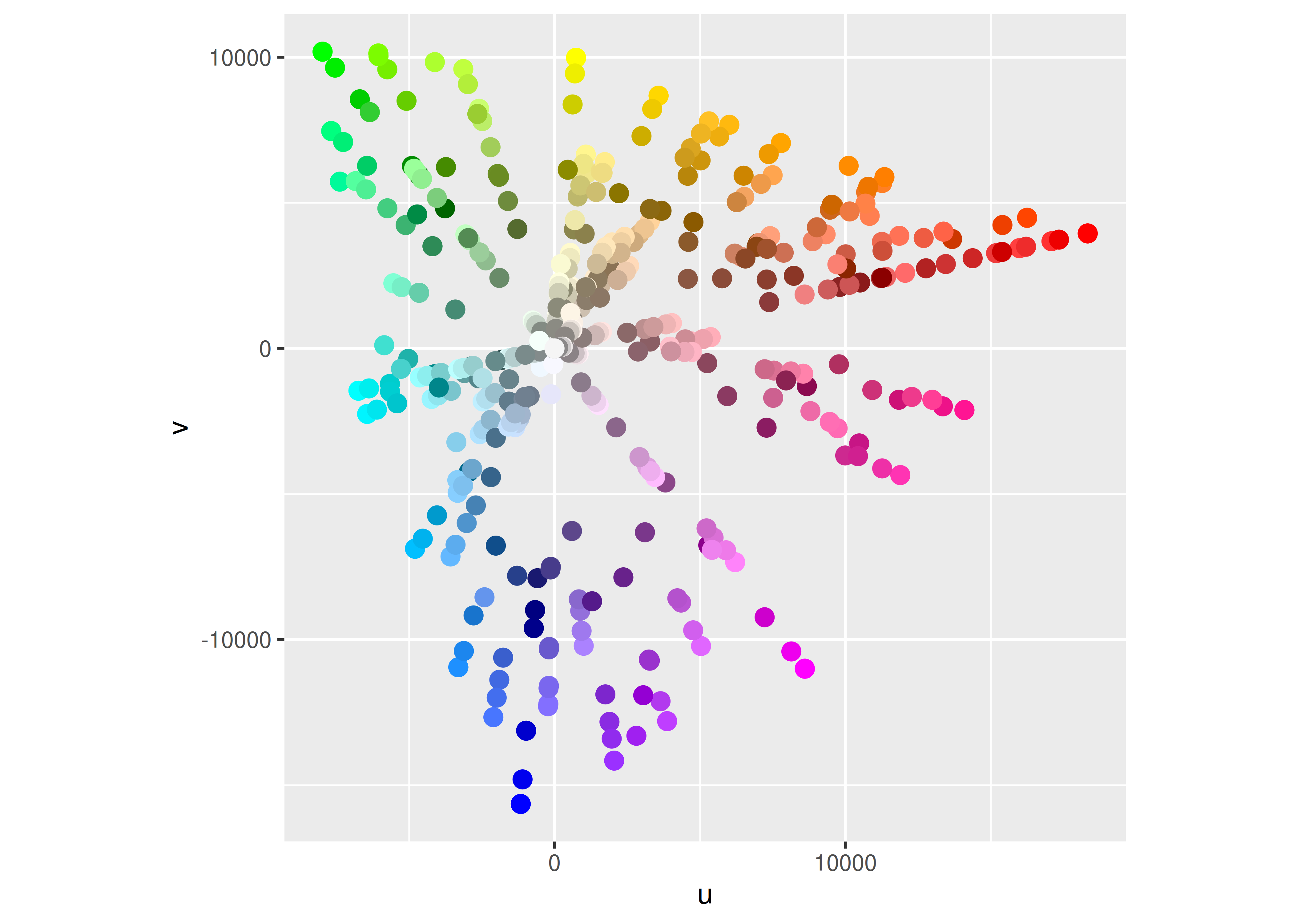
Identity scales — such as scale_colour_identity() and scale_shape_identity() — are used when your data is already scaled such that the data and aesthetic spaces are the same. The code below shows an example where the identity scale is useful. luv_colours contains the locations of all R’s built-in colours in the LUV colour space (the space that HCL is based on). A legend is unnecessary, because the point colour represents itself: the data and aesthetic spaces are the same.
head(luv_colours)
#>      L         u    v           col
#> 1 9342 -3.37e-12    0         white
#> 2 9101 -4.75e+02 -635     aliceblue
#> 3 8810  1.01e+03 1668  antiquewhite
#> 4 8935  1.07e+03 1675 antiquewhite1
#> 5 8452  1.01e+03 1610 antiquewhite2
#> 6 7498  9.03e+02 1402 antiquewhite3

ggplot(luv_colours, aes(u, v)) +
  geom_point(aes(colour = col), size = 3) +
  scale_color_identity() +
  coord_equal()