ggplot(mpg, aes(displ, hwy, colour = factor(cyl))) +
  geom_point()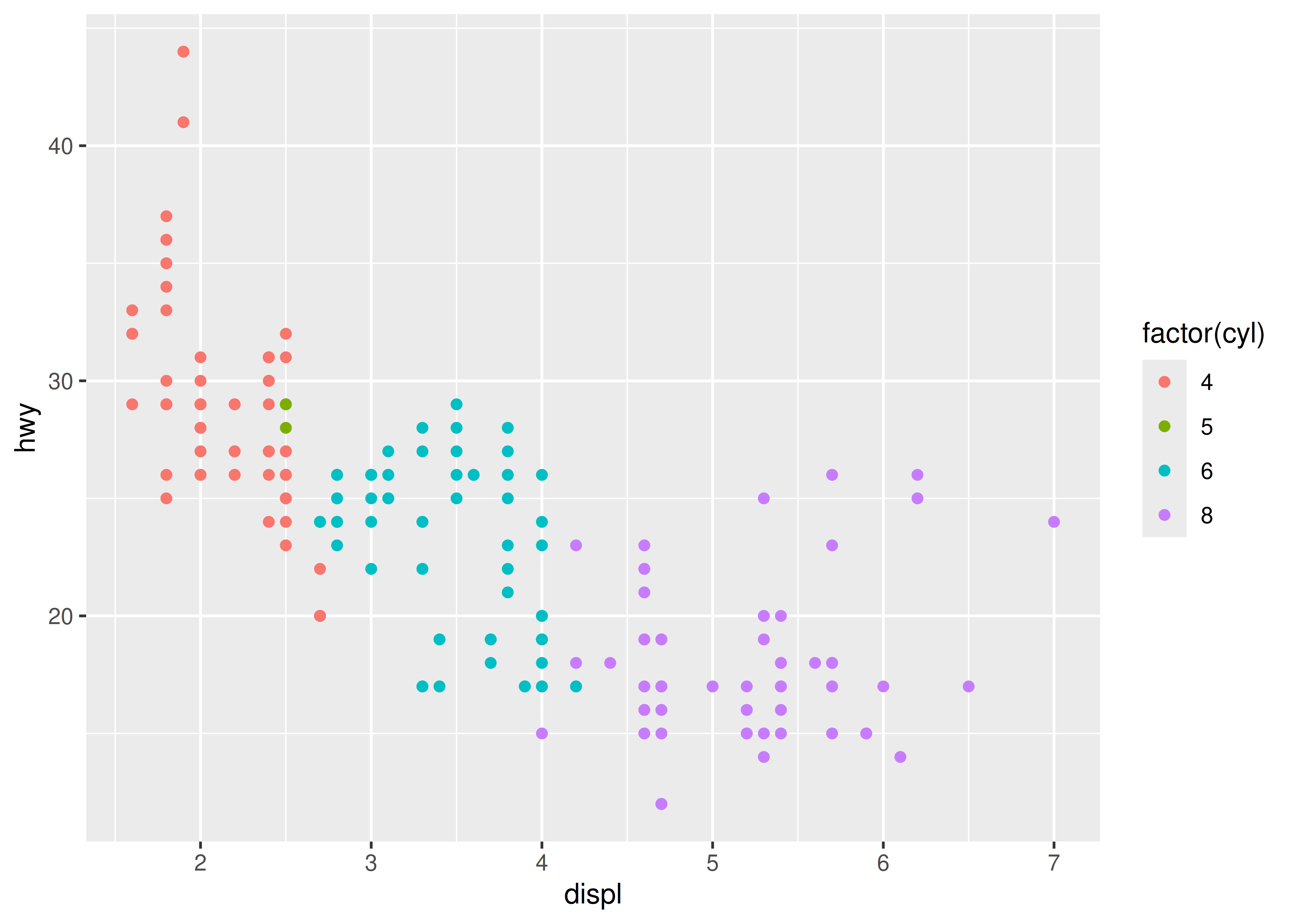
You are reading the work-in-progress third edition of the ggplot2 book. This chapter is currently a dumping ground for ideas, and we don’t recommend reading it.
In order to unlock the full power of ggplot2, you’ll need to master the underlying grammar. By understanding the grammar, and how its components fit together, you can create a wider range of visualizations, combine multiple sources of data, and customise to your heart’s content.
This chapter describes the theoretical basis of ggplot2: the layered grammar of graphics. The layered grammar is based on Wilkinson’s grammar of graphics (Wilkinson 2005), but adds a number of enhancements that help it to be more expressive and fit seamlessly into the R environment. The differences between the layered grammar and Wilkinson’s grammar are described fully in Wickham (2008). In this chapter you will learn a little bit about each component of the grammar and how they all fit together. The next chapters discuss the components in more detail, and provide more examples of how you can use them in practice.
The grammar makes it easier for you to iteratively update a plot, changing a single feature at a time. The grammar is also useful because it suggests the high-level aspects of a plot that can be changed, giving you a framework to think about graphics, and hopefully shortening the distance from mind to paper. It also encourages the use of graphics customised to a particular problem, rather than relying on specific chart types.
This chapter begins by describing in detail the process of drawing a simple plot. Building a scatterplot starts with a simple scatterplot, then Adding complexity makes it more complex by adding a smooth line and faceting. While working through these examples you will be introduced to all six components of the grammar, which are then defined more precisely in Components of the layered grammar.
How are engine size and fuel economy related? We might create a scatterplot of engine displacement and highway mpg with points coloured by number of cylinders:
ggplot(mpg, aes(displ, hwy, colour = factor(cyl))) +
geom_point()
You can create plots like this easily, but what is going on underneath the surface? How does ggplot2 draw this plot?
What precisely is a scatterplot? You have seen many before and have probably even drawn some by hand. A scatterplot represents each observation as a point, positioned according to the value of two variables. As well as a horizontal and vertical position, each point also has a size, a colour and a shape. These attributes are called aesthetics, and are the properties that can be perceived on the graphic. Each aesthetic can be mapped from a variable, or set to a constant value. In the previous graphic, displ is mapped to horizontal position, hwy to vertical position and cyl to colour. Size and shape are not mapped, but remain at their (constant) default values.
Once we have these mappings, we can create a new dataset that records this information:
| x | y | colour |
|---|---|---|
| 1.8 | 29 | 4 |
| 1.8 | 29 | 4 |
| 2.0 | 31 | 4 |
| 2.0 | 30 | 4 |
| 2.8 | 26 | 6 |
| 2.8 | 26 | 6 |
| 3.1 | 27 | 6 |
| 1.8 | 26 | 4 |
This new dataset is a result of applying the aesthetic mappings to the original data. We can create many different types of plots using this data. The scatterplot uses points, but were we instead to draw lines we would get a line plot. If we used bars, we’d get a bar plot. Neither of those examples makes sense for this data, but we could still draw them (We’ve omitted the legends to save space):
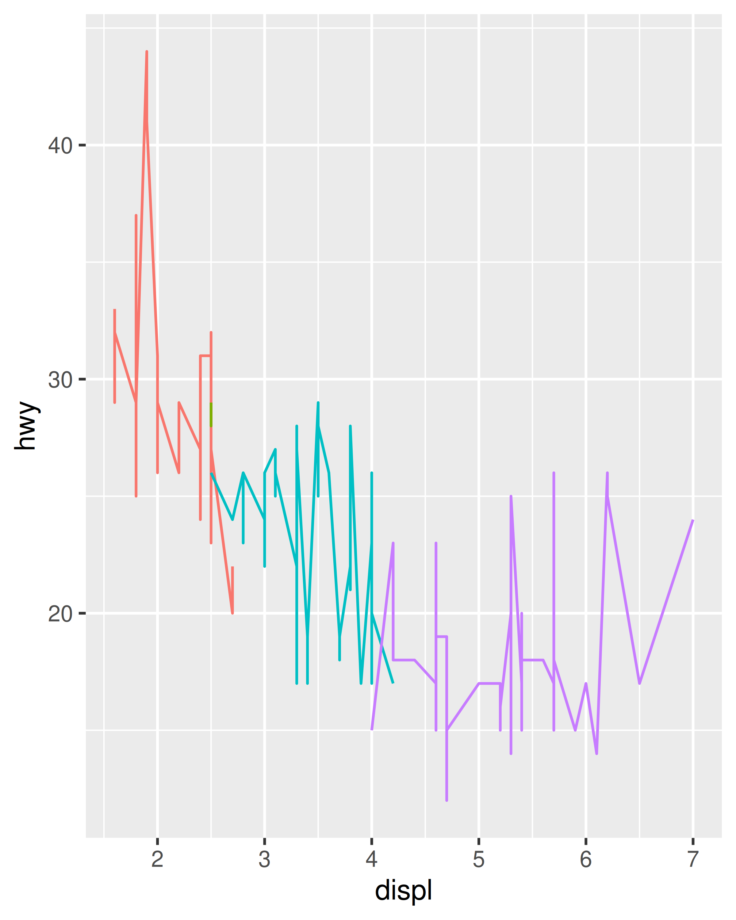
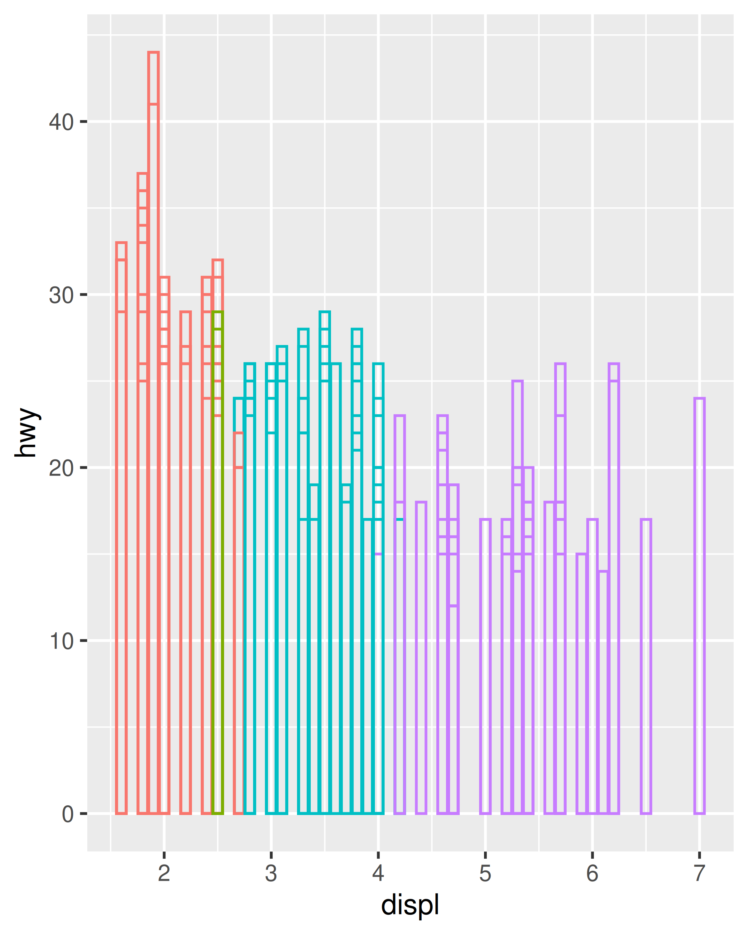
In ggplot, we can produce many plots that don’t make sense, yet are grammatically valid. This is no different than English, where we can create senseless but grammatical sentences like the angry rock barked like a comma.
Points, lines and bars are all examples of geometric objects, or geoms. Geoms determine the “type” of the plot. Plots that use a single geom are often given a special name:
| Named plot | Geom | Other features |
|---|---|---|
| scatterplot | point | |
| bubblechart | point | size mapped to a variable |
| barchart | bar | |
| box-and-whisker plot | boxplot | |
| line chart | line |
More complex plots with combinations of multiple geoms don’t have a special name, and we have to describe them by hand. For example, this plot overlays a per group regression line on top of a scatterplot:
ggplot(mpg, aes(displ, hwy, colour = factor(cyl))) +
  geom_point() +
  geom_smooth(method = "lm")
#> `geom_smooth()` using formula = 'y ~ x'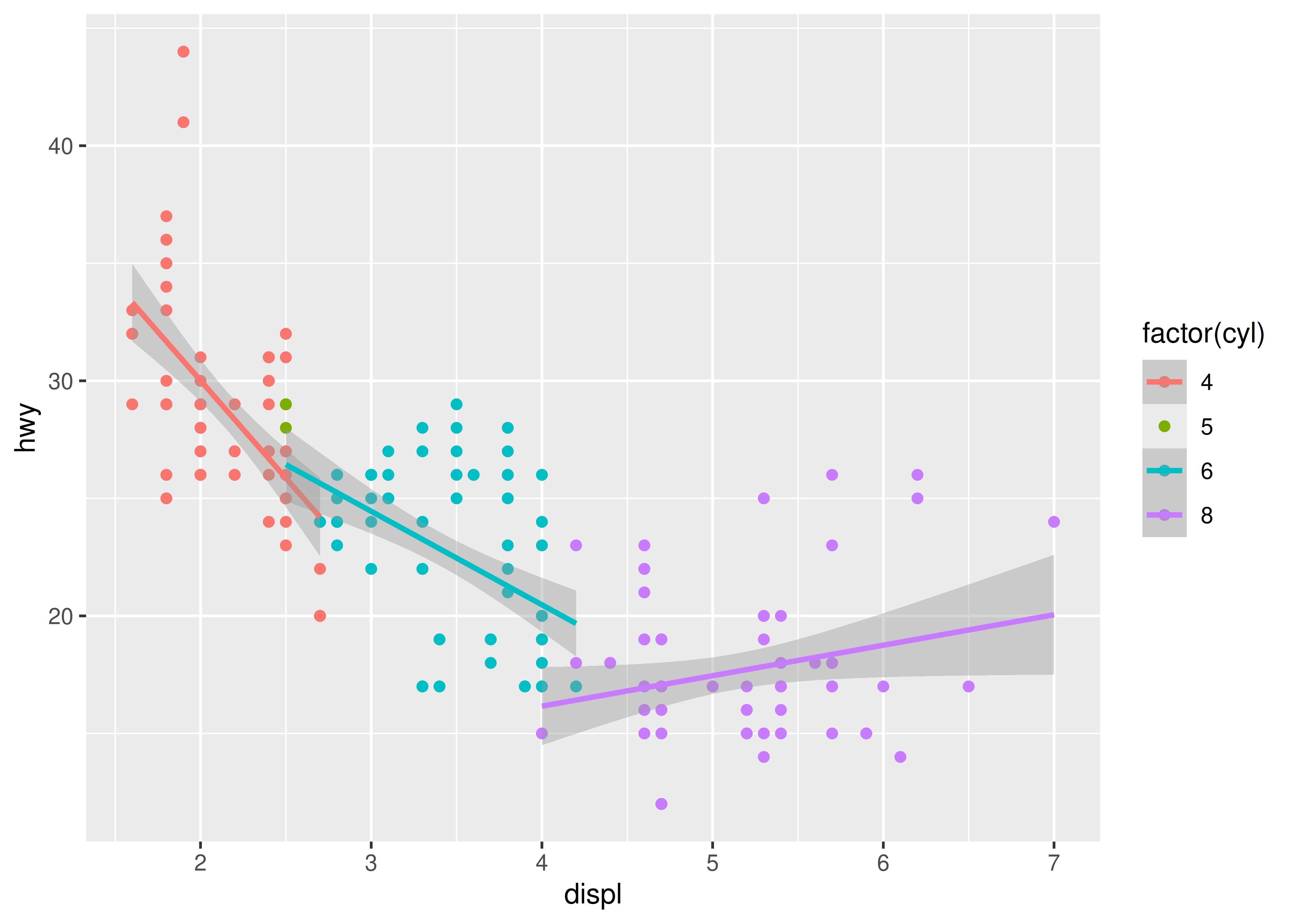
What would you call this plot? Once you’ve mastered the grammar, you’ll find that many of the plots that you produce are uniquely tailored to your problems and will no longer have special names.
The values in the previous table have no meaning to the computer. We need to convert them from data units (e.g., litres, miles per gallon and number of cylinders) to graphical units (e.g., pixels and colours) that the computer can display. This conversion process is called scaling and performed by scales. Now that these values are meaningful to the computer, they may not be meaningful to us: colours are represented by a six-letter hexadecimal string, sizes by a number and shapes by an integer. These aesthetic specifications that are meaningful to R are described in vignette("ggplot2-specs").
In this example, we have three aesthetics that need to be scaled: horizontal position (x), vertical position (y) and colour. Scaling position is easy in this example because we are using the default linear scales. We need only a linear mapping from the range of the data to \([0, 1]\). We use \([0, 1]\) instead of exact pixels because the drawing system that ggplot2 uses, grid, takes care of that final conversion for us. A final step determines how the two positions (x and y) are combined to form the final location on the plot. This is done by the coordinate system, or coord. In most cases this will be Cartesian coordinates, but it might be polar coordinates, or a spherical projection used for a map.
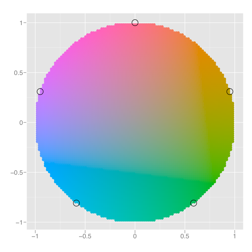
The process for mapping the colour is a little more complicated, as we have a non-numeric result: colours. However, colours can be thought of as having three components, corresponding to the three types of colour-detecting cells in the human eye. These three cell types give rise to a three-dimensional colour space. Scaling then involves mapping the data values to points in this space. There are many ways to do this, but here since cyl is a categorical variable we map values to evenly spaced hues on the colour wheel, as shown in the figure below. A different mapping is used when the variable is continuous.
The result of these conversions is below. As well as aesthetics that have been mapped to variable, we also include aesthetics that are constant. We need these so that the aesthetics for each point are completely specified and R can draw the plot. The points will be filled circles (shape 19 in R) with a 1-mm diameter:
| x | y | colour | size | shape |
|---|---|---|---|---|
| 0.037 | 0.531 | #F8766D | 1 | 19 |
| 0.037 | 0.531 | #F8766D | 1 | 19 |
| 0.074 | 0.594 | #F8766D | 1 | 19 |
| 0.074 | 0.562 | #F8766D | 1 | 19 |
| 0.222 | 0.438 | #00BFC4 | 1 | 19 |
| 0.222 | 0.438 | #00BFC4 | 1 | 19 |
| 0.278 | 0.469 | #00BFC4 | 1 | 19 |
| 0.037 | 0.438 | #F8766D | 1 | 19 |
Finally, we need to render this data to create the graphical objects that are displayed on the screen. To create a complete plot we need to combine graphical objects from three sources: the data, represented by the point geom; the scales and coordinate system, which generate axes and legends so that we can read values from the graph; and plot annotations, such as the background and plot title.
With a simple example under our belts, let’s now turn to look at this slightly more complicated example:
ggplot(mpg, aes(displ, hwy)) +
  geom_point() +
  geom_smooth() +
  facet_wrap(~year)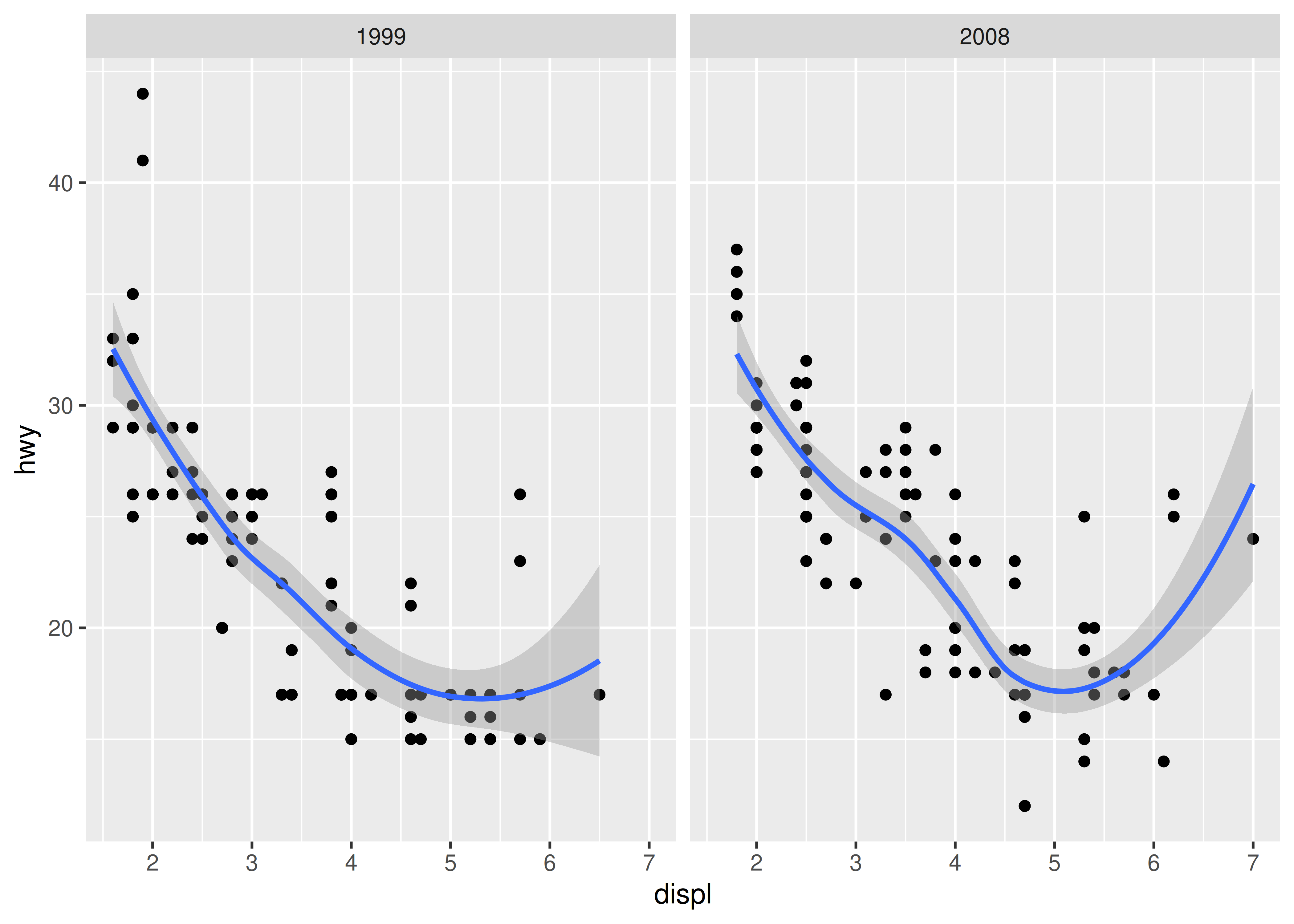
This plot adds three new components to the mix: facets, multiple layers and statistics. The facets and layers expand the data structure described above: each facet panel in each layer has its own dataset. You can think of this as a 3d array: the panels of the facets form a 2d grid, and the layers extend upwards in the 3rd dimension. In this case the data in the layers is the same, but in general we can plot different datasets on different layers.
The smooth layer is different to the point layer because it doesn’t display the raw data, but instead displays a statistical transformation of the data. Specifically, the smooth layer fits a smooth line through the middle of the data. This requires an additional step in the process described above: after mapping the data to aesthetics, the data is passed to a statistical transformation, or stat, which manipulates the data in some useful way. In this example, the stat fits the data to a loess smoother, and then returns predictions from evenly spaced points within the range of the data. Other useful stats include 1 and 2d binning, group means, quantile regression and contouring.
As well as adding an additional step to summarise the data, we also need some extra steps when we get to the scales. This is because we now have multiple datasets (for the different facets and layers) and we need to make sure that the scales are the same across all of them. Scaling actually occurs in three parts: transforming, training and mapping. We haven’t mentioned transformation before, but you have probably seen it before in log-log plots. In a log-log plot, the data values are not linearly mapped to position on the plot, but are first log-transformed.
Scale transformation occurs before statistical transformation so that statistics are computed on the scale-transformed data. This ensures that a plot of \(\log(x)\) vs. \(\log(y)\) on linear scales looks the same as \(x\) vs. \(y\) on log scales. There are many different transformations that can be used, including taking square roots, logarithms and reciprocals. See 10 Position scales and axes for more details.
After the statistics are computed, each scale is trained on every dataset from all the layers and facets. The training operation combines the ranges of the individual datasets to get the range of the complete data. Without this step, scales could only make sense locally and we wouldn’t be able to overlay different layers because their positions wouldn’t line up. Sometimes we do want to vary position scales across facets (but never across layers), and this is described more fully in Controlling scales.
Finally, the scales map the data values into aesthetic values. This is a local operation: the variables in each dataset are mapped to their aesthetic values, producing a new dataset that can then be rendered by the geoms.
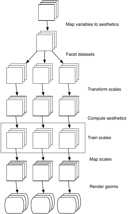
The figure below illustrates the complete process schematically.
In the examples above, we have seen some of the components that make up a plot: data and aesthetic mappings, geometric objects (geoms), statistical transformations (stats), scales, and faceting. We have also touched on the coordinate system. One thing we didn’t mention is the position adjustment, which deals with overlapping graphic objects. Together, the data, mappings, stat, geom and position adjustment form a layer. A plot may have multiple layers, as in the example where we overlaid a smoothed line on a scatterplot. All together, the layered grammar defines a plot as the combination of:
A default dataset and set of mappings from variables to aesthetics.
One or more layers, each composed of a geometric object, a statistical transformation, a position adjustment, and optionally, a dataset and aesthetic mappings.
One scale for each aesthetic mapping.
A coordinate system.
The faceting specification.
The following sections describe each of the higher-level components more precisely, and point you to the parts of the book where they are documented.
Layers are responsible for creating the objects that we perceive on the plot. A layer is composed of five parts:
The properties of a layer are described in 13 Build a plot layer by layer and their uses for data visualisation in are outlined in 3 Individual geoms to 8 Annotations.
A scale controls the mapping from data to aesthetic attributes, and we need a scale for every aesthetic used on a plot. Each scale operates across all the data in the plot, ensuring a consistent mapping from data to aesthetics. Some examples are shown below.
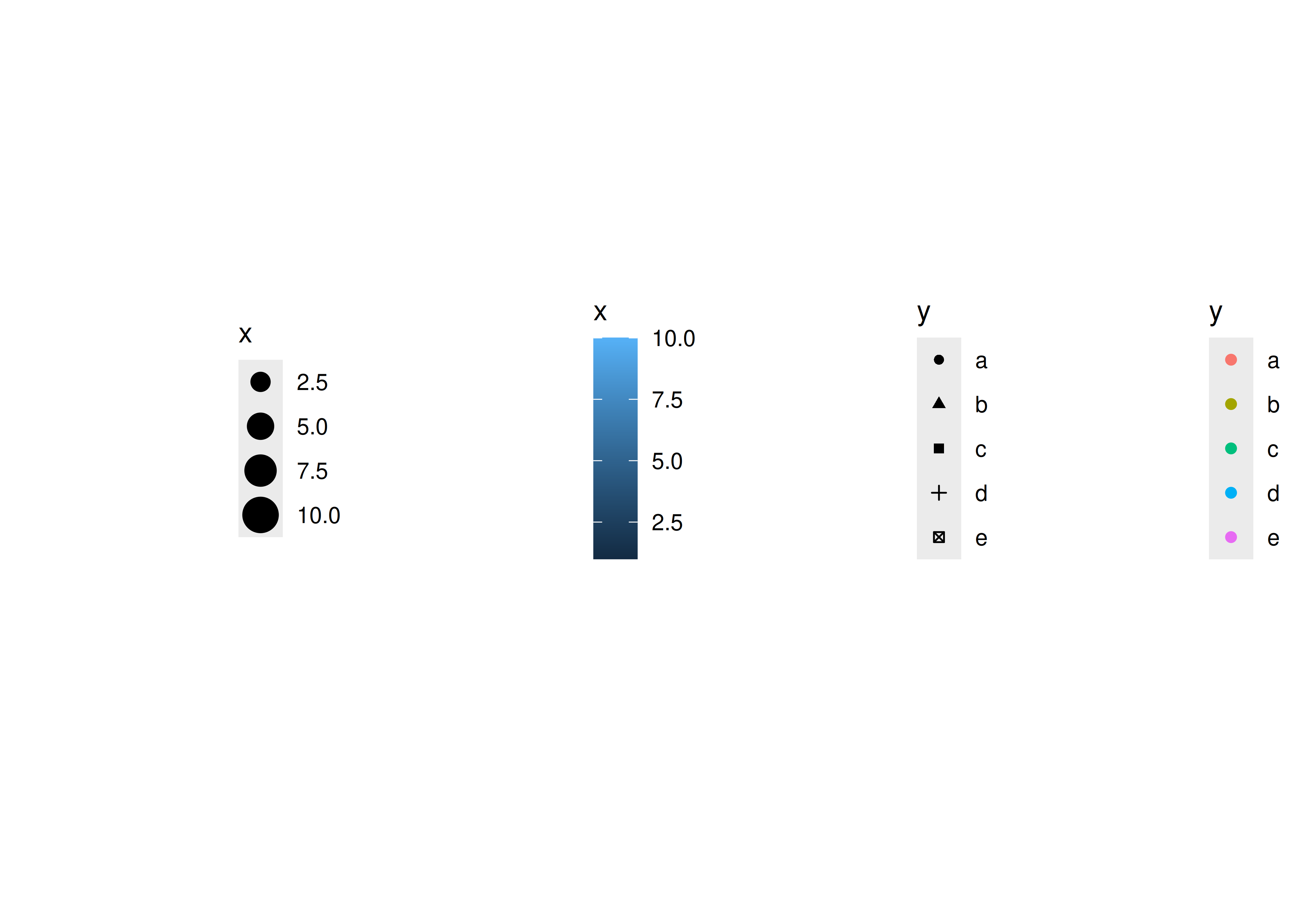
A scale is a function and its inverse, along with a set of parameters. For example, the colour gradient scale maps a segment of the real line to a path through a colour space. The parameters of the function define whether the path is linear or curved, which colour space to use (e.g., LUV or RGB), and the colours at the start and end.
The inverse function is used to draw a guide so that you can read values from the graph. Guides are either axes (for position scales) or legends (for everything else). Most mappings have a unique inverse (i.e., the mapping function is one-to-one), but many do not. A unique inverse makes it possible to recover the original data, but this is not always desirable if we want to focus attention on a single aspect.
For more details, see 11 Colour scales and legends.
A coordinate system, or coord for short, maps the position of objects onto the plane of the plot. Position is often specified by two coordinates \((x, y)\), but potentially could be three or more (although this is not implemented in ggplot2). The Cartesian coordinate system is the most common coordinate system for two dimensions, while polar coordinates and various map projections are used less frequently.
Coordinate systems affect all position variables simultaneously and differ from scales in that they also change the appearance of the geometric objects. For example, in polar coordinates, bar geoms look like segments of a circle. Additionally, scaling is performed before statistical transformation, while coordinate transformations occur afterward. The consequences of this are shown in Non-linear coordinate systems.
Coordinate systems control how the axes and grid lines are drawn. The figure below illustrates three different types of coordinate systems: Cartesian, semi-log, and polar. Very little advice is available for drawing these for non-Cartesian coordinate systems, so a lot of work needs to be done to produce polished output. See 15 Coordinate systems for more details.
#> Warning: `coord_trans()` was deprecated in ggplot2 4.0.0.
#> ℹ Please use `coord_transform()` instead.
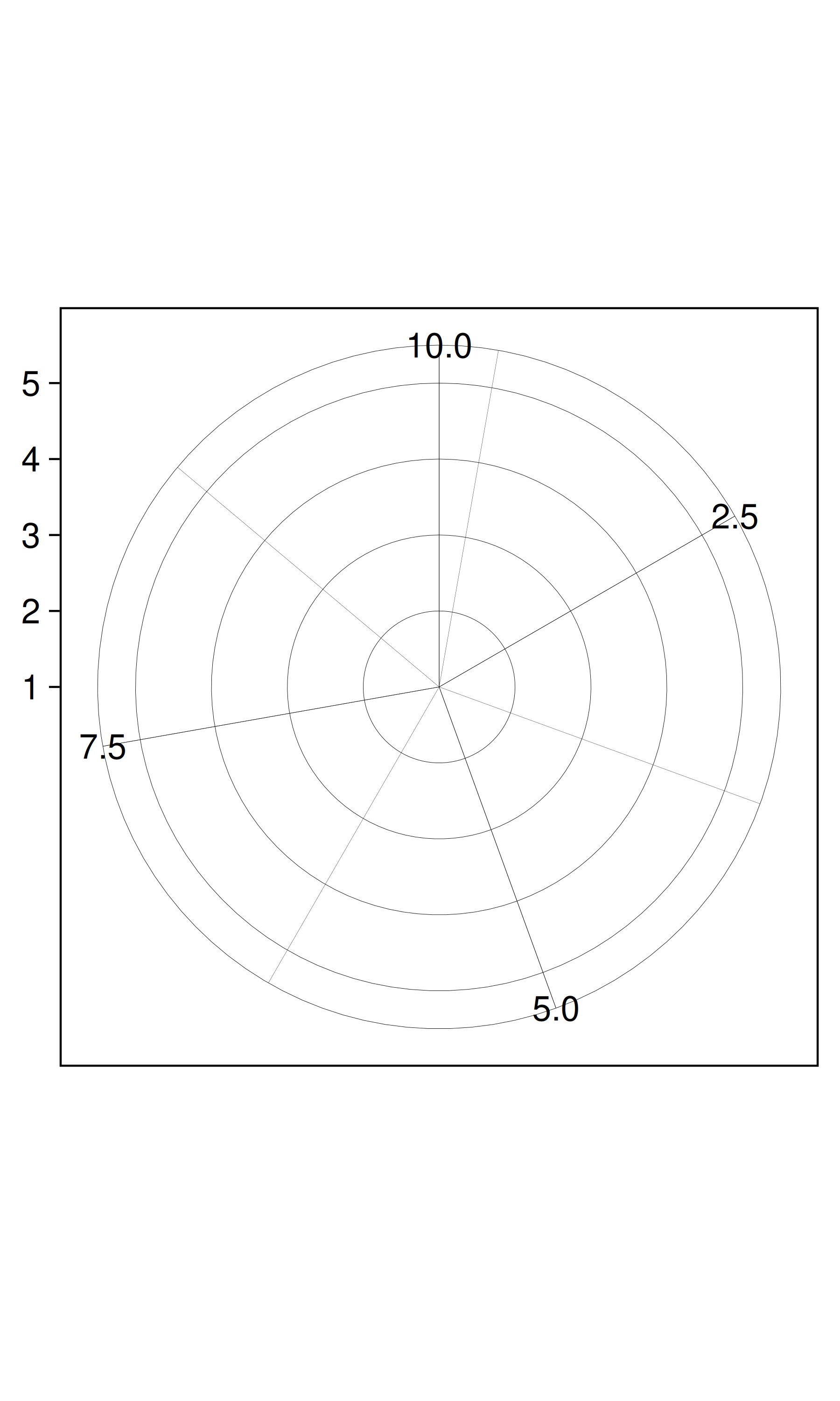
The polar coordinate system illustrates the difficulties associated with non-Cartesian coordinates: it is hard to draw the axes well.
There is also another thing that turns out to be sufficiently useful that we should include it in our general framework: faceting, a general case of conditioned or trellised plots. This makes it easy to create small multiples, each showing a different subset of the whole dataset. This is a powerful tool when investigating whether patterns hold across all conditions. The faceting specification describes which variables should be used to split up the data, and whether position scales should be free or constrained. Faceting is described in Position adjustments.
One of the best ways to get a handle on how the grammar works is to apply it to the analysis of existing graphics. For each of the graphics listed below, write down the components of the graphic. Don’t worry if you don’t know what the corresponding functions in ggplot2 are called (or if they even exist!), instead focusing on recording the key elements of a plot so you could communicate it to someone else.
“Napoleon’s march” by Charles John Minard: http://www.datavis.ca/gallery/re-minard.php
“Where the Heat and the Thunder Hit Their Shots”, by Jeremy White, Joe Ward, and Matthew Ericson at The New York Times. http://nyti.ms/1duzTvY
“London Cycle Hire Journeys”, by James Cheshire. http://bit.ly/1S2cyRy
The Pew Research Center’s favorite data visualizations of 2014: http://pewrsr.ch/1KZSSN6
“The Tony’s Have Never Been so Dominated by Women”, by Joanna Kao at FiveThirtyEight: http://53eig.ht/1cJRCyG.
“In Climbing Income Ladder, Location Matters” by the Mike Bostock, Shan Carter, Amanda Cox, Matthew Ericson, Josh Keller, Alicia Parlapiano, Kevin Quealy and Josh Williams at the New York Times: http://nyti.ms/1S2dJQT
“Dissecting a Trailer: The Parts of the Film That Make the Cut”, by Shan Carter, Amanda Cox, and Mike Bostock at the New York Times: http://nyti.ms/1KTJQOE