theme_minimal <- function(base_size = 11,
                          base_family = "",
                          base_line_size = base_size/22,
                          base_rect_size = base_size/22) {
    theme_bw(
      base_size = base_size,
      base_family = base_family,
      base_line_size = base_line_size,
      base_rect_size = base_rect_size
    ) %+replace%
    theme(
      axis.ticks = element_blank(),
      legend.background = element_blank(),
      legend.key = element_blank(),
      panel.background = element_blank(),
      panel.border = element_blank(),
      strip.background = element_blank(),
      plot.background = element_blank(),
      complete = TRUE
    )
}20 Extending ggplot2
You are reading the work-in-progress third edition of the ggplot2 book. This chapter should be readable but is currently undergoing final polishing.
The ggplot2 package has been designed in a way that makes it relatively easy to extend the functionality with new types of the common grammar components. The extension system allows you to distribute these extensions as packages should you choose to, but the ease with which extensions can be made means that writing one-off extensions to solve a particular plotting challenge is also viable. This chapter discusses different ways ggplot2 can be extended and highlights specific issues to keep in mind. We’ll present small examples throughout the chapter, but to see a worked example from beginning to end, see Chapter 21.
20.1 New themes
20.1.1 Modifying themes
Themes are probably the easiest form of extensions as they only require you to write code you would normally write when creating plots with ggplot2. While it is possible to build up a new theme from the ground it is usually easier and less error-prone to modify an existing theme. This approach is often taken in the ggplot2 source. For example, here is the source code for theme_minimal():
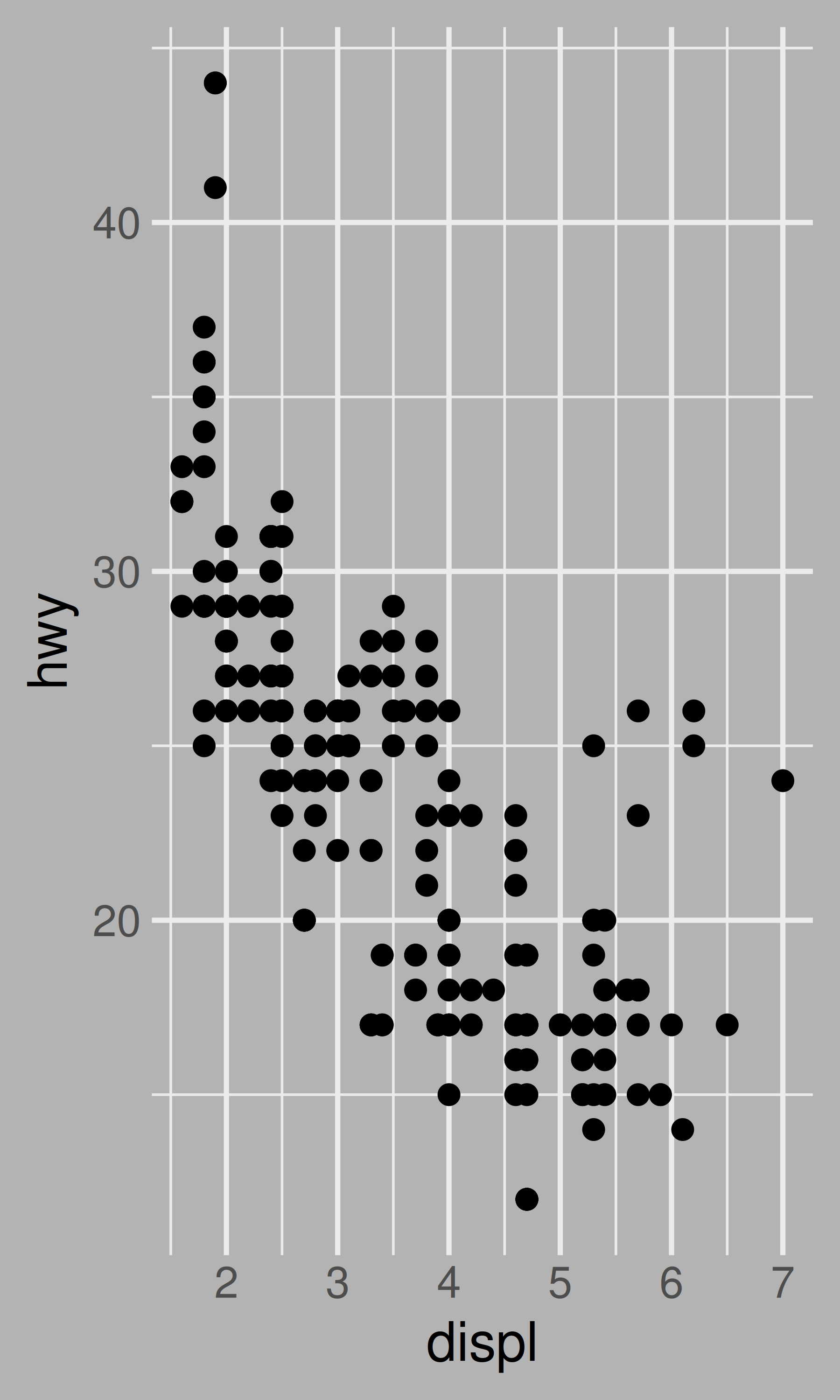
As you can see, the code doesn’t look much different to the code you normally write when styling a plot (Chapter 17). The theme_minimal() function uses theme_bw() as the base theme, and then replaces certain parts of it with its own style using the %+replace% operator. When writing new themes, it is a good idea to provide a few parameters to the user for defining overarching aspects of the theme. One important such aspect is sizing of text and lines but other aspects could be e.g. key and accent colours of the theme. For example, we could create a variant of theme_minimal() that allows the user to specify the plot background colour:
theme_background <- function(background = "white", ...) {
theme_minimal(...) %+replace%
theme(
plot.background = element_rect(
fill = background,
colour = background
),
complete = TRUE
)
}
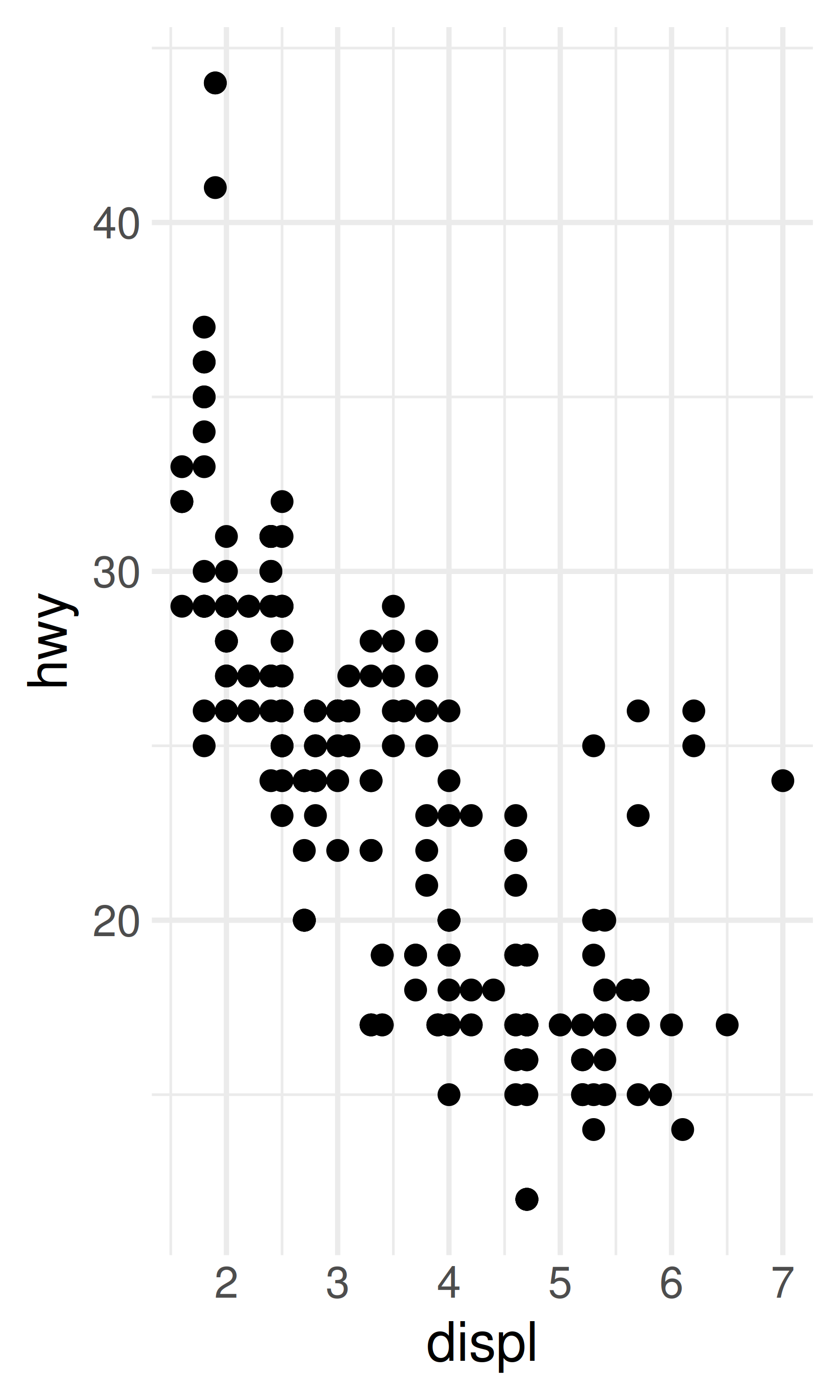
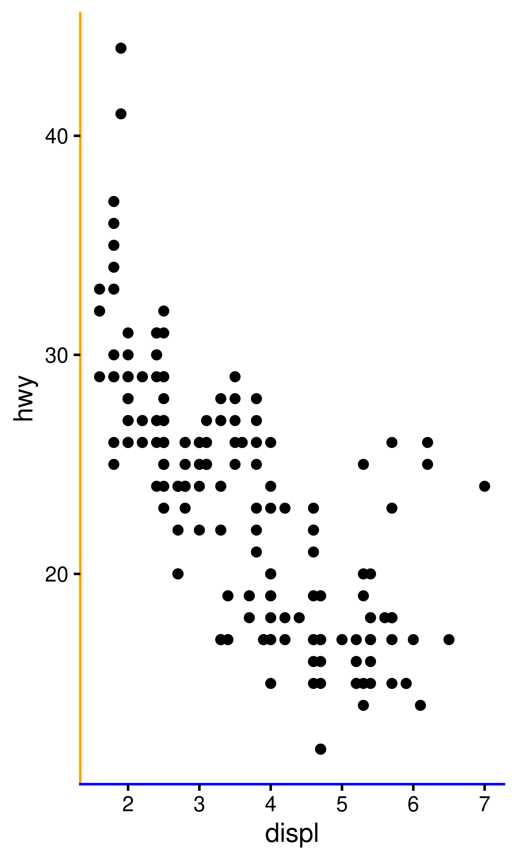
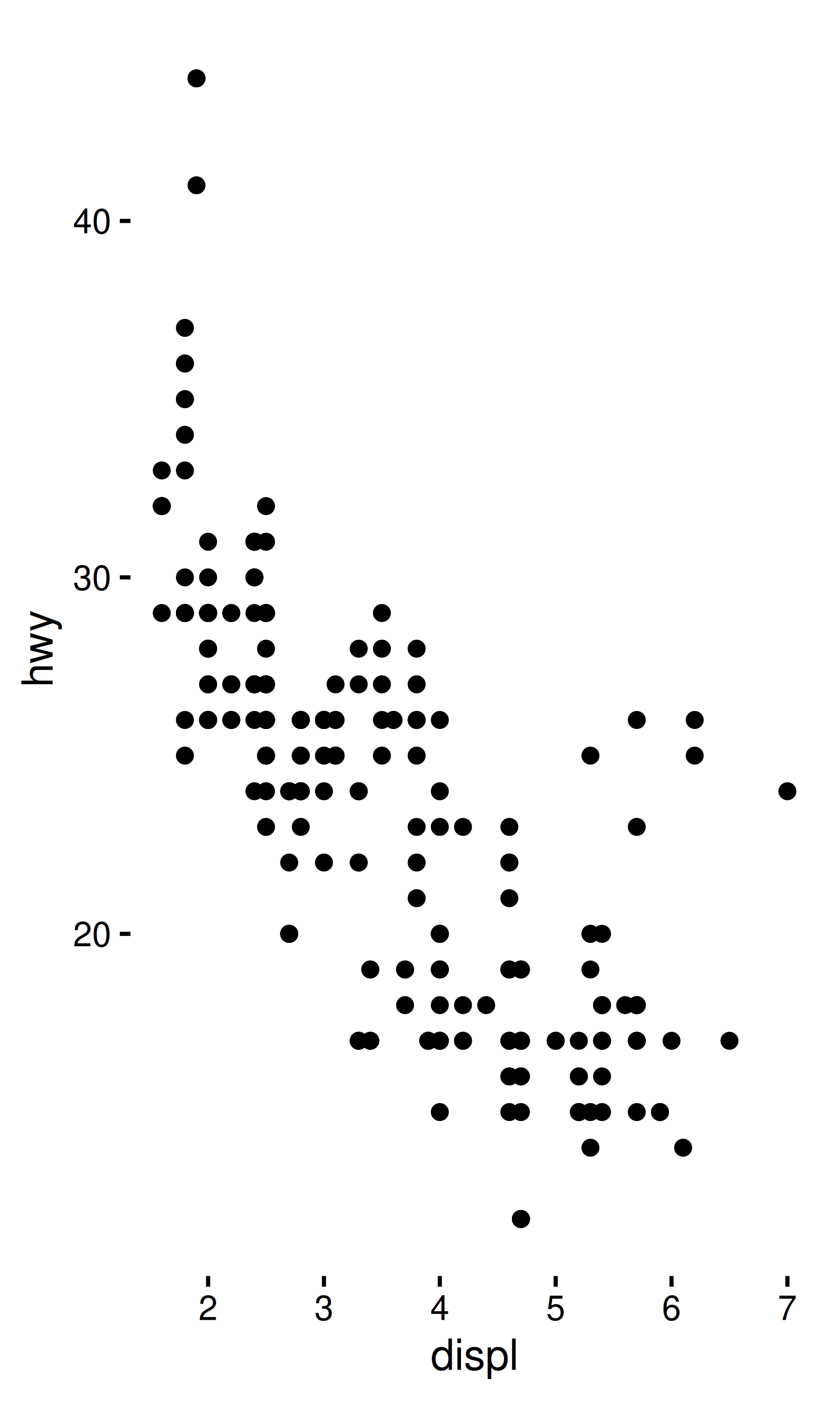
base <- ggplot(mpg, aes(displ, hwy)) + geom_point()
base + theme_minimal(base_size = 14)
base + theme_background(base_size = 14)
base + theme_background(base_size = 14, background = "grey70")
20.1.2 Complete themes
An important point to note is the use of complete = TRUE in the code for theme_minimal() and theme_background(). It is always good practice to do this when defining your own themes in a ggplot2 extension package: this will ensure that your theme behaves in the same way as the default theme and as a consequence will be less likely to surprise users. To see why this is necessary, compare these two themes:
# good
theme_predictable <- function(...) {
  theme_classic(...) %+replace%
    theme(
      axis.line.x = element_line(color = "blue"),
      axis.line.y = element_line(color = "orange"),
      complete = TRUE
    )
}

# bad
theme_surprising <- function(...) {
  theme_classic(...) %+replace%
    theme(
      axis.line.x = element_line(color = "blue"),
      axis.line.y = element_line(color = "orange")
    )
}
Both themes are intended to do the same thing: change the defaults to theme_classic() so that the x-axis is drawn with a blue line, and the y-axis is drawn with an orange line. At first glance, it appears that both versions behave in line with the user expectations:
base + theme_classic()
base + theme_predictable()
base + theme_surprising()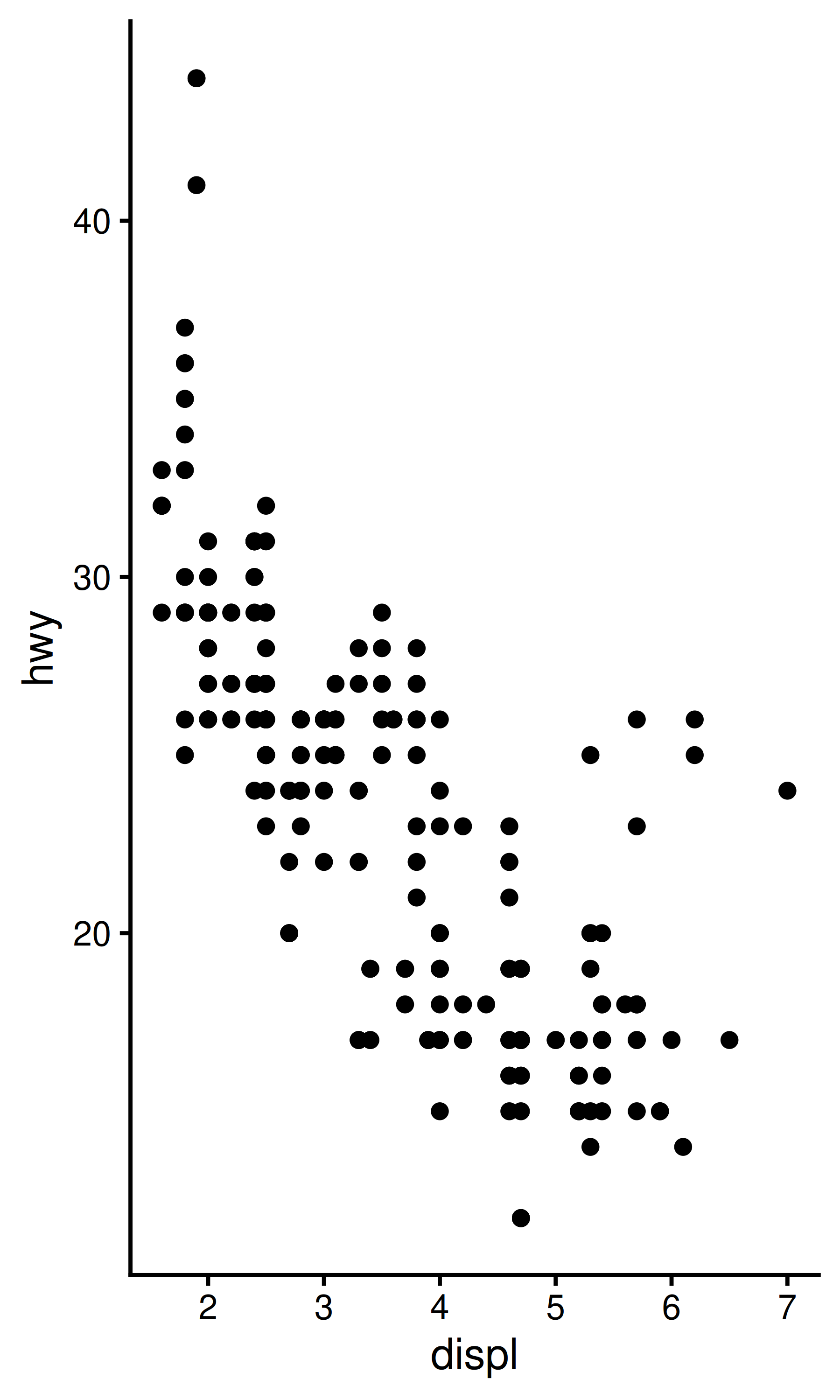

However, suppose the user of your theme wants to remove the axis lines:
base + theme_classic() + theme(axis.line = element_blank())
base + theme_predictable() + theme(axis.line = element_blank())
base + theme_surprising() + theme(axis.line = element_blank())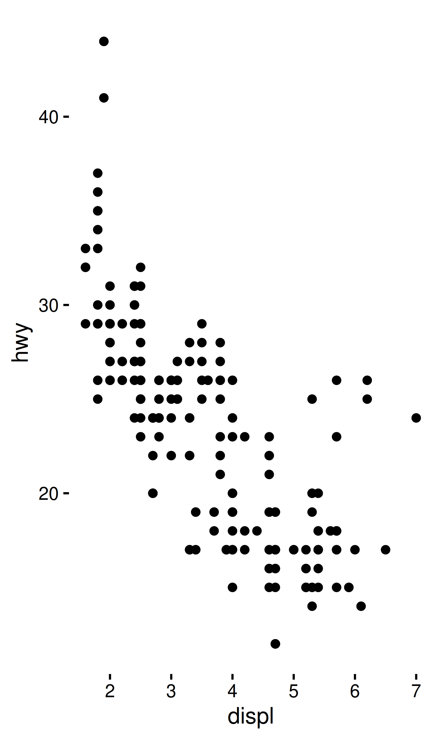

The behaviour of theme_predictable() is the same as theme_classic() and the axis lines are removed, but for theme_surprising() this does not happen. The reason for this is that ggplot2 treats complete themes as a collection of “fallback” values: when the user adds theme(axis.line = element_blank()) to a complete theme, there is no need to rely on the fallback value for axis.line.x or axis.line.y, because these are inherited from axis.line in the user command. This is a kindness to your users, as it allows them to overwrite everything that inherits from axis.line using a command like theme_predictable() + theme(axis.line = ...). In contrast, theme_surprising() does not specify a complete theme. When the user calls theme_surprising() the fallback values are taken from theme_classic(), but more importantly, ggplot2 treats the theme() command that sets axis.line.x and axis.line.y exactly as if the user had typed it. As a consequence, the plot specification is equivalent to this:
base +
  theme_classic() +
  theme(
      axis.line.x = element_line(color = "blue"),
      axis.line.y = element_line(color = "orange"),
      axis.line = element_blank()
  )
In this code, the specific-first inheritance rule applies, and as such setting axis.line does not override the more specific axis.line.x.
20.1.3 Defining theme elements
In Chapter 17 we saw that the structure of a ggplot2 theme is defined by the element tree. The element tree specifies what type each theme element has and where it inherits its value from (you can use the get_element_tree() function to return this tree as a list). The extension system for ggplot2 makes it possible to define new theme elements by registering them as part of the element tree using the register_theme_elements() function. Let’s say you’re writing a new package called “ggxyz” that includes a panel annotation as part of the coordinate system and you want this panel annotation to be a theme element:
register_theme_elements(
  ggxyz.panel.annotation = element_text(
    color = "blue",
    hjust = 0.95,
    vjust = 0.05
  ),
  element_tree = list(
    ggxyz.panel.annotation = el_def(
      class = "element_text",
      inherit = "text"
    )
  )
)
There are two points to note here when defining new theme elements in a package:
It is important to call
register_theme_elements()from the.onLoad()function of your package, so that the new theme elements are available to anybody using functions from your package, irrespective of whether the package has been attachedIt is always a good idea to include the name of your package as a prefix for any new theme elements. That way, if someone else writes a panel annotation package
ggabc, there is no potential conflict between theme elementsggxyz.panel.annotationandggabc.panel.annotation.
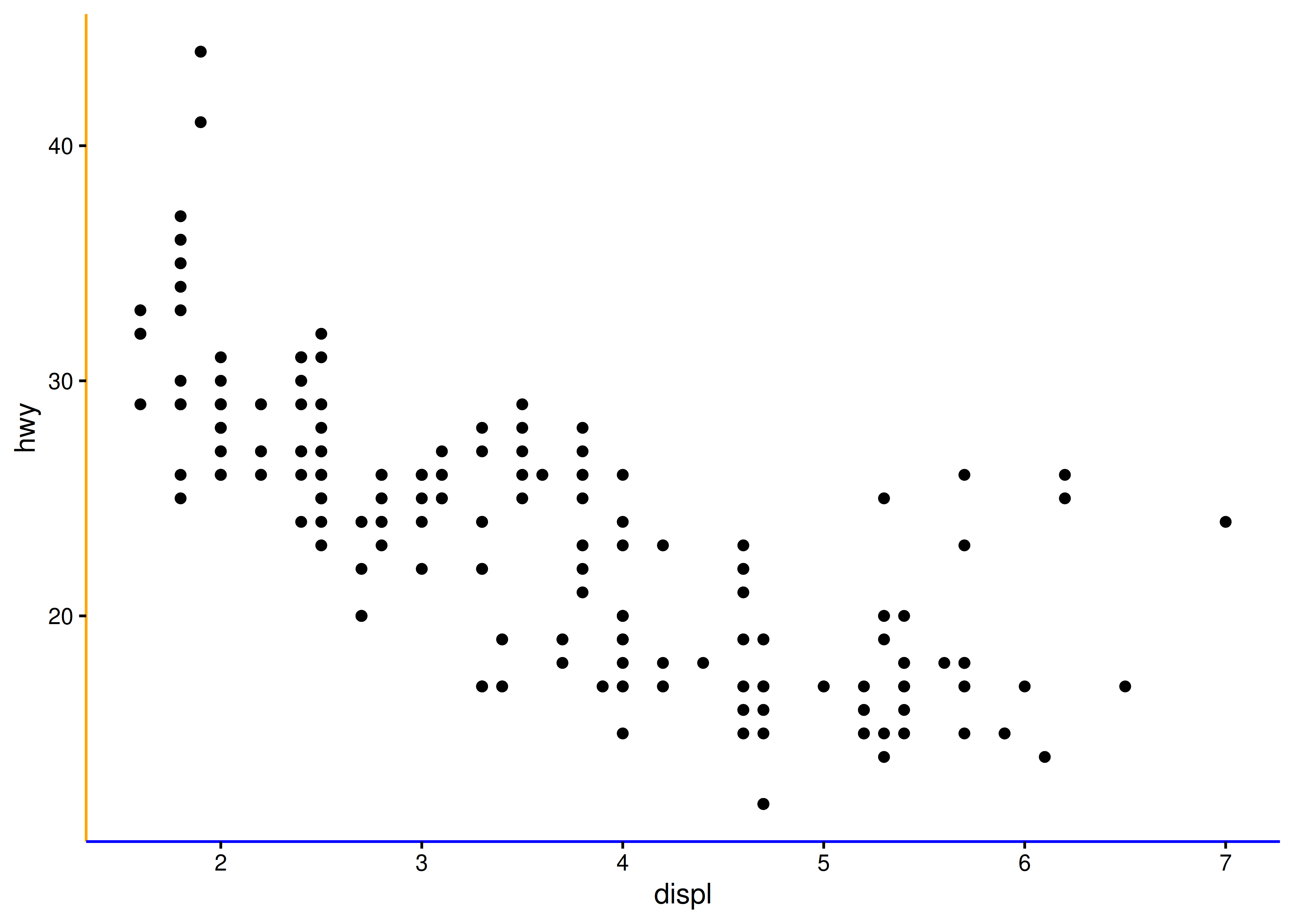
Once the element tree has been updated, the package can define a new coordinate system that uses the new theme element. A simple way to do this is to define a function that creates a new instance of the CoordCartesian ggproto object. We’ll talk more about this in Section 20.4, but for now it is sufficient to note that this code will work:
coord_annotate <- function(label = "panel annotation") {
  ggproto(NULL, CoordCartesian,
          limits = list(x = NULL, y = NULL),
          expand = TRUE,
          default = FALSE,
          clip = "on",
          render_fg = function(panel_params, theme) {
            element_render(
              theme = theme,
              element = "ggxyz.panel.annotation",
              label = label
            )
          }
  )
}
So now this works:
base + coord_annotate("annotation in blue")
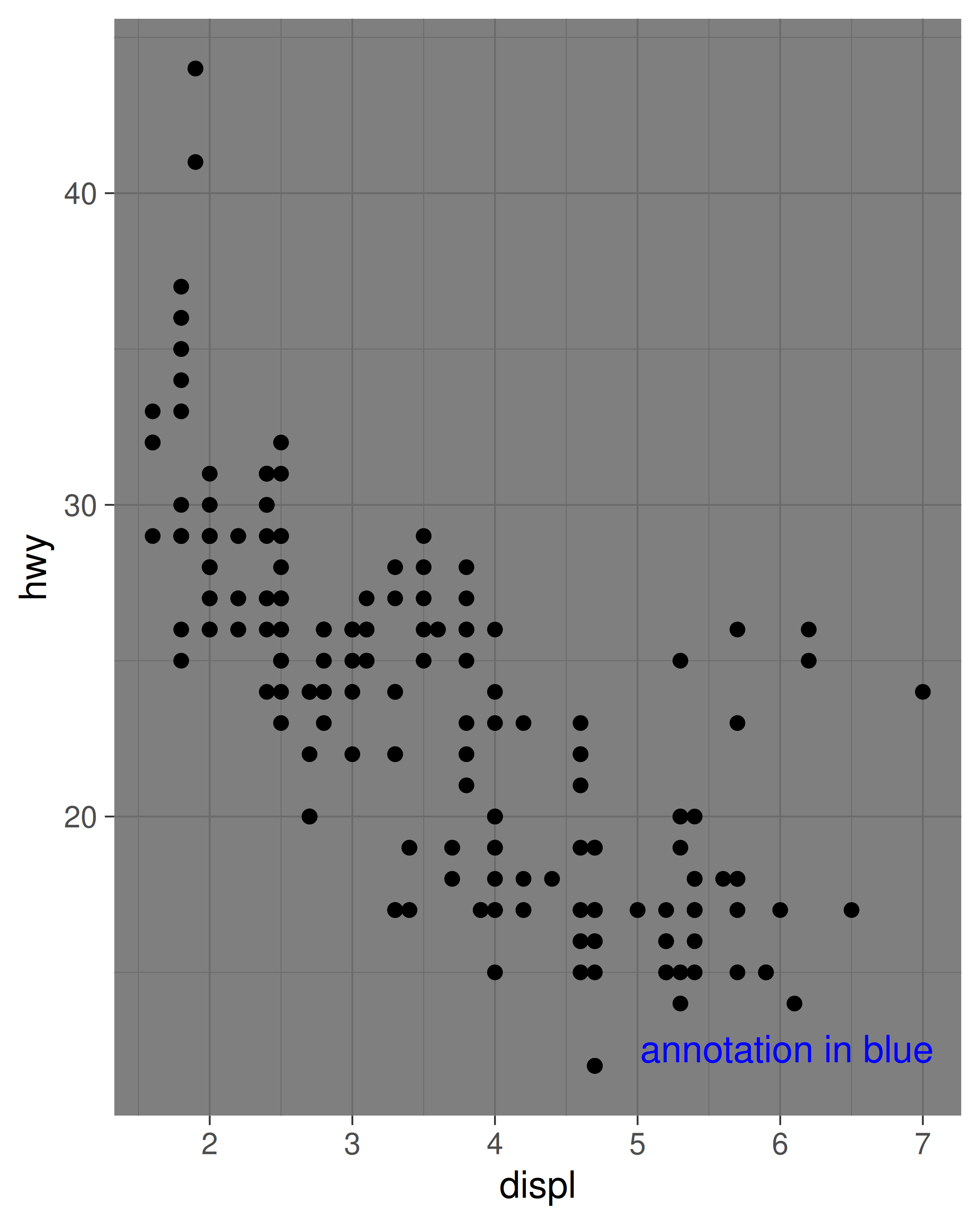
base + coord_annotate("annotation in blue") + theme_dark()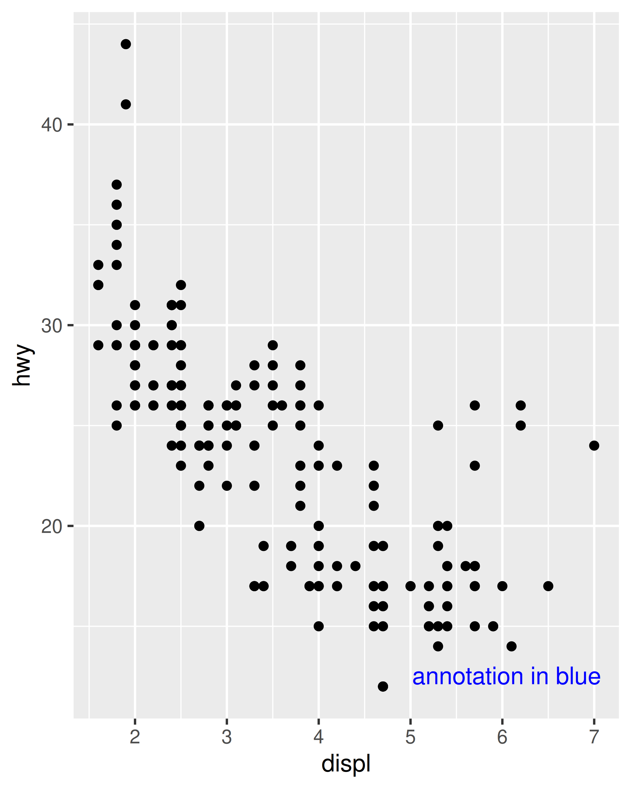
Having modified the element tree, it is worth mentioning the reset_theme_settings() function restores the default element tree, discards all new element definitions, and (unless turned off) resets the currently active theme to the default.
20.2 New stats
It may seem surprising, but creating new stats is one of the most useful ways to extend the capabilities of ggplot2. When users add new layers to a plot they most often use a geom function, and so it is tempting as a developer to think that your ggplot2 extension should be encapsulated as a new geom. To an extent this is true, as your users will likely want to use a geom function, but in truth the variety among different geoms is mostly due to the variety in different stats. One of the benefits of working with stats is that they are purely about data transformations. Most R users and developers are very comfortable with data transformation, which makes the task of defining a new stat easier. As long as the desired behaviour can be encapsulated in a stat, there is no need to fiddle with any calls to grid.
20.2.1 Creating stats
As discussed in Chapter 19, the core behaviour of a stat is captured by a tiered succession of calls to compute_layer(), compute_panel(), and compute_group(), all of which are methods associated with the ggproto object defining the stat. By default the top two functions don’t do very much, they simply split the data and then pass it down to the function below:
-
compute_layer()splits the data set by thePANELcolumn, callscompute_panel(), and reassembles the results. -
compute_panel()splits the panel data by thegroupcolumn, callscompute_group(), and reassembles the results.
Because of this, the only method you usually need to specify as a developer is the compute_group() function, whose job is to take the data for a single group and transform it appropriately. This will be sufficient to create a working stat, though it may not yield the best performance. As a consequence developers sometimes find it valuable to offload some of the work to compute_panel() where possible: doing so allows you to vectorise computations and avoid an expensive split-combine step (we’ll see an example of this later in Section 21.2). However, as a general rule it is better to begin by modifying compute_group() only and see if the performance is adequate.
To illustrate this, we’ll start by creating a stat that calculates the convex hull of a set of points, using the chull() function included in grDevices. As you might expect, most of the work is done by a new ggproto object that we will create:
As described in Section 19.4 the first two arguments to ggproto() are used to indicate that this object defines a new class (conveniently named "StatChull") which inherits fields and methods from the Stat object. We then specify only those fields and methods that need to be altered from the defaults provided by Stat, in this case compute_group() and required_aes. Our compute_group() function takes two inputs, data and scales—because this is what ggplot2 expects—but the actual computation is dependent only on the data. Note that because the computation necessarily requires both position aesthetics to be present, we have also specified the required_aes field to make sure that ggplot2 knows that these aesthetics are required.
By creating this ggproto object we have a working stat, but have not yet given the user a way to access it. To address this we write a layer function, stat_chull(). All layer functions have the same form: you specify defaults in the function arguments and then call layer(), sending ... into the params argument. The arguments in ... will either be arguments for the geom (if you’re making a stat wrapper), arguments for the stat (if you’re making a geom wrapper), or aesthetics to be set. layer() takes care of teasing the different parameters apart and making sure they’re stored in the right place. So our stat_chull() function looks like this
stat_chull <- function(mapping = NULL, data = NULL,
                       geom = "polygon", position = "identity",
                       na.rm = FALSE, show.legend = NA,
                       inherit.aes = TRUE, ...) {
  layer(
    stat = StatChull,
    data = data,
    mapping = mapping,
    geom = geom,
    position = position,
    show.legend = show.legend,
    inherit.aes = inherit.aes,
    params = list(na.rm = na.rm, ...)
  )
}
and our stat can now be used in plots:
ggplot(mpg, aes(displ, hwy)) +
geom_point() +
stat_chull(fill = NA, colour = "black")
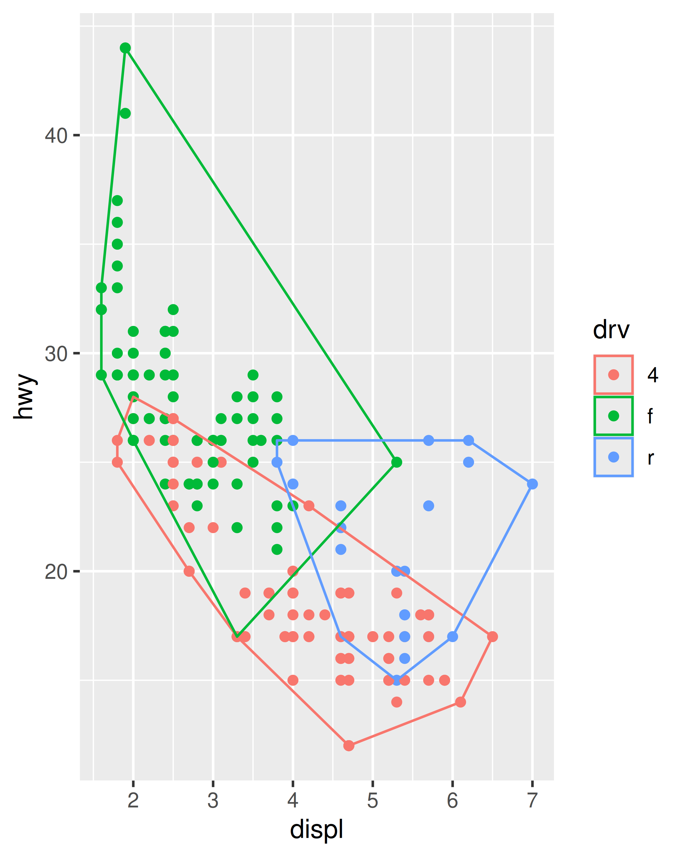
ggplot(mpg, aes(displ, hwy, colour = drv)) +
geom_point() +
stat_chull(fill = NA)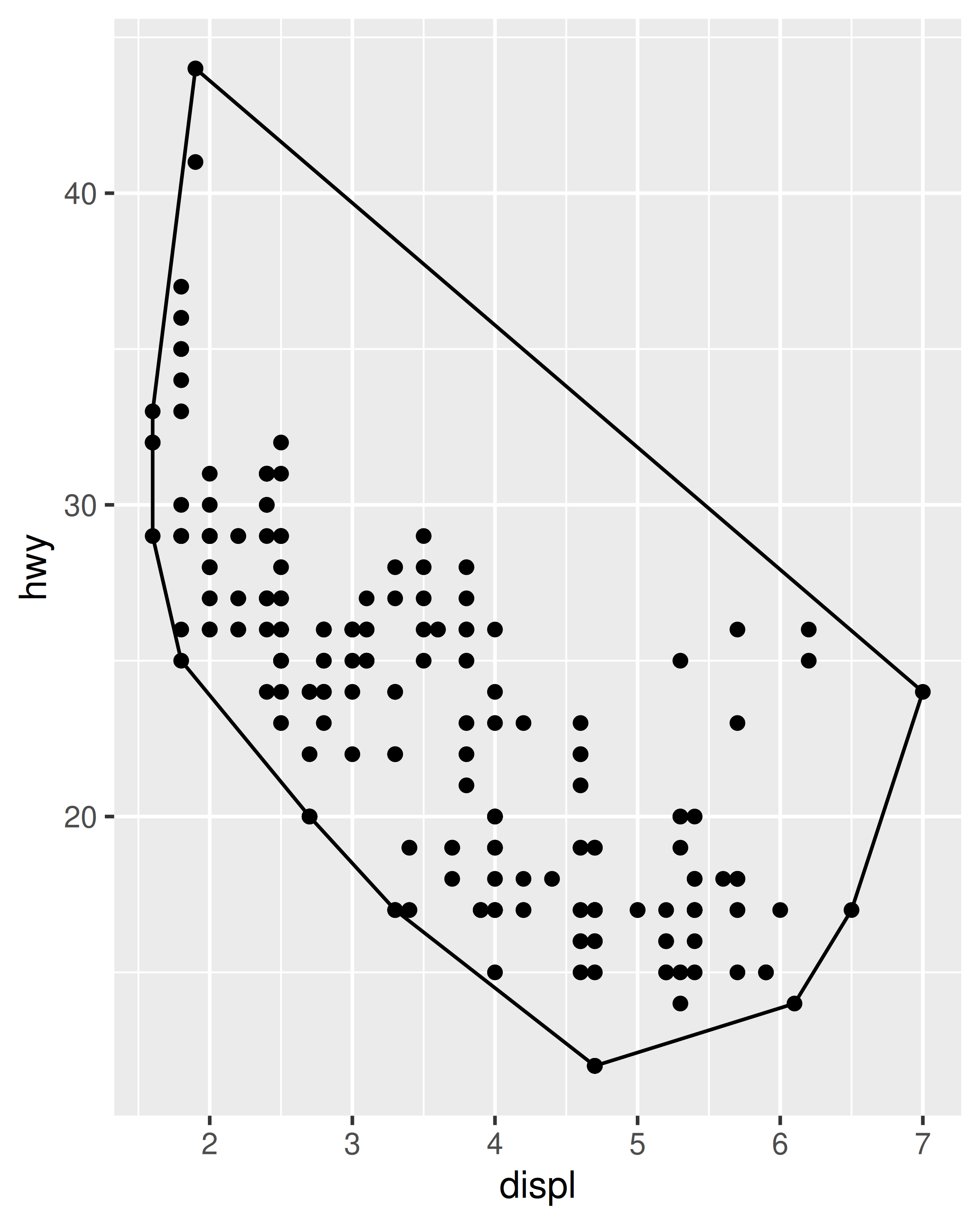
When creating new stats it is usually a good idea to provide an accompanying geom_*() constructor as well as the stat_*() constructor, because most users are accustomed to adding plot layers with geoms rather than stats. We’ll show what a geom_chull() function might look like in Section 20.3.
Note that it is not always possible to define geom_*() constructor in a sensible way. This can happen when there is no obvious default geom for the new stat, or if the stat is intended to offer a slight modification to an existing geom/stat pair. In such cases it may be wise to provide only a stat_*() function.
20.2.2 Modifying parameters and data
When defining new stats, it is often necessary to specify the setup_params() and/or setup_data() functions. These are called before the compute_*() functions and they allow the Stat to react and modify itself in response to the parameters and data (especially the data, as this is not available when the stat is constructed):
- The
setup_params()function is called first. It takes two arguments corresponding to the layerdataand a list of parameters (params) specified during construction, and returns a modified list of parameters that will be used in later computations. Because the parameters are used by thecompute_*()functions, the elements of the list should correspond to argument names in thecompute_*()functions in order to be made available. - The
setup_data()function is called next. It also takesdataandparamsas input—though the parameters it receives are the modified parameters returned fromsetup_params()—and returns the modified layer data. It is important that no matter what modifications happen insetup_data()thePANELandgroupcolumns remain intact.
In the example below we show how to use the setup_params() method to define a new stat. An example modifying the setup_data() method is included later, in Section 20.3.2.
Suppose we want to create StatDensityCommon, a stat that computes a density estimate of a variable after estimating a default bandwidth to apply to all groups in the data. This could be done in many different ways but for simplicity let’s imagine we have a function common_bandwidth() that estimates the bandwidth separately for each group using the bw.nrd0() function and then returns the average:
What we want from StatDensityCommon is to use the common_bandwith() function to set a common bandwidth before the data are separated by group and passed to the compute_group() function. This is where the setup_params() method is useful:
StatDensityCommon <- ggproto("StatDensityCommon", Stat,
  required_aes = "x",

  setup_params = function(data, params) {
    if(is.null(params$bandwith)) {
      params$bandwidth <- common_bandwidth(data)
      message("Picking bandwidth of ", signif(params$bandwidth, 3))
    }
    return(params)
  },

  compute_group = function(data, scales, bandwidth = 1) {
    d <- density(data$x, bw = bandwidth)
    return(data.frame(x = d$x, y = d$y))
  }
)
We then define a stat_*() function in the usual way:
stat_density_common <- function(mapping = NULL, data = NULL,
                                geom = "line", position = "identity",
                                na.rm = FALSE, show.legend = NA,
                                inherit.aes = TRUE, bandwidth = NULL, ...) {
  layer(
    stat = StatDensityCommon,
    data = data,
    mapping = mapping,
    geom = geom,
    position = position,
    show.legend = show.legend,
    inherit.aes = inherit.aes,
    params = list(
      bandwidth = bandwidth,
      na.rm = na.rm,
      ...
    )
  )
}
We can now apply our new stat
ggplot(mpg, aes(displ, colour = drv)) +
  stat_density_common()
#> Picking bandwidth of 0.345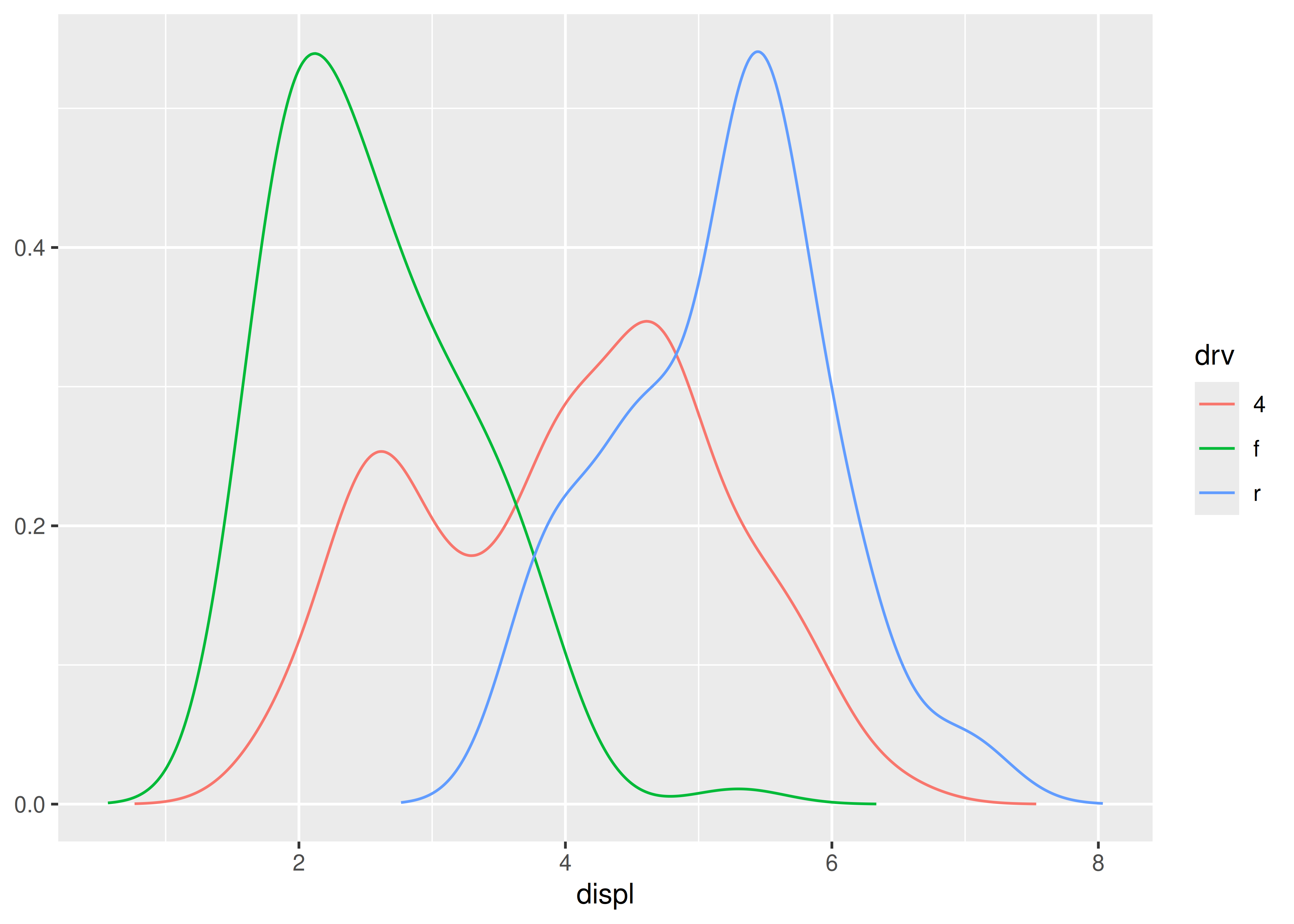
20.3 New geoms
While many things can be achieved by creating new stats, there are situations where creating a new geom is necessary. Some of these are
- It is not meaningful to return data from the stat in a form that is understandable by any current geoms.
- The layer needs to combine the output of multiple geoms.
- The geom needs to return grobs not currently available from existing geoms.
Creating new geoms can feel slightly more daunting than creating new stats as the end result is a collection of grobs rather than a modified data.frame and this is something outside of the comfort zone of many developers. Still, apart from the last point above, it is possible to get by without having to think too much about grid and grobs.
20.3.1 Modifying geom defaults
In many situations your new geom may simply be an existing geom that expects slightly different input or has different default parameter values. The stat_chull() example from the previous section is a good example of this. Notice that in when creating plots using stat_chull() we had to manually specify the fill and colour parameters if those were not mapped to aesthetics. The reason for this is that GeomPolygon creates a borderless filled polygon by default, and this is not well suited to the needs of our convex hull geom. To make our lives a little easier then, we can create a subclass of GeomPolygon that modifies the defaults so that it produces a hollow polygon by default. We can do this in a straightforward way by overriding the default_aes value:
GeomPolygonHollow <- ggproto("GeomPolygonHollow", GeomPolygon,
  default_aes = aes(
    colour = "black",
    fill = NA,
    linewidth = 0.5,
    linetype = 1,
    alpha = NA
  )
)
We can now define our geom_chull() constructor function using GeomPolygonHollow as the default geom:
geom_chull <- function(mapping = NULL, data = NULL, stat = "chull",
                       position = "identity", na.rm = FALSE,
                       show.legend = NA, inherit.aes = TRUE, ...) {
  layer(
    geom = GeomPolygonHollow,
    data = data,
    mapping = mapping,
    stat = stat,
    position = position,
    show.legend = show.legend,
    inherit.aes = inherit.aes,
    params = list(na.rm = na.rm, ...)
  )
}
For the sake of consistency we would also define stat_chull() to use this as the default. In any case, we now have a new geom_chull() function that works fairly well without the user needing to set parameters:
ggplot(mpg, aes(displ, hwy)) +
  geom_chull() +
  geom_point()
20.3.2 Modifying geom data
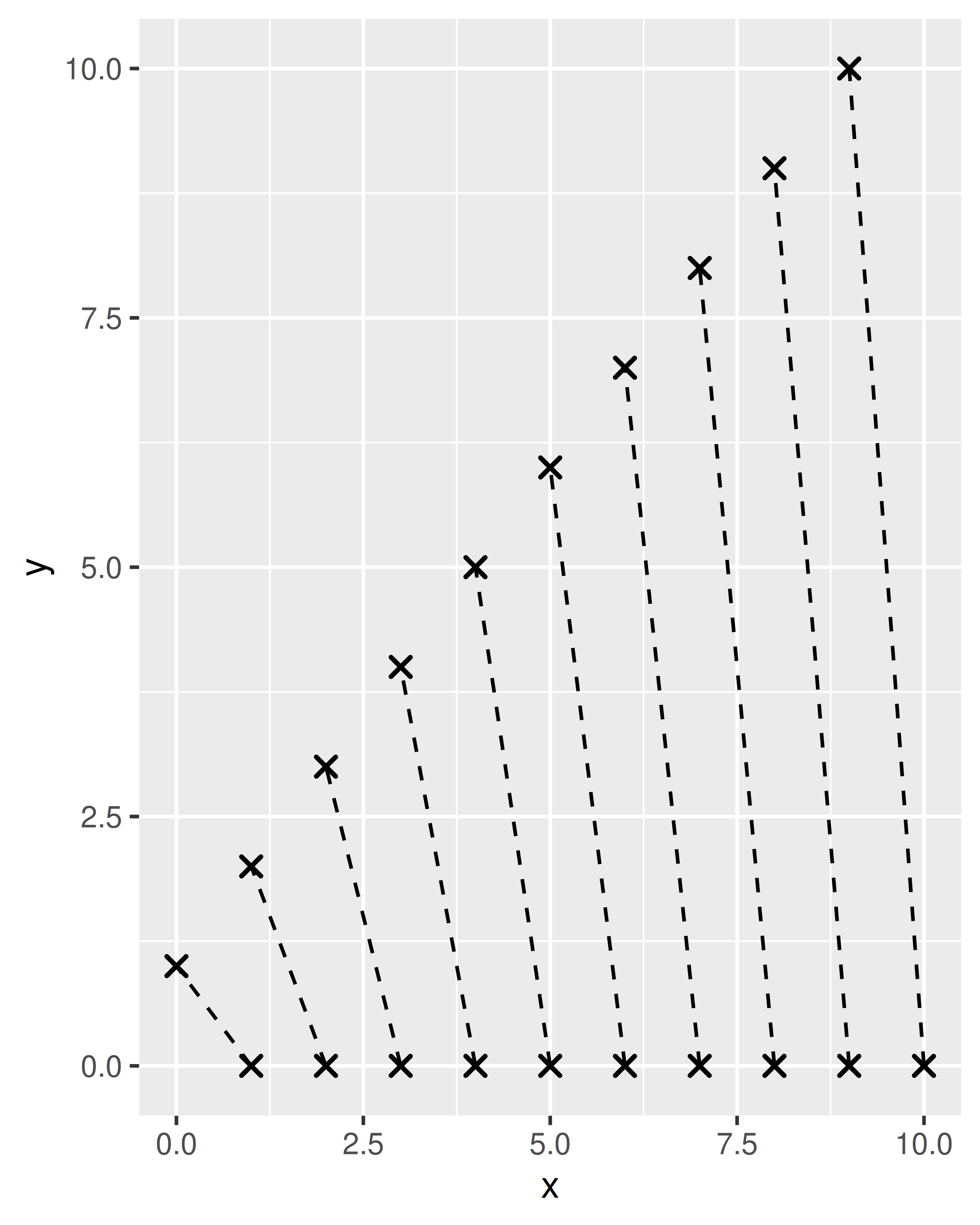
In other cases you may want to define a geom that is visually equivalent to an existing geom, but accepts data in a different format. An example of this in the ggplot2 source code is geom_spoke(), a variation of geom_segment() that accepts data in polar coordinates. To make this work, the GeomSpoke ggproto object is subclassed from GeomSegment, and uses the setup_data() method to take polar coordinate data from the user and then transform it to the format that GeomSegment expects. To illustrate this technique we’ll create geom_spike(), a geom that re-implements the functionality of geom_spoke(). This requires us to overwrite the required_aes field as well as the setup_data() method:
GeomSpike <- ggproto("GeomSpike", GeomSegment,

  # Specify the required aesthetics
  required_aes = c("x", "y", "angle", "radius"),

  # Transform the data before any drawing takes place
  setup_data = function(data, params) {
    transform(data,
      xend = x + cos(angle) * radius,
      yend = y + sin(angle) * radius
    )
  }
)
We now write the user facing geom_spike() function:
geom_spike <- function(mapping = NULL, data = NULL,
                       stat = "identity", position = "identity",
                       ..., na.rm = FALSE, show.legend = NA,
                       inherit.aes = TRUE) {
  layer(
    data = data,
    mapping = mapping,
    geom = GeomSpike,
    stat = stat,
    position = position,
    show.legend = show.legend,
    inherit.aes = inherit.aes,
    params = list(na.rm = na.rm, ...)
  )
}
We are now able to use geom_spike() in plots:
df <- data.frame(
  x = 1:10,
  y = 0,
  angle = seq(from = 0, to = 2 * pi, length.out = 10),
  radius = seq(from = 0, to = 2, length.out = 10)
)
ggplot(df, aes(x, y)) +
  geom_spike(aes(angle = angle, radius = radius)) +
  coord_equal()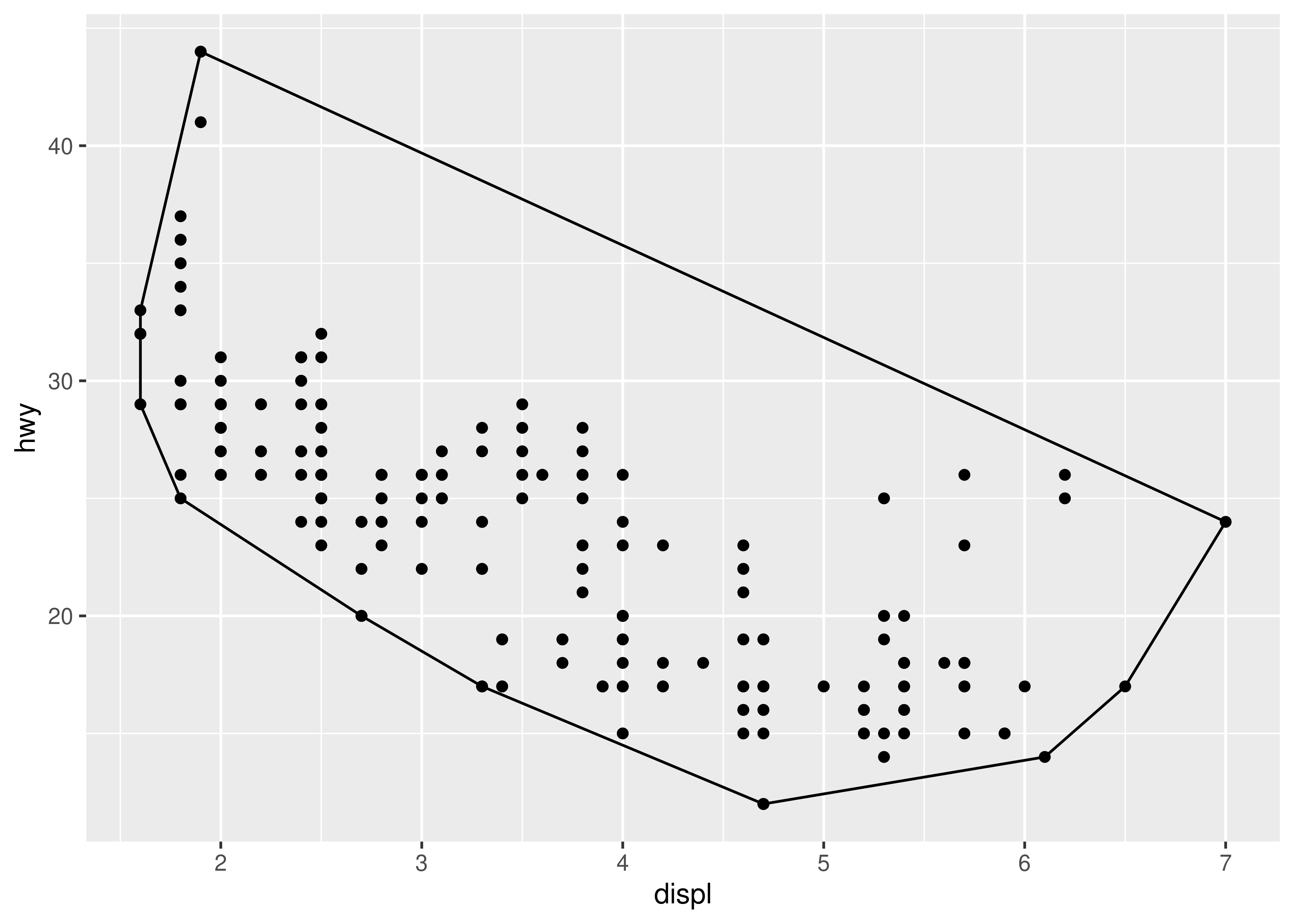
As with stats, geoms have a setup_params() method in addition to the setup_data() method, which can be used to modify parameters before any drawing takes place (see Section 20.2.2 for an example). One thing to note in the geom context, however, is that setup_data() is called before any position adjustment is done.
20.3.3 Combining multiple geoms
A useful technique for defining new geoms is to combine functionality from different geoms. For example, the geom_smooth() function for drawing nonparametric regression lines uses functionality from geom_line() to draw the regression line and geom_ribbon() to draw the shaded error bands. To do this within your new geom, it is helpful to consider the drawing process. In much the same way that a stat works by a tiered succession of calls to compute_layer() then compute_panel() and finally compute_group(), a geom is constructed by calls to draw_layer(), draw_panel(), and draw_group().
If you want to combine the functionality of multiple geoms it can usually be achieved by preparing the data for each of the geoms inside the draw_*() call and send it off to the different geoms, collecting the output using grid::gList() when a list of grobs is needed or grid::gTree() if a single grob with multiple children is required. As a relatively minimal example, consider the GeomBarbell ggproto object that creates geoms consisting of two points connected by a bar:
GeomBarbell <- ggproto("GeomBarbell", Geom,

  required_aes = c("x", "y", "xend", "yend"),

  default_aes = aes(
    colour = "black",
    linewidth = .5,
    size = 2,
    linetype = 1,
    shape = 19,
    fill = NA,
    alpha = NA,
    stroke = 1
  ),

  draw_panel = function(data, panel_params, coord, ...) {

    # Transformed data for the points
    point1 <- transform(data)
    point2 <- transform(data, x = xend, y = yend)

    # Return all three components
    grid::gList(
      GeomSegment$draw_panel(data, panel_params, coord, ...),
      GeomPoint$draw_panel(point1, panel_params, coord, ...),
      GeomPoint$draw_panel(point2, panel_params, coord, ...)
    )
  }
)
In this example the draw_panel() method returns a list of three grobs, one generated from GeomSegment and two from GeomPoint. As usual, if we want the geom to be exposed to the user we add a wrapper function:
geom_barbell <- function(mapping = NULL, data = NULL,
                         stat = "identity", position = "identity",
                         ..., na.rm = FALSE, show.legend = NA,
                         inherit.aes = TRUE) {
  layer(
    data = data,
    mapping = mapping,
    stat = stat,
    geom = GeomBarbell,
    position = position,
    show.legend = show.legend,
    inherit.aes = inherit.aes,
    params = list(na.rm = na.rm, ...)
  )
}
We are now able to use the composite geom:
df <- data.frame(x = 1:10, xend = 0:9, y = 0, yend = 1:10)
base <- ggplot(df, aes(x, y, xend = xend, yend = yend))

base + geom_barbell()
base + geom_barbell(shape = 4, linetype = "dashed") 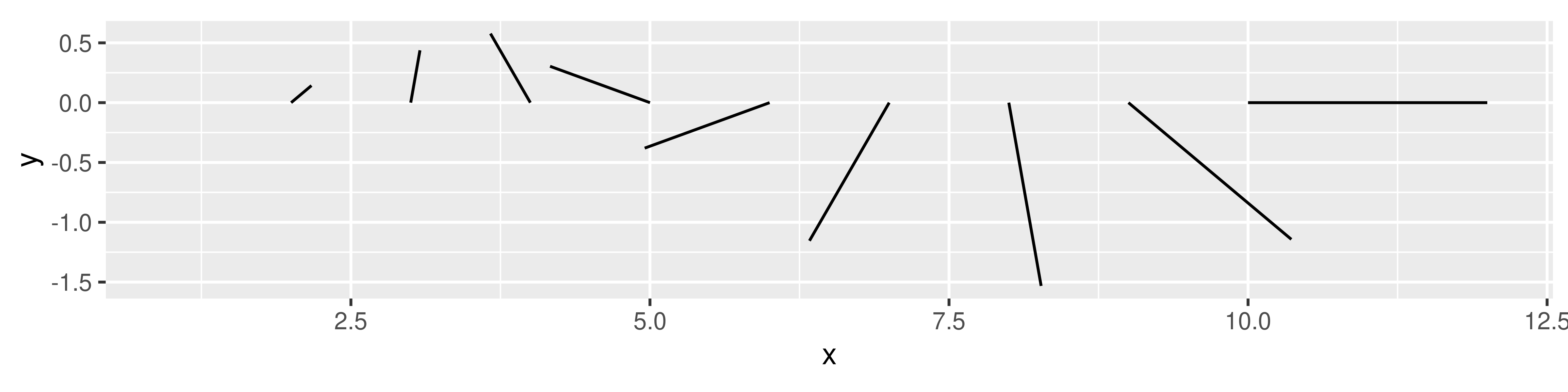
If you cannot leverage any existing geom implementation for creating the grobs, you’d have to implement the full draw_*() method from scratch, which requires a little more understanding of the grid package. For more information about grid and an example that uses this to construct a geom from grid primitives, see Chapter 21.
20.4 New coords
The primary role of the coord is to rescale the position aesthetics onto the [0, 1] range, potentially transforming them in the process. Defining new coords is relatively rare: the coords described in Chapter 15 are suitable for most non-cartographic cases, and with the introduction of coord_sf() discussed in Chapter 6, ggplot2 is able to capture most cartographic projections out of the box.
The most common situation in which developers may need to know the internals of coordinate systems is when defining new geoms. It is not uncommon for one of the draw_*() methods in a geom to call the transform() method of the coord. For example, the transform() method for CoordCartesian is used to rescale position data but does not transform it in any other way, and the geom may need to apply this rescaling to draw the grob properly. An example of this use appears in Chapter 21.
In addition to transforming position data, the coord has responsibility for rendering the axes, axis labels, panel foreground and panel background. Additionally, the coord can intercept and modify the layer data and the facet layout. Much of this functionality is available to developers to leverage if it is absolutely necessary (an example is shown in Section 20.1.3), but in the majority of cases it is better to leave this functionality alone.
20.5 New scales
There are three ways one might want to extend ggplot2 with new scales. The simplest case is when you want to provide a convenient wrapper for a new palette, typically for a colour or fill aesthetic. As an impractical example, suppose you wanted to sample random colours to fill a violin or box plot, using a palette function like this:
We can then write a scale_fill_random() constructor function that passes the palette to discrete_scale() and then use it in plots:
scale_fill_random <- function(..., aesthetics = "fill") {
  discrete_scale(
    aesthetics = aesthetics,
    scale_name = "random",
    palette = random_colours
  )
}

ggplot(mpg, aes(hwy, class, fill = class)) +
  geom_violin(show.legend = FALSE) +
  scale_fill_random()
#> Warning: The `scale_name` argument of `discrete_scale()` is deprecated as of ggplot2
#> 3.5.0.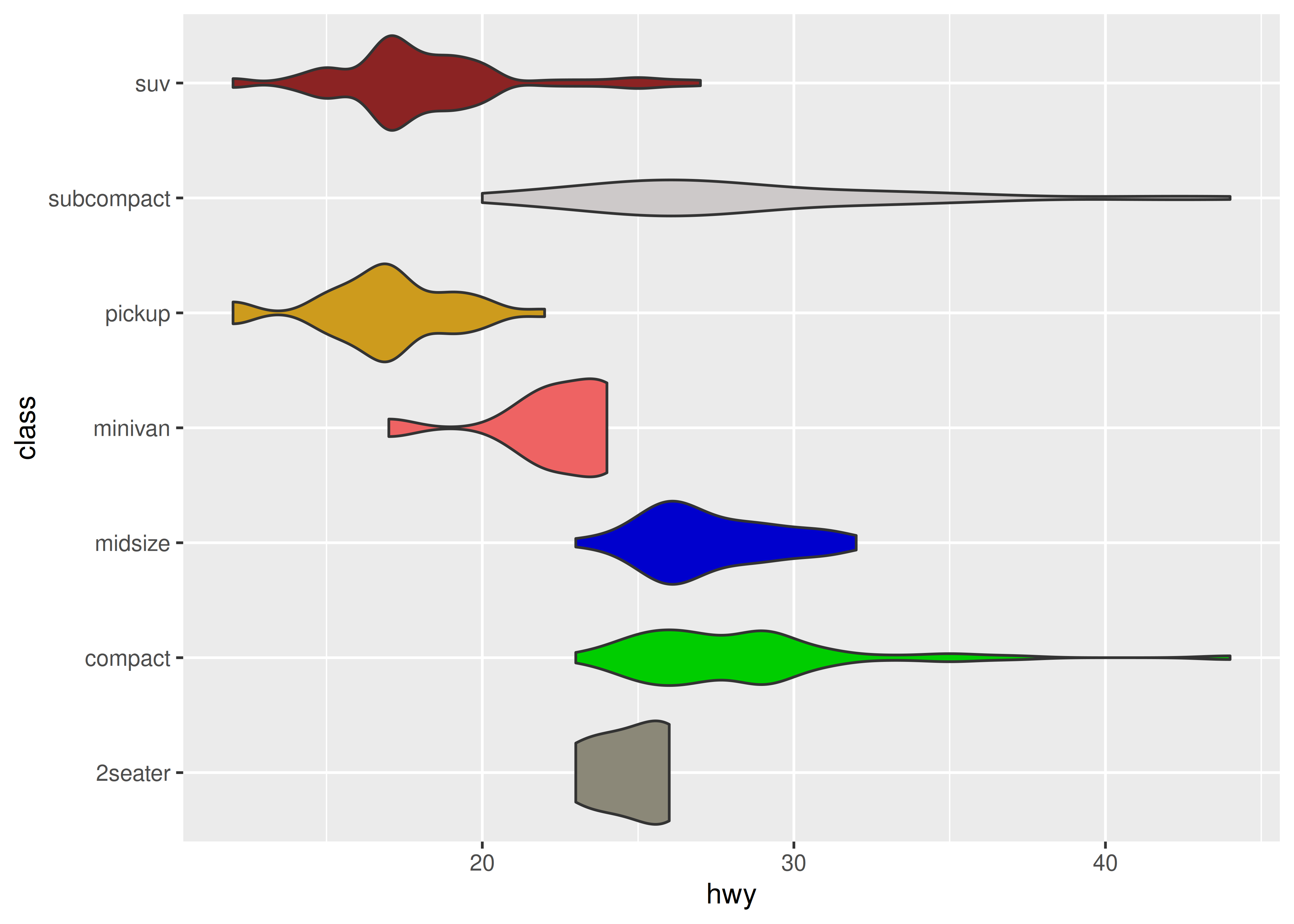
Another relatively simple case is where you provide a geom that takes a new type of aesthetic that needs to be scaled. Let’s say that you created a new line geom, and instead of the size aesthetic you decided on using a width aesthetic. In order to get width scaled in the same way as you’ve come to expect scaling of size you must provide a default scale for the aesthetic. Default scales are found based on their name and the data type provided to the aesthetic. If you assign continuous values to the width aesthetic ggplot2 will look for a scale_width_continuous() function and use this if no other width scale has been added to the plot. If such a function is not found (and no width scale was added explicitly), the aesthetic will not be scaled.
A last possibility worth mentioning, but outside the scope of this book, is the possibility of creating a new primary scale type. Historically, ggplot2 has had two primary scale types, continuous and discrete. Recently the binned scale type joined which allows for binning of continuous data into discrete bins. It is possible to develop further primary scales, by following the example of ScaleBinned. It requires subclassing Scale or one of the provided primary scales, and create new train() and map() methods, among others.
20.6 New positions
The Position ggproto class is somewhat simpler than other ggproto classes, reflecting the fact that the position_*() functions have a very narrow scope. The role of the position is to receive and modify the data immediately before it is passed to any drawing functions. Strictly speaking, the position is able to modify the data in any fashion, but there is an implicit expectation that it modifies position aesthetics only. A position possesses compute_layer() and compute_panel() methods that behave analogously to the equivalent methods for a stat, but it does not possess a compute_group() method. It also contains setup_params() and setup_data() methods that are similar to the setup_*() methods for other ggproto classes, with one notable exception: the setup_params() method only receives the data as input, and not a list of parameter. The reason for this is that position_*() functions are never used on their own in ggplot2: rather, they are always called within the main geom_*() or stat_*() command that specifies the layer, and the parameters from the main command are not passed to the position_*() function call.
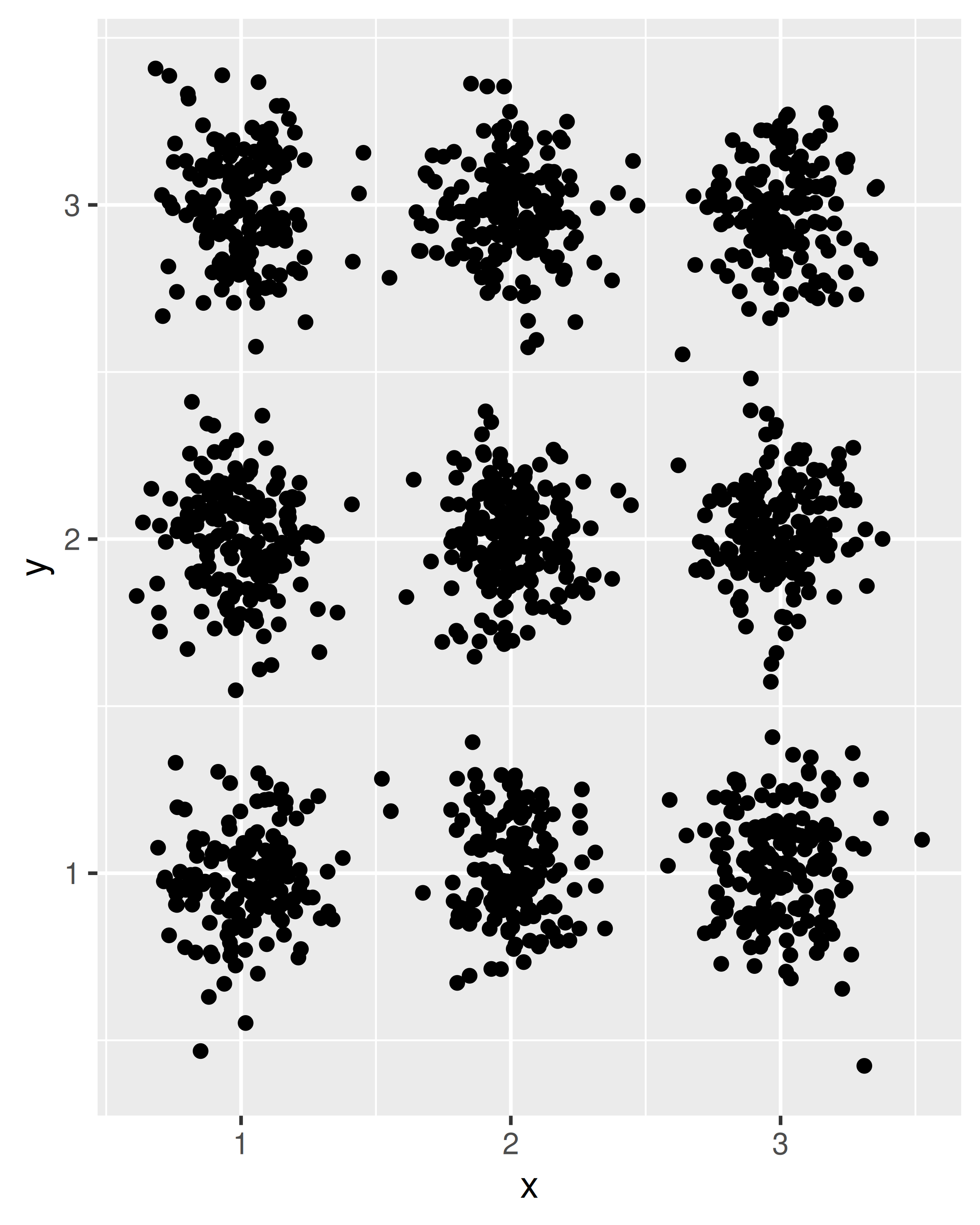
To give a simple example, we’ll implement a slightly simplified version of the position_jitternormal() function from the ggforce package, which behaves in the same way as position_jitter() except that the perturbations are sampled from a normal distribution rather than a uniform distribution. In order to keep the exposition simple, we’ll assume we have the following convenience function defined:
When called, normal_transformer() returns a function that perturbs the input vector by adding random noise with mean zero and standard deviation sd. The first step when creating our new position is to make a subclass of the Position object:
PositionJitterNormal <- ggproto('PositionJitterNormal', Position,

  # We need an x and y position aesthetic
  required_aes = c('x', 'y'),

  # By using the "self" argument we can access parameters that the
  # user has passed to the position, and add them as layer parameters
  setup_params = function(self, data) {
    list(
      sd_x = self$sd_x,
      sd_y = self$sd_y
    )
  },

  # When computing the layer, we can read the standard deviation
  # parameters off the param list, and use them to transform the
  # position aesthetics
  compute_layer = function(data, params, panel) {

    # construct transformers for the x and y position scales
    x_transformer <- normal_transformer(x, params$sd_x)
    y_transformer <- normal_transformer(y, params$sd_y)

    # return the transformed data
    transform_position(
      df = data,
      trans_x = x_transformer,
      trans_y = y_transformer
    )
  }
)
The compute_layer() method makes use of transform_position(), a convenience function provided by ggplot2 whose role is to apply the user-supplied functions to all aesthetics associated with the relevant position scale (e.g., not just x and y, but also xend and yend).
In a realistic implementation, the position_jitternormal() constructor would apply some input validation to make sure the user has not specified negative standard deviations, but in this context we’ll keep it simple:
position_jitternormal <- function(sd_x = .15, sd_y = .15) {
  ggproto(NULL, PositionJitterNormal, sd_x = sd_x, sd_y = sd_y)
}
We are now able to use our new position function when creating plots. To see the difference between position_jitter() and the position_jitternormal() function we have just defined, compare the following plots:
df <- data.frame(
  x = sample(1:3, 1500, TRUE),
  y = sample(1:3, 1500, TRUE)
)

ggplot(df, aes(x, y)) + geom_point(position = position_jitter())
ggplot(df, aes(x, y)) + geom_point(position = position_jitternormal())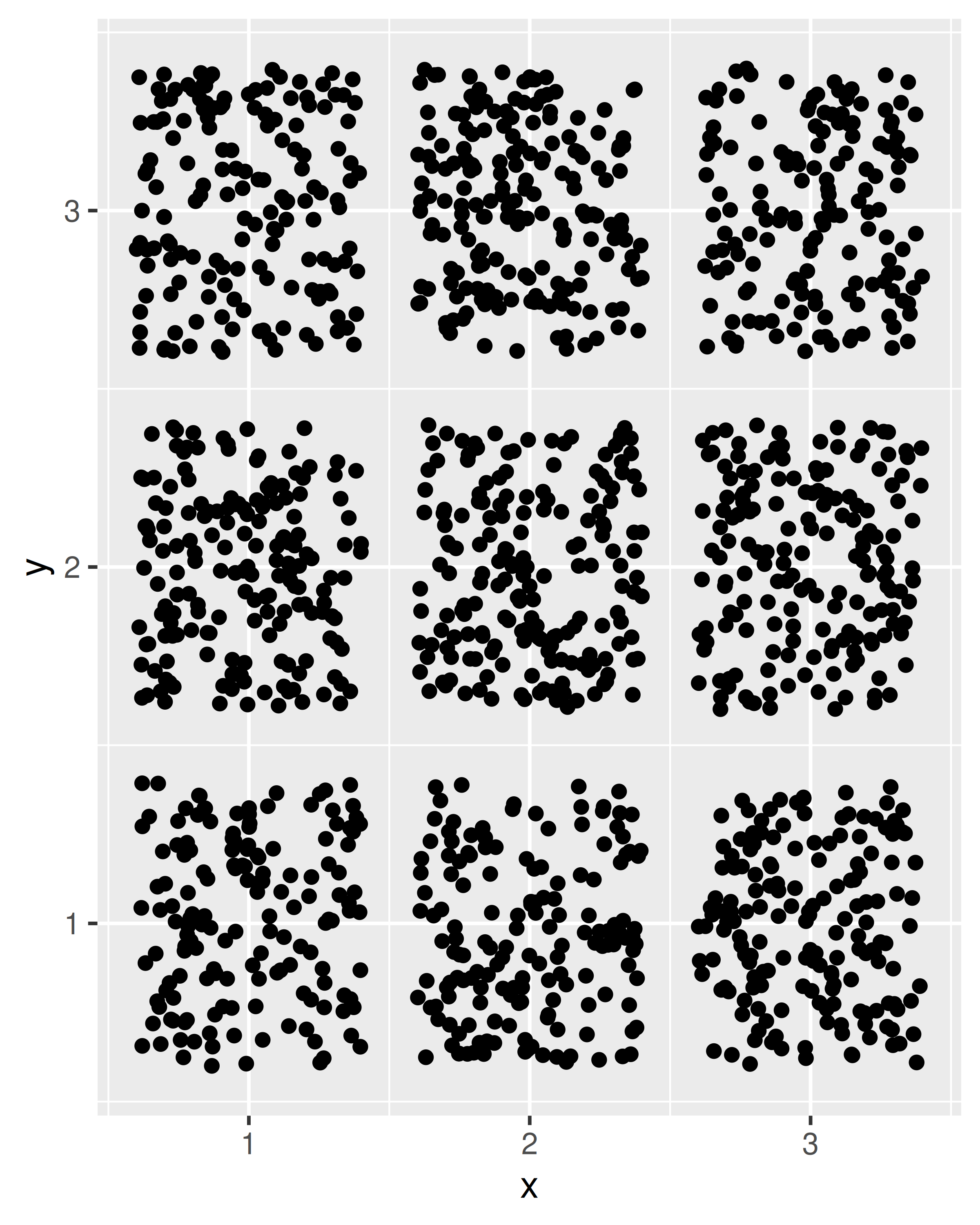
One practical consideration to keep in mind when designing new positions is that users very rarely call the position constructor directly. The command specifying the layer is more likely to include an expression like position = "dodge" rather than position = position_dodge(), and even less likely to override your default values as would occur if the user specified position = position_dodge(width = 0.9). As a consequence, it is important to think carefully and make the defaults work for most cases if at all possible. This can be quite tricky: positions have very little control over the shape and format of the layer data, but the user will expect them to behave predictably in all situations. An example is the case of dodging, where users might like to dodge a boxplot and a point-cloud, and would expect the point-cloud to appear in the same area as its respective boxplot. This is a perfectly reasonable expectation at the user level, but it can be tricky for the developer. A boxplot has an explicit width that can be used to control the dodging whereas the same is not true for points, but the user will expect them to be moved in the same way. Such considerations often mean that position implementations end up much more complex than their simplest solution to take care of a wide range of edge cases.
20.7 New facets
Facets are one of the most powerful concepts in ggplot2, and extending facets is one of the most powerful ways to modify how ggplot2 operates. This power comes at a cost: facets are responsible for receiving all the panels, attaching the axes and strips to them, and then arranging them in the expected manner. To create an entirely new faceting system requires an in-depth understanding of grid and gtable, and can be a daunting challenge. Fortunately, you don’t always need to create the facet from scratch. For example, if your new facet will produce panels that lie on a grid, you can often subclass FacetWrap or FacetGrid and modify one or two methods. In particular, you may wish to define new compute_layout() and/OR map_data() methods:
The
compute_layout()method receives the original data set and creates a layout specification, a data frame with one row per panel that indicates where each panel falls on the grid, along with information about which axis limits should be free and which should be fixed.The
map_data()method receives this layout specification and the original data as the input, and attaches aPANELcolumn to it, which is used to assign each row in the data frame to one of the panels in the layout.
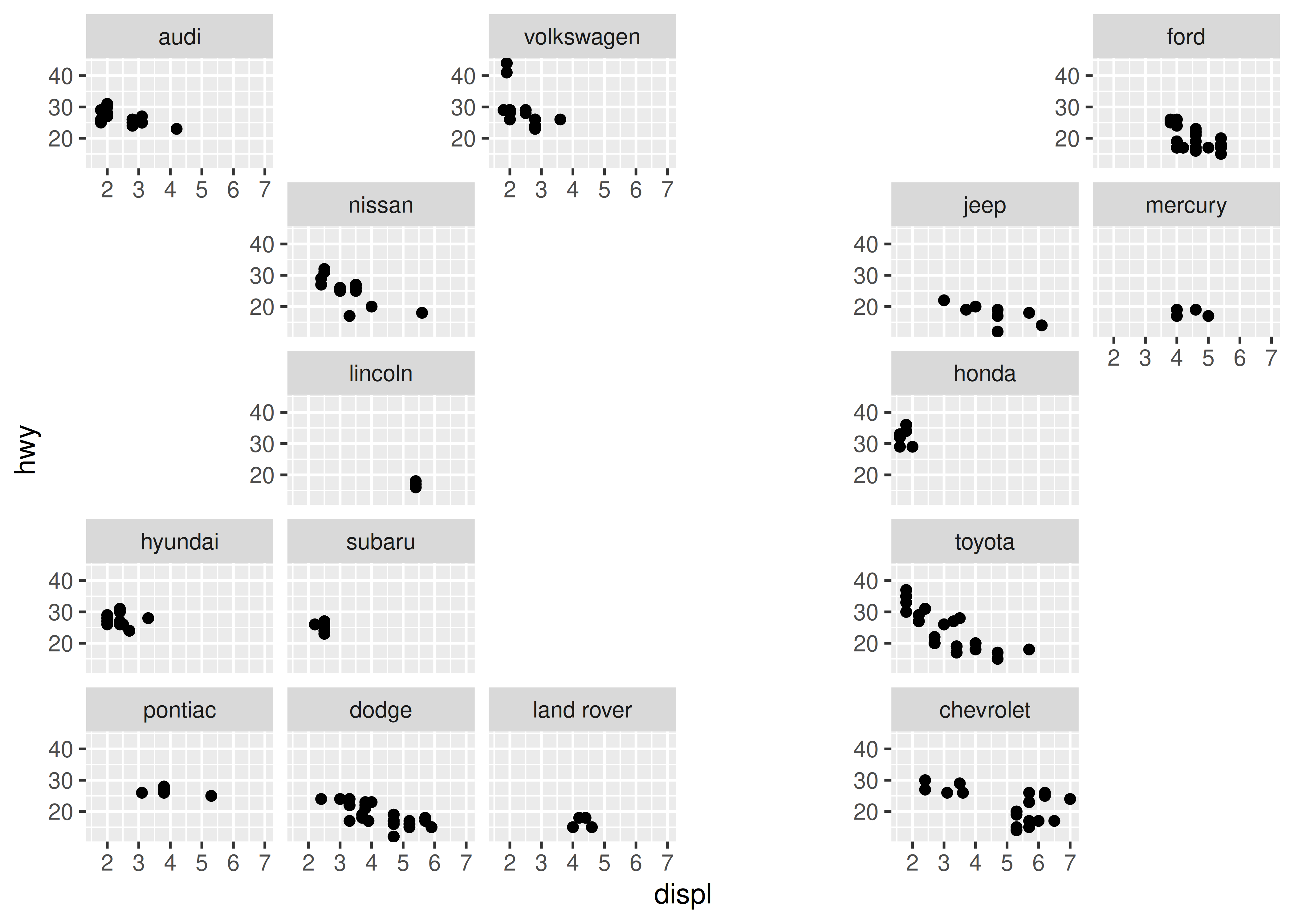
To illustrate how you can create new facets by subclassing an existing facet, we’ll create a relatively simple facetting system that “scatters” the panels, placing them in random locations on a grid. To do this we’ll create a new ggproto object called FacetScatter that is a subclass of FacetWrap, and write a new compute_layout() method that places each panel in a randomly chosen cell of the panel grid:
FacetScatter <- ggproto("FacetScatter", FacetWrap,

  # This isn't important to the example: all we're doing is
  # forcing all panels to use fixed scale so that the rest
  # of the example can be kept simple
  setup_params = function(data, params) {
    params <- FacetWrap$setup_params(data, params)
    params$free <- list(x = FALSE, y = FALSE)
    return(params)
  },

  # The compute_layout() method does the work
  compute_layout = function(data, params) {

    # create a data frame with one column per facetting
    # variable, and one row for each possible combination
    # of values (i.e., one row per panel)
    panels <- combine_vars(
      data = data,
      env = params$plot_env,
      vars = params$facets,
      drop = FALSE
    )

    # Create a data frame with columns for ROW and COL,
    # with one row for each possible cell in the panel grid
    locations <- expand.grid(ROW = 1:params$nrow, COL = 1:params$ncol)

    # Randomly sample a subset of the locations
    shuffle <- sample(nrow(locations), nrow(panels))

    # Assign each panel a location
    layout <- data.frame(
      PANEL = 1:nrow(panels),       # panel identifier
      ROW = locations$ROW[shuffle], # row number for the panels
      COL = locations$COL[shuffle], # column number for the panels
      SCALE_X = 1L,                 # all x-axis scales are fixed
      SCALE_Y = 1L                  # all y-axis scales are fixed
    )

    # Bind the layout information with the panel identification
    # and return the resulting specification
    return(cbind(layout, panels))
  }
)
To give you a sense of what this output looks like, this is the layout specification that is created when building the plot shown at the end of this section:
#>    PANEL ROW COL SCALE_X SCALE_Y manufacturer COORD
#> 1      1   4   1       1       1         audi     1
#> 2      2   5   5       1       1    chevrolet     1
#> 3      3   5   1       1       1        dodge     1
#> 4      4   5   3       1       1         ford     1
#> 5      5   1   5       1       1        honda     1
#> 6      6   4   4       1       1      hyundai     1
#> 7      7   3   5       1       1         jeep     1
#> 8      8   2   2       1       1   land rover     1
#> 9      9   5   2       1       1      lincoln     1
#> 10    10   4   5       1       1      mercury     1
#> 11    11   2   4       1       1       nissan     1
#> 12    12   5   4       1       1      pontiac     1
#> 13    13   3   2       1       1       subaru     1
#> 14    14   5   6       1       1       toyota     1
#> 15    15   4   6       1       1   volkswagen     1
Next, we’ll write the facet_scatter() constructor function to expose this functionality to the user. For facets this is as simple as creating a new instance of the relevant ggproto object (FacetScatter in this case) that passes user-specified parameters to the facet:
facet_scatter <- function(facets, nrow, ncol,
                          strip.position = "top",
                          labeller = "label_value") {

  ggproto(NULL, FacetScatter,
    params = list(
      facets = rlang::quos_auto_name(facets),
      strip.position = strip.position,
      labeller = labeller,
      ncol = ncol,
      nrow = nrow
    )
  )
}
There a couple of things to note about this constructor function. First, to keep the example simple, facet_scatter() contains fewer arguments than facet_wrap(), and we’ve made nrow and ncol required arguments: the user needs to specify the size of the grid over which the panels should be scattered. Second, the facet_scatter() function requires you to specify the facets using vars(). It won’t work if the user tries to supply a formula. Relatedly, note the use of rlang::quos_auto_name(): the vars() function returns an unnamed list of expressions (technically, quosures), but the downstream code requires a named list. As long as you’re expecting the user to use vars() this is all the preprocessing you need, but if you want to support other input formats you’ll need to be a little fancier (you can see how to do this by looking at the ggplot2 source code).
In any case, we now have a working facet:
ggplot(mpg, aes(displ, hwy)) +
  geom_point() +
  facet_scatter(vars(manufacturer), nrow = 5, ncol = 6)