df <- data.frame(r = c(0, 1), theta = c(0, 3 / 2 * pi))
ggplot(df, aes(r, theta)) +
geom_line() +
geom_point(size = 2, colour = "red")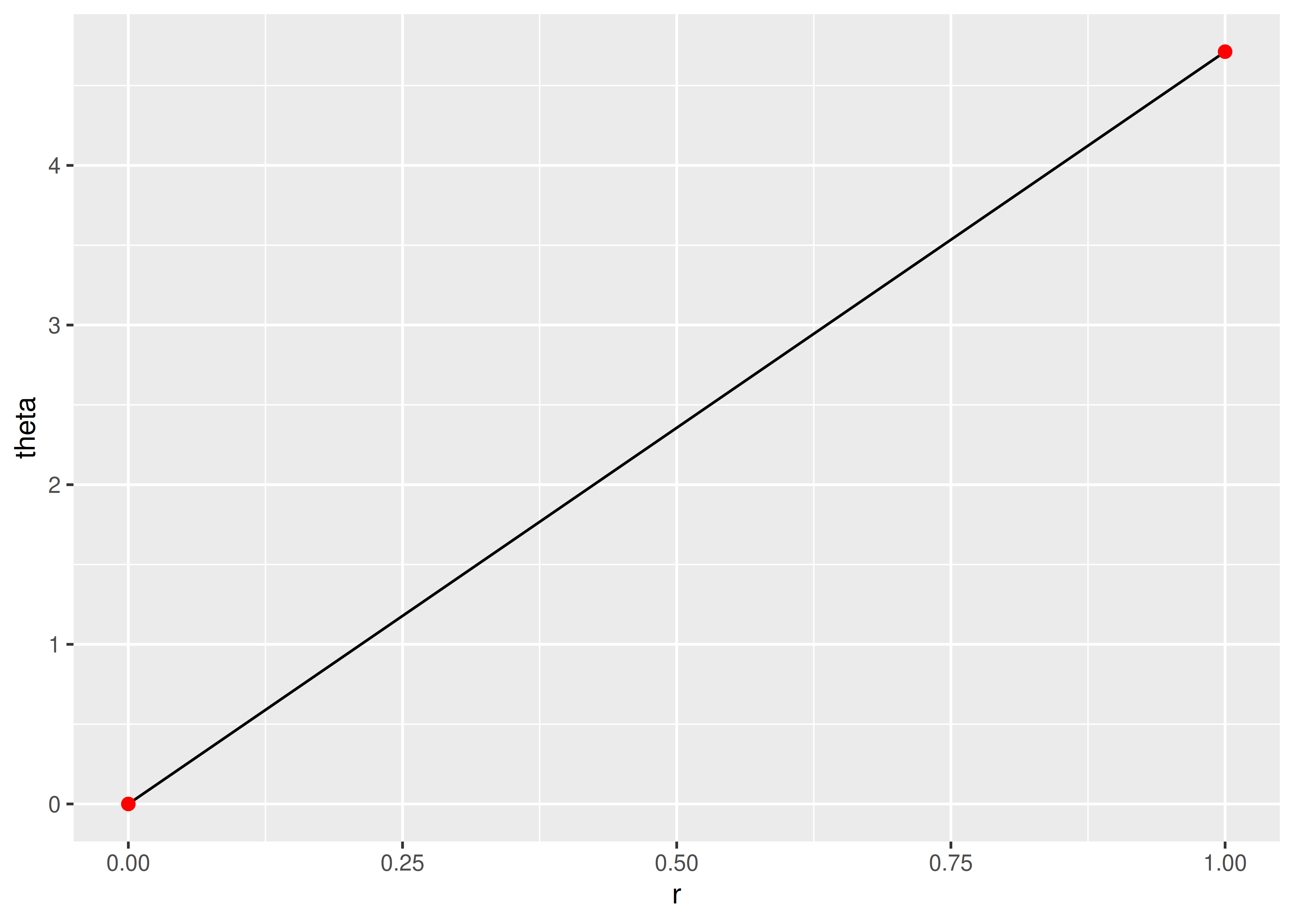
You are reading the work-in-progress third edition of the ggplot2 book. This chapter is currently a dumping ground for ideas, and we don’t recommend reading it.
Coordinate systems have two main jobs:
Combine the two position aesthetics to produce a 2d position on the plot. The position aesthetics are called x and y, but they might be better called position 1 and 2 because their meaning depends on the coordinate system used. For example, with the polar coordinate system they become angle and radius (or radius and angle), and with maps they become latitude and longitude.
In coordination with the faceter, coordinate systems draw axes and panel backgrounds. While the scales control the values that appear on the axes, and how they map from data to position, it is the coordinate system which actually draws them. This is because their appearance depends on the coordinate system: an angle axis looks quite different than an x axis.
There are two types of coordinate systems. Linear coordinate systems preserve the shape of geoms:
coord_cartesian(): the default Cartesian coordinate system, where the 2d position of an element is given by the combination of the x and y positions.
coord_flip(): Cartesian coordinate system with x and y axes flipped.
coord_fixed(): Cartesian coordinate system with a fixed aspect ratio.
On the other hand, non-linear coordinate systems can change the shapes: a straight line may no longer be straight. The closest distance between two points may no longer be a straight line.
coord_map()/coord_quickmap()/coord_sf(): Map projections.
coord_polar(): Polar coordinates.
coord_trans(): Apply arbitrary transformations to x and y positions, after the data has been processed by the stat.
Each coordinate system is described in more detail below.
There are three linear coordinate systems: coord_cartesian(), coord_flip(), coord_fixed().
coord_cartesian()
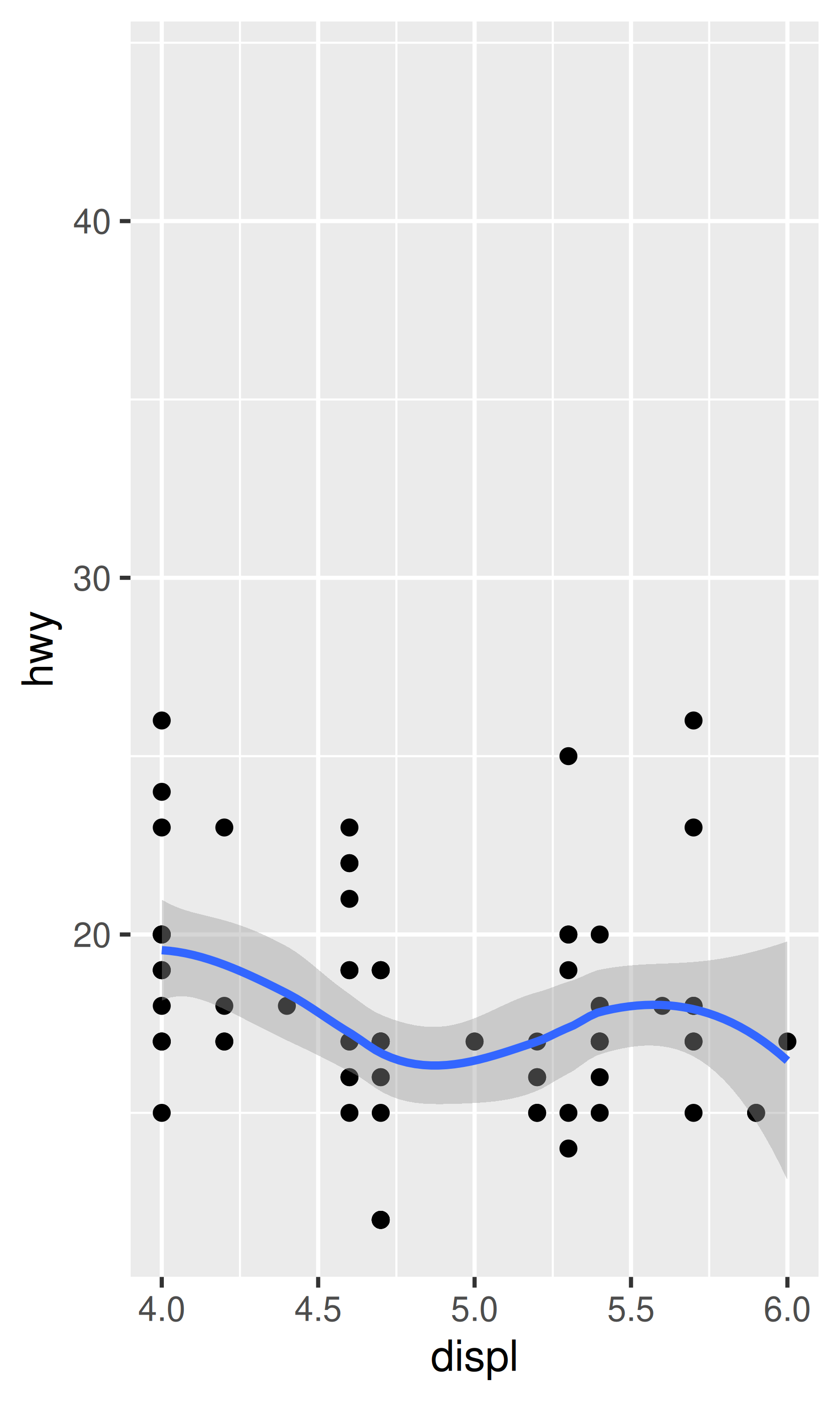
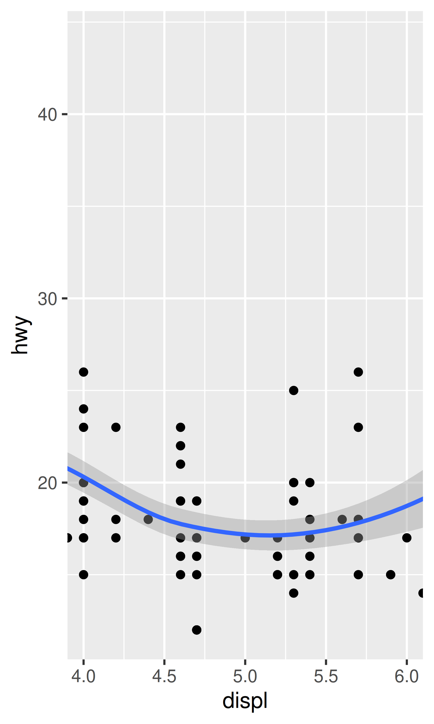
coord_cartesian() has arguments xlim and ylim. If you think back to the scales chapter, you might wonder why we need these. Doesn’t the limits argument of the scales already allow us to control what appears on the plot? The key difference is how the limits work: when setting scale limits, any data outside the limits is thrown away; but when setting coordinate system limits, we still use all the data, but we only display a small region of the plot. Setting coordinate system limits is like looking at the plot under a magnifying glass.
base <- ggplot(mpg, aes(displ, hwy)) +
  geom_point() +
  geom_smooth()

# Full dataset
base
#> `geom_smooth()` using method = 'loess' and formula = 'y ~ x'
# Scaling to 4--6 throws away data outside that range
base + scale_x_continuous(limits = c(4, 6))
#> `geom_smooth()` using method = 'loess' and formula = 'y ~ x'
#> Warning: Removed 153 rows containing non-finite outside the scale range
#> (`stat_smooth()`).
#> Warning: Removed 153 rows containing missing values or values outside the scale range
#> (`geom_point()`).
# Zooming to 4--6 keeps all the data but only shows some of it
base + coord_cartesian(xlim = c(4, 6))
#> `geom_smooth()` using method = 'loess' and formula = 'y ~ x'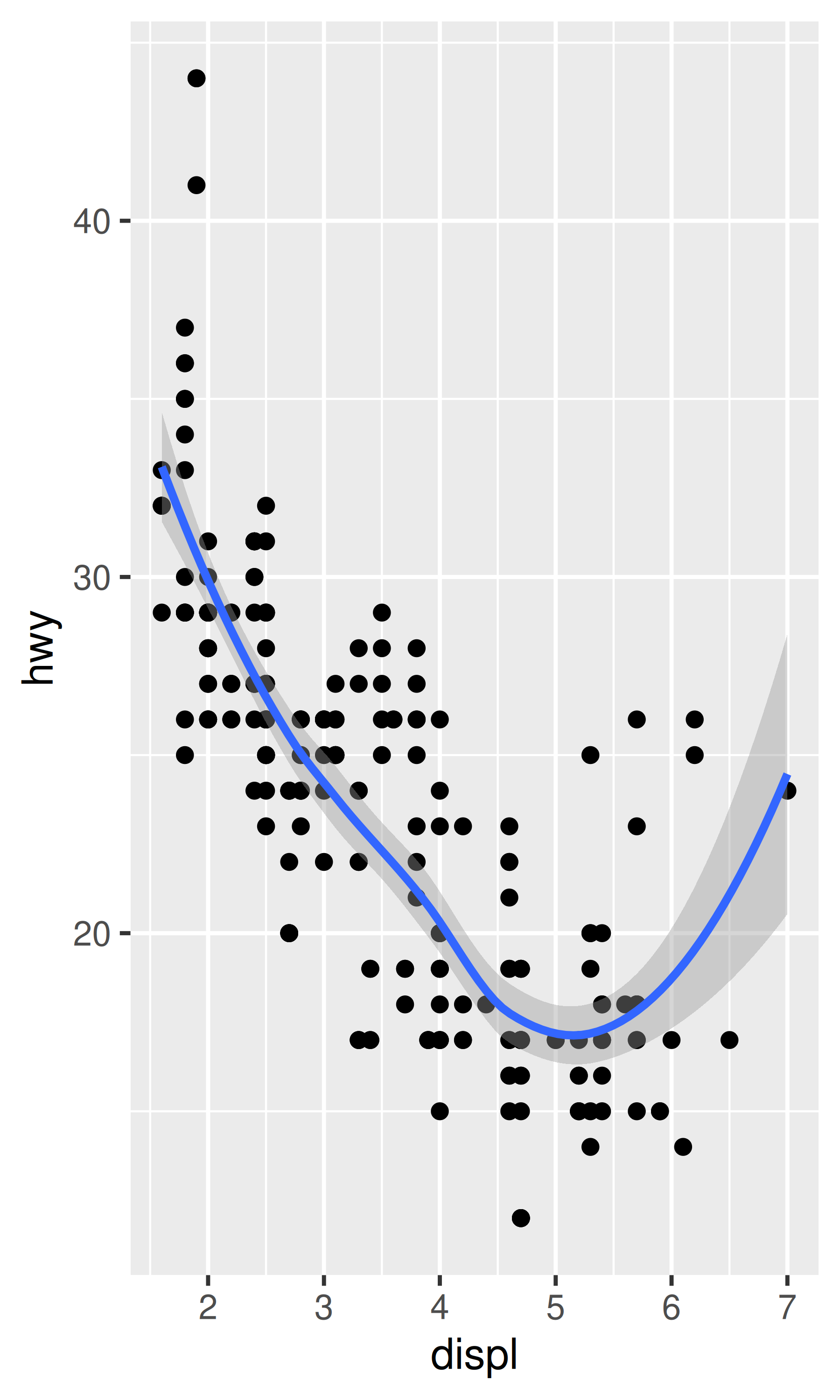
coord_flip()
Most statistics and geoms assume you are interested in y values conditional on x values (e.g., smooth, summary, boxplot, line): in most statistical models, the x values are assumed to be measured without error. If you are interested in x conditional on y (or you just want to rotate the plot 90 degrees), you can use coord_flip() to exchange the x and y axes. Compare this with just exchanging the variables mapped to x and y:
ggplot(mpg, aes(displ, cty)) +
geom_point() +
geom_smooth()
#> `geom_smooth()` using method = 'loess' and formula = 'y ~ x'
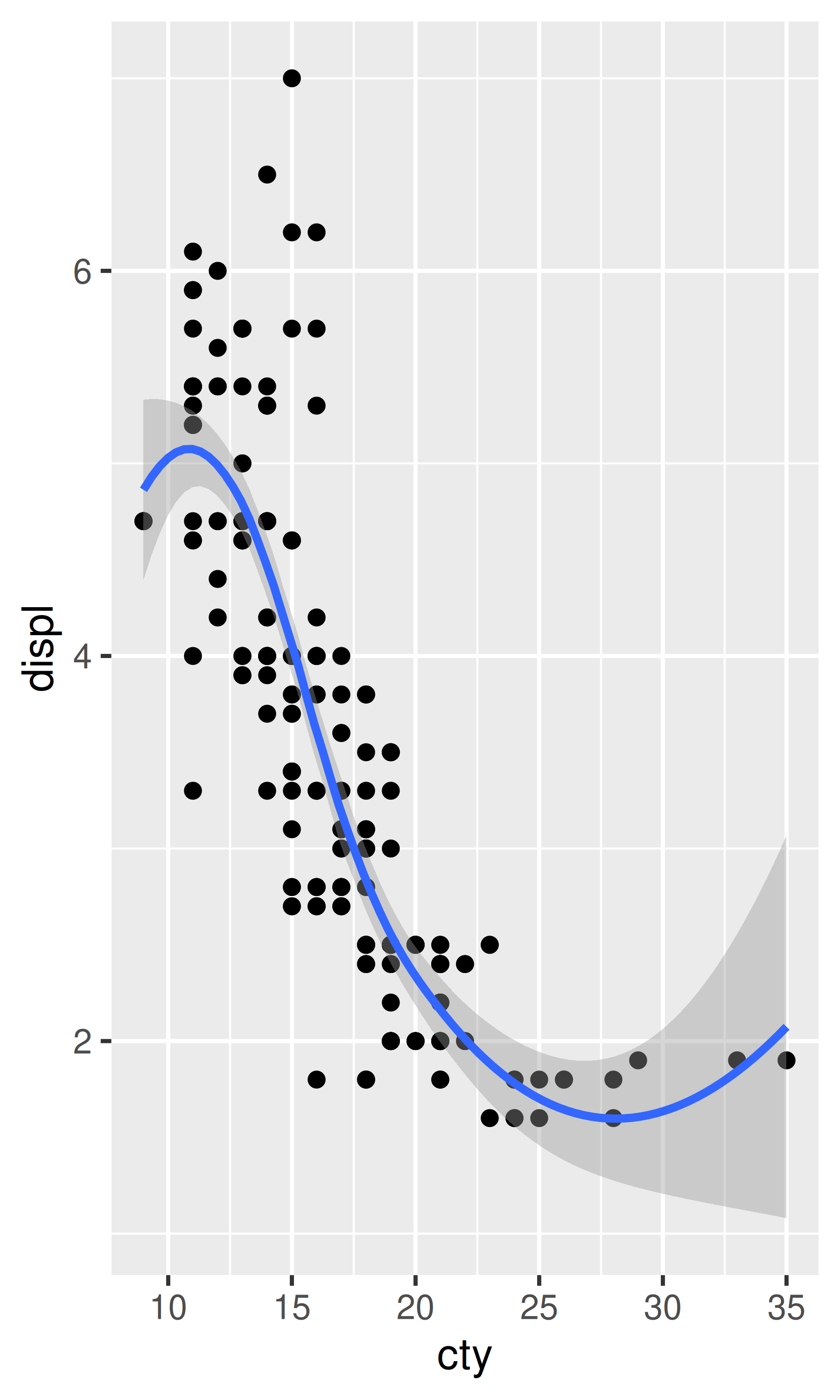
# Exchanging cty and displ rotates the plot 90 degrees, but the smooth
# is fit to the rotated data.
ggplot(mpg, aes(cty, displ)) +
geom_point() +
geom_smooth()
#> `geom_smooth()` using method = 'loess' and formula = 'y ~ x'
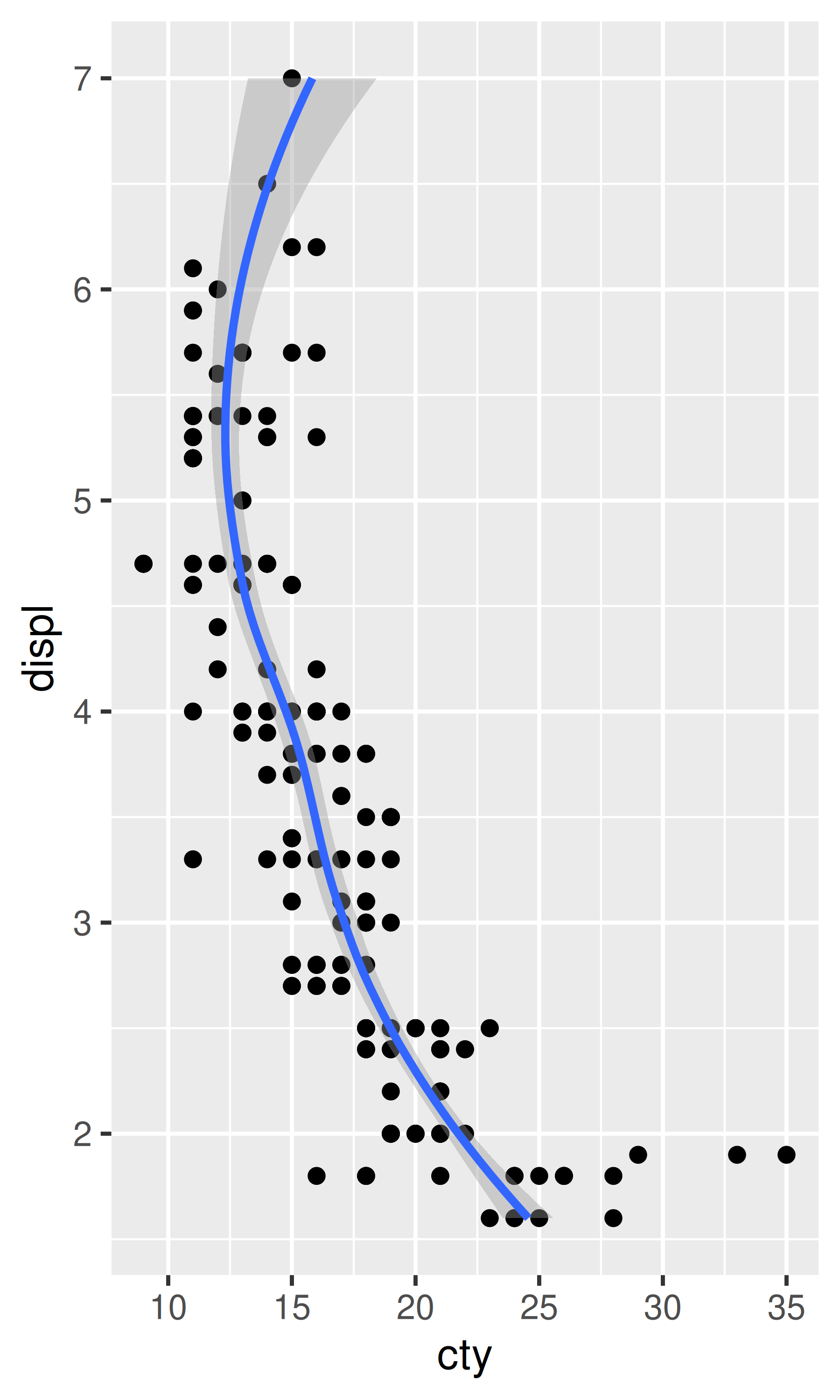
# coord_flip() fits the smooth to the original data, and then rotates
# the output
ggplot(mpg, aes(displ, cty)) +
geom_point() +
geom_smooth() +
coord_flip()
#> `geom_smooth()` using method = 'loess' and formula = 'y ~ x'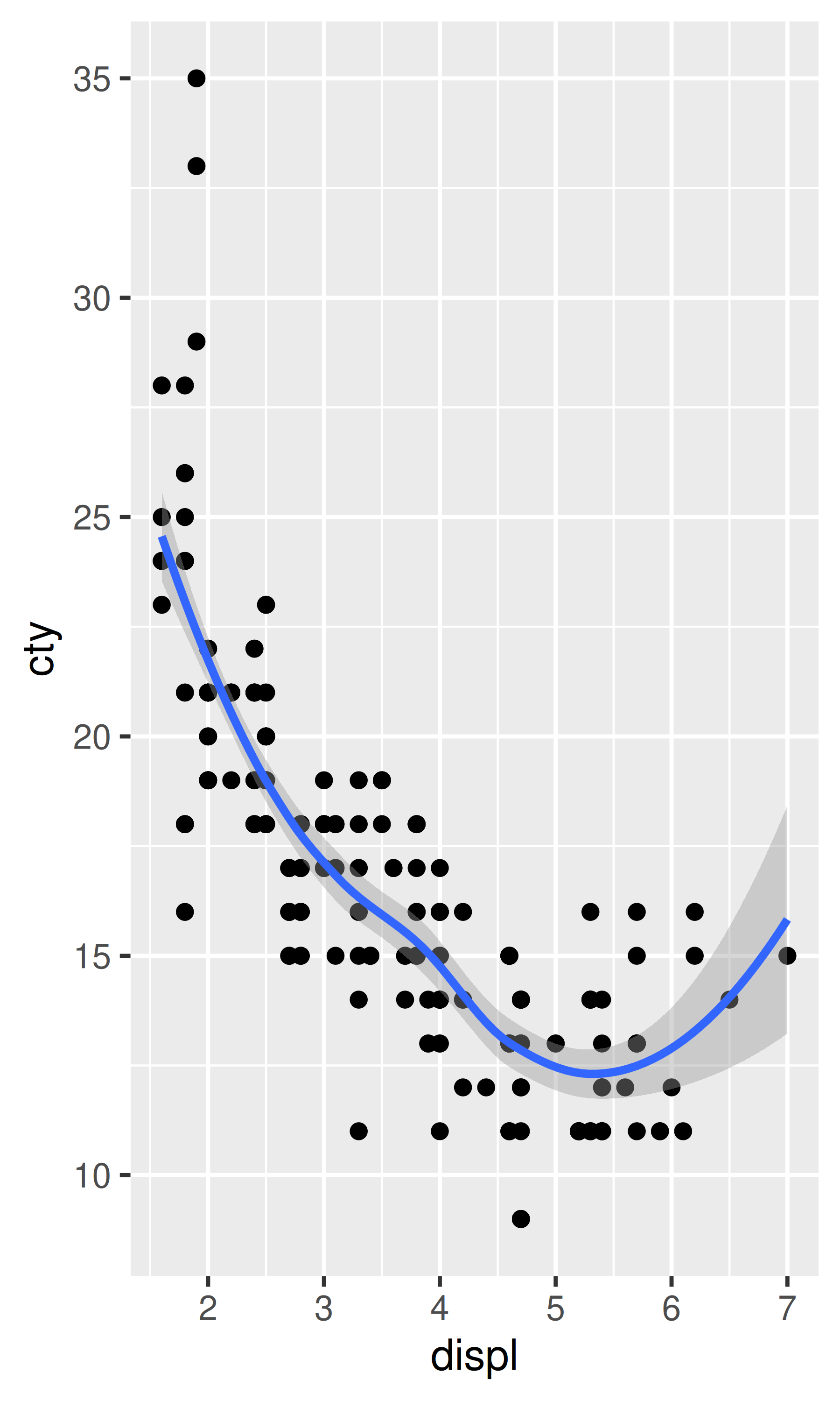
coord_fixed()
coord_fixed() fixes the ratio of length on the x and y axes. The default ratio ensures that the x and y axes have equal scales: i.e., 1 cm along the x axis represents the same range of data as 1 cm along the y axis. The aspect ratio will also be set to ensure that the mapping is maintained regardless of the shape of the output device. See the documentation of coord_fixed() for more details.
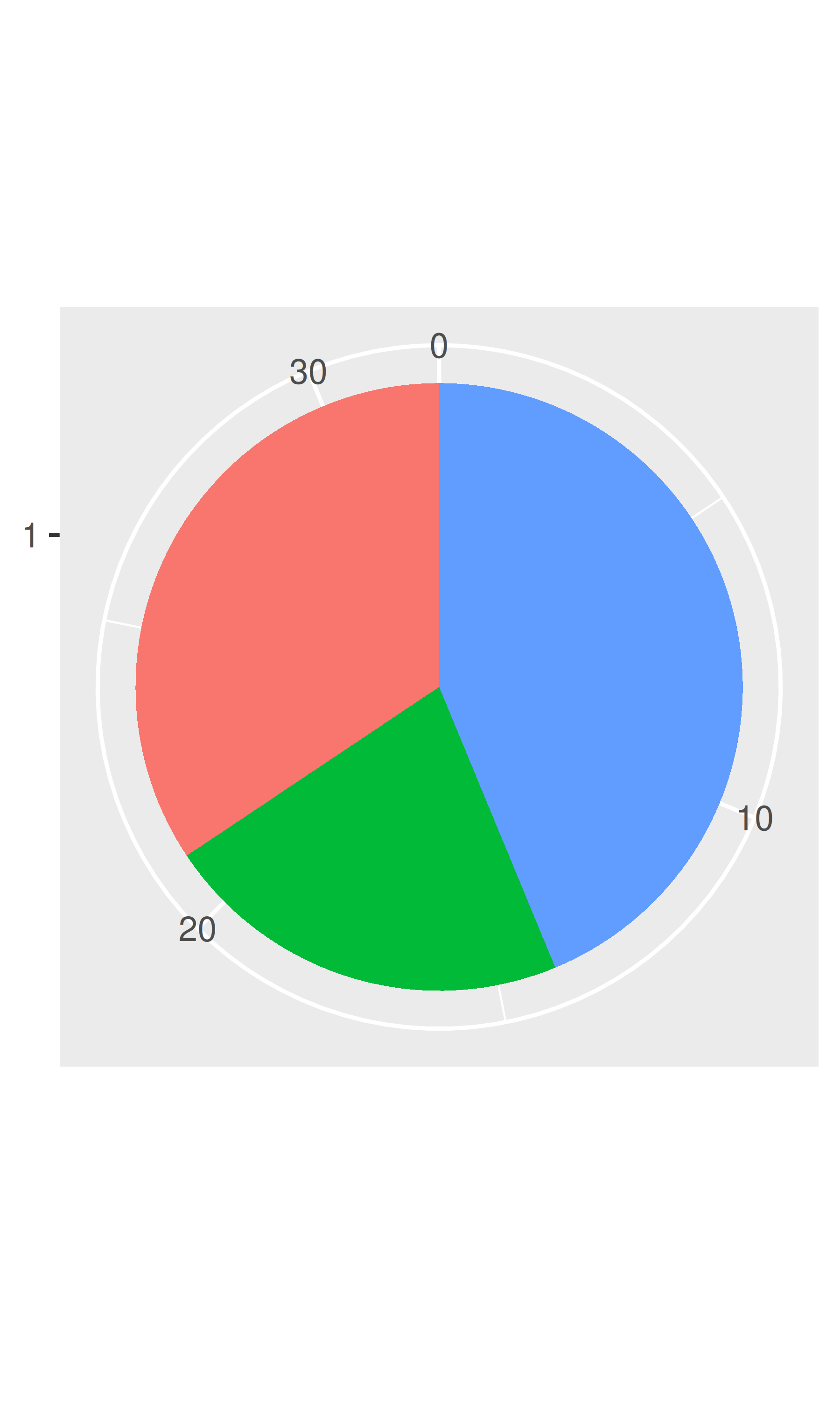
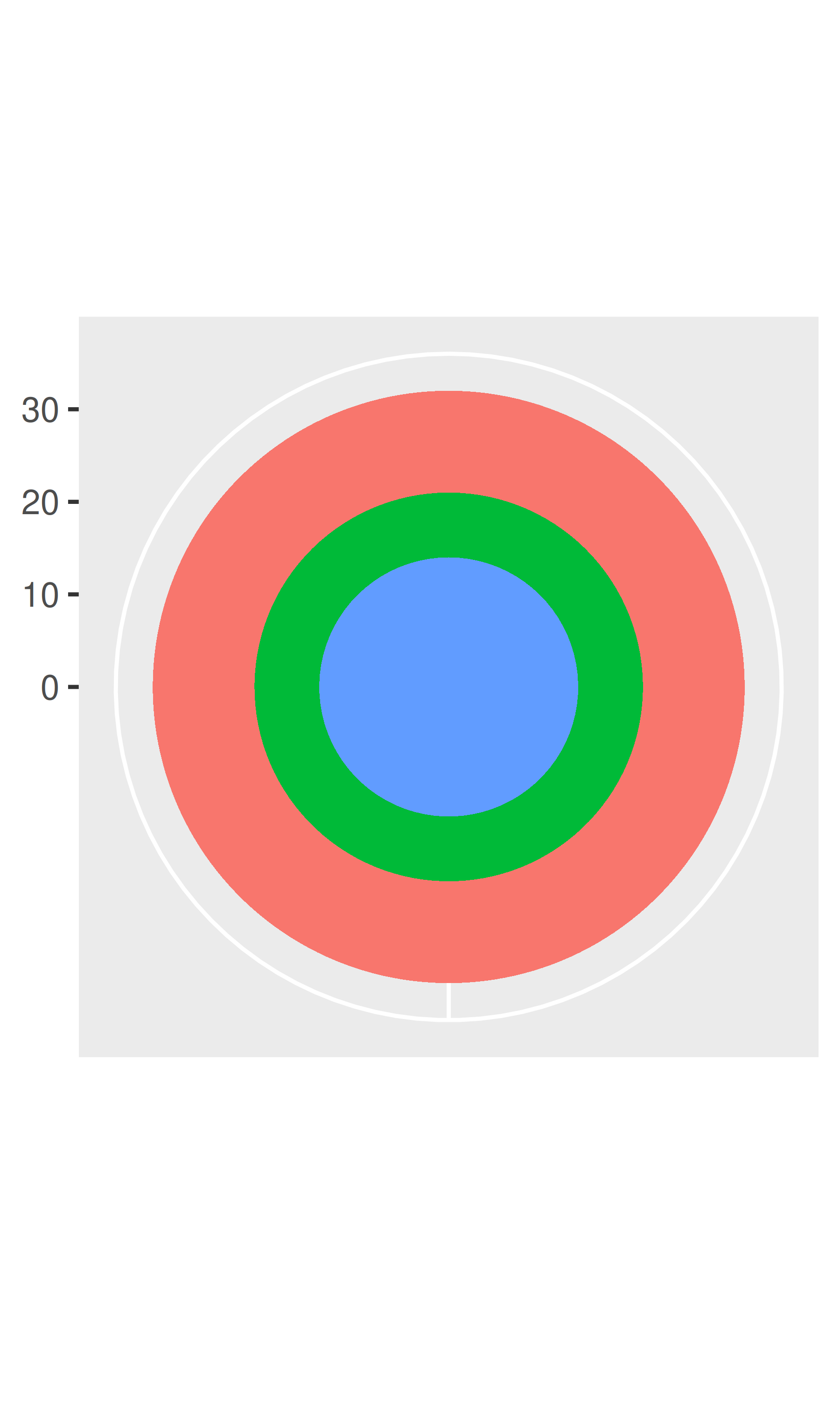
Unlike linear coordinates, non-linear coordinates can change the shape of geoms. For example, in polar coordinates a rectangle becomes an arc; in a map projection, the shortest path between two points is not necessarily a straight line. The code below shows how a line and a rectangle are rendered in a few different coordinate systems.
rect <- data.frame(x = 50, y = 50)
line <- data.frame(x = c(1, 200), y = c(100, 1))
base <- ggplot(mapping = aes(x, y)) +
  geom_tile(data = rect, aes(width = 50, height = 50)) +
  geom_line(data = line) +
  xlab(NULL) + ylab(NULL)
base
base + coord_polar("x")
base + coord_polar("y")![]()
![]()
![]()
base + coord_flip()
base + coord_trans(y = "log10")
#> Warning: `coord_trans()` was deprecated in ggplot2 4.0.0.
#> ℹ Please use `coord_transform()` instead.
base + coord_fixed()![]()
![]()
![]()
The transformation takes part in two steps. Firstly, the parameterisation of each geom is changed to be purely location-based, rather than location- and dimension-based. For example, a bar can be represented as an x position (a location), a height and a width (two dimensions). Interpreting height and width in a non-Cartesian coordinate system is hard because a rectangle may no longer have constant height and width, so we convert to a purely location-based representation, a polygon defined by the four corners. This effectively converts all geoms to a combination of points, lines and polygons.
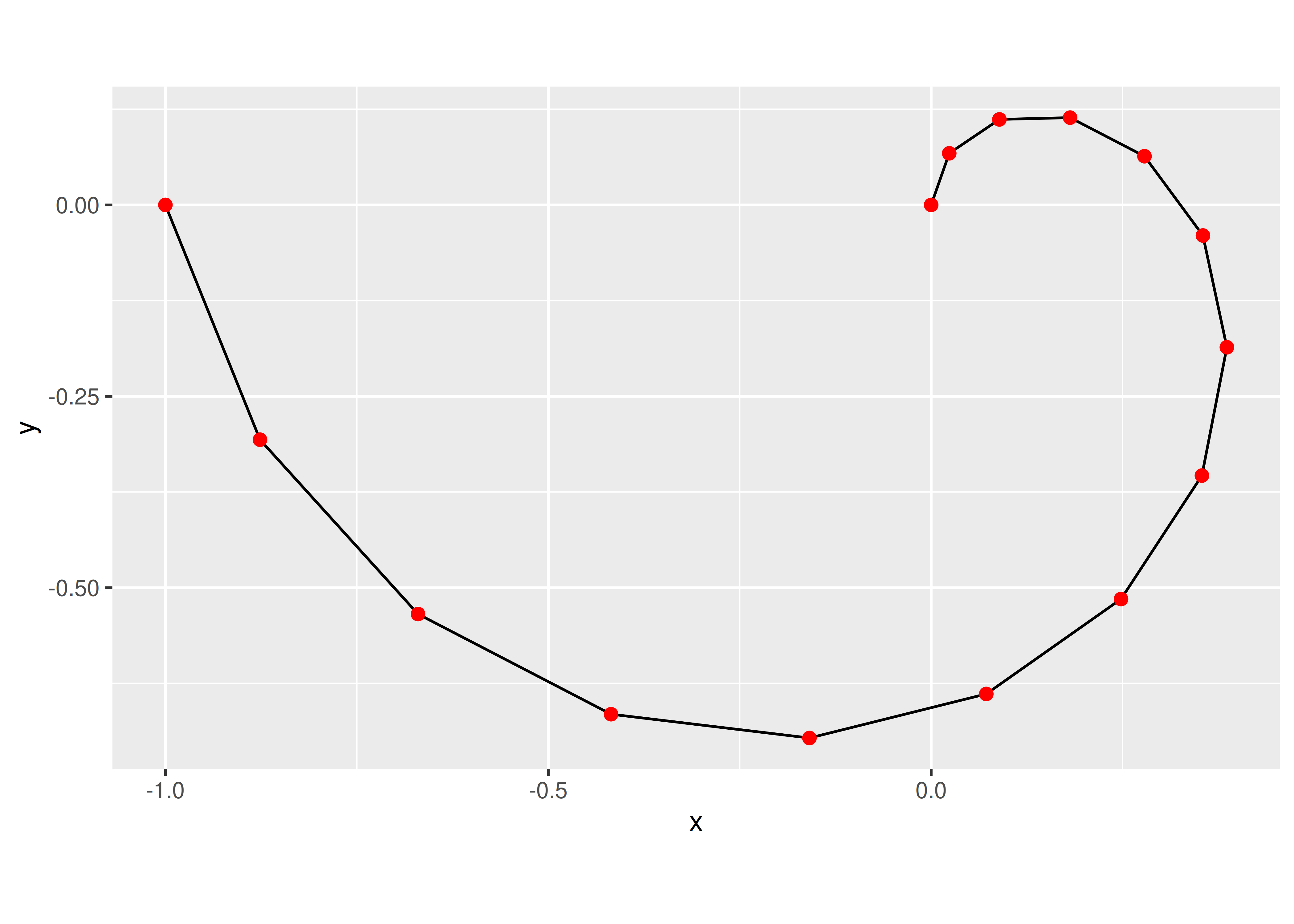
Once all geoms have a location-based representation, the next step is to transform each location into the new coordinate system. It is easy to transform points, because a point is still a point no matter what coordinate system you are in. Lines and polygons are harder, because a straight line may no longer be straight in the new coordinate system. To make the problem tractable we assume that all coordinate transformations are smooth, in the sense that all very short lines will still be very short straight lines in the new coordinate system. With this assumption in hand, we can transform lines and polygons by breaking them up into many small line segments and transforming each segment. This process is called munching and is illustrated below:
We start with a line parameterised by its two endpoints:
df <- data.frame(r = c(0, 1), theta = c(0, 3 / 2 * pi))
ggplot(df, aes(r, theta)) +
  geom_line() +
  geom_point(size = 2, colour = "red")
We break it into multiple line segments, each with two endpoints.
interp <- function(rng, n) {
  seq(rng[1], rng[2], length = n)
}
munched <- data.frame(
  r = interp(df$r, 15),
  theta = interp(df$theta, 15)
)

ggplot(munched, aes(r, theta)) +
  geom_line() +
  geom_point(size = 2, colour = "red")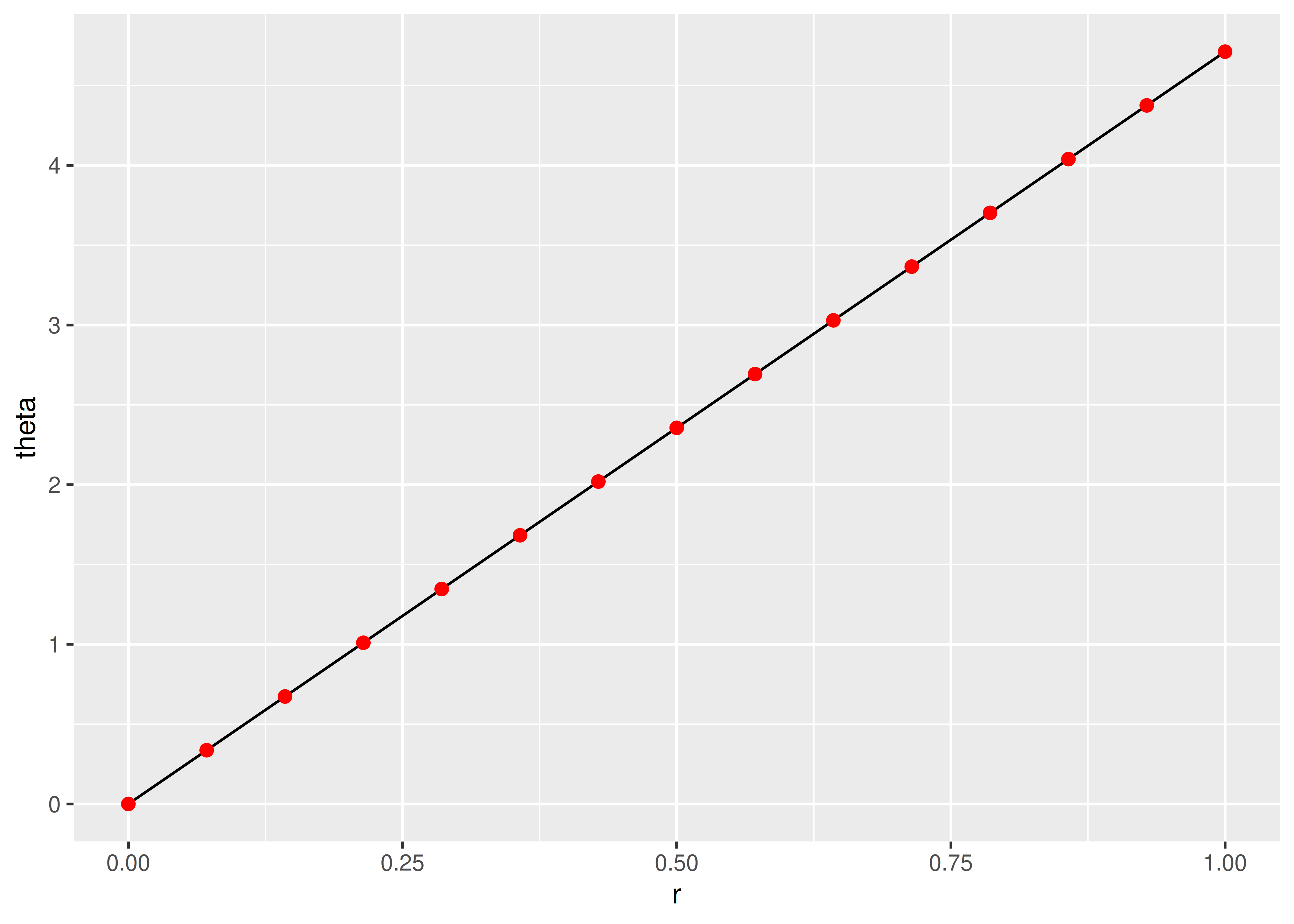
We transform the locations of each piece:
Internally ggplot2 uses many more segments so that the result looks smooth.
coord_trans()
Like limits, we can also transform the data in two places: at the scale level or at the coordinate system level. coord_trans() has arguments x and y which should be strings naming the transformer or transformer objects (see Chapter 10). Transforming at the scale level occurs before statistics are computed and does not change the shape of the geom. Transforming at the coordinate system level occurs after the statistics have been computed, and does affect the shape of the geom. Using both together allows us to model the data on a transformed scale and then backtransform it for interpretation: a common pattern in analysis.
# Linear model on original scale is poor fit
base <- ggplot(diamonds, aes(carat, price)) +
  stat_bin2d() +
  geom_smooth(method = "lm") +
  xlab(NULL) +
  ylab(NULL) +
  theme(legend.position = "none")
base

# Better fit on log scale, but harder to interpret
base +
  scale_x_log10() +
  scale_y_log10()

# Fit on log scale, then backtransform to original.
# Highlights lack of expensive diamonds with large carats
pow10 <- scales::exp_trans(10)
base +
  scale_x_log10() +
  scale_y_log10() +
coord_trans(x = pow10, y = pow10)![]()
![]()
![]()
coord_polar()
Using polar coordinates gives rise to pie charts and wind roses (from bar geoms), and radar charts (from line geoms). Polar coordinates are often used for circular data, particularly time or direction, but the perceptual properties are not good because the angle is harder to perceive for small radii than it is for large radii. The theta argument determines which position variable is mapped to angle (by default, x) and which to radius.
The code below shows how we can turn a bar into a pie chart or a bullseye chart by changing the coordinate system. The documentation includes other examples.
base <- ggplot(mtcars, aes(factor(1), fill = factor(cyl))) +
  geom_bar(width = 1) +
  theme(legend.position = "none") +
  scale_x_discrete(NULL, expand = c(0, 0)) +
  scale_y_continuous(NULL, expand = c(0, 0))

# Stacked barchart
base

# Pie chart
base + coord_polar(theta = "y")

# The bullseye chart
base + coord_polar()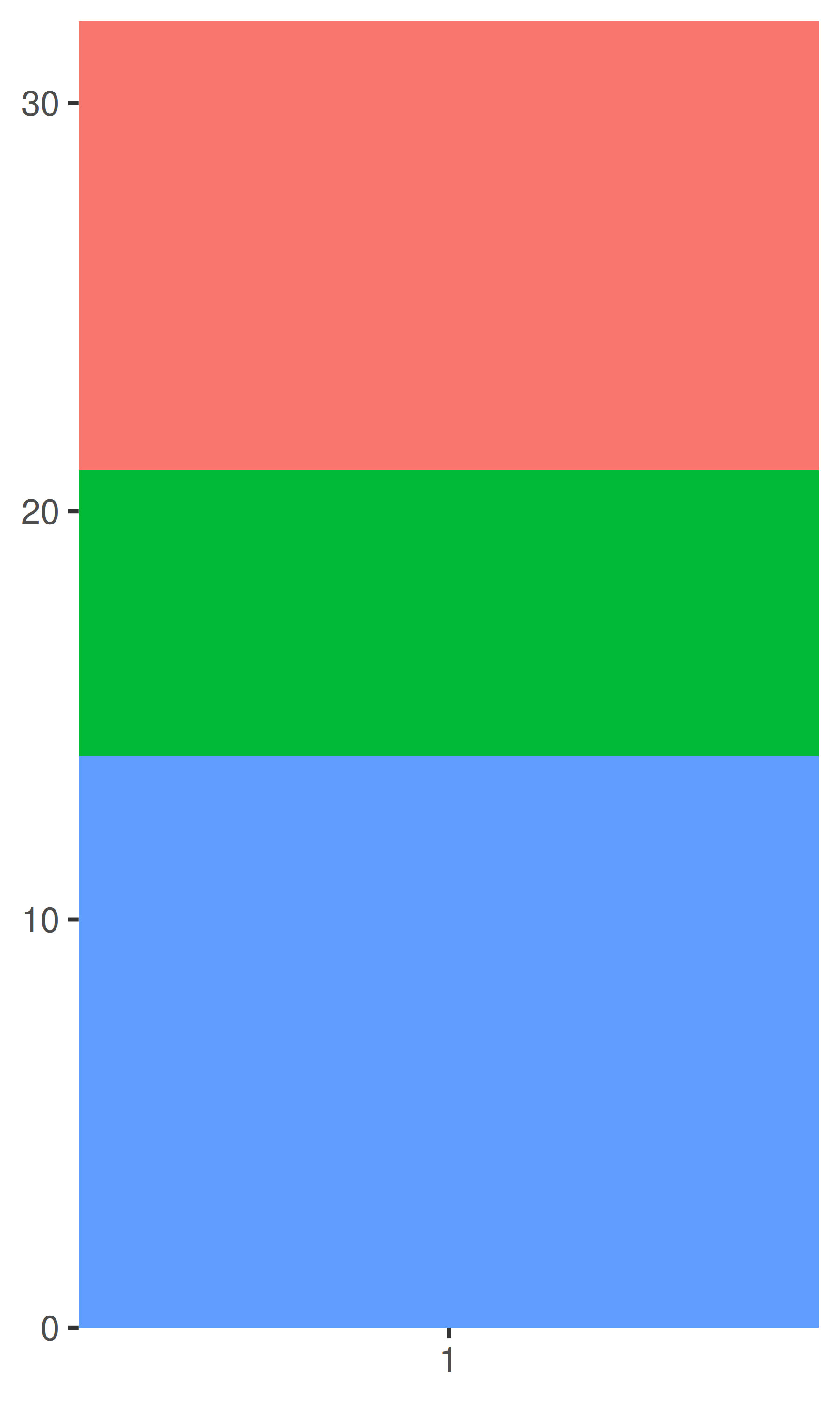
coord_map()
Maps are intrinsically displays of spherical data. Simply plotting raw longitudes and latitudes is misleading, so we must project the data. There are two ways to do this with ggplot2:
coord_quickmap() is a quick and dirty approximation that sets the aspect ratio to ensure that 1m of latitude and 1m of longitude are the same distance in the middle of the plot. This is a reasonable place to start for smaller regions, and is very fast.
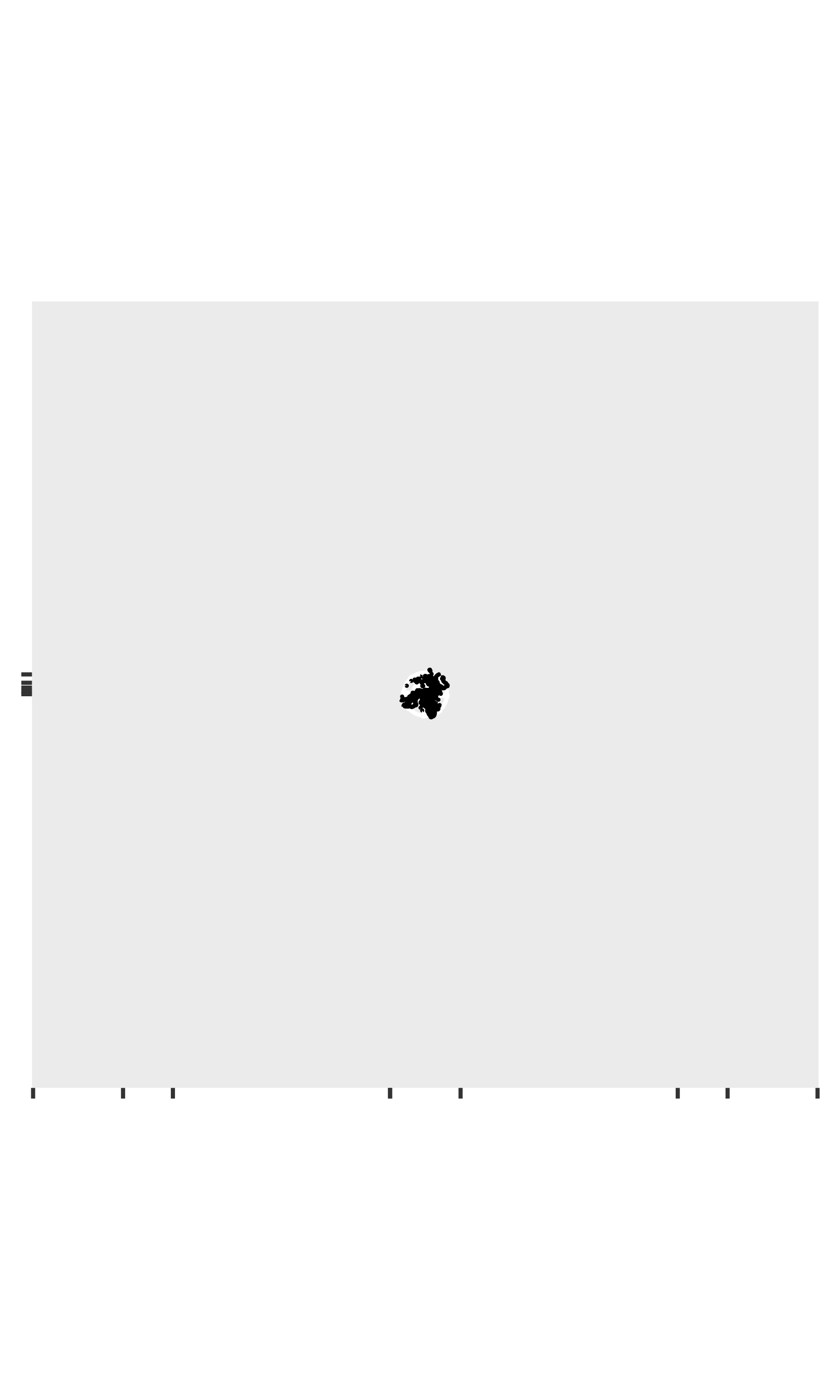
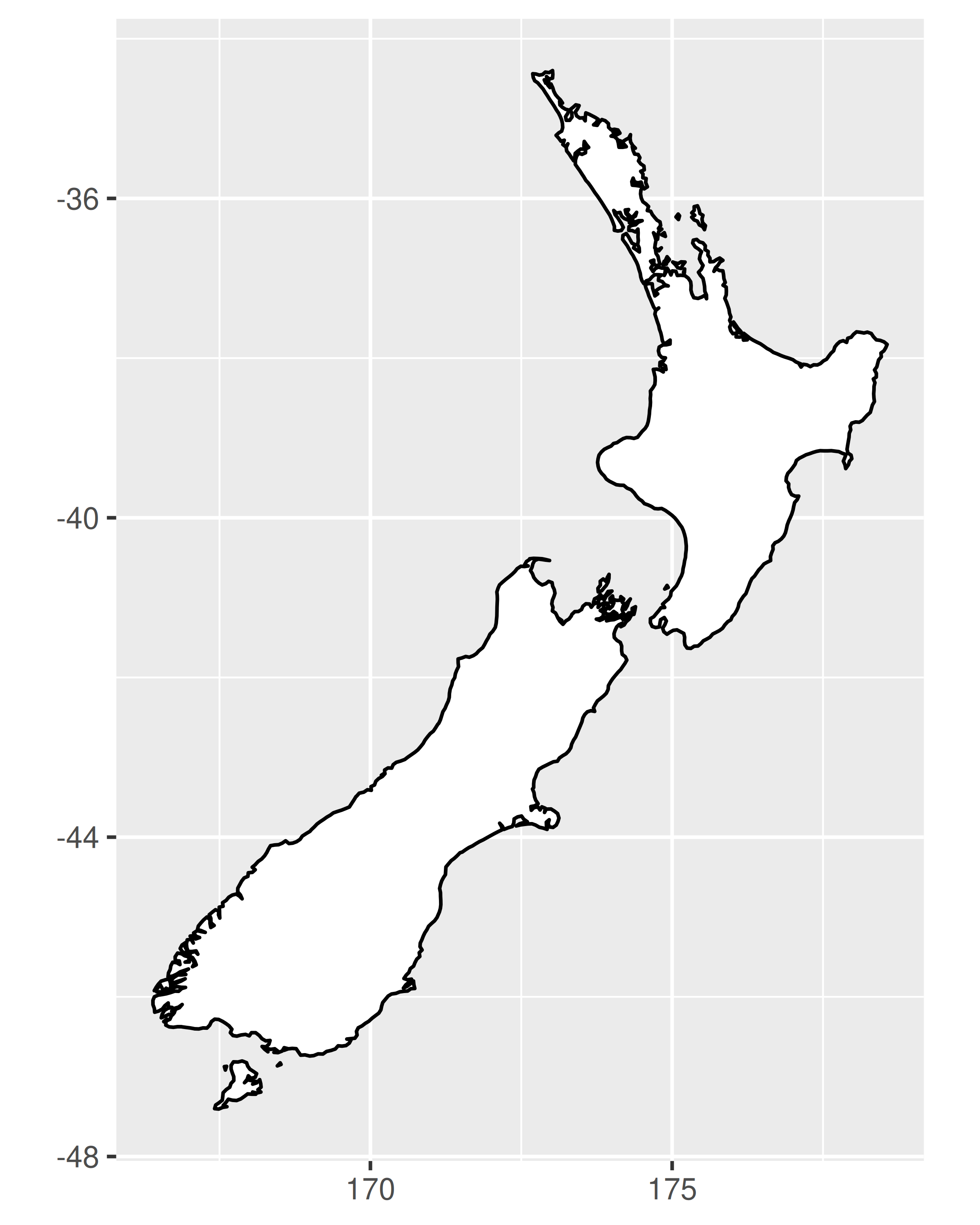
# Prepare a map of NZ
nzmap <- ggplot(map_data("nz"), aes(long, lat, group = group)) +
  geom_polygon(fill = "white", colour = "black") +
  xlab(NULL) + ylab(NULL)

# Plot it in cartesian coordinates
nzmap
# With the aspect ratio approximation
nzmap + coord_quickmap()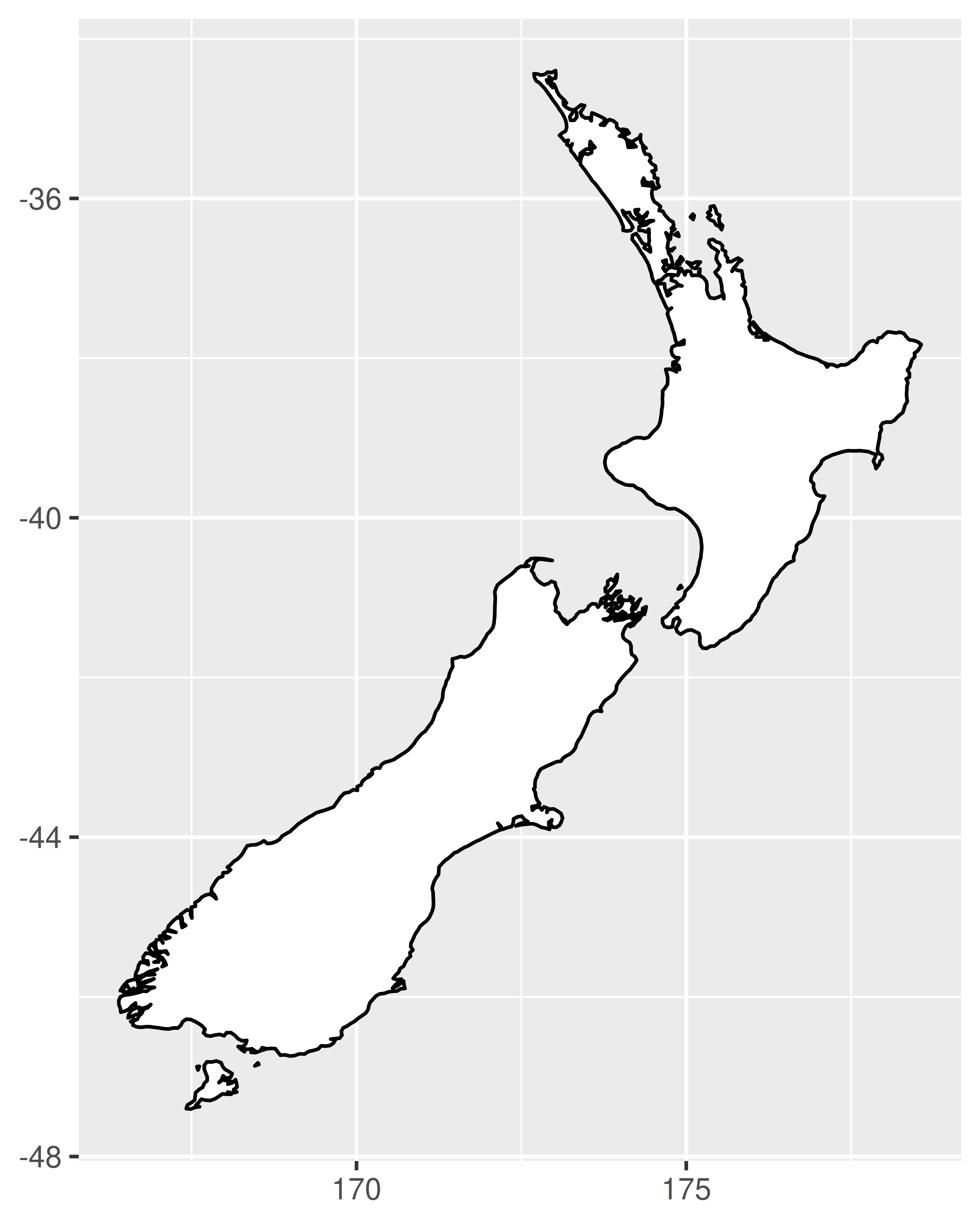
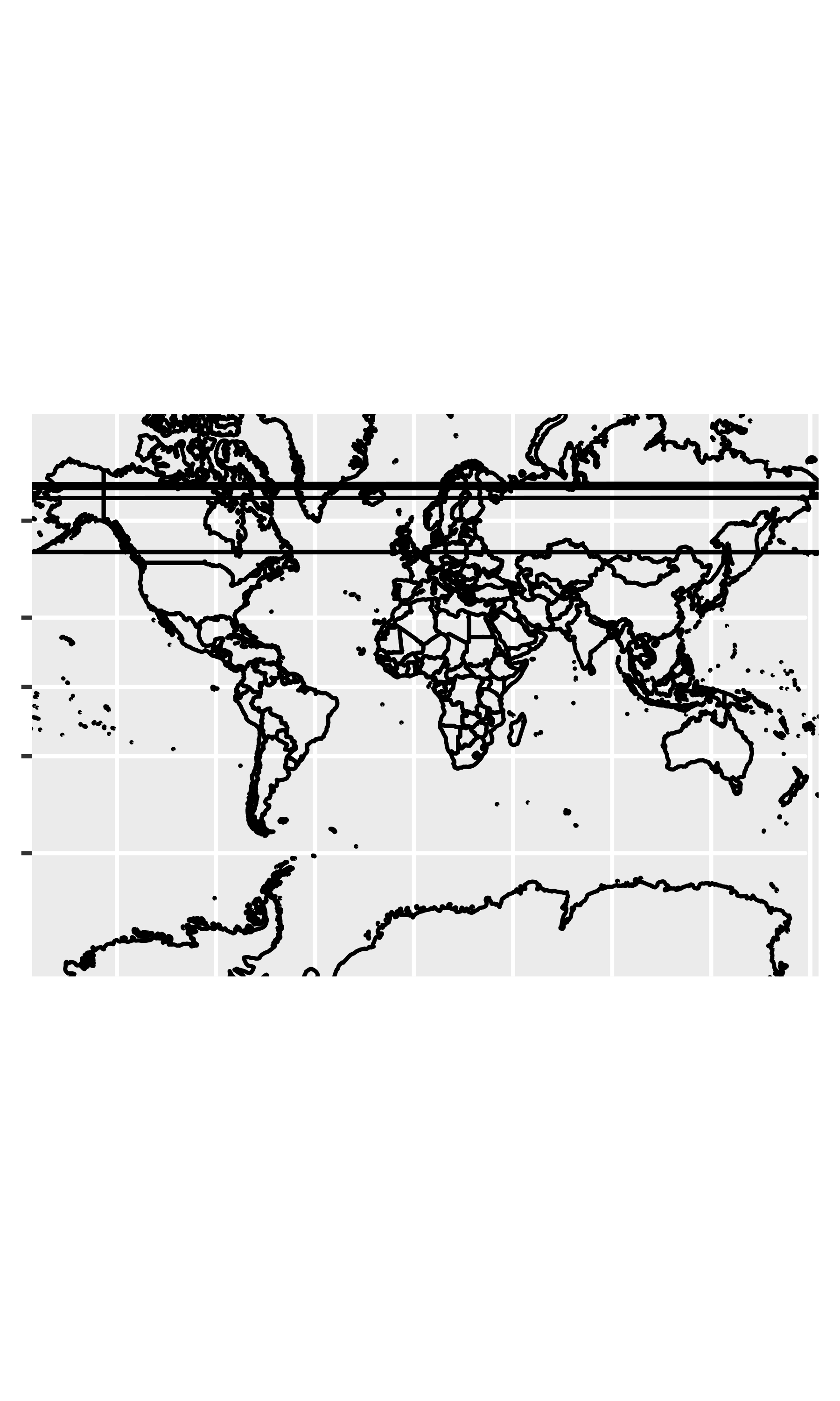
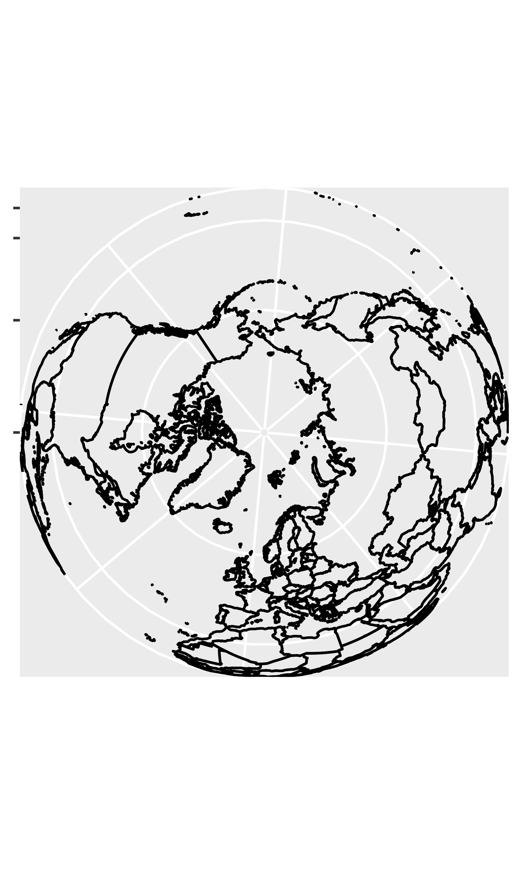
coord_map() uses the mapproj package, https://cran.r-project.org/package=mapproj to do a formal map projection. It takes the same arguments as mapproj::mapproject() for controlling the projection. It is much slower than coord_quickmap() because it must munch the data and transform each piece.
world <- map_data("world")
worldmap <- ggplot(world, aes(long, lat, group = group)) +
  geom_path() +
  scale_y_continuous(NULL, breaks = (-2:3) * 30, labels = NULL) +
  scale_x_continuous(NULL, breaks = (-4:4) * 45, labels = NULL)

worldmap + coord_map()
# Some crazier projections
worldmap + coord_map("ortho")
worldmap + coord_map("stereographic")