borders <- function(database = "world", regions = ".", fill = NA,
colour = "grey50", ...) {
df <- map_data(database, regions)
geom_polygon(
aes_(~long, ~lat, group = ~group),
data = df, fill = fill, colour = colour, ...,
inherit.aes = FALSE, show.legend = FALSE
)
}18 Programming with ggplot2
You are reading the work-in-progress third edition of the ggplot2 book. This chapter is currently a dumping ground for ideas, and we don’t recommend reading it.
18.1 Introduction
A major requirement of a good data analysis is flexibility. If your data changes, or you discover something that makes you rethink your basic assumptions, you need to be able to easily change many plots at once. The main inhibitor of flexibility is code duplication. If you have the same plotting statement repeated over and over again, you’ll have to make the same change in many different places. Often just the thought of making all those changes is exhausting! This chapter will help you overcome that problem by showing you how to program with ggplot2.
To make your code more flexible, you need to reduce duplicated code by writing functions. When you notice you’re doing the same thing over and over again, think about how you might generalise it and turn it into a function. If you’re not that familiar with how functions work in R, you might want to brush up your knowledge at https://adv-r.hadley.nz/functions.html.
In this chapter we’ll show how to write functions that create:
- A single ggplot2 component.
- Multiple ggplot2 components.
- A complete plot.
And then we’ll finish off with a brief illustration of how you can apply functional programming techniques to ggplot2 objects.
You might also find the cowplot and ggthemes packages helpful. As well as providing reusable components that help you directly, you can also read the source code of the packages to figure out how they work.
18.2 Single components
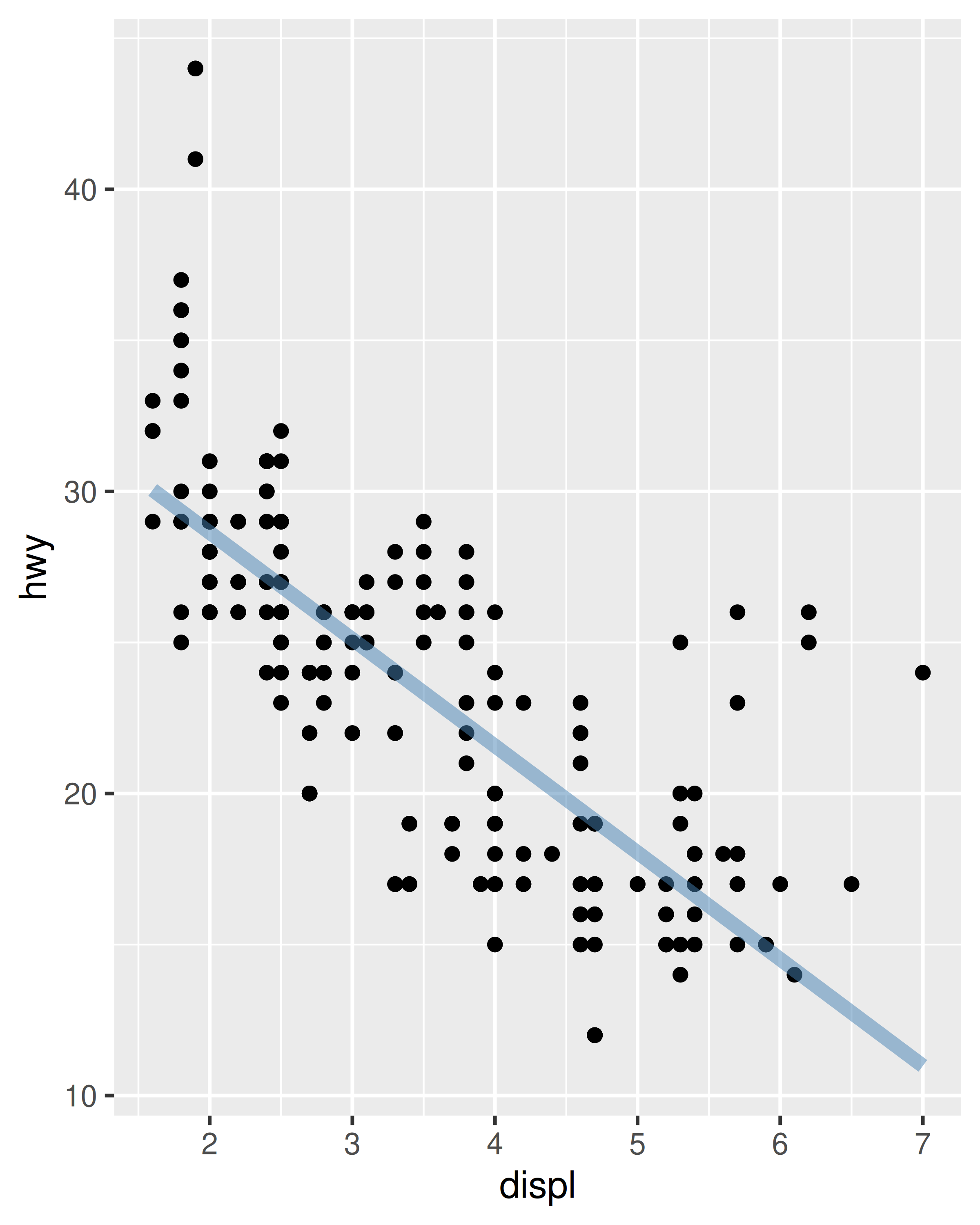
Each component of a ggplot plot is an object. Most of the time you create the component and immediately add it to a plot, but you don’t have to. Instead, you can save any component to a variable (giving it a name), and then add it to multiple plots:
bestfit <- geom_smooth(
  method = "lm",
  se = FALSE,
  colour = alpha("steelblue", 0.5),
  linewidth = 2
)
ggplot(mpg, aes(cty, hwy)) +
  geom_point() +
  bestfit
#> `geom_smooth()` using formula = 'y ~ x'
ggplot(mpg, aes(displ, hwy)) +
  geom_point() +
  bestfit
#> `geom_smooth()` using formula = 'y ~ x'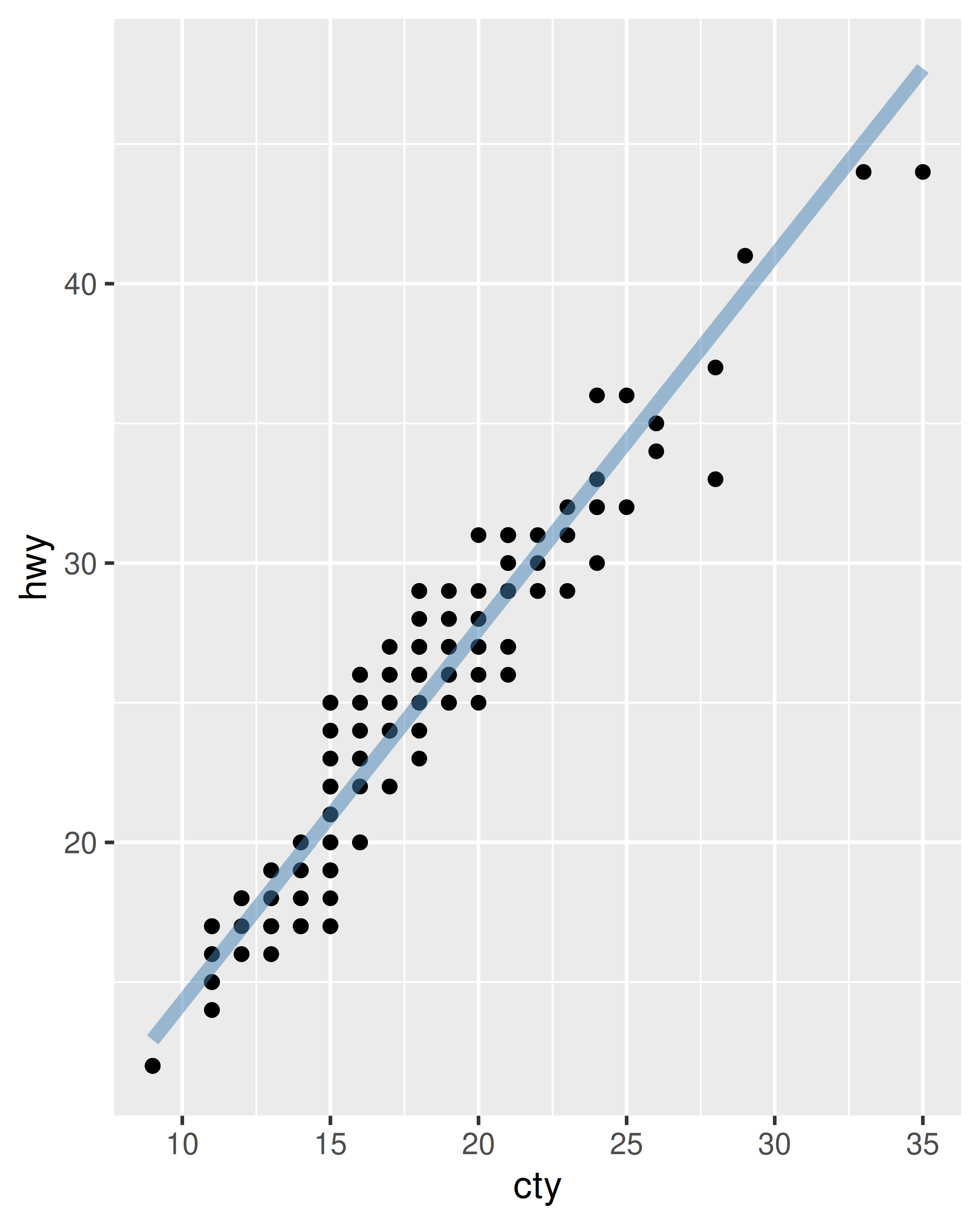
That’s a great way to reduce simple types of duplication (it’s much better than copying-and-pasting!), but requires that the component be exactly the same each time. If you need more flexibility, you can wrap these reusable snippets in a function. For example, we could extend our bestfit object to a more general function for adding lines of best fit to a plot. The following code creates a geom_lm() with three parameters: the model formula, the line colour and the linewidth:
geom_lm <- function(formula = y ~ x, colour = alpha("steelblue", 0.5),
                    linewidth = 2, ...)  {
  geom_smooth(formula = formula, se = FALSE, method = "lm", colour = colour,
    linewidth = linewidth, ...)
}
ggplot(mpg, aes(displ, 1 / hwy)) +
  geom_point() +
  geom_lm()
ggplot(mpg, aes(displ, 1 / hwy)) +
  geom_point() +
  geom_lm(y ~ poly(x, 2), linewidth = 1, colour = "red")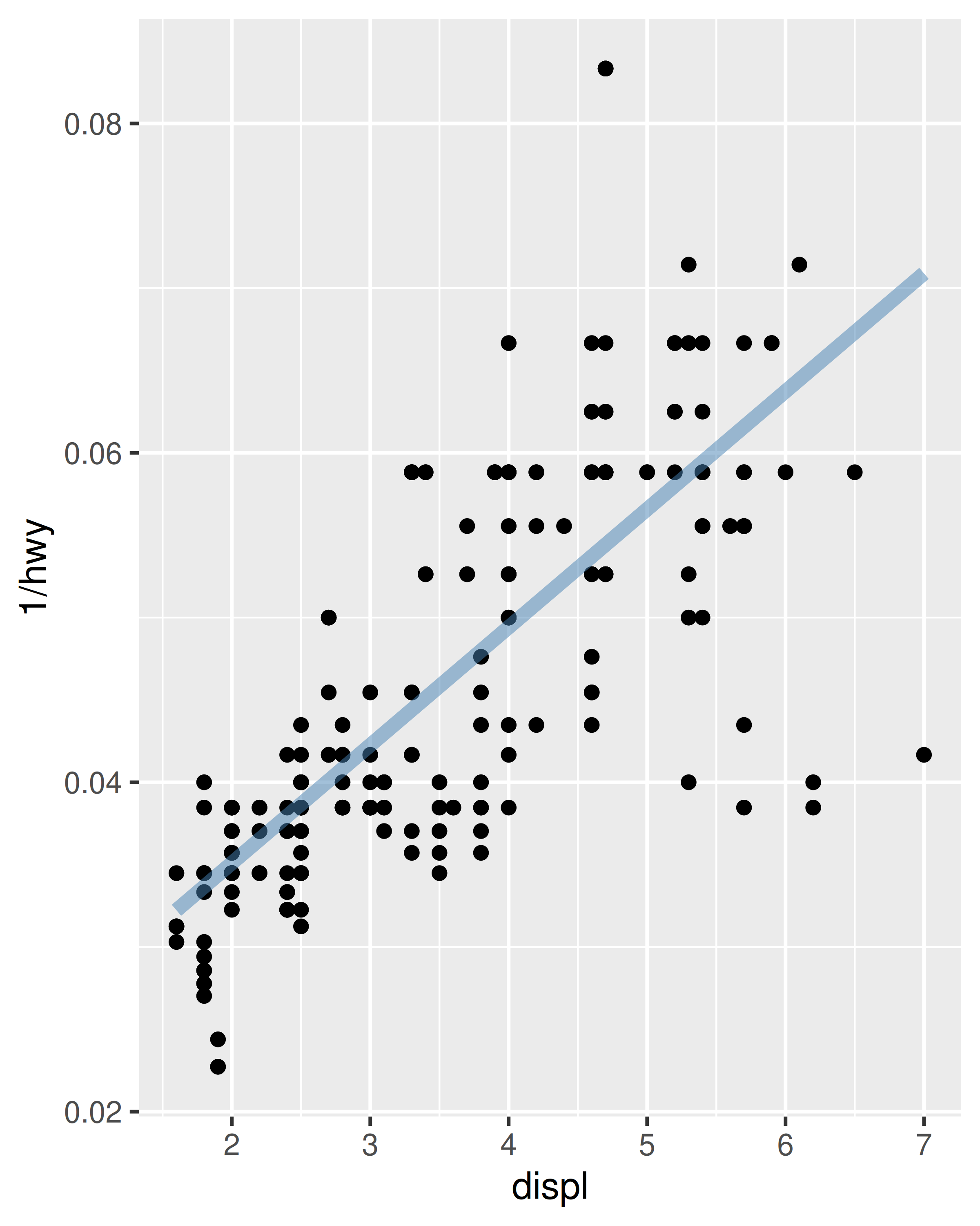
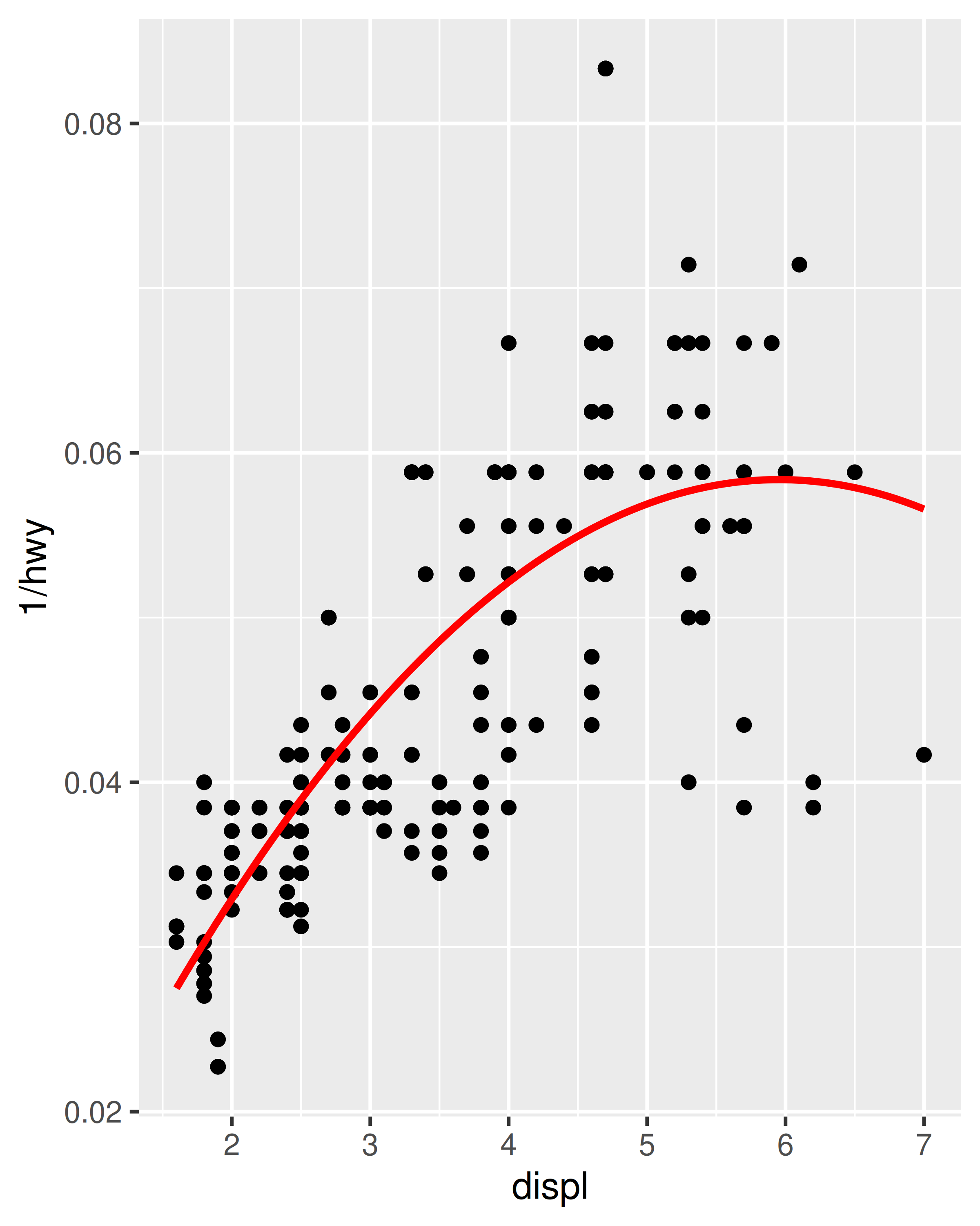
Pay close attention to the use of “...”. When included in the function definition “...” allows a function to accept arbitrary additional arguments. Inside the function, you can then use “...” to pass those arguments on to another function. Here we pass “...” onto geom_smooth() so the user can still modify all the other arguments we haven’t explicitly overridden. When you write your own component functions, it’s a good idea to always use “...” in this way.
Finally, note that you can only add components to a plot; you can’t modify or remove existing objects.
18.2.1 Exercises
Create an object that represents a pink histogram with 100 bins.
Create an object that represents a fill scale with the Blues ColorBrewer palette.
Read the source code for
theme_grey(). What are its arguments? How does it work?Create
scale_colour_wesanderson(). It should have a parameter to pick the palette from the wesanderson package, and create either a continuous or discrete scale.
18.3 Multiple components
It’s not always possible to achieve your goals with a single component. Fortunately, ggplot2 has a convenient way of adding multiple components to a plot in one step with a list. The following function adds two layers: one to show the mean, and one to show its 95% confidence interval:
geom_mean <- function() {
  list(
    stat_summary(fun = "mean", geom = "bar", fill = "grey70"),
    stat_summary(fun.data = "mean_cl_normal", geom = "errorbar", width = 0.4)
  )
}
ggplot(mpg, aes(class, cty)) + geom_mean()
ggplot(mpg, aes(drv, cty)) + geom_mean()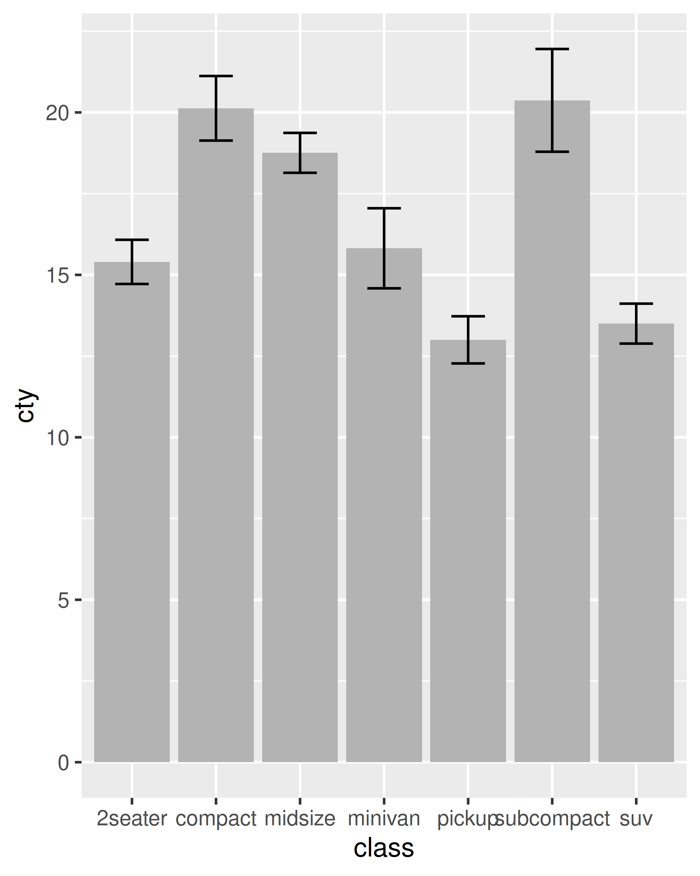

If the list contains any NULL elements, they’re ignored. This makes it easy to conditionally add components:
geom_mean <- function(se = TRUE) {
list(
stat_summary(fun = "mean", geom = "bar", fill = "grey70"),
if (se)
stat_summary(fun.data = "mean_cl_normal", geom = "errorbar", width = 0.4)
)
}
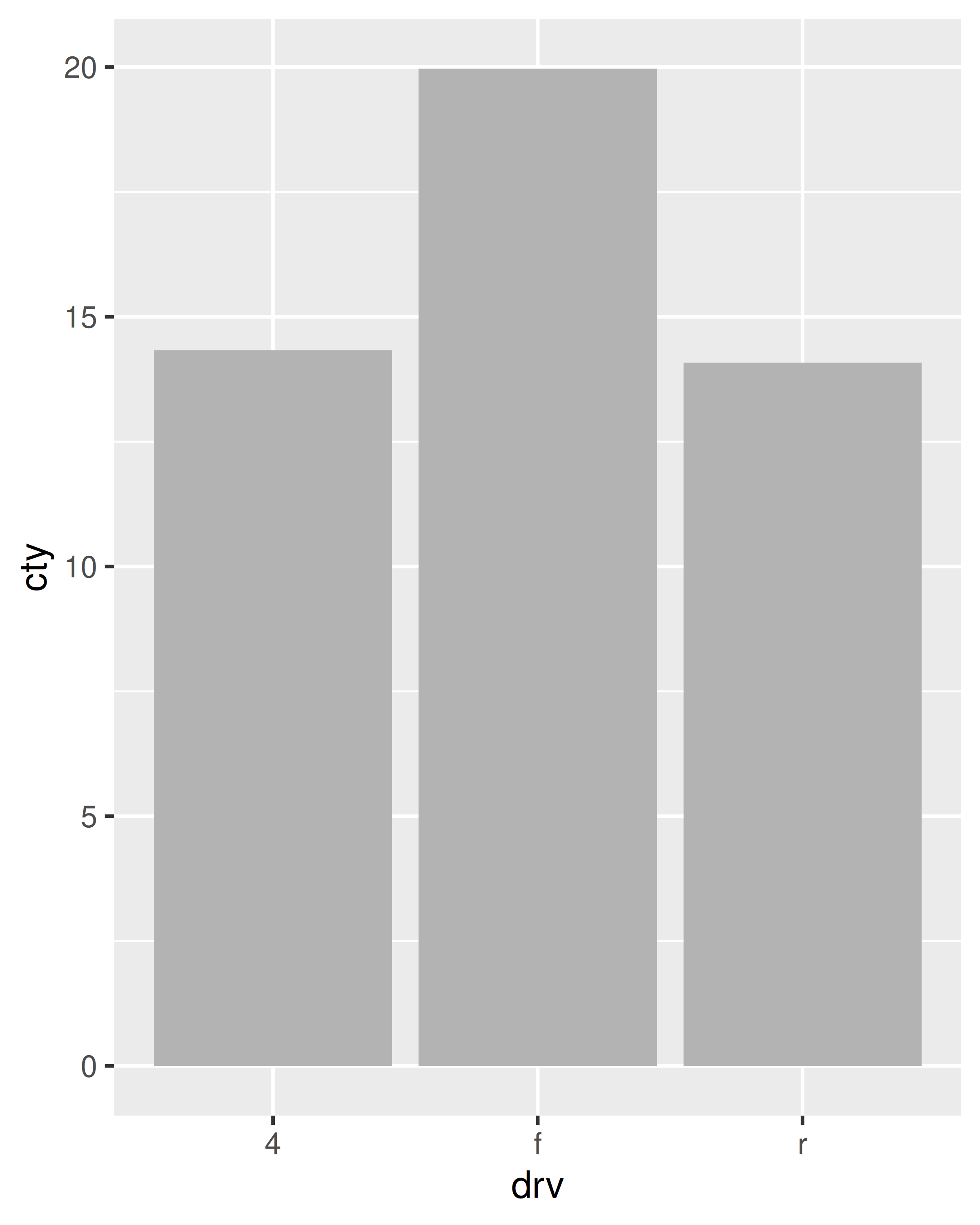
ggplot(mpg, aes(drv, cty)) + geom_mean()
ggplot(mpg, aes(drv, cty)) + geom_mean(se = FALSE)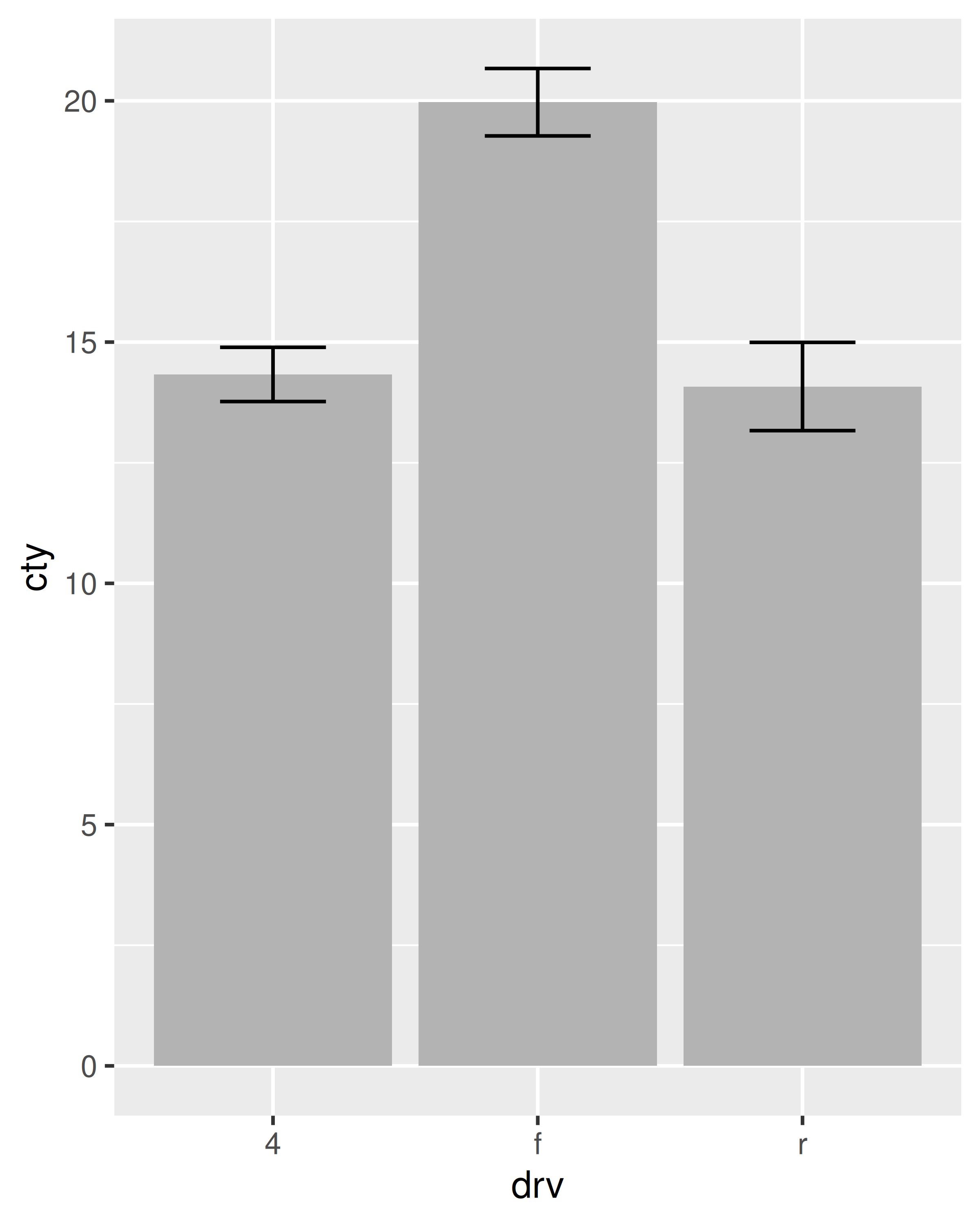
18.3.1 Plot components
You’re not just limited to adding layers in this way. You can also include any of the following object types in the list:
A data.frame, which will override the default dataset associated with the plot. (If you add a data frame by itself, you’ll need to use
%+%, but this is not necessary if the data frame is in a list.)An
aes()object, which will be combined with the existing default aesthetic mapping.Scales, which override existing scales, with a warning if they’ve already been set by the user.
Coordinate systems and faceting specification, which override the existing settings.
Theme components, which override the specified components.
18.3.2 Annotation
It’s often useful to add standard annotations to a plot. In this case, your function will also set the data in the layer function, rather than inheriting it from the plot. There are two other options that you should set when you do this. These ensure that the layer is self-contained:
inherit.aes = FALSEprevents the layer from inheriting aesthetics from the parent plot. This ensures your annotation works regardless of what else is on the plot.show.legend = FALSEensures that your annotation won’t appear in the legend.
One example of this technique is the borders() function built into ggplot2. It’s designed to add map borders from one of the datasets in the maps package:
18.3.3 Additional arguments
If you want to pass additional arguments to the components in your function, ... is no good: there’s no way to direct different arguments to different components. Instead, you’ll need to think about how you want your function to work, balancing the benefits of having one function that does it all vs. the cost of having a complex function that’s harder to understand.
To get you started, here’s one approach using modifyList() and do.call():
geom_mean <- function(..., bar.params = list(), errorbar.params = list()) {
params <- list(...)
bar.params <- modifyList(params, bar.params)
errorbar.params <- modifyList(params, errorbar.params)
bar <- do.call("stat_summary", modifyList(
list(fun = "mean", geom = "bar", fill = "grey70"),
bar.params)
)
errorbar <- do.call("stat_summary", modifyList(
list(fun.data = "mean_cl_normal", geom = "errorbar", width = 0.4),
errorbar.params)
)
list(bar, errorbar)
}
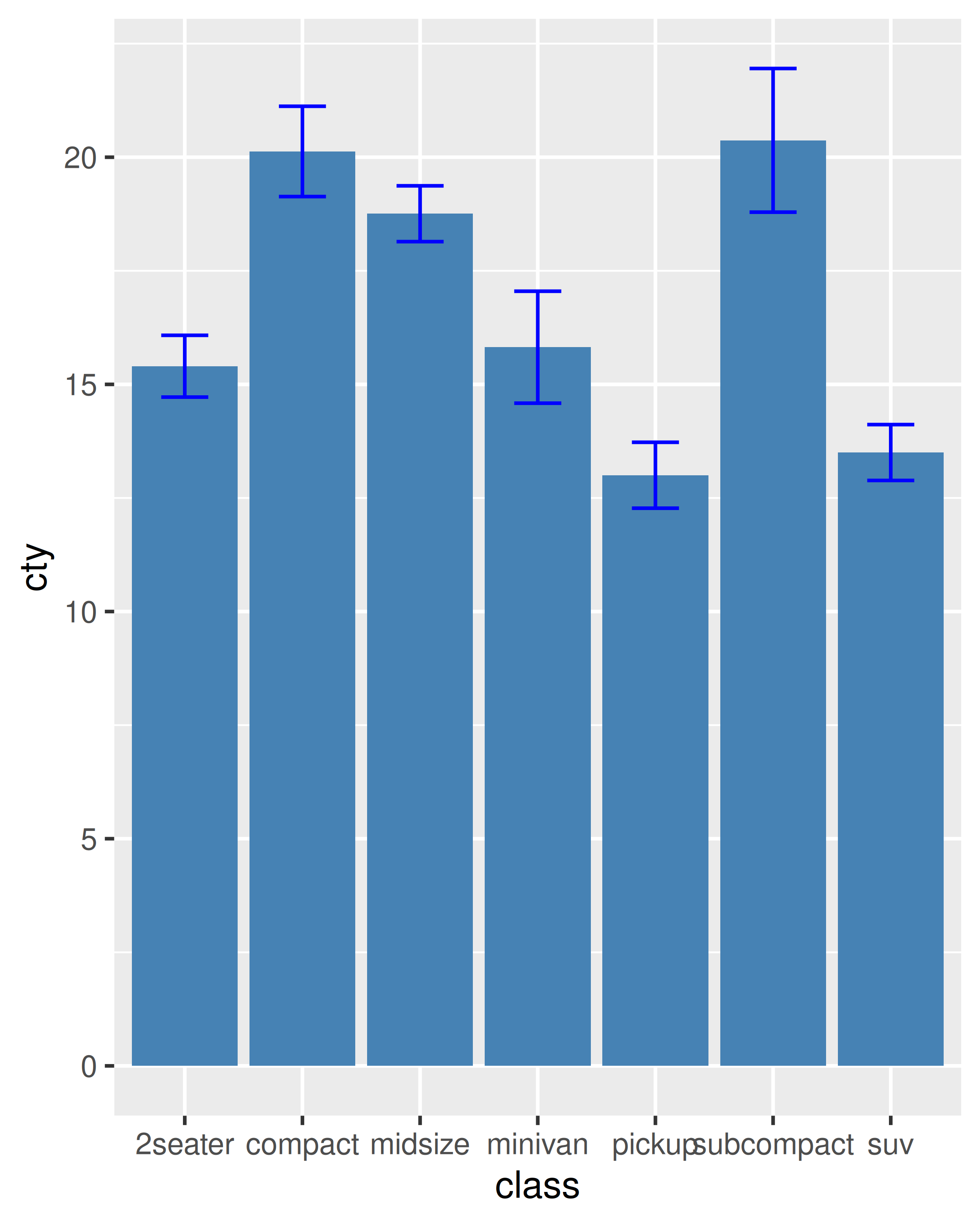
ggplot(mpg, aes(class, cty)) +
geom_mean(
colour = "steelblue",
errorbar.params = list(width = 0.5, linewidth = 1)
)
ggplot(mpg, aes(class, cty)) +
geom_mean(
bar.params = list(fill = "steelblue"),
errorbar.params = list(colour = "blue")
)
If you need more complex behaviour, it might be easier to create a custom geom or stat. You can learn about that in the extending ggplot2 vignette included with the package. Read it by running vignette("extending-ggplot2").
18.3.4 Exercises
To make the best use of space, many examples in this book hide the axes labels and legend. we’ve just copied-and-pasted the same code into multiple places, but it would make more sense to create a reusable function. What would that function look like?
Extend the
borders()function to also addcoord_quickmap()to the plot.Look through your own code. What combinations of geoms or scales do you use all the time? How could you extract the pattern into a reusable function?
18.4 Plot functions
Creating small reusable components is most in line with the ggplot2 spirit: you can recombine them flexibly to create whatever plot you want. But sometimes you’re creating the same plot over and over again, and you don’t need that flexibility. Instead of creating components, you might want to write a function that takes data and parameters and returns a complete plot.
For example, you could wrap up the complete code needed to make a piechart:
piechart <- function(data, mapping) {
  ggplot(data, mapping) +
    geom_bar(width = 1) +
    coord_polar(theta = "y") +
    xlab(NULL) +
    ylab(NULL)
}
piechart(mpg, aes(factor(1), fill = class))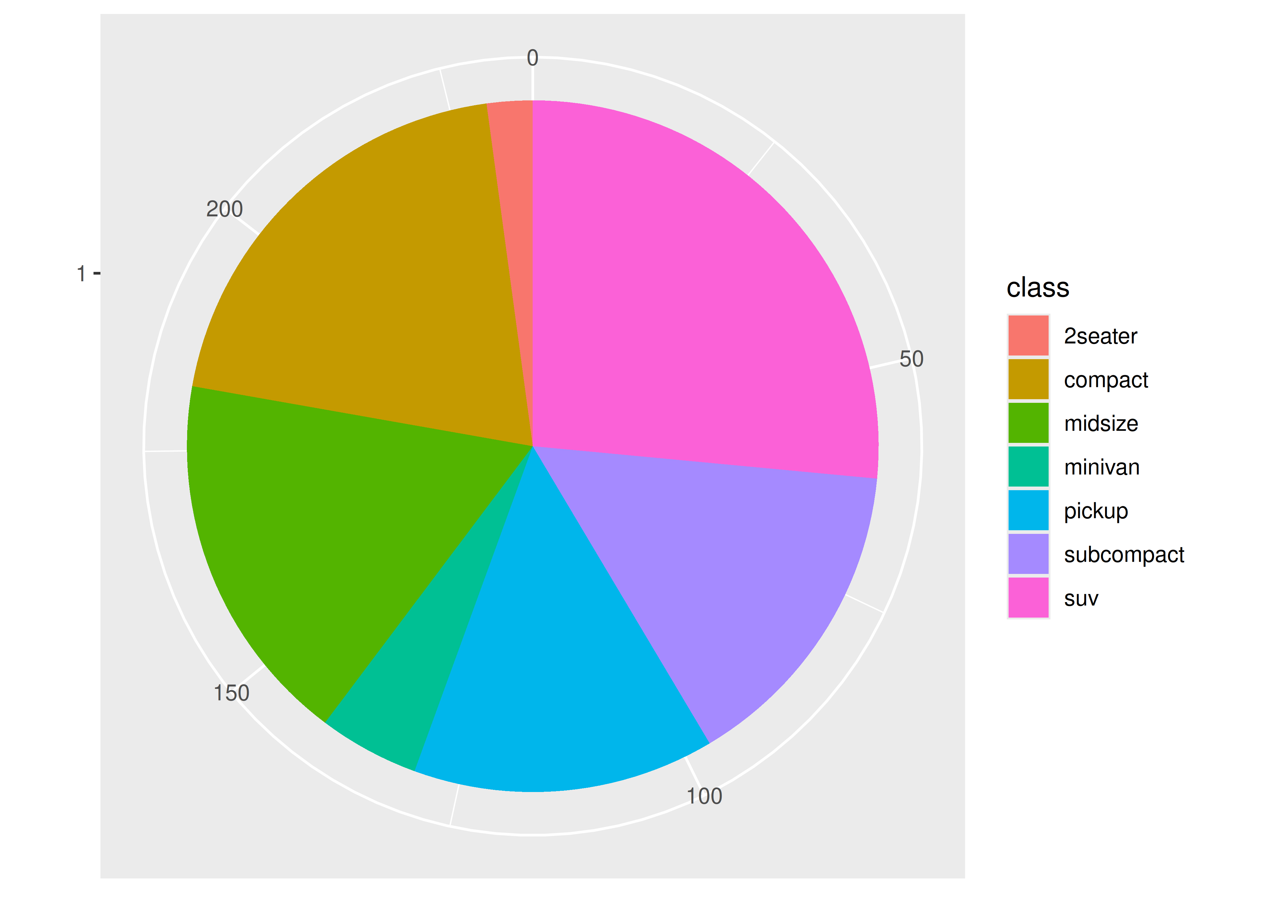
This is much less flexible than the component-based approach, but equally, it’s much more concise. Note that we were careful to return the plot object, rather than printing it. That makes it possible to add on other ggplot2 components.
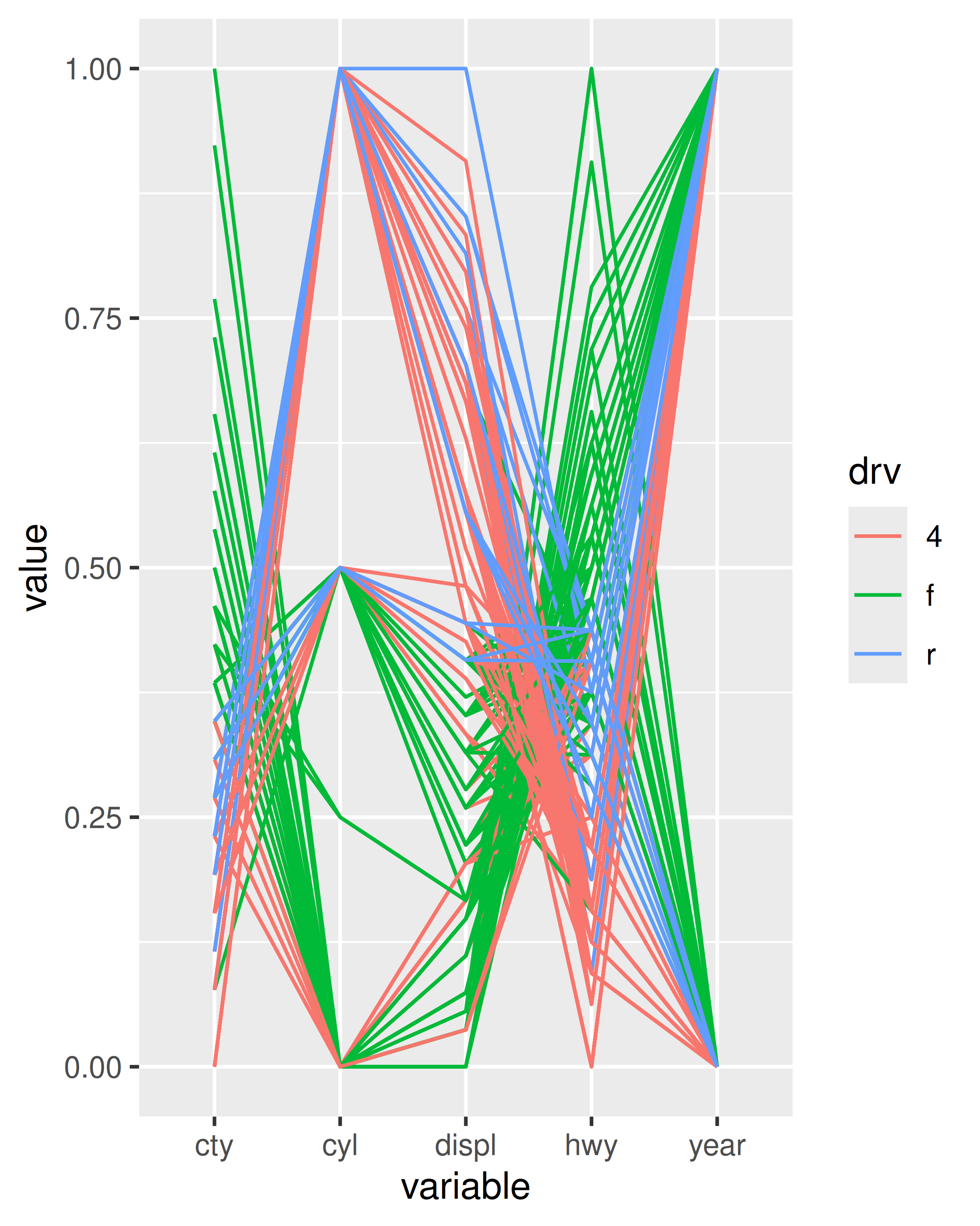
You can take a similar approach to drawing parallel coordinates plots (PCPs). PCPs require a transformation of the data, so we recommend writing two functions: one that does the transformation and one that generates the plot. Keeping these two pieces separate makes life much easier if you later want to reuse the same transformation for a different visualisation.
pcp_data <- function(df) {
  is_numeric <- vapply(df, is.numeric, logical(1))

  # Rescale numeric columns
  rescale01 <- function(x) {
    rng <- range(x, na.rm = TRUE)
    (x - rng[1]) / (rng[2] - rng[1])
  }
  df[is_numeric] <- lapply(df[is_numeric], rescale01)

  # Add row identifier
  df$.row <- rownames(df)

  # Treat numerics as value (aka measure) variables
  # gather_ is the standard-evaluation version of gather, and
  # is usually easier to program with.
  tidyr::gather_(df, "variable", "value", names(df)[is_numeric])
}
pcp <- function(df, ...) {
  df <- pcp_data(df)
  ggplot(df, aes(variable, value, group = .row)) + geom_line(...)
}
pcp(mpg)
#> Warning: `gather_()` was deprecated in tidyr 1.2.0.
#> ℹ Please use `gather()` instead.
pcp(mpg, aes(colour = drv))
#> Warning: `gather_()` was deprecated in tidyr 1.2.0.
#> ℹ Please use `gather()` instead.
18.4.1 Indirectly referring to variables
The piechart() function above is a little unappealing because it requires the user to know the exact aes() specification that generates a pie chart. It would be more convenient if the user could simply specify the name of the variable to plot. To do that you’ll need to learn a bit more about how aes() works.
aes() uses tidy-evaluation: rather than looking at the values of its arguments, it looks at their expressions. This makes programming difficult because when you want it to refer to a variable provided in an argument it instead uses the name of the argument:
my_function <- function(x_var) {
  aes(x = x_var)
}
my_function(abc)
#> Aesthetic mapping:
#> * `x` -> `x_var`
We resolve this using the standard technique for programming with tidy-evaluation: embracing. Embracing tells gglot2 to look “inside” the argument use its value, not its literal name:
my_function <- function(x_var) {
  aes(x = {{ x_var }})
}
my_function(abc)
#> Aesthetic mapping:
#> * `x` -> `abc`
This makes it easy to update our piechart function:
piechart <- function(data, var) {
  ggplot(data, aes(factor(1), fill = {{ var }})) +
    geom_bar(width = 1) +
    coord_polar(theta = "y") +
    xlab(NULL) +
    ylab(NULL)
}
mpg |> piechart(class)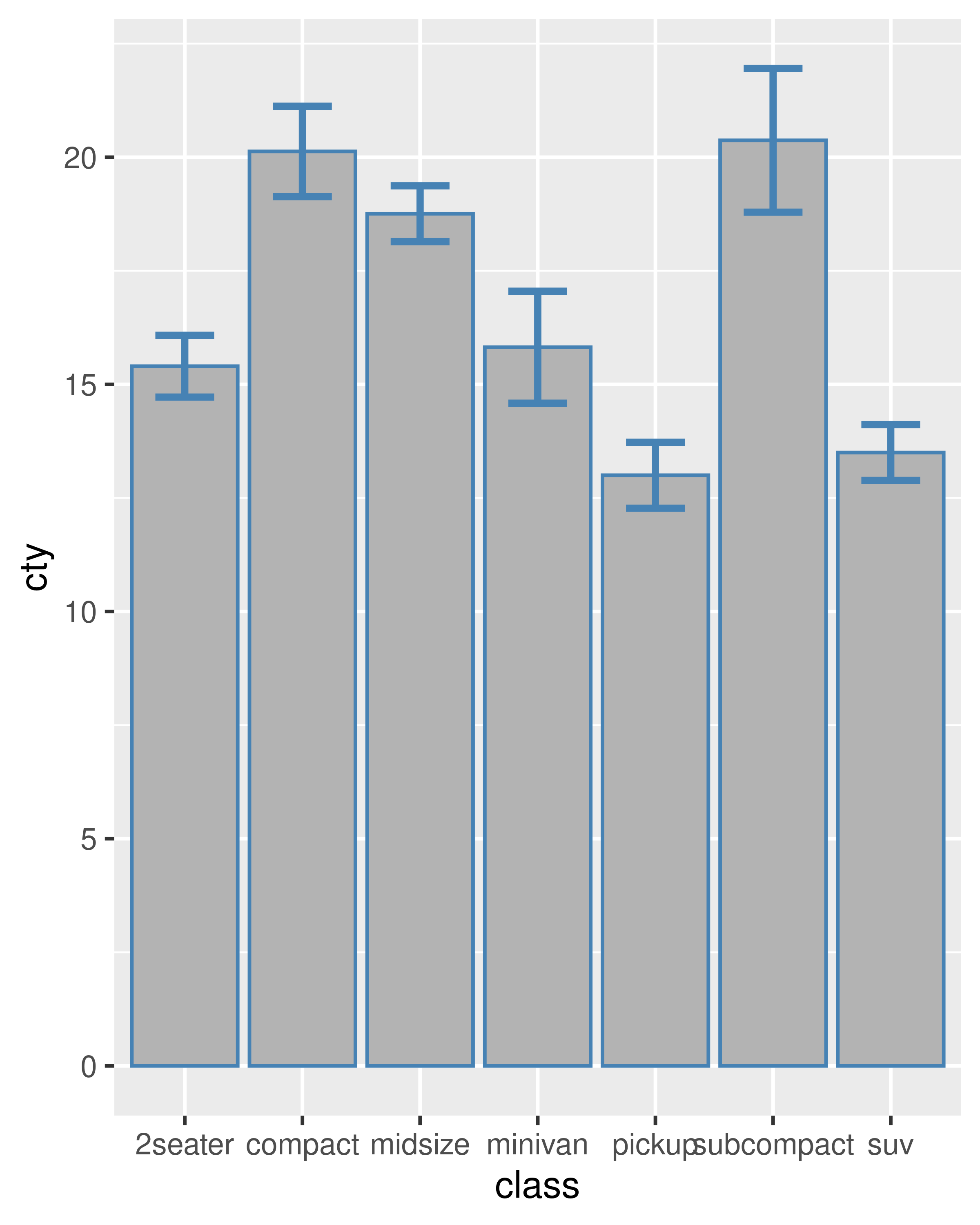
18.4.2 Exercises
Create a
distribution()function specially designed for visualising continuous distributions. Allow the user to supply a dataset and the name of a variable to visualise. Let them choose between histograms, frequency polygons, and density plots. What other arguments might you want to include?What additional arguments should
pcp()take? What are the downsides of how...is used in the current code?
18.5 Functional programming
Since ggplot2 objects are just regular R objects, you can put them in a list. This means you can apply all of R’s great functional programming tools. For example, if you wanted to add different geoms to the same base plot, you could put them in a list and use lapply().
geoms <- list(
geom_point(),
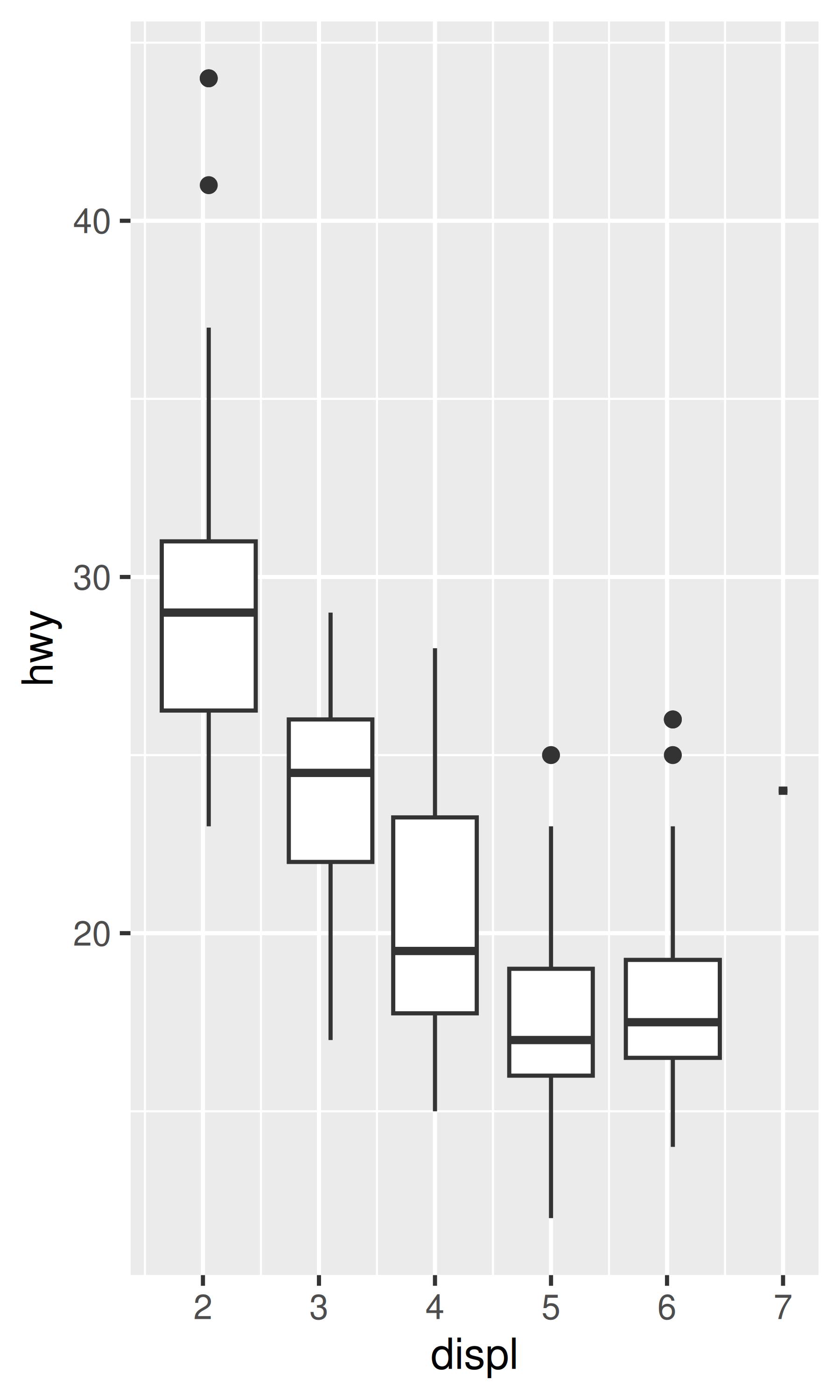
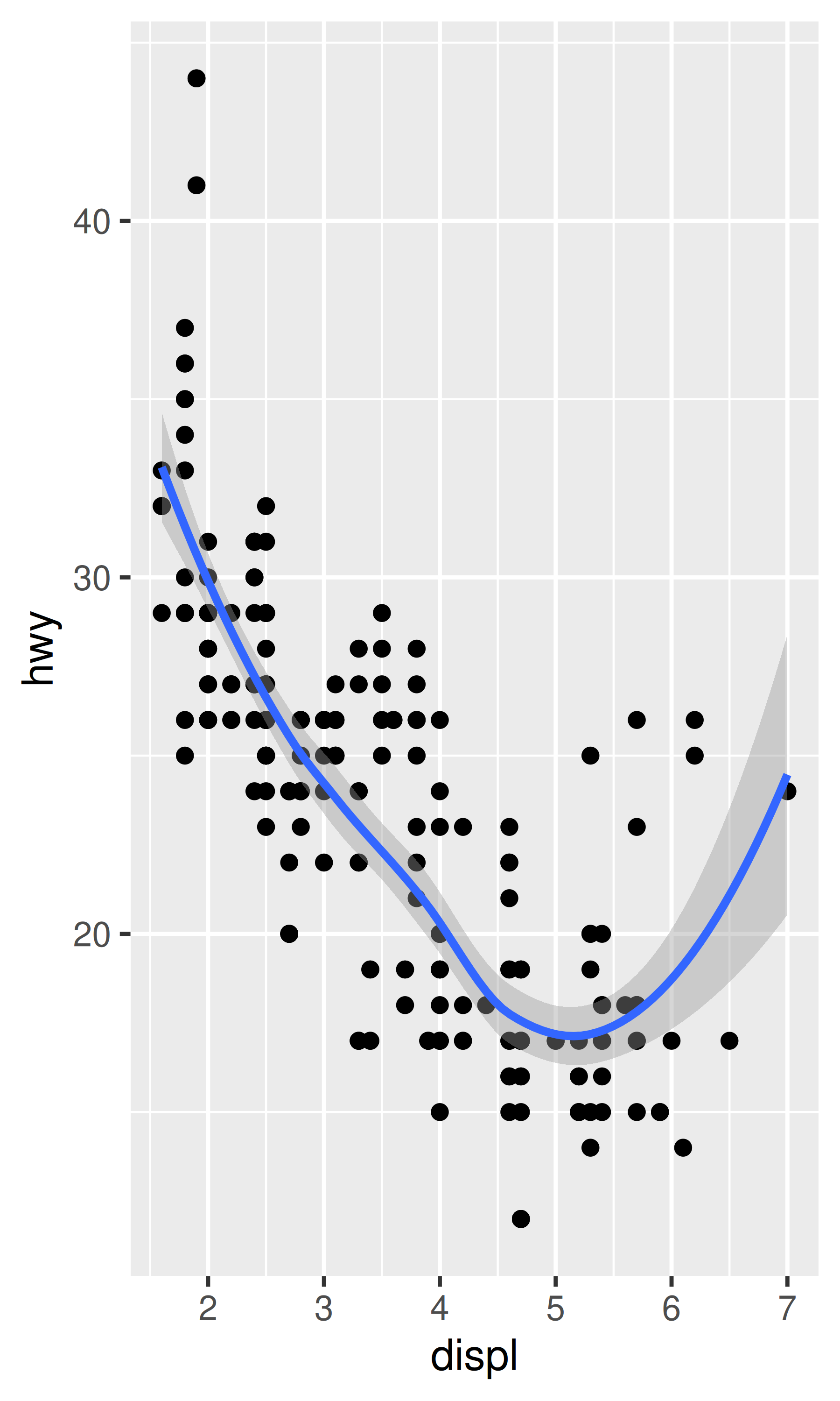
geom_boxplot(aes(group = cut_width(displ, 1))),
list(geom_point(), geom_smooth())
)
p <- ggplot(mpg, aes(displ, hwy))
lapply(geoms, function(g) p + g)
#> [[1]]
#>
#> [[2]]
#> Warning: Orientation is not uniquely specified when both the x and y aesthetics are
#> continuous. Picking default orientation 'x'.
#>
#> [[3]]
#> `geom_smooth()` using method = 'loess' and formula = 'y ~ x'
If you’re not familiar with functional programming, read through https://adv-r.hadley.nz/fp.html and think about how you might apply the techniques to your duplicated plotting code.
18.5.1 Exercises
-
How could you add a
geom_point()layer to each element of the following list?plots <- list( ggplot(mpg, aes(displ, hwy)), ggplot(diamonds, aes(carat, price)), ggplot(faithfuld, aes(waiting, eruptions, size = density)) ) -
What does the following function do? What’s a better name for it?