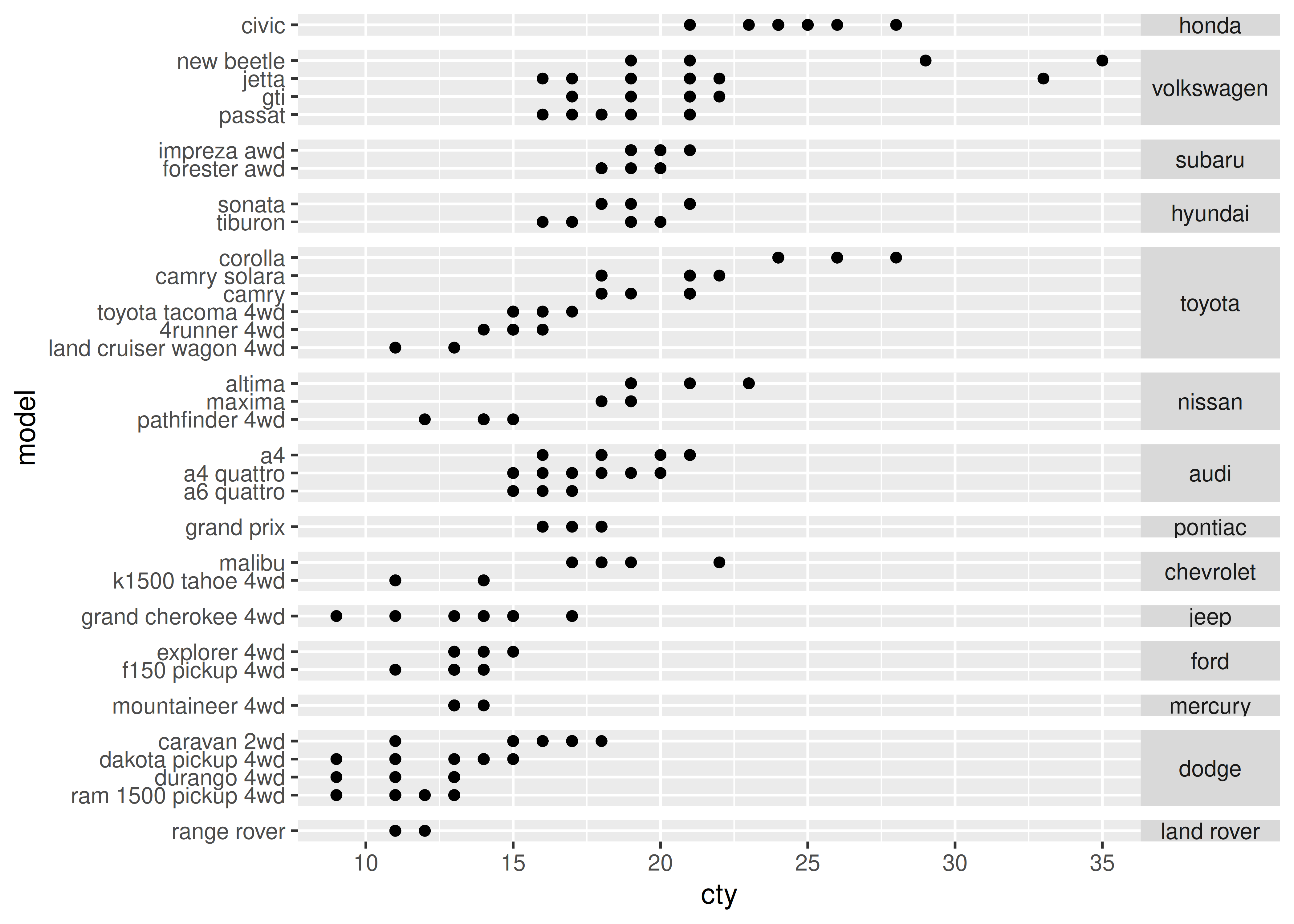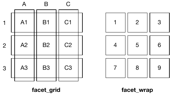
facet_grid() (left) is fundamentally 2d, being made up of two independent components. facet_wrap() (right) is 1d, but wrapped into 2d to save space.You are reading the work-in-progress third edition of the ggplot2 book. This chapter is currently a dumping ground for ideas, and we don’t recommend reading it.
You first encountered faceting in Section 2.5. Faceting generates small multiples each showing a different subset of the data. Small multiples are a powerful tool for exploratory data analysis: you can rapidly compare patterns in different parts of the data and see whether they are the same or different. This section will discuss how you can fine-tune facets, particularly the way in which they interact with position scales.
There are three types of faceting:
facet_null(): a single plot, the default.
facet_wrap(): “wraps” a 1d ribbon of panels into 2d.
facet_grid(): produces a 2d grid of panels defined by variables which form the rows and columns.
The differences between facet_wrap() and facet_grid() are illustrated in the figure below.
facet_grid() (left) is fundamentally 2d, being made up of two independent components. facet_wrap() (right) is 1d, but wrapped into 2d to save space.Faceted plots have the capability to fill up a lot of space, so for this chapter we will use a subset of the mpg dataset that has a manageable number of levels: three cylinders (4, 6, 8), two types of drive train (4 and f), and six classes.
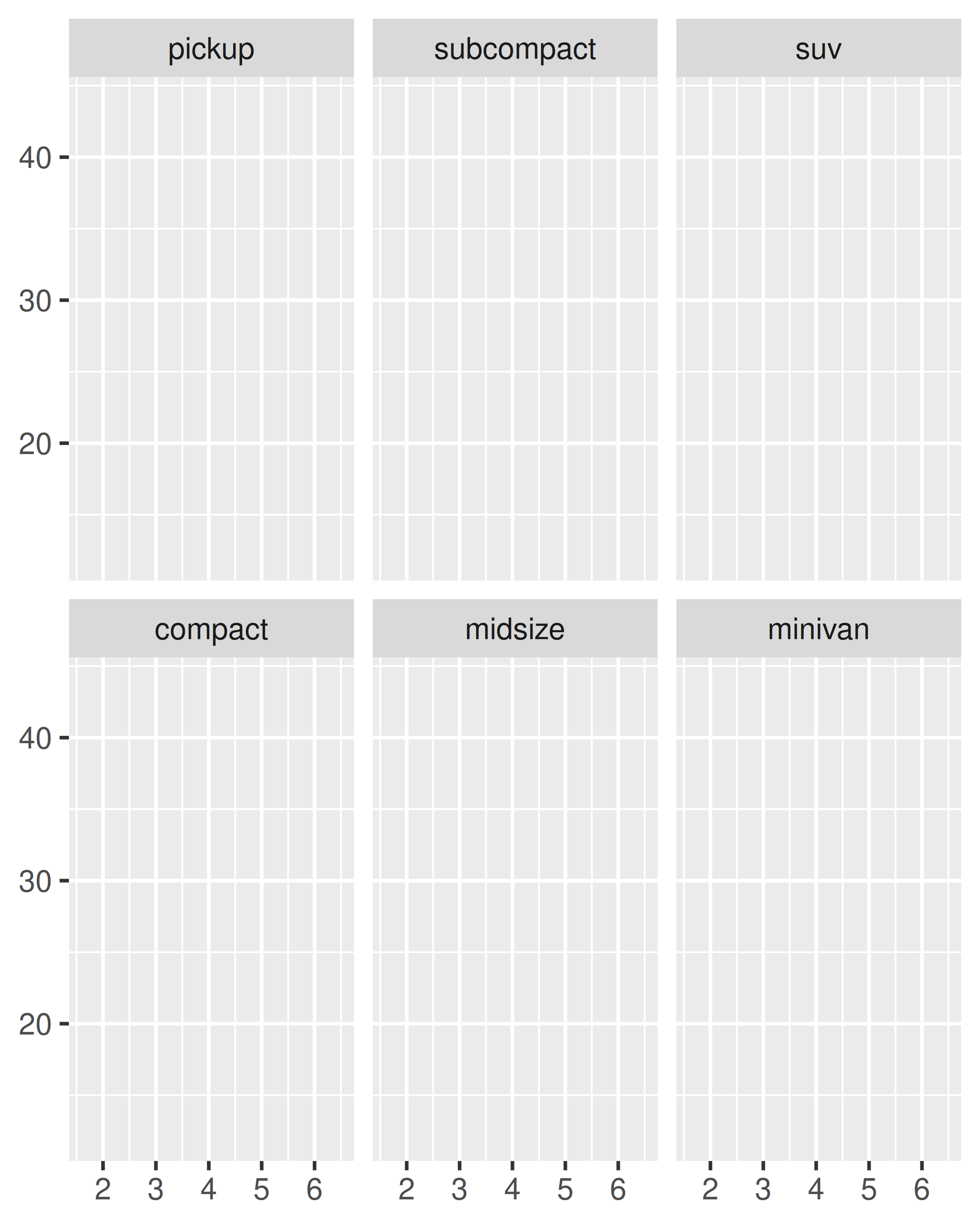
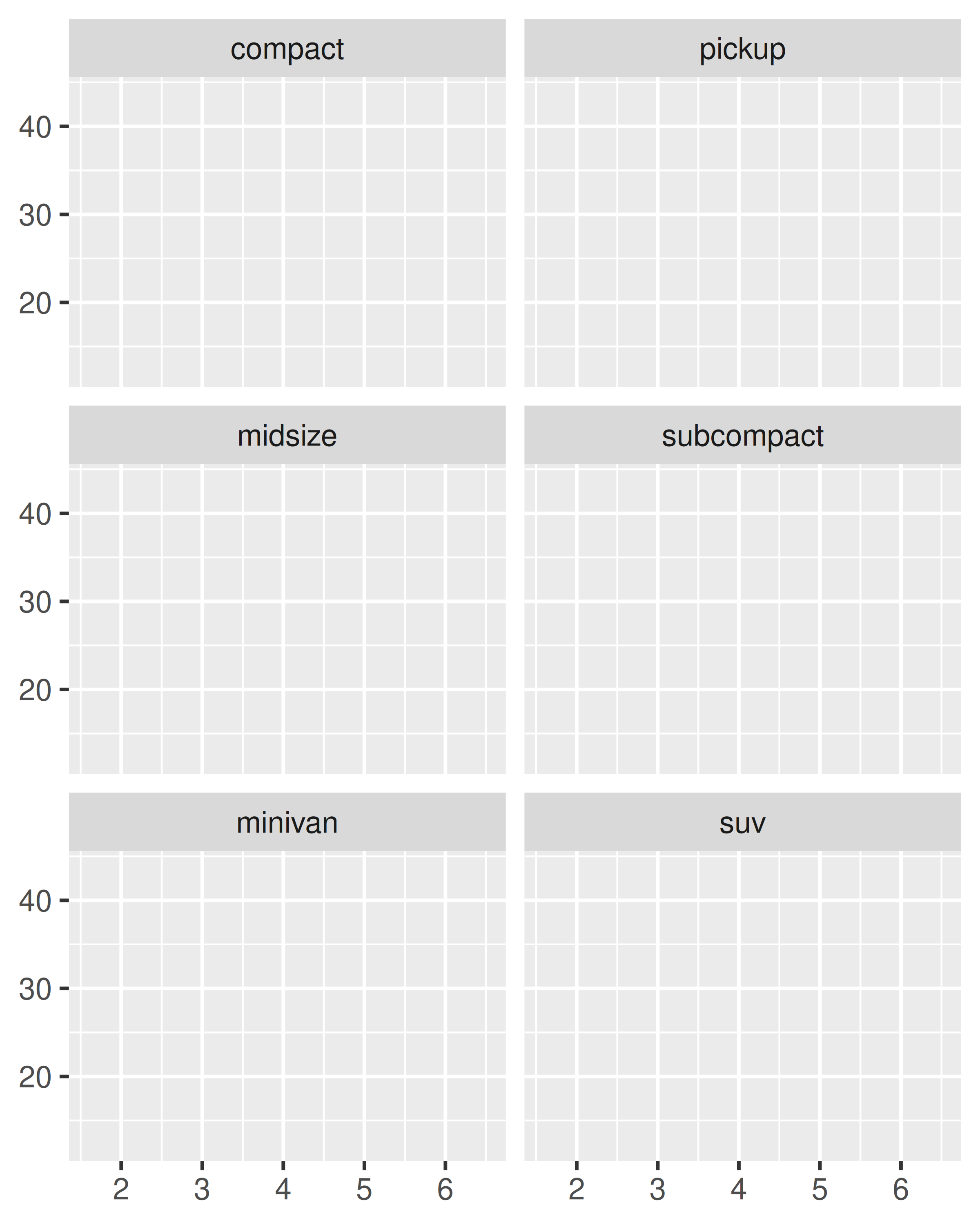
facet_wrap() makes a long ribbon of panels (generated by any number of variables) and wraps it into 2d. This is useful if you have a single variable with many levels and want to arrange the plots in a more space efficient manner.
You can control how the ribbon is wrapped into a grid with ncol, nrow, as.table and dir. ncol and nrow control how many columns and rows (you only need to set one). as.table controls whether the facets are laid out like a table (TRUE), with highest values at the bottom-right, or a plot (FALSE), with the highest values at the top-right. dir controls the direction of wrap: horizontal or vertical.
base <- ggplot(mpg2, aes(displ, hwy)) +
  geom_blank() +
  xlab(NULL) +
  ylab(NULL)

base + facet_wrap(~class, ncol = 3)
base + facet_wrap(~class, ncol = 3, as.table = FALSE)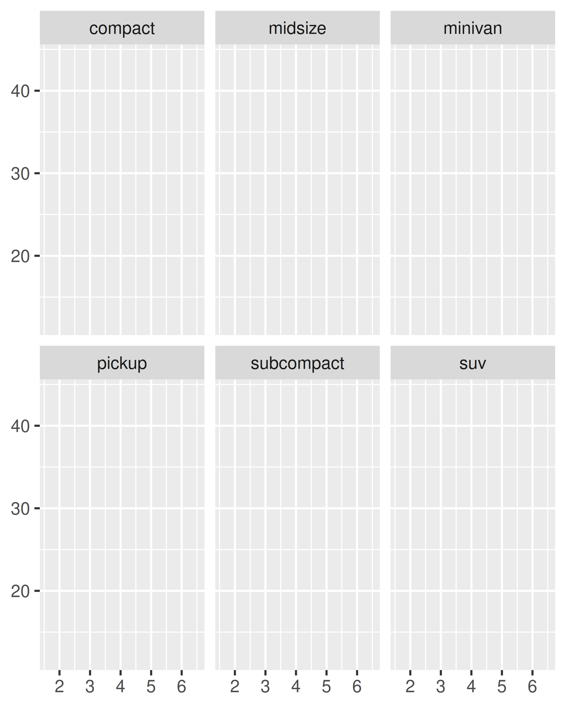
base + facet_wrap(~class, nrow = 3)
base + facet_wrap(~class, nrow = 3, dir = "v")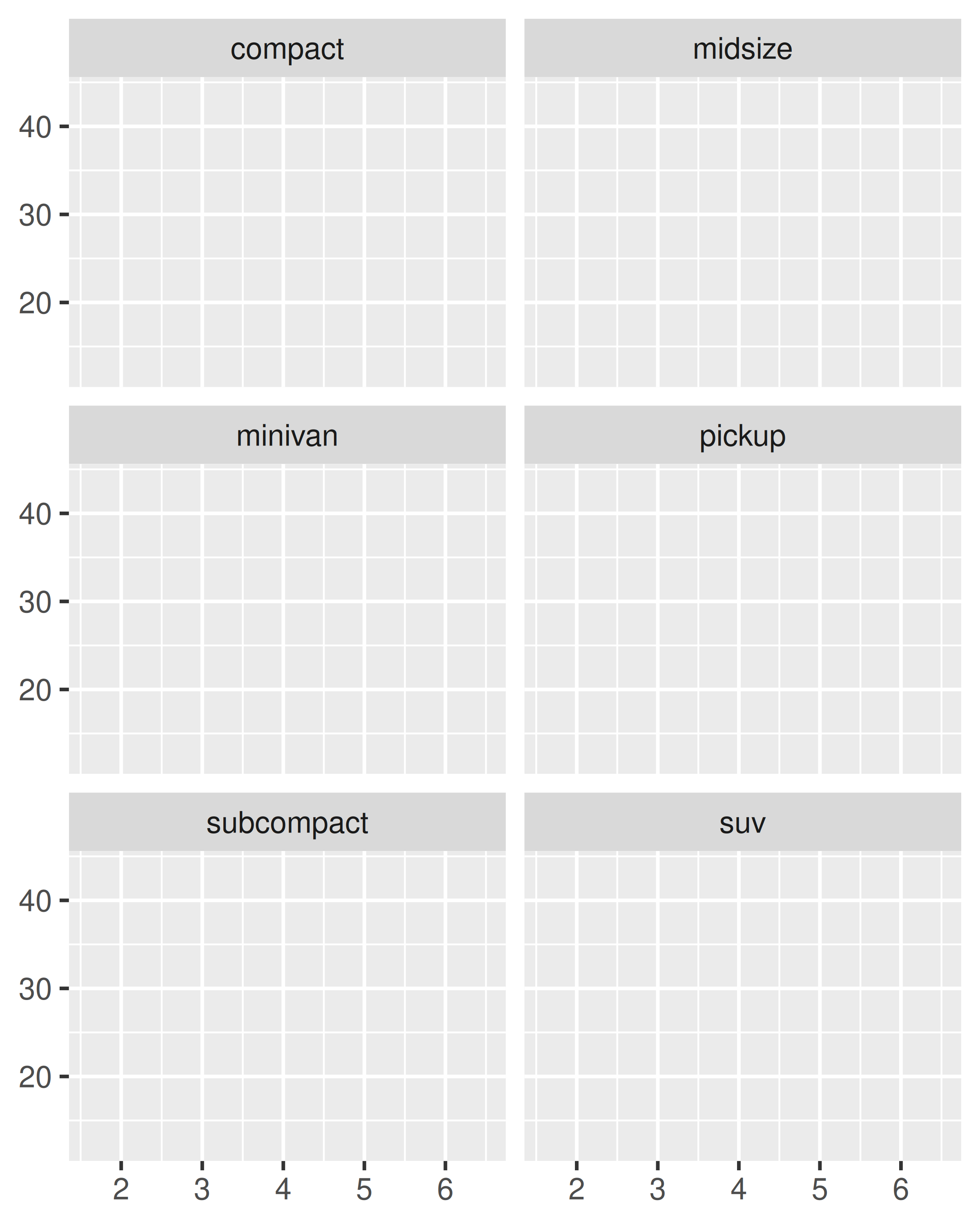
facet_grid() lays out plots in a 2d grid, as defined by a formula:
. ~ a spreads the values of a across the columns. This direction facilitates comparisons of y position, because the vertical scales are aligned.
base + facet_grid(. ~ cyl)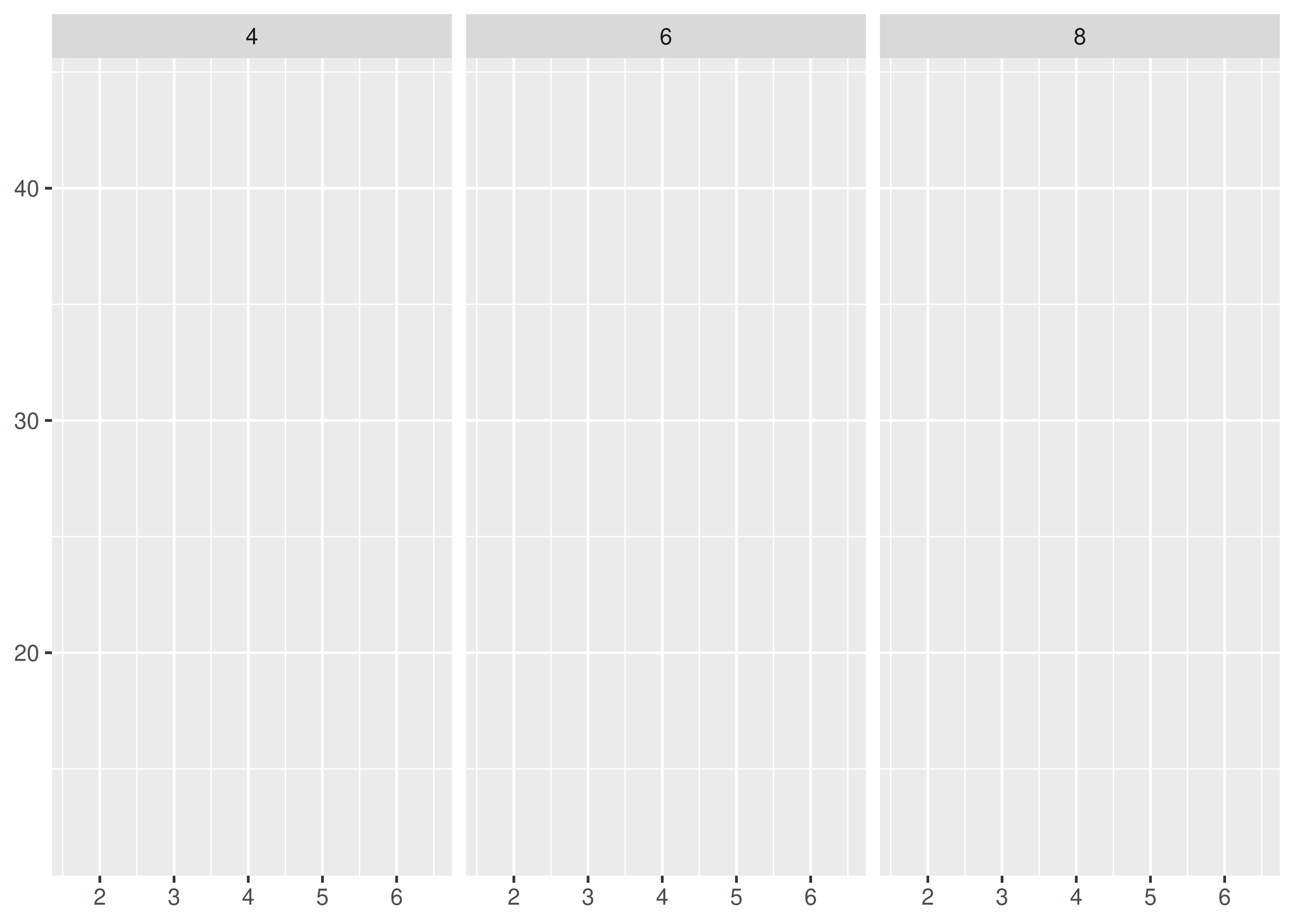
b ~ . spreads the values of b down the rows. This direction facilitates comparison of x position because the horizontal scales are aligned. This makes it particularly useful for comparing distributions.
base + facet_grid(drv ~ .)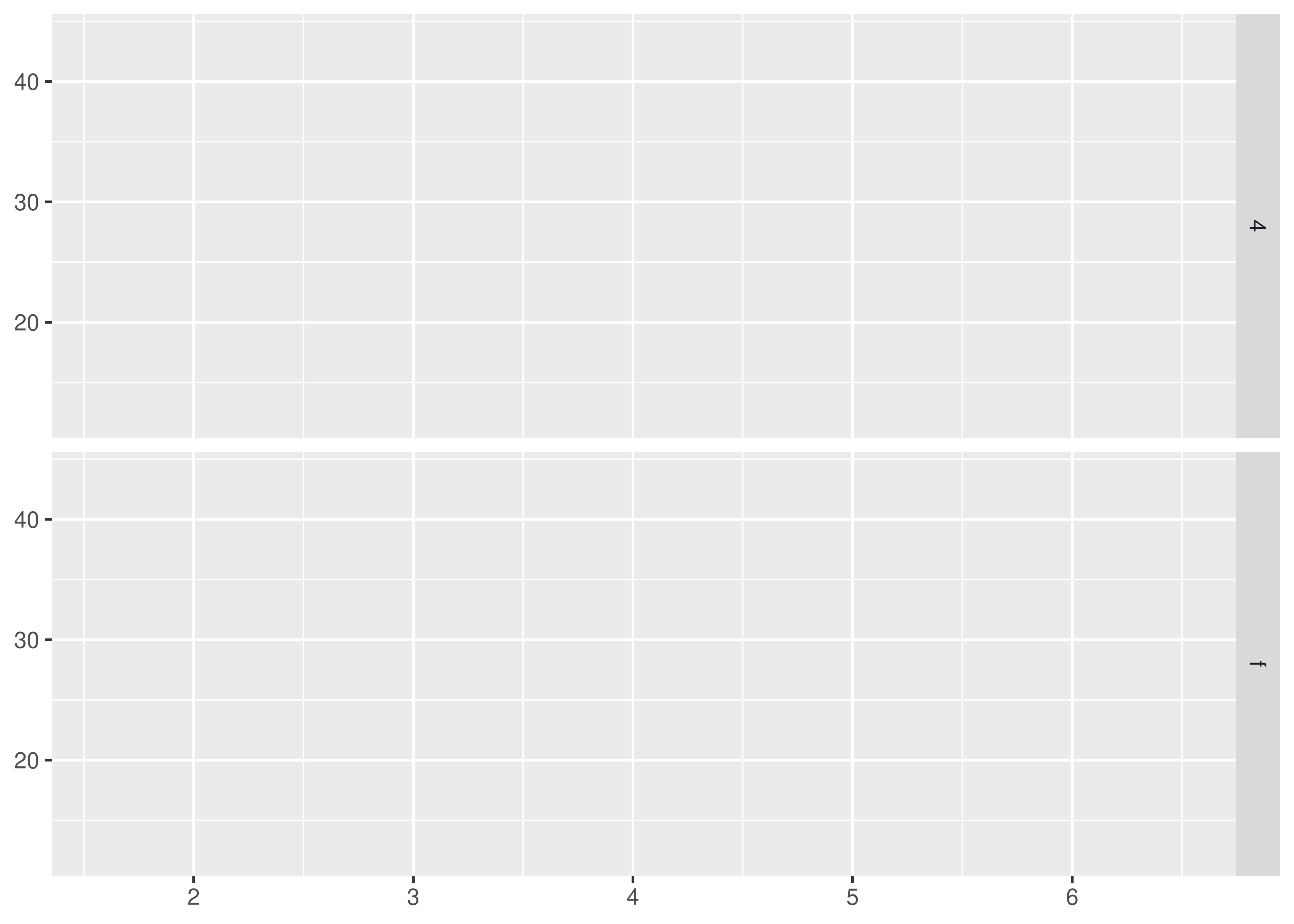
b ~ a spreads a across columns and b down rows. You’ll usually want to put the variable with the greatest number of levels in the columns, to take advantage of the aspect ratio of your screen.
base + facet_grid(drv ~ cyl)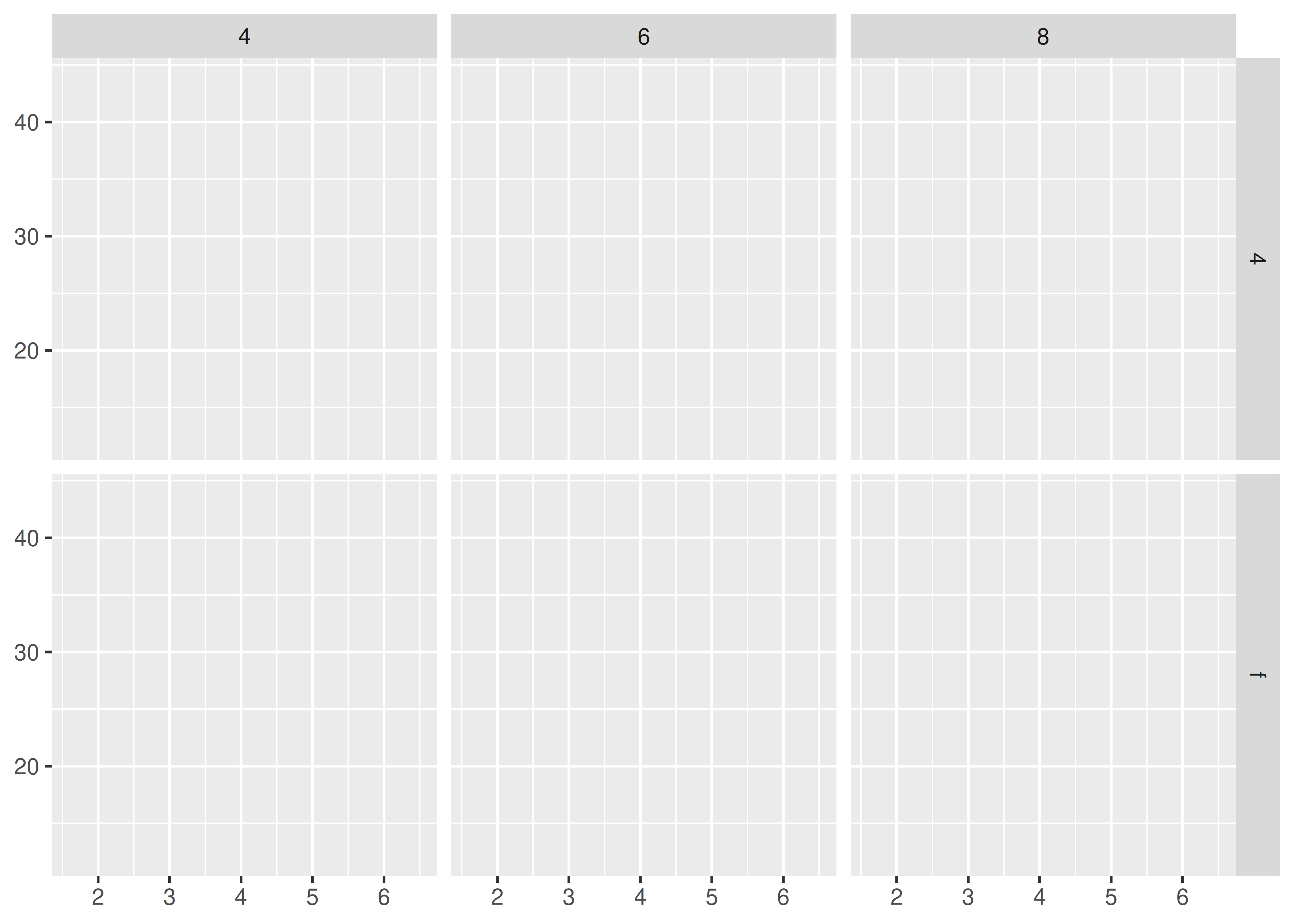
You can use multiple variables in the rows or columns, by “adding” them together, e.g. a + b ~ c + d. Variables appearing together on the rows or columns are nested in the sense that only combinations that appear in the data will appear in the plot. Variables that are specified on rows and columns will be crossed: all combinations will be shown, including those that didn’t appear in the original dataset: this may result in empty panels.
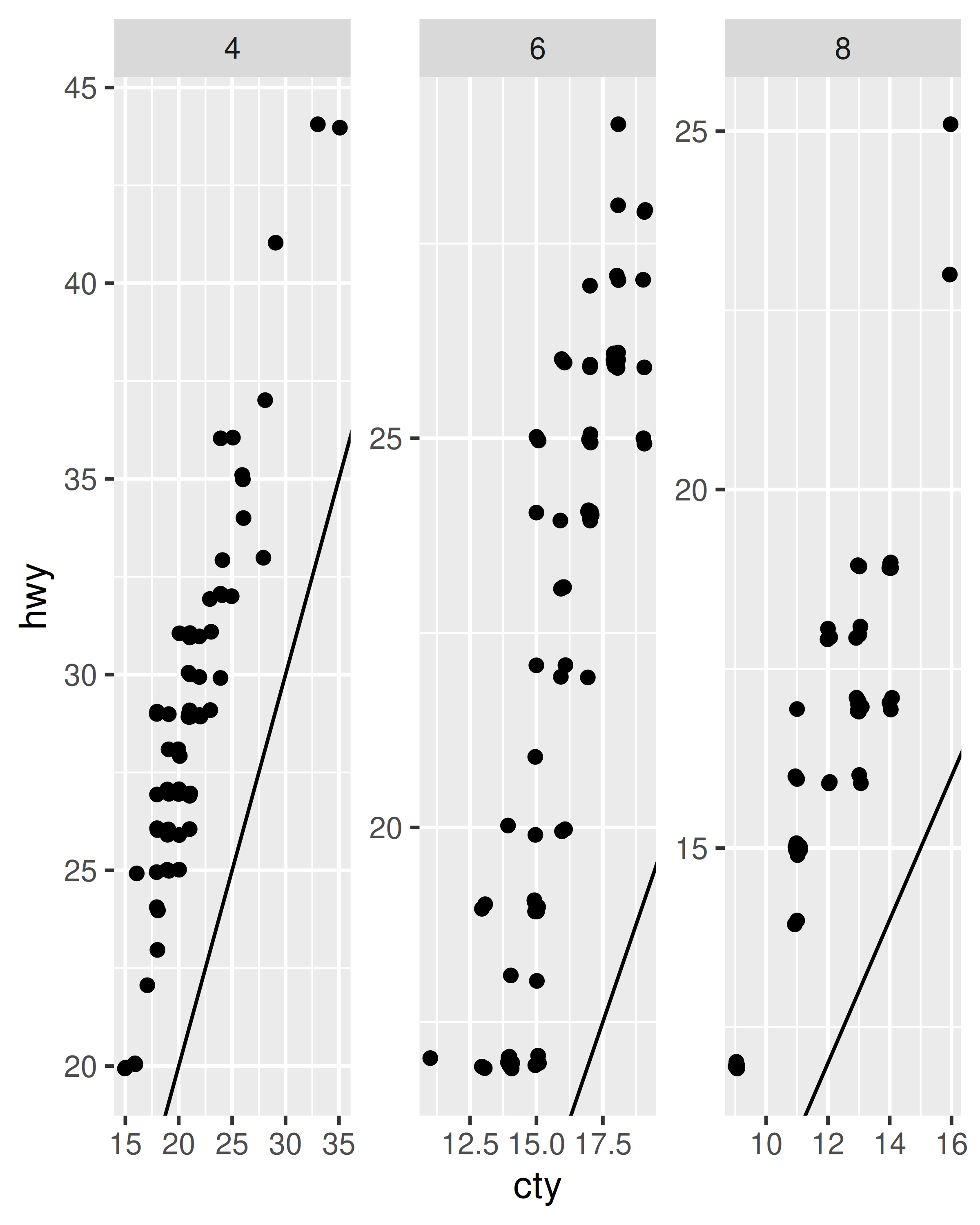
For both facet_wrap() and facet_grid() you can control whether the position scales are the same in all panels (fixed) or allowed to vary between panels (free) with the scales parameter:
scales = "fixed": x and y scales are fixed across all panels.scales = "free_x": the x scale is free, and the y scale is fixed.scales = "free_y": the y scale is free, and the x scale is fixed.scales = "free": x and y scales vary across panels.facet_grid() imposes an additional constraint on the scales: all panels in a column must have the same x scale, and all panels in a row must have the same y scale. This is because each column shares an x axis, and each row shares a y axis.
Fixed scales make it easier to see patterns across panels; free scales make it easier to see patterns within panels.
p <- ggplot(mpg2, aes(cty, hwy)) +
  geom_abline() +
  geom_jitter(width = 0.1, height = 0.1)

p + facet_wrap(~cyl)
p + facet_wrap(~cyl, scales = "free")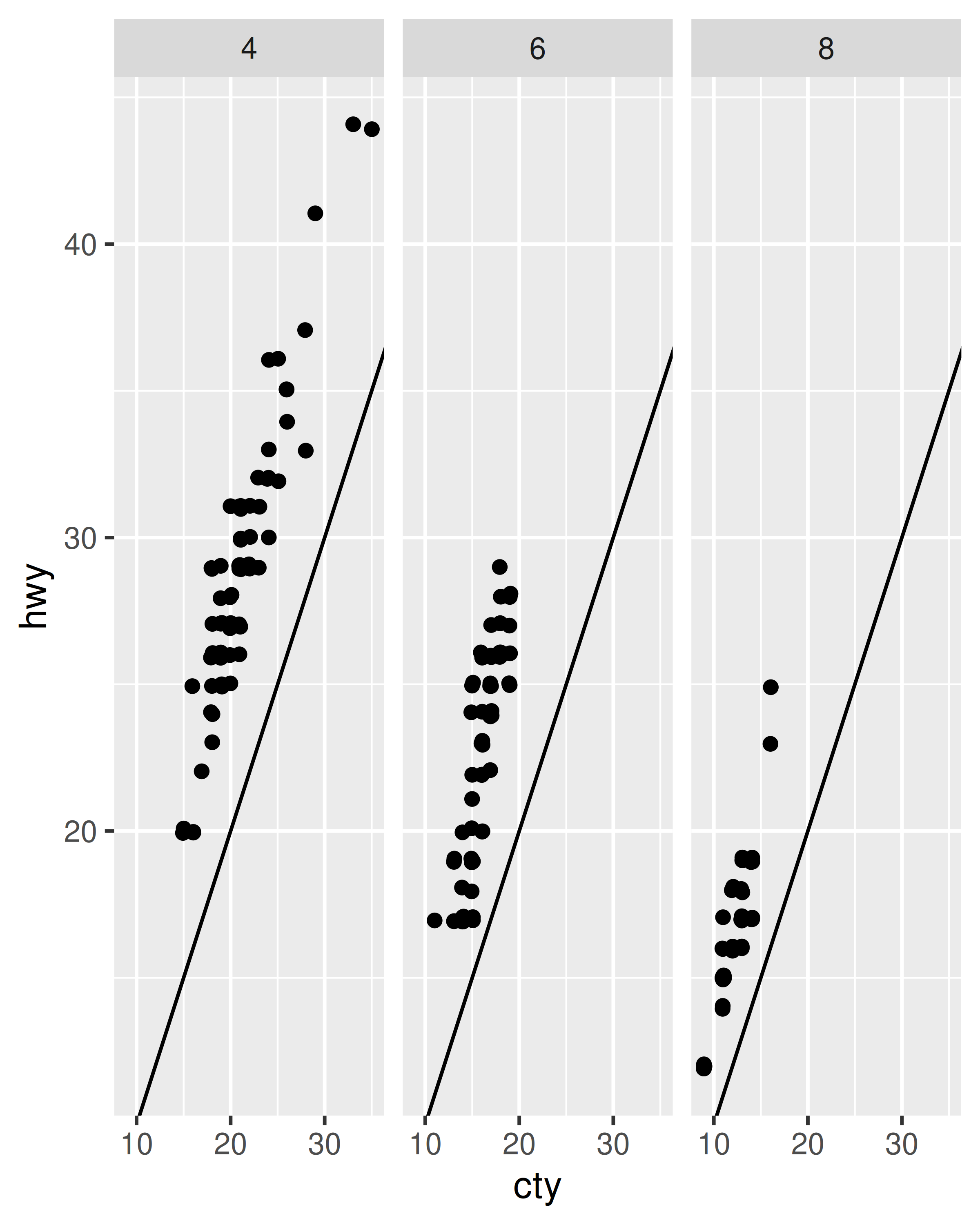
Free scales are also useful when we want to display multiple time series that were measured on different scales. To do this, we first need to change from ‘wide’ to ‘long’ data, stacking the separate variables into a single column. An example of this is shown below with the long form of the economics data.
economics_long
#> # A tibble: 2,870 × 4
#>   date       variable value  value01
#>   <date>     <chr>    <dbl>    <dbl>
#> 1 1967-07-01 pce       507. 0
#> 2 1967-08-01 pce       510. 0.000265
#> 3 1967-09-01 pce       516. 0.000762
#> 4 1967-10-01 pce       512. 0.000471
#> 5 1967-11-01 pce       517. 0.000916
#> 6 1967-12-01 pce       525. 0.00157
#> # ℹ 2,864 more rows
ggplot(economics_long, aes(date, value)) +
  geom_line() +
  facet_wrap(~variable, scales = "free_y", ncol = 1)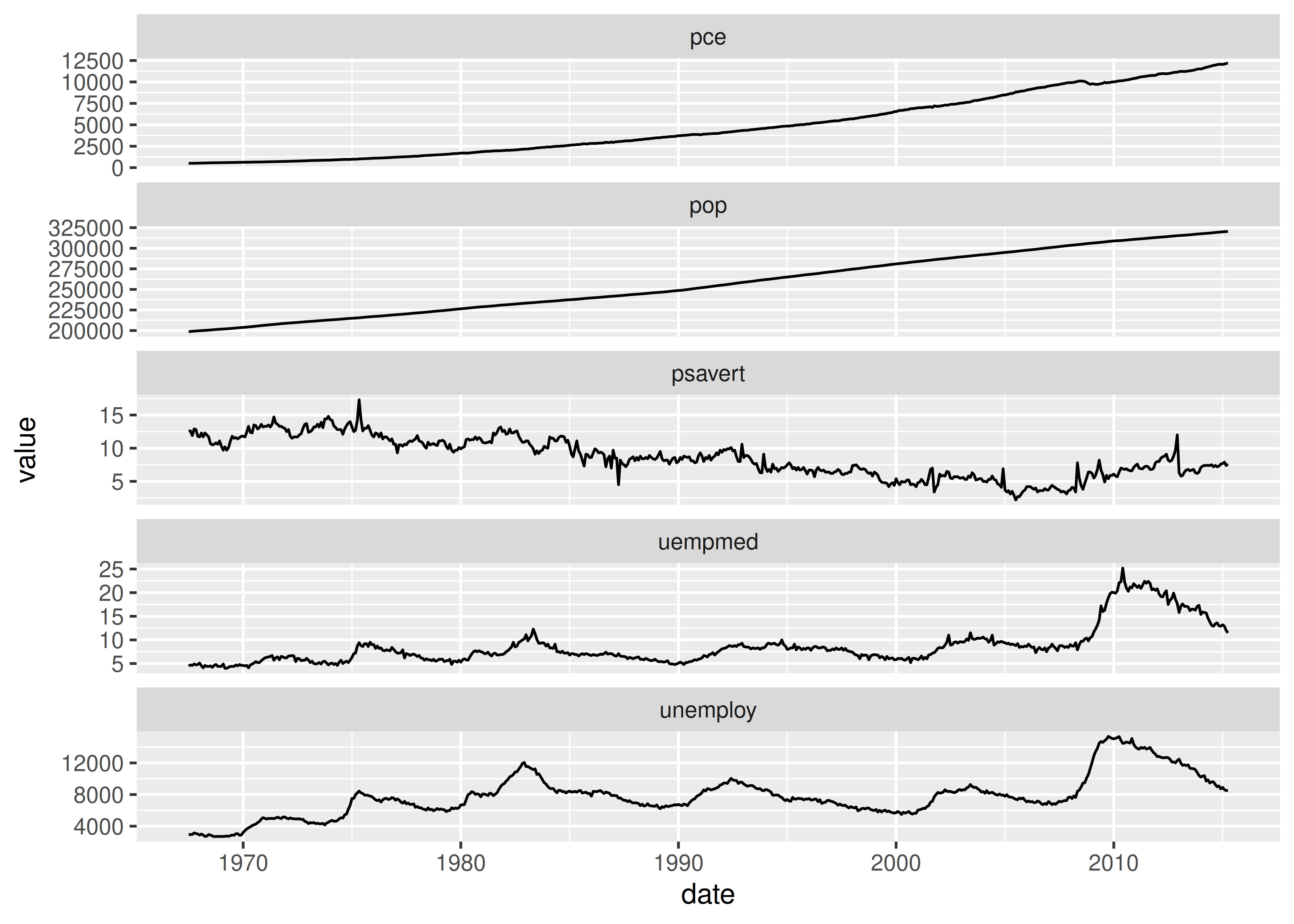
facet_grid() has an additional parameter called space, which takes the same values as scales. When space is “free”, each column (or row) will have width (or height) proportional to the range of the scale for that column (or row). This makes the scaling equal across the whole plot: 1 cm on each panel maps to the same range of data. (This is somewhat analogous to the ‘sliced’ axis limits of lattice.) For example, if panel a had range 2 and panel b had range 4, one-third of the space would be given to a, and two-thirds to b. This is most useful for categorical scales, where we can assign space proportionally based on the number of levels in each facet, as illustrated below.
If you are using faceting on a plot with multiple datasets, what happens when one of those datasets is missing the faceting variables? This situation commonly arises when you are adding contextual information that should be the same in all panels. For example, imagine you have a spatial display of disease faceted by gender. What happens when you add a map layer that does not contain the gender variable? Here ggplot will do what you expect: it will display the map in every facet: missing faceting variables are treated like they have all values.
Here’s a simple example. Note how the single red point from df2 appears in both panels.
df1 <- data.frame(x = 1:3, y = 1:3, gender = c("f", "f", "m"))
df2 <- data.frame(x = 2, y = 2)

ggplot(df1, aes(x, y)) +
  geom_point(data = df2, colour = "red", size = 2) +
  geom_point() +
  facet_wrap(~gender)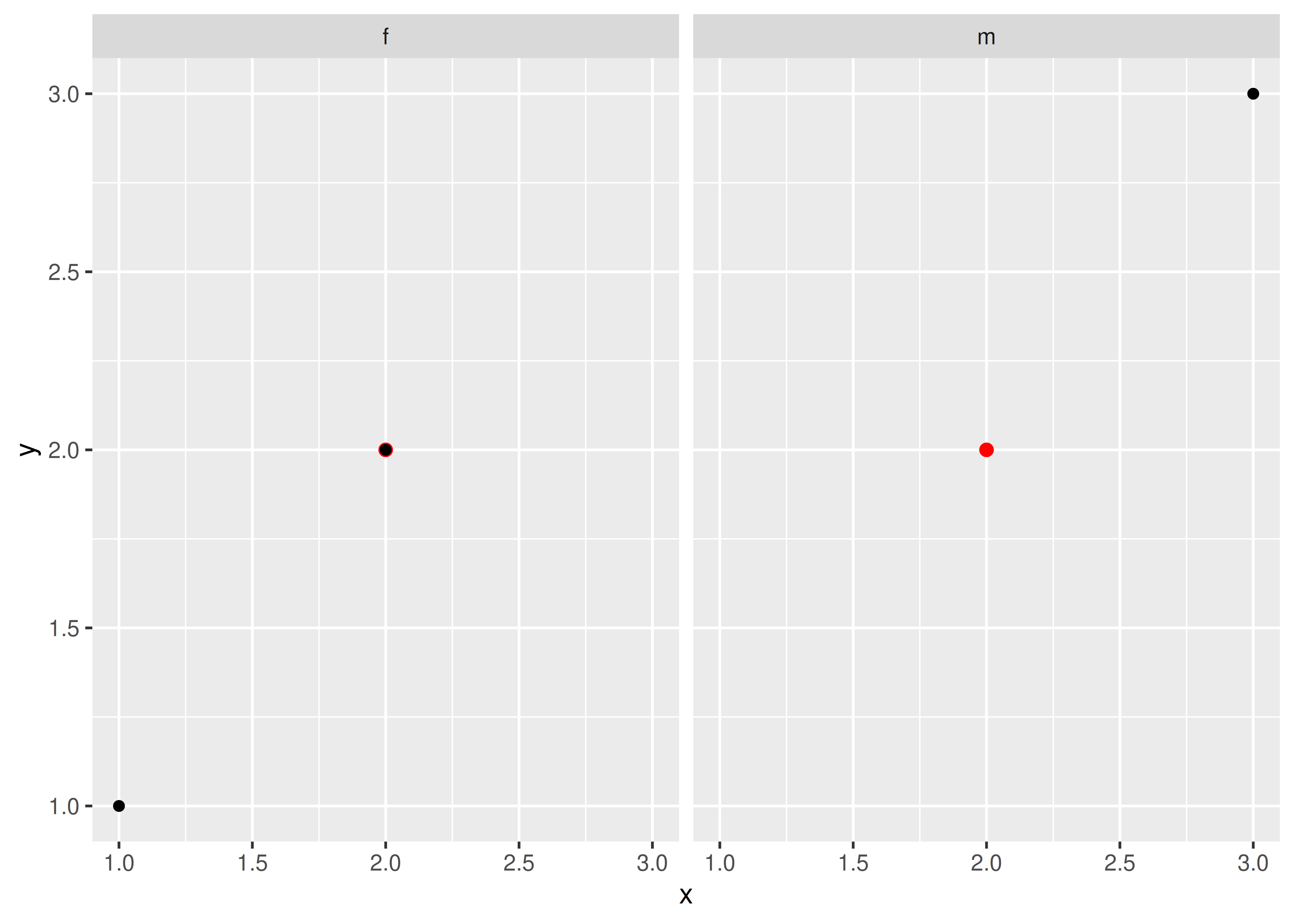
This technique is particularly useful when you add annotations to make it easier to compare between facets, as shown in the next section.
Faceting is an alternative to using aesthetics (like colour, shape or size) to differentiate groups. Both techniques have strengths and weaknesses, based around the relative positions of the subsets. With faceting, each group is quite far apart in its own panel, and there is no overlap between the groups. This is good if the groups overlap a lot, but it does make small differences harder to see. When using aesthetics to differentiate groups, the groups are close together and may overlap, but small differences are easier to see.
df <- data.frame(
  x = rnorm(120, c(0, 2, 4)),
  y = rnorm(120, c(1, 2, 1)),
  z = letters[1:3]
)

ggplot(df, aes(x, y)) +
  geom_point(aes(colour = z))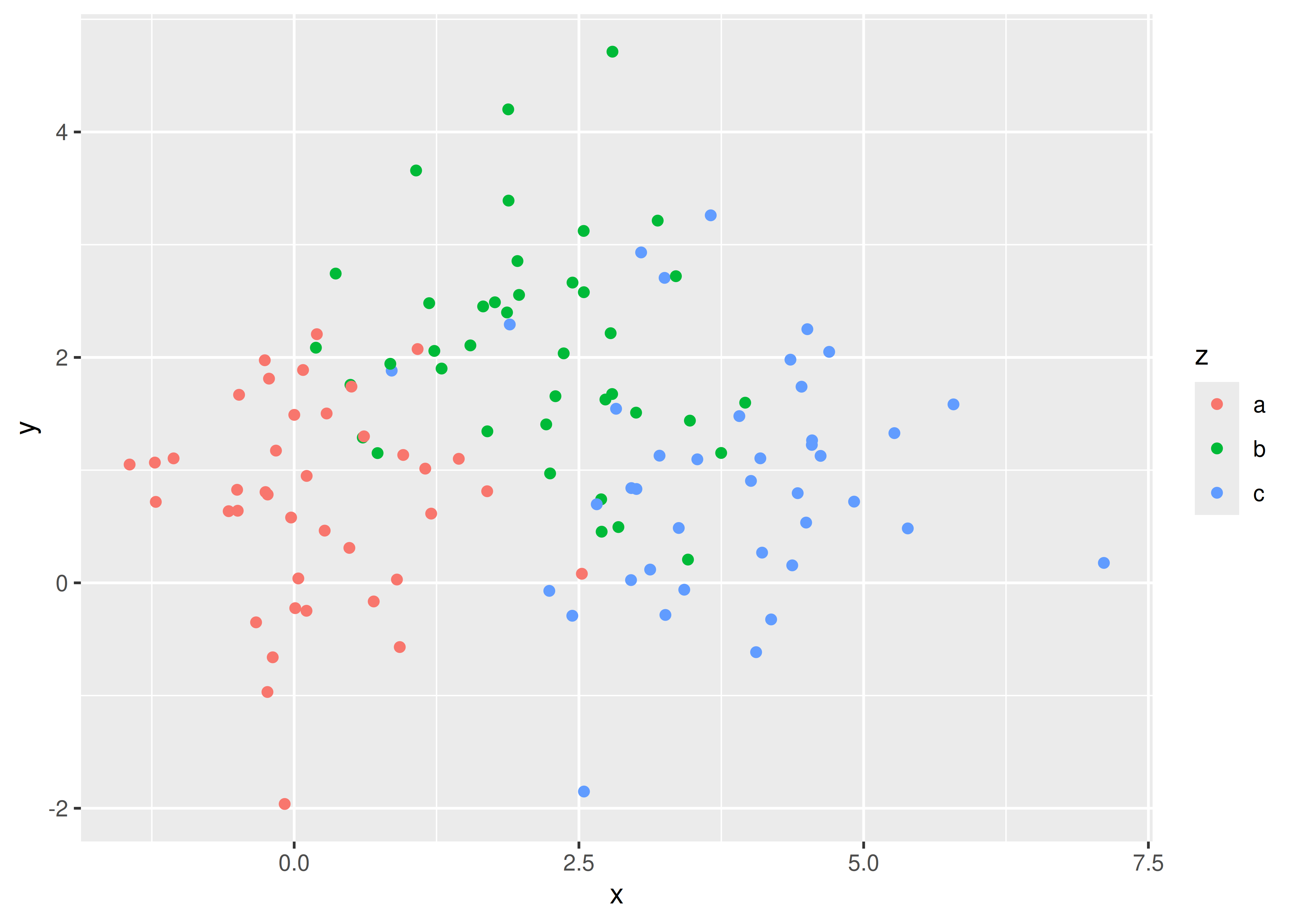
ggplot(df, aes(x, y)) +
  geom_point() +
  facet_wrap(~z)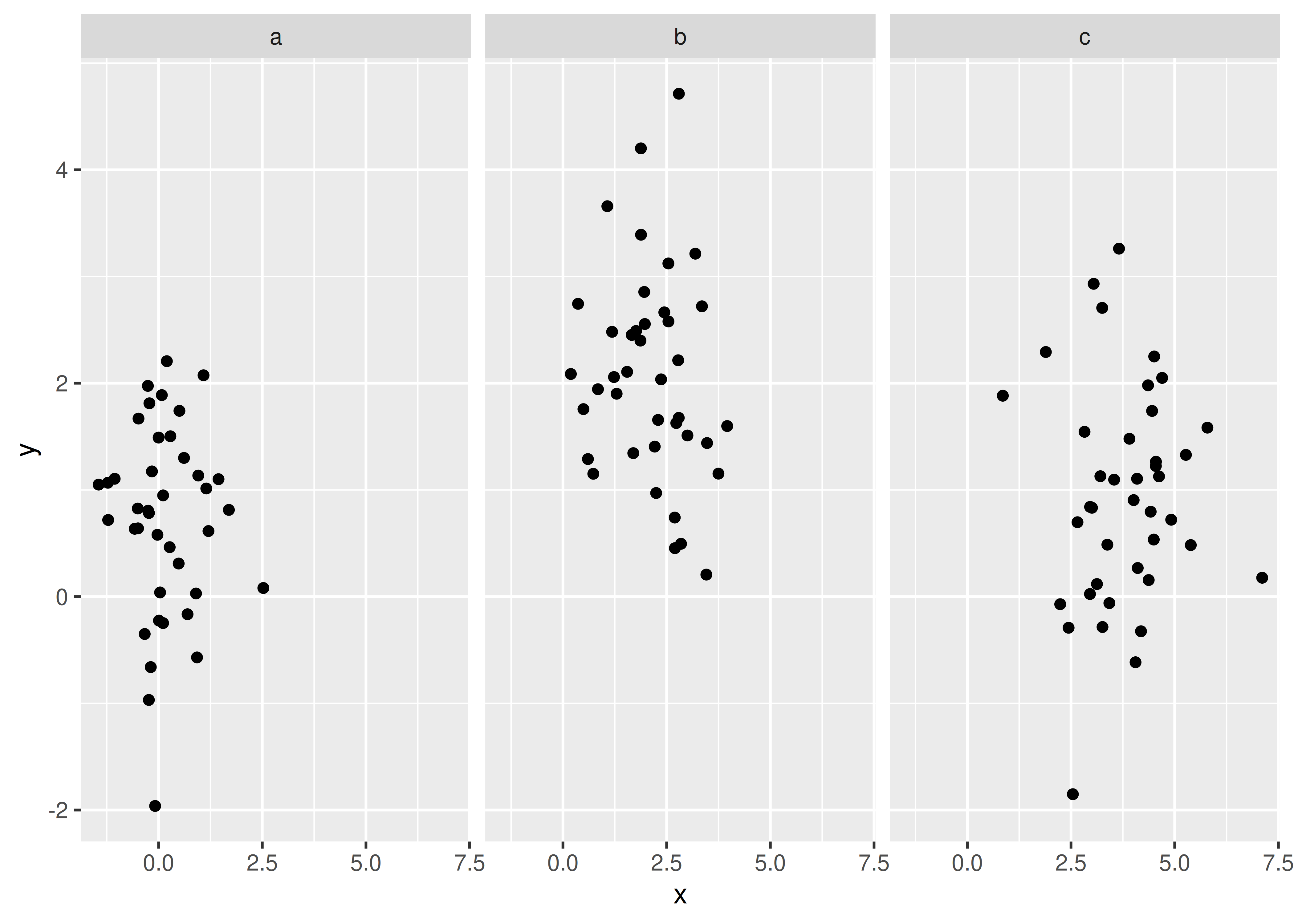
Comparisons between facets often benefit from some thoughtful annotation. For example, in this case we could show the mean of each group in every panel. To do this we group and summarise the data using the dplyr package, which is covered in R for Data Science at https://r4ds.had.co.nz. Note that we need two “z” variables: one for the facets and one for the colours.
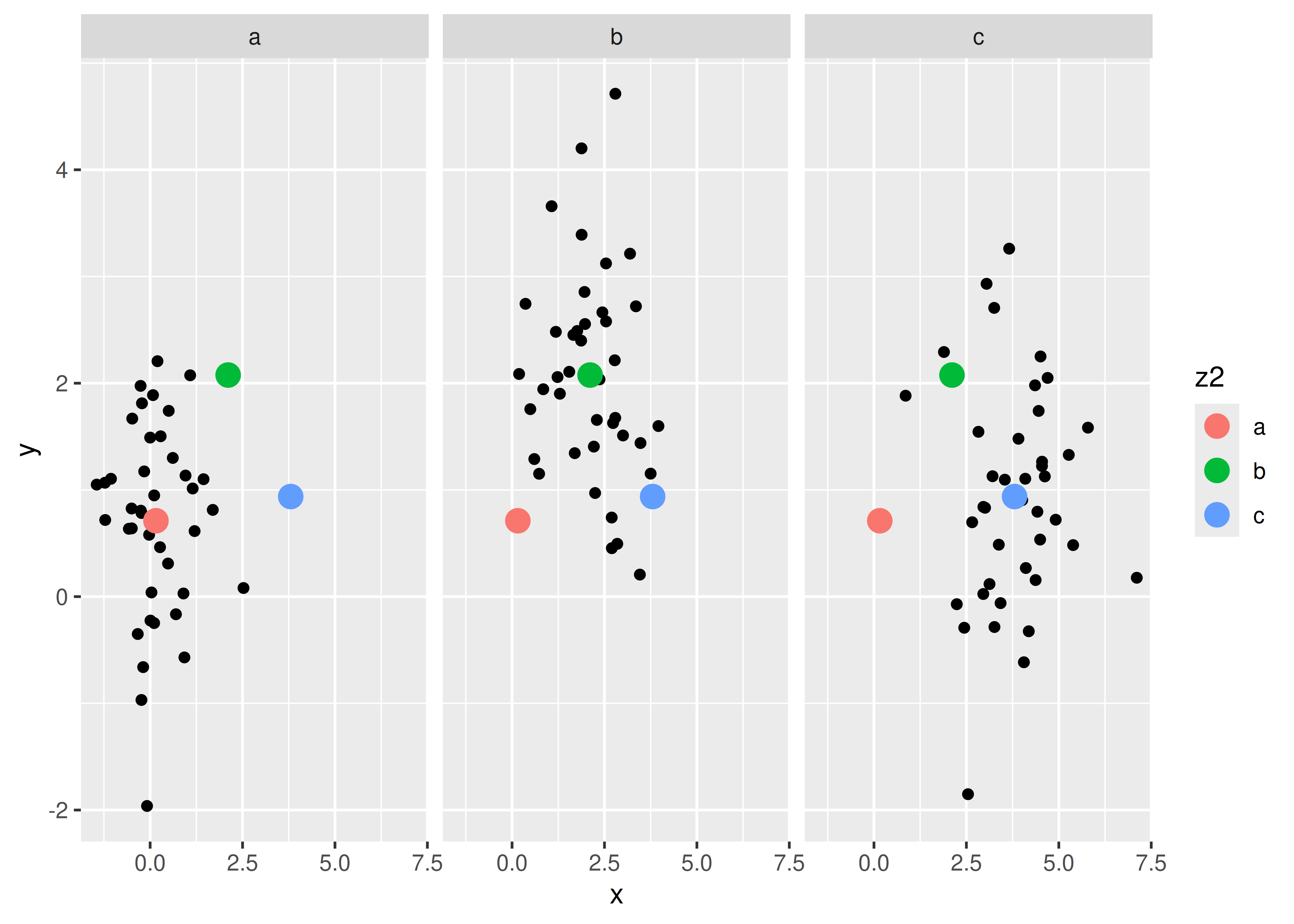
Another useful technique is to put all the data in the background of each panel:
df2 <- dplyr::select(df, -z)

ggplot(df, aes(x, y)) +
  geom_point(data = df2, colour = "grey70") +
  geom_point(aes(colour = z)) +
  facet_wrap(~z)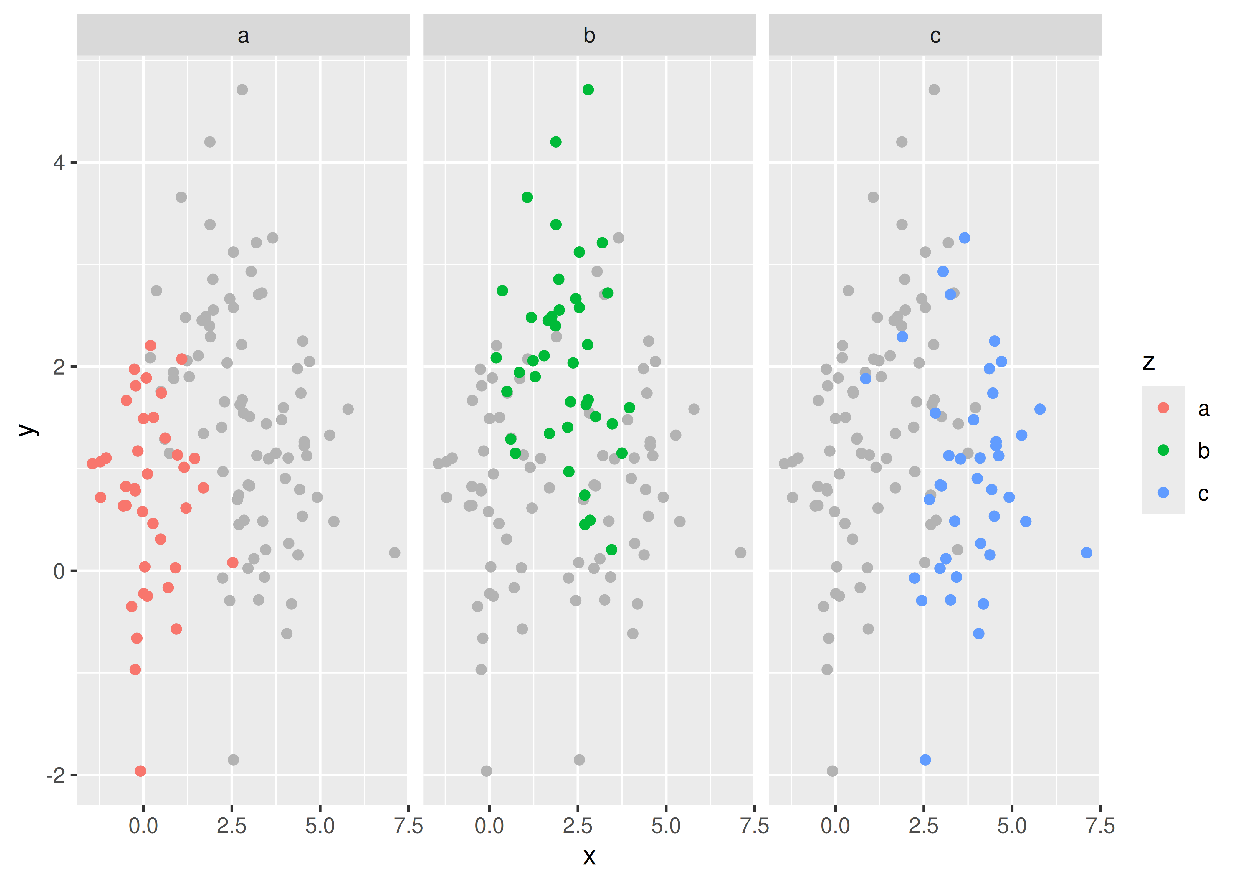
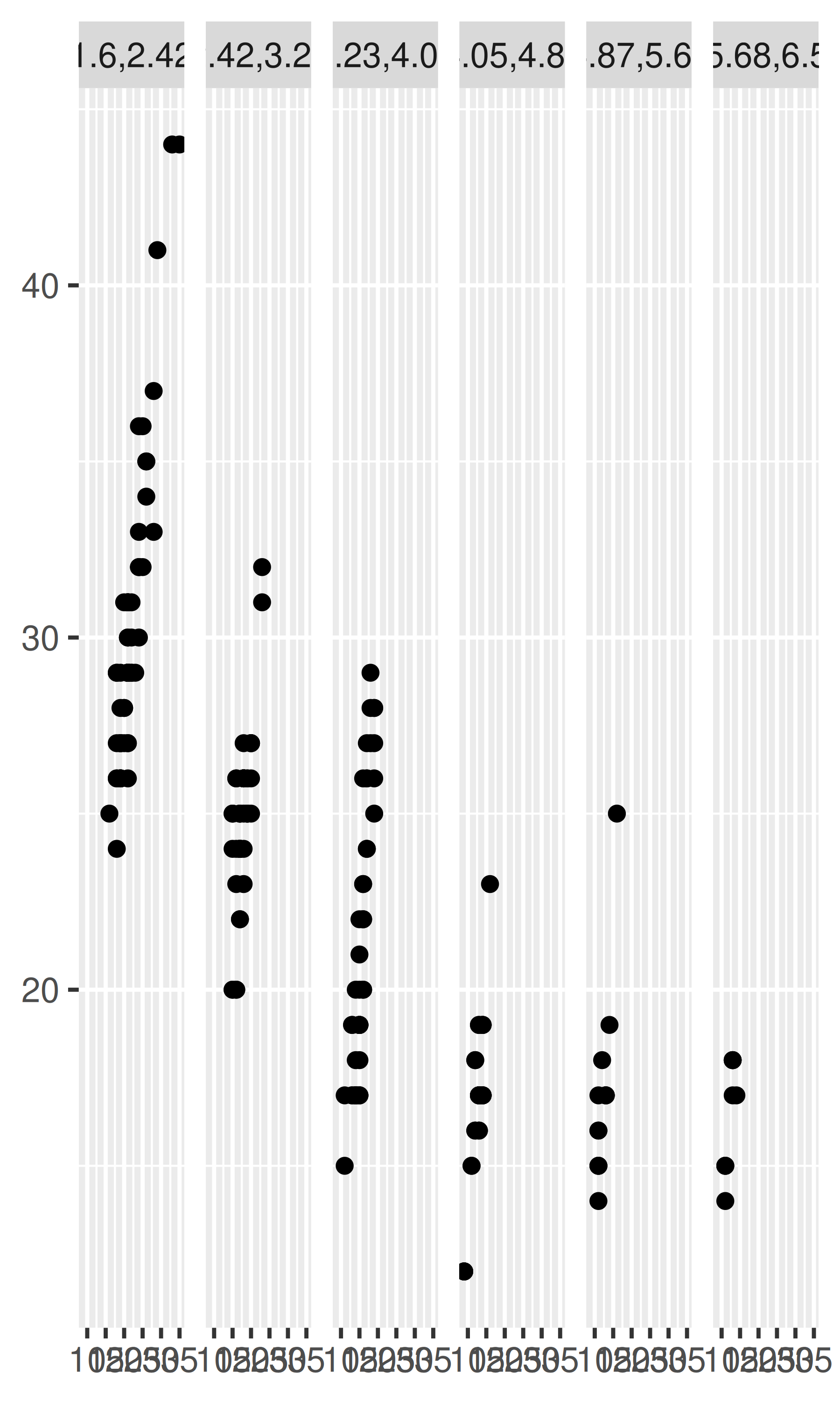
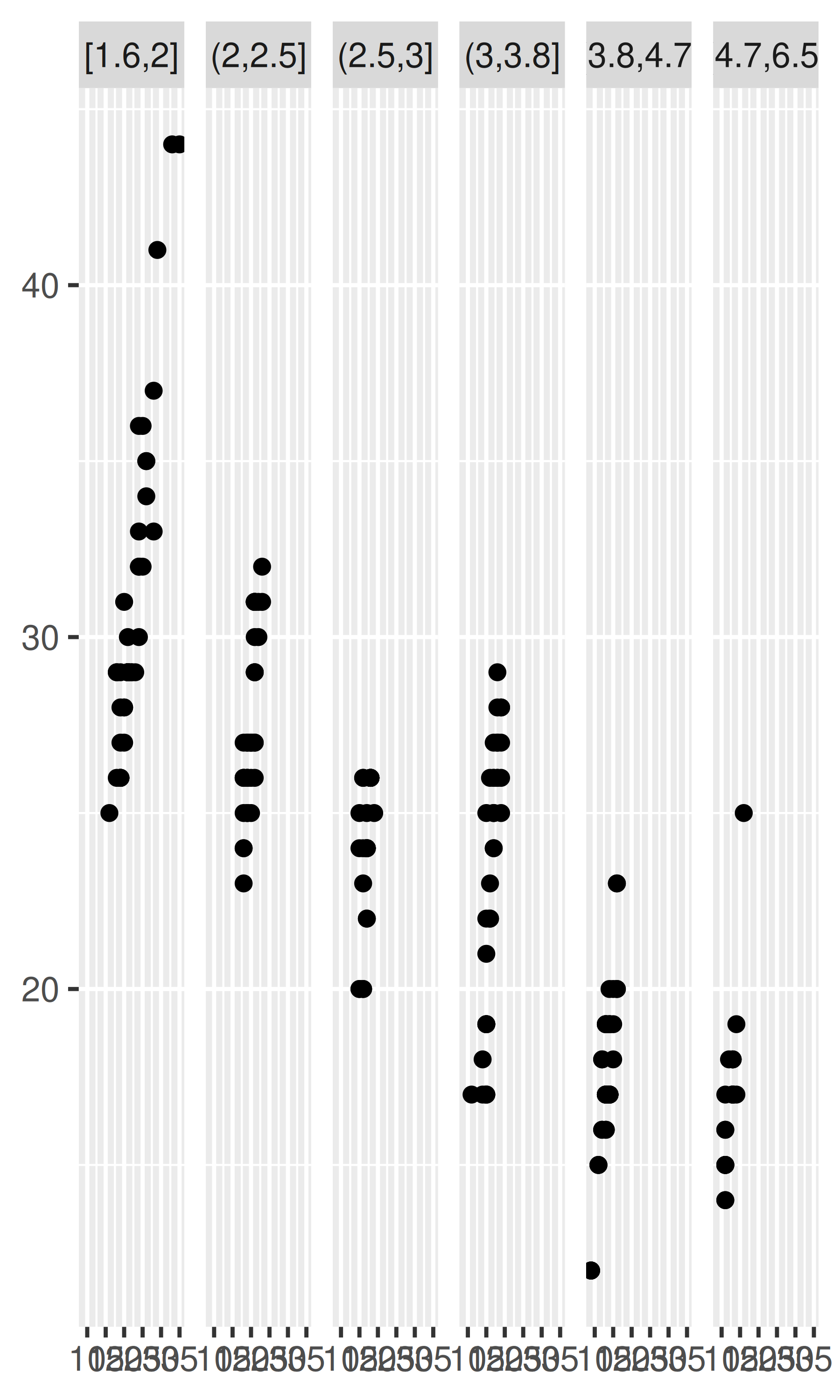
To facet continuous variables, you must first discretise them. ggplot2 provides three helper functions to do so:
Divide the data into n bins each of the same length: cut_interval(x, n)
Divide the data into bins of width width: cut_width(x, width).
Divide the data into n bins each containing (approximately) the same number of points: cut_number(x, n = 10).
They are illustrated below:
# Bins of width 1
mpg2$disp_w <- cut_width(mpg2$displ, 1)
# Six bins of equal length
mpg2$disp_i <- cut_interval(mpg2$displ, 6)
# Six bins containing equal numbers of points
mpg2$disp_n <- cut_number(mpg2$displ, 6)

plot <- ggplot(mpg2, aes(cty, hwy)) +
  geom_point() +
  labs(x = NULL, y = NULL)
plot + facet_wrap(~disp_w, nrow = 1)
plot + facet_wrap(~disp_i, nrow = 1)
plot + facet_wrap(~disp_n, nrow = 1)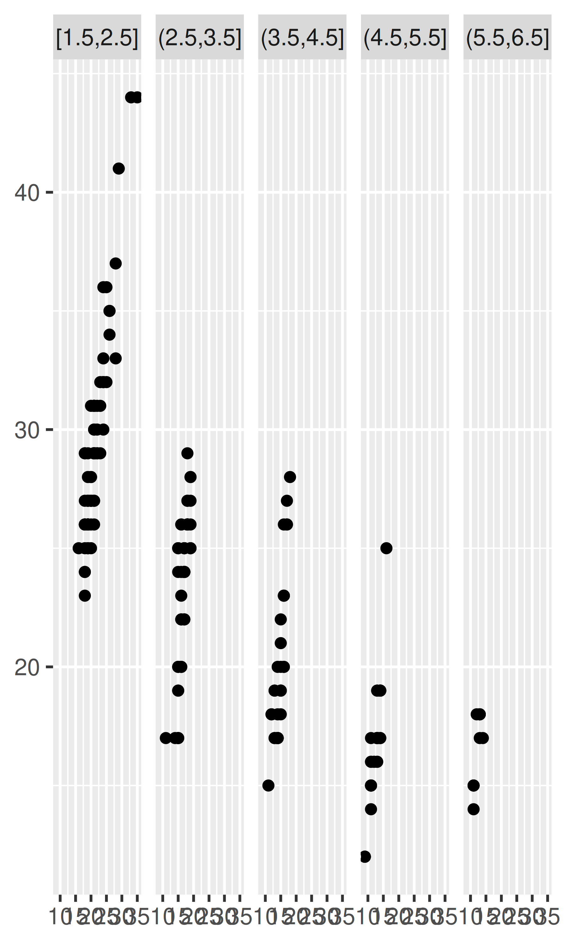
Note that the faceting formula does not evaluate functions, so you must first create a new variable containing the discretised data.
Diamonds: display the distribution of price conditional on cut and carat. Try faceting by cut and grouping by carat. Try faceting by carat and grouping by cut. Which do you prefer?
Diamonds: compare the relationship between price and carat for each colour. What makes it hard to compare the groups? Is grouping better or faceting? If you use faceting, what annotation might you add to make it easier to see the differences between panels?
Why is facet_wrap() generally more useful than facet_grid()?
Recreate the following plot. It facets mpg2 by class, overlaying a smooth curve fit to the full dataset.
#> `geom_smooth()` using method = 'loess' and formula = 'y ~ x'